


-
一、简单的绘图展示
-
二、绘制柱状图
-
三、共用坐标轴绘制两种不同类型的图
-
四、pandas导入excel数据并绘制频率分布直方图
-
五、绘制箱线图
-
-
*
-
一、简单的绘图展示
randomList = np.random.randn(10).cumsum() randomList #结果 ''' array([ 0.43692622, -0.17404988, 0.8479853 , 1.39711286, 1.67546532, 4.37286221, 4.22259538, 4.40355887, 4.38907365, 4.45077964]) ''' [/code] ```code s = pd.Series(randomList, index=np.arange(0,100,10))# index 指定序列中每个元素的索引 s #结果 ''' 0 0.436926 10 -0.174050 20 0.847985 30 1.397113 40 1.675465 50 4.372862 60 4.222595 70 4.403559 80 4.389074 90 4.450780 dtype: float64 ''' [/code] ```code s.plot() #用pandas中的Seris绘制折线图 plt.show() [/code]  ```code #利用pandas的DataFrame绘图 arr = np.random.randn(10,4) #产生一组10行4列的随机数组 arr #结果 array([[ 0.01616026, 0.57473119, 0.65414164, 0.93159686], [-0.03817341, -0.64962119, 0.27062599, 1.87690331], [ 1.15445861, 0.26759284, 0.69272073, -1.03753846], [ 0.11747495, 0.07197997, 0.15004073, -1.42265905], [-1.03527018, 0.38356526, -0.60570823, 0.45902491], [ 1.00210782, -1.18924028, -1.15890713, 0.7904771 ], [-0.70293899, 1.34306577, 0.63224563, 1.36712281], [-0.61717437, 0.31562477, -0.16665483, 0.08683415], [-0.9461549 , -0.11139913, -0.54149887, -1.12147449], [-0.15181162, 0.6141104 , -0.11115217, 0.43228114]])
list("ABCD")
[/code]
[‘A’, ‘B’, ‘C’, ‘D’]
```code
df = pd.DataFrame(arr,columns=list("ABCD"),index=np.arange(0,100,10))
df
[/code]
.dataframe thead tr:only-child th { text-align: right; } .dataframe thead th {
text-align: left; } .dataframe tbody tr th { vertical-align: top; } | A |
B | C | D
---|---|---|---|---
0 | 0.016160 | 0.574731 | 0.654142 | 0.931597
10 | -0.038173 | -0.649621 | 0.270626 | 1.876903
20 | 1.154459 | 0.267593 | 0.692721 | -1.037538
30 | 0.117475 | 0.071980 | 0.150041 | -1.422659
40 | -1.035270 | 0.383565 | -0.605708 | 0.459025
50 | 1.002108 | -1.189240 | -1.158907 | 0.790477
60 | -0.702939 | 1.343066 | 0.632246 | 1.367123
70 | -0.617174 | 0.315625 | -0.166655 | 0.086834
80 | -0.946155 | -0.111399 | -0.541499 | -1.121474
90 | -0.151812 | 0.614110 | -0.111152 | 0.432281
```code
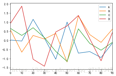
df.plot()
plt.show()
[/code]
# 二、绘制柱状图
```code
# Series 绘制柱状图
np.random.randn(16)
#结果
array([ 1.65970298, -2.34573948, 0.04198811, 1.24727844, 0.08232593,
0.94127546, 0.24426673, 0.05756959, -2.0821717 , 0.08035341,
-1.25196654, 0.08303011, 1.44323599, 0.32131152, -1.07353378,
1.10811569])
    list('abcdefghijklmnop')

    data = pd.Series(np.random.randn(16),index=list("abcdefghijklmnop"))
    data


        a   -2.156393
        b    1.420026
        c    0.209807
        d    0.777654
        e    0.652906
        f   -1.704662
        g   -0.478381
        h   -0.234059
        i   -1.888555
        j    0.127597
        k   -0.211189
        l    0.960216
        m    0.491695
        n   -0.166496
        o    0.494728
        p    1.112572
        dtype: float64
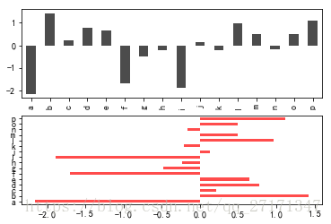
#创建一个带有两行一列绘图区域的画板
fig,axes = plt.subplots(2,1)
#Series在画板上绘制第一个柱状图
data.plot(kind="bar",ax=axes[0],color="k",alpha=0.7)
#Series在画板上绘制第二个柱状图
data.plot(kind="barh",ax=axes[1],color='r',alpha=0.7)
plt.show()
[/code]
# 三、共用坐标轴绘制两种不同类型的图
```code
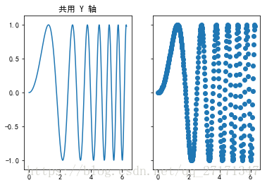
'''
pyplot.subplots(nrows,ncols,sharex,sharey)方法使用
nrows 创建几行绘图区域
ncols 创建几列绘图区域
sharex 是否共用x轴
sharey 是否共用y轴
'''
x = np.linspace(0,2*pi,400)
y = np.sin(x**2)
#创建一个有一行两列绘图对象的画板赋值给fig,两个绘图区域分别赋值给ax1,ax2
fig,(ax1,ax2) = plt.subplots(1,2,sharey=True)
#在第一个绘图区域上绘制折线图
ax1.plot(x,y)
ax1.set_title("共用 Y 轴")
#在第二个绘图区域上绘制散点图
ax2.scatter(x,y)
plt.show()
[/code]
# 四、pandas导入excel数据并绘制频率分布直方图
```code
# pandas加载excel数据
df = pd.read_excel("pandas-matplotlib.xlsx","Sheet1")
df
[/code]
.dataframe thead tr:only-child th { text-align: right; } .dataframe thead th {
text-align: left; } .dataframe tbody tr th { vertical-align: top; } | EMPID
| Gender | Age | Sales | BMI | Income
---|---|---|---|---|---|---
0 | E001 | M | 34 | 123 | Normal | 350
1 | E002 | F | 40 | 114 | Overweight | 450
2 | E003 | F | 37 | 135 | Obesity | 169
3 | E004 | M | 30 | 139 | Underweight | 189
4 | E005 | F | 44 | 117 | Underweight | 183
5 | E006 | M | 36 | 121 | Normal | 80
6 | E007 | M | 32 | 133 | Obesity | 166
7 | E008 | F | 26 | 140 | Normal | 120
8 | E009 | M | 32 | 133 | Normal | 75
9 | E010 | M | 36 | 133 | Underweight | 40
```code
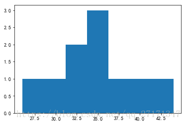
# 取出数据中的Age这一列
df["Age"]
#结果
0 34
1 40
2 37
3 30
4 44
5 36
6 32
7 26
8 32
9 36
Name: Age, dtype: int64
#创建画板
fig = plt.figure()
#在画板上添加一个绘图区域,并返回选中的绘图区域
ax = fig.add_subplot(111)
#在ax中绘制频率分布直方图
ax.hist(df["Age"],bins=7)
plt.show()
[/code]
```code
#分位值
df.describe()
[/code]
.dataframe thead tr:only-child th { text-align: right; } .dataframe thead th {
text-align: left; } .dataframe tbody tr th { vertical-align: top; } | Age |
Sales | Income
---|---|---|---
count | 10.000000 | 10.000000 | 10.000000
mean | 34.700000 | 128.800000 | 182.200000
std | 5.121849 | 9.271222 | 127.533699
min | 26.000000 | 114.000000 | 40.000000
25% | 32.000000 | 121.500000 | 90.000000
50% | 35.000000 | 133.000000 | 167.500000
75% | 36.750000 | 134.500000 | 187.500000
max | 44.000000 | 140.000000 | 450.000000
# 五、绘制箱线图
“`python
fig = plt.figure()
ax = fig.add_subplot(111)
ax.boxplot(df[“Age”])
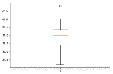
“`


 4551
4551


 被折叠的 条评论
为什么被折叠?
被折叠的 条评论
为什么被折叠?
 到【灌水乐园】发言


