


HarmonyOS4.0系列——03、声明式UI、链式编程、事件方法、以及自定义组件简单案例
声明式 UI
ArkTS以声明方式组合和扩展组件来描述应用程序的UI,同时还提供了基本的属性、事件和子组件配置方法,帮助开发者实现应用交互逻辑。
如果组件的接口定义没有包含必选构造参数,则组件后面的“()”不需要配置任何内容。例如,Divider组件不包含构造参数(下划线组件)
$r`形式引入应用资源,可应用于多语言场景
struct 内部无需用 let 声明,外部需要用 let 声明
使用 Stage 模型的应用,需要在module.json5配置文件中声明权限。
例如加载网络图片,语法:
Image(src: string | Resource | media.PixelMap)
加载本地资源
Image("images/view.jpg").width(200);
加载网络图片需要申请权限
Image(
  "https://profile-avatar.csdnimg.cn/63cdb1329d9e45b49ccbc25c10e23baf_nanchen_j.jpg!1"
); // 实际使用时请替换为真实地址
@Entry
@Component
struct DeclarativeUi {
  @State message: string = 'Hello World'

  build() {
    Row() {
      Column() {
        Text('声明式UI')
        Divider()
        Image('https://profile-avatar.csdnimg.cn/63cdb1329d9e45b49ccbc25c10e23baf_nanchen_j.jpg!1')
          .width(100)
          .height(100)

      }
      .width('100%')
    }
    .height('100%')
  }
}
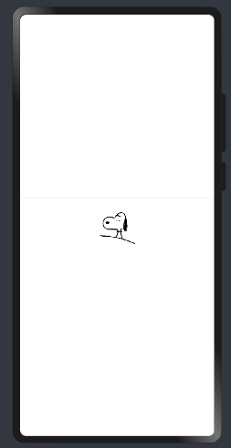
实际效果:
Resource 资源
使用资源格式可以跨包/跨模块引入图片,resources 文件夹下的图片都可以通过$r 资源接口读取到并转换到 Resource 格式。
Image($r("app.media.icon"));
也可以将图片放在rawfile文件夹下
其中:$r代表的是资源类型,app.media为应用程序下的媒体资源
链式编程
一条一条编写,类似于JQuery
Text("声明式UI").fontSize(40).fontColor(Color.Green);
事件方法
动态监听值的变化,例:
@Entry
@Component
struct DeclarativeUi {
  @State num:number = 3
  build() {
    Row() {
      Column() {
        Text('声明式UI'+this.num)
          .fontSize(40)
          .fontColor(Color.Green)
        Divider()

        Button('click++').onClick(()=>{
          this.num++
        })
      }
      .width('100%')
    }
    .height('100%')
  }
}
@Entry
@Component
struct DeclarativeUi {
  num:number = 3 // 不会具有响应式
}
注意:在struct中声明变量动态绑定需要用到@Struct,否则不会是响应式
private
定义私有变量,写法:
private content:string = 'Southern Wind'
自定义组件
当我们需要写多个文本不同但样式相同的效果,需要使用自定义组件来实现,下面是需要注意的几点
- @Component:
@Component装饰器仅能装饰struct关键字声明的数据结构。struct被@Component装饰后具备组件化的能力,需要实现build方法描述UI,一个struct只能被一个@Component装饰。 @Entry放在哪个组件前面,哪个就在页面上显示- 在
Entry组件中,build()中必须有且只有一个更组件 - 自定义组件必须定义
build()函数
定义一个itemComponent的组件
@Component
struct itemComponent{
  //  private私有变量
  private content:string = 'Southern Wind'
  build(){
    // @ts-ignore
    Row(){
      Image($r('app.media.gray'))
        .width(30)
        .height(30)
        .margin(15)
      Text(this.content)
        .fontSize(30)
        .fontColor(Color.White)

    }
    .backgroundColor(Color.Gray)
    .borderRadius(20)
    .padding({
      right:20
    })
    .margin({
      top:15
    })
  }
}
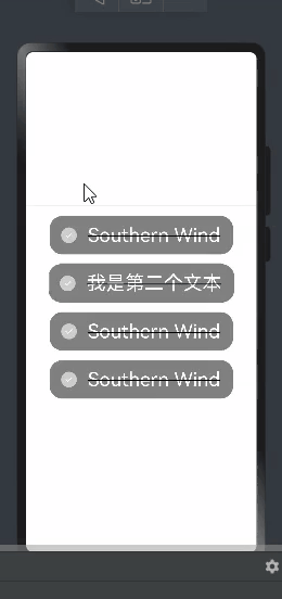
在主组件中渲染
@Entry
@Component
struct Index {
  build() {
    Row() {
      Column() {
        Divider()
        itemComponent()
        itemComponent({
          content:'我是第二个文本'
        })
        itemComponent()
        itemComponent()
      }
      .width('100%')
    }
    .height('100%')
  }
}
效果:
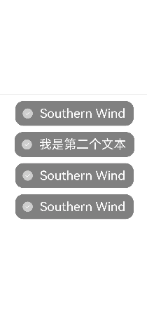
这里可以看到,自定义组件定义的变量在渲染第二次的时候可以被赋值替换
自定义组件具有以下特点
可组合:允许开发者使用系统组件、及其属性和方法
可复用:自定义组件可以被其他组件复用,并作为不同的实例在不同的父组件或容器中使用。
数据驱动UI更新:通过状态变量的改变,来驱动UI的刷新。
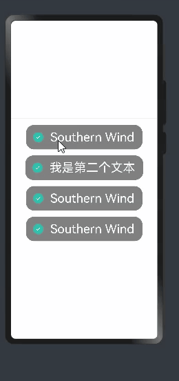
@Component
struct itemComponent{
  //  private私有变量
  private content:string = 'Southern Wind'

  @State isStatus:boolean = false

  build(){
    // @ts-ignore
    Row(){
      Image(this.isStatus ?$r('app.media.gray'):$r('app.media.gou'))
        .width(30)
        .height(30)
        .margin(15)
      Text(this.content)
        .fontSize(30)
        .fontColor(Color.White)

    }
    .backgroundColor(Color.Gray)
    .borderRadius(20)
    .padding({
      right:20
    })
    .margin({
      top:15
    })
    .onClick(()=>{
      this.isStatus = !this.isStatus
    })
  }
}
图片交互时渲染可以采用三元表达式的写法进行书写
效果:
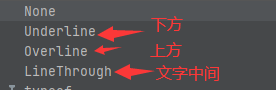
添加下滑线:TextDecorationType文本枚举类型
  .decoration({
    type:TextDecorationType.None
  })
完整代码及效果:
@Entry
@Component
struct Index {
  build() {
    Row() {
      Column() {
        Divider()
        itemComponent()
        itemComponent({
          content:'我是第二个文本'
        })
        itemComponent()
        itemComponent()
      }
      .width('100%')
    }
    .height('100%')
  }
}


@Component
struct itemComponent{
  //  private私有变量
  private content:string = 'Southern Wind'

  @State isStatus:boolean = true

  build(){
    // @ts-ignore
    Row(){
      Image(this.isStatus ?$r('app.media.gray'):$r('app.media.gou'))
        .width(30)
        .height(30)
        .margin(15)
      Text(this.content)
        .fontSize(30)
        .fontColor(Color.White)
        .decoration({
          type:this.isStatus ?TextDecorationType.LineThrough :TextDecorationType.None,
          color:Color.Black
        })

    }
    .backgroundColor(Color.Gray)
    .borderRadius(20)
    .padding({
      right:20
    })
    .margin({
      top:15
    })
    .onClick(()=>{
      this.isStatus = !this.isStatus
    })
  }
}
图标:


 390
390


 被折叠的 条评论
为什么被折叠?
被折叠的 条评论
为什么被折叠?
 到【灌水乐园】发言


