


一、九宫格图片
需求场景:
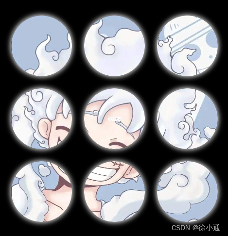
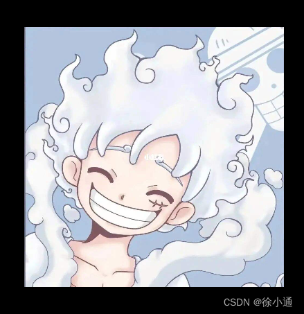
实现一个图片就行九宫格展示,hover可以过渡进行组合,形成完整图片,示例如下。
实现方案:
对每个图片元素进行background-position展示部分图片
<!DOCTYPE html>
<html lang="en">
<head>
    <meta charset="UTF-8">
    <title>九宫格</title>
</head>
<body>
<div class="app-container">
    <div class="img-swapper">
        <div class="img"></div>
        <div class="img"></div>
        <div class="img"></div>
        <div class="img"></div>
        <div class="img"></div>
        <div class="img"></div>
        <div class="img"></div>
        <div class="img"></div>
        <div class="img"></div>
    </div>
</div>
</body>
<style>
    body {
        margin: 0;
        padding: 0;
    }

    .app-container {
        position: absolute;
        inset: 0;
        display: flex;
        justify-content: center;
        align-items: center;
        background: black;
    }

    .img-swapper {
        width: 300px;
        height: 300px;
        display: flex;
        flex-wrap: wrap;
        position: relative;
    }

    .img {
        width: 100px;
        height: 100px;
        background-image: url("../assets/img/lufei.png");
        background-size: 300px 300px;
        transition: all 0.5s linear;
        box-shadow: 0 0 8px 2px lightgray;
        border-radius: 50%;

    }

    .img:nth-child(3n) {
        position: relative;
        left: 20px;
        background-position-x: -200%;
    }

    .img:nth-child(3n+1) {
        position: relative;
        left: -20px;
        background-position-x: 0;
    }

    .img:nth-child(3n+2) {
        position: relative;
        left: 0;
        background-position-x: -100%;
    }

    .img:nth-child(n+7) {
        position: relative;
        top: 20px;
        background-position-y: -200%;
    }

    .img:nth-child(-n+6) {
        position: relative;
        top: 0;
        background-position-y: -100%;
    }

    .img:nth-child(-n+3) {
        position: relative;
        top: -20px;
        background-position-y: 0;
    }
    .img-swapper:hover .img{
        top: 0;
        left: 0;
        box-shadow: none;
        border-radius: 0;
    }
</style>
</html>
二、边框按钮
需求场景:
边框颜色旋转按钮


实现方案:
对每个图片元素进行background-position展示部分图片
<!DOCTYPE html>
<html lang="en">

<head>
    <meta charset="UTF-8">
    <meta name="viewport" content="width=device-width, initial-scale=1.0">
    <title>ButtonBorder</title>
</head>

<body>
    <div class="btn-wrapper">
        <div class="btn">边框按钮</div>
    </div>
</body>

</html>

<style>
    body {
        margin: 0;
        padding: 0;
    }

    .btn-wrapper {
        background-color: black;
        height: 100%;
        position: absolute;
        inset: 0;
        display: flex;
        justify-content: center;
        align-items: center;
    }

    .btn {
        color: white;
        background-color: red;
        font-size: 20px;
        font-weight: 700;
        padding: 8px 12px;
        border-radius: 8px;
        position: relative;
        z-index: 200;
        overflow: hidden;

    }

    .btn::before {
        content: ' ';
        width: 300%;
        height: 300%;
        position: absolute;
        background-color: #0087ff;
        border-radius: 8px;
        z-index: -100;
        left: 50%;
        top: 50%;
        transform-origin: 0 0;
        animation: identifier 1.5s infinite linear;
    }

    .btn::after {
        content: '';
        position: absolute;
        top: 2px;
        left: 2px;
        border-radius: 8px;
        width: calc(100% - 4px);
        height: calc(100% - 4px);
        background-color: black;
        z-index: -2;
    }

    @keyframes identifier {
        to {
            transform: rotateZ(360deg);
        }
    }
</style>


 3509
3509


 被折叠的 条评论
为什么被折叠?
被折叠的 条评论
为什么被折叠?
 到【灌水乐园】发言


