


浮动的介绍
指的是一个元素脱离文档流,悬浮在父元素之上的现象。
网页的制作,是一个“流”从上而下,编织每一个标签的(和织毛衣一样,从上到下),不能像PS设计软件,想在哪里画就在哪里画。
文档流的一个例子:
<!DOCTYPE html>
<html lang="en">
<head>
    <meta charset="UTF-8">
    <title>浮动</title>

    <style>
        *{
            padding:0;
            margin:0;
        }
        .box1{
            width:300px;
            height:300px;
            background-color:red;
        }
        .box2{
            width:400px;
            height:400px;
            background-color:green;
        }
    </style>
</head>
<body>
<div class="box1">

</div>
<div class="box2">

</div>
</body>
</html>
样式:
有两个div标签,div标签是块级标签,各自独占一行,先编织box1再编织box2,按文档流展示。
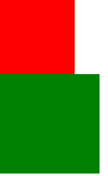
脱离文档流的例子:
想让box1 box2 在一行展示,但是又是块级标签,块级标签又是独占一行的。想让块级标签在一行显示,把块级标签变成行内标签不就行了嘛,再设置padding和margin,让两个标签显示在一行上,这个方式在一行显示内容较多的网页上略显繁琐。有更简单的方式,就是使用浮动。
<!DOCTYPE html>
<html lang="en">
<head>
    <meta charset="UTF-8">
    <title>浮动</title>

    <style>
        *{
            padding:0;
            margin:0;
        }
        .box1{
            width:300px;
            height:300px;
            background-color:red;
            float:left;
        }
        .box2{
            width:400px;
            height:400px;
            background-color:green;
            float:left;
        }
    </style>
</head>
<body>
<!--
    css中布局最多的一个属性。
    效果:两个元素并排显示,并且两个元素都能设置宽度和高度。
    三个特性:
        1.浮动元素脱标
        2.浮动的元素互相贴靠
        3.浮动的元素有“字围”效果
        4.紧凑效果
-->
<div class="box1">

</div>
<div class="box2">

</div>
</body>
</html>
样式:

浮动元素脱标
div盒子演示浮动脱标:
<!DOCTYPE html>
<html lang="en">
<head>
    <meta charset="UTF-8">
    <title>浮动</title>

    <style>
        *{
            padding:0;
            margin:0;
        }
        .box1{
            width:300px;
            height:300px;
            background-color:red;
            float:left;
        }
        .box2{
            width:400px;
            height:400px;
            background-color:green;
        }
    </style>
</head>
<body>
<!--
脱标:就是脱离了标准文档流。
小红盒子浮动了,脱离了标准流,此时小绿这个盒子就是标准文档流中的第一个盒子,所以就渲染到了左上方。
-->
<div class="box1">
小红
</div>
<div class="box2">
小绿
</div>
</body>
</html>
样式:

span标签脱标:
<!DOCTYPE html>
<html lang="en">
<head>
    <meta charset="UTF-8">
    <title>浮动</title>

    <style>
        *{
            padding:0;
            margin:0;
        }
        .box1{
            width:300px;
            height:300px;
            background-color:red;
            float:left;
        }
        .box2{
            width:400px;
            height:400px;
            background-color:green;
        }
        span{
            background-color:yellow;
            float:left;
            width:150px;
            height:30px;
        }
    </style>
</head>
<body>
<!--
脱标:就是脱离了标准文档流。
小红盒子浮动了,脱离了标准流,此时小绿这个盒子就是标准文档流中的第一个盒子,所以就渲染到了左上方。
-->
<div class="box1">
小红
</div>
<div class="box2">
小绿
</div>
<!--span标签不许需要转成块级元素也能设置宽高
    所有的标签一旦设置浮动,能够并排,都不区分行内和块级元素,能设置宽高。
-->
<span>span标签1</span>
<span>span标签2</span>
</body>
</html>
样式:

浮动的元素互相贴靠
如果父元素有足够的空间,那么3哥紧靠着2哥,2哥紧靠着1哥,1哥紧靠着边。
如果没有足够的空间,那么就靠着3哥靠着1哥。如果一个的边不够长就自己继续往边上靠。
父元素空间足够,三兄弟互相贴靠:
<!DOCTYPE html>
<html lang="en">
<head>
    <meta charset="UTF-8">
    <title>浮动</title>

    <style>
        *{
            padding:0;
            margin:0;
        }
        .box1{
            width:100px;
            height:200px;
            background-color:red;
            float:left;
        }
        .box2{
            width:200px;
            height:300px;
            background-color:green;
            float:left;
        }
        .box3{
            width:300px;
            height:400px;
            background-color:yellow;
            float:left;
        }
    </style>
</head>
<body>
<div class="box1">1</div>
<div class="box2">2</div>
<div class="box3">3</div>
</body>
</html>
样式:

浏览器缩小,即父级元素不够时,1哥的边不够长时:

浏览器缩小,1哥的边够长时:

浮动肯定会贴靠,谁贴着谁,靠哪个边得看父级的宽度。
浮动的元素有“字围”效果
字符效果:当div浮动,p不浮动。div挡住了p,但是p中的文字不会被遮盖,形成字围效果。
当不设置浮动是div标签和p标签都是独占一行的:
<!DOCTYPE html>
<html lang="en">
<head>
    <meta charset="UTF-8">
    <title>浮动</title>

    <style>
        *{
            padding:0;
            margin:0;
        }
        .box1{
            width:100px;
            height:100px;
            background-color:red;

        }
    </style>
</head>
<body>
<div class="box1">1</div>
<p>内容内容内容内容内容内容内容内容内容内容内容内容内容内容内容内容内容内容内容内容内容内容内容内容内容内容内容内容内容内容
内容内容内容内容内容内容内容内容内容内容内容内容内容内容内容内容内容内容内容内容内容内容内容内容内容内容内容内容内容内容内容
内容内容内容内容内容内容内容内容内容内容内容内容内容内容内容内容内容内容内容内容内容内容内容内容内容内容内容内容内容内容内容内容内容内容内容内容内容内容内容内容内容内容
内容内容内容内容内容内容内容内容内容内容内容内容内容内容内容内容内容内容内容内容内容内容内容内容内容内容内容内容内容内容内容
内容内容内容内容内容内容内容内容内容内容内容内容内容内容内容内容内容内容内容内容内容内容内容内容内容内内容内容内容内容内容内容内容内容内容内容内容内容内容内容内容内容内容
内容内容内容内容内容内容内容内容内容内容内容内容内容内容内容内容内容内容内容内容内容内容内容内容内容内容内容内容内容内容内容
内容内容内容内容内容内容内容内容内容内容内容内容内容内容内容内容内容内容内容内容内容内容内容内容内容内容内容内容内容内容内容内容
内容内容内容内容内容内容内容内容内容内容内容内容内容内容内容内容内容内容内容内容内容内容内容内容内容内容内容内容内容内容内容
内容内容内容内容内容内容内容内容内容内容内容内容内容内容内容内容内容内容内容内容内容内容内容内容内容内内容内容内容内容内容内容内容内容内容内容内内容内容内容内容内容内容
</p>
</body>
</html>

当给div标签设置浮动时,出现了字围效果,p标签变成了第一个文档流渲染的标签,但是文字没有被div浮动覆盖,而是形成了字围:
<!DOCTYPE html>
<html lang="en">
<head>
    <meta charset="UTF-8">
    <title>浮动</title>

    <style>
        *{
            padding:0;
            margin:0;
        }
        .box1{
            width:100px;
            height:100px;
            background-color:red;
            float:left;
        }
        p{
            background-color:#666;
        }
    </style>
</head>
<body>
<div class="box1">1</div>
<p>我是内容内容内容内容内容内容内容内容内容内容内容内容内容内容内容内容内容内容内容内容内容内容内容内容内容内容内容内容内容内容
内容内容内容内容内容内容内容内容内容内容内容内容内容内容内容内容内容内容内容内容内容内容内容内容内容内容内容内容内容内容内容
内容内容内容内容内容内容内容内容内容内容内容内容内容内容内容内容内容内容内容内容内容内容内容内容内容内容内容内容内容内容内容内容内容内容内容内容内容内容内容内容内容内容
内容内容内容内容内容内容内容内容内容内容内容内容内容内容内容内容内容内容内容内容内容内容内容内容内容内容内容内容内容内容内容
内容内容内容内容内容内容内容内容内容内容内容内容内容内容内容内容内容内容内容内容内容内容内容内容内容内内容内容内容内容内容内容内容内容内容内容内容内容内容内容内容内容内容
内容内容内容内容内容内容内容内容内容内容内容内容内容内容内容内容内容内容内容内容内容内容内容内容内容内容内容内容内容内容内容
内容内容内容内容内容内容内容内容内容内容内容内容内容内容内容内容内容内容内容内容内容内容内容内容内容内容内容内容内容内容内容内容
内容内容内容内容内容内容内容内容内容内容内容内容内容内容内容内容内容内容内容内容内容内容内容内容内容内容内容内容内容内容内容
内容内容内容内容内容内容内容内容内容内容内容内容内容内容内容内容内容内容内容内容内容内容内容内容内容内内容内容内容内容内容内容内容内容内容内容内内容内容内容内容内容内容
</p>
</body>
</html>
样式:

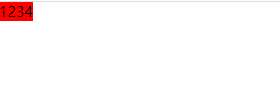
紧凑效果
不给浮动的元素设置宽和高,就会自动收缩为文字的宽度。
<!DOCTYPE html>
<html lang="en">
<head>
    <meta charset="UTF-8">
    <title>浮动</title>

    <style>
        *{
            padding:0;
            margin:0;
        }
        .box1{
            background-color:red;
            float:left;
        }
    </style>
</head>
<body>
<div class="box1">1234</div>
</body>
</html>
样式:
浮动带来的问题
小技巧:子元素浮动,父盒子一般不设置高度,让父盒子的高度随子元素内容高度进行变化。如果给父盒子设置高度,子元素的高度在修改时可能会超出父盒子的高度,导致布局变乱。如果想布局不变乱就要给对应的父盒子设定适当的高度,这个操作相当的繁琐。
不给父盒子设置高度的例子
在布局时,父盒子不设置高度,子元素全部浮动,相当于父盒子在文档流中的高度是没有的,在设置和父盒子的同级盒子b时,就会出浮动的盒子“浮在了”盒子b上面,导致布局紊乱。
<!DOCTYPE html>
<html lang="en">
<head>
    <meta charset="UTF-8">
    <title>Title</title>
    <style>
        .father{
            width:1126px;
        }
        .father .box1{
            width:200px;
            height:500px;
            float:left;
            background-color:red;
        }
        .father .box2{
            width:300px;
            height:200px;
            float:left;
            background-color:yellow;
        }
        .father .box3{
            width:400px;
            height:300px;
            float:left;
            background-color:green;
        }
        .father2{
            width:1126px;
            height:500px;
            background-color:blue;
        }
    </style>
</head>
<body>
<div class="father">
    <div class="box1"></div>
    <div class="box2"></div>
    <div class="box3"></div>
</div>

<div class="father2"></div>
</body>
</html>
样式:

出现这种问题,我们要清楚浮动带来的影响。
清除浮动
给父盒子设置高度
给父盒子设置高度的方式不灵活。很少使用。
相当于浮动起来的那部分高度在标准文档流中占位。
clear:both 内墙法
给浮动元素的最后面加一个空的div,并且该div部浮动,然后设置clear:both(意思时清除别人对我的浮动影响);
问题是,无缘无故增加了div元素,结构冗余。不可能每一个浮动最后面都加一个div来清除浮动。
<!DOCTYPE html>
<html lang="en">
<head>
    <meta charset="UTF-8">
    <title>Title</title>
    <style>
        .father{
            width:1126px;
        }
        .father .box1{
            width:200px;
            height:500px;
            float:left;
            background-color:red;
        }
        .father .box2{
            width:300px;
            height:200px;
            float:left;
            background-color:yellow;
        }
        .father .box3{
            width:400px;
            height:300px;
            float:left;
            background-color:green;
        }
        .father2{
            width:1126px;
            height:500px;
            background-color:blue;
        }
        .clear{
            clear:both;
        }
    </style>
</head>
<body>
<div class="father">
    <div class="box1"></div>
    <div class="box2"></div>
    <div class="box3"></div>
<!--    在浮动的最后一个元素后面加div并设置clear:both-->
    <div class="clear"></div>
</div>

<div class="father2"></div>
</body>
</html>
样式:

伪元素清除浮动(常用)
在父盒子添加class值clearfix并设置样式。
<!DOCTYPE html>
<html lang="en">
<head>
    <meta charset="UTF-8">
    <title>Title</title>
    <style>
        .father{
            width:1126px;
        }
        .father .box1{
            width:200px;
            height:500px;
            float:left;
            background-color:red;
        }
        .father .box2{
            width:300px;
            height:200px;
            float:left;
            background-color:yellow;
        }
        .father .box3{
            width:400px;
            height:300px;
            float:left;
            background-color:green;
        }
        .father2{
            width:1126px;
            height:500px;
            background-color:blue;
        }
        .clearfix:after{
        /* 必须写这三句*/
            content:"";
            clear:both;
            display:block;
        }
    </style>
</head>
<body>
<div class="father clearfix">
    <div class="box1"></div>
    <div class="box2"></div>
    <div class="box3"></div>
</div>

<div class="father2"></div>
</body>
</html>
overflow:hidden (常用)
给父盒子添加属性overflow:hidden
<!DOCTYPE html>
<html lang="en">
<head>
    <meta charset="UTF-8">
    <title>Title</title>
    <style>
        .father{
            width:1126px;
            /*内容会被修剪,并且其余内容是不可见的*/
            overflow:hidden;
        }
        .father .box1{
            width:200px;
            height:500px;
            float:left;
            background-color:red;
        }
        .father .box2{
            width:300px;
            height:200px;
            float:left;
            background-color:yellow;
        }
        .father .box3{
            width:400px;
            height:300px;
            float:left;
            background-color:green;
        }
        .father2{
            width:1126px;
            height:500px;
            background-color:blue;
        }
    </style>
</head>
<body>
<div class="father">
    <div class="box1"></div>
    <div class="box2"></div>
    <div class="box3"></div>
</div>

<div class="father2"></div>
</body>
</html>


 4577
4577


 被折叠的 条评论
为什么被折叠?
被折叠的 条评论
为什么被折叠?
 到【灌水乐园】发言


