


import React from 'react'

import { Tooltip } from 'antd';

import './index.less';`


`class Tooltip extends React.Component {

   constructor(props){

       super(props);

       this.state={

           visible: false,

           DtStyle:{},

           DtClass:'',

       }

    }

   componentDidMount(){ this.getItemWidth() }

   getItemWidth=()=>{

       if(this.container){//当这个节点存在的时候

           this.setState({

                DtStyle:{width:`${this.container.clientWidth}px`},//宽等于该节点的宽

                DtClass:'NowrapAndTitle'

           })

       }

    }

 render () {

   const {DtStyle,DtClass}=this.state;

   const {center,title,children}=this.props;

   return (

       <div className="PublicTableTooltip" style={{textAlign:center?'center':'left'}}>//设置是居中还是左对齐

           <Tooltip placement="topLeft" title={title}overlayClassName="ItemPublicTableTooltip">

                  //把这个节点赋给这个组件的this.constiner属性

                <div ref={node =>this.container = node} style={DtStyle}className={DtClass}>{children}</div>

           </Tooltip>

       </div>

    )

  }

}

export default Tooltip
CSS样式
`.PublicTableTooltip{

   .NowrapAndTitle{

   // 不换行显示。。。

   overflow: hidden;

   -o-text-overflow: ellipsis;

   text-overflow: ellipsis;

   white-space: nowrap;
  }
}
.ItemPublicTableTooltip{

 .ant-tooltip-inner{

   background-color: rgba();

  }

 .ant-tooltip-arrow{

   border-top-color: rgba();

  }

}
调用的时候
import Tooltip from './index';

<Tooltip title={text} center>

       {text}//直接包裹要提示的内容即可

</Tooltip>
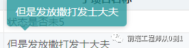
效果图:
请关注我的公众号:前端工程师从0到1(微信搜索)


 201
201


 被折叠的 条评论
为什么被折叠?
被折叠的 条评论
为什么被折叠?
 到【灌水乐园】发言


