


React开发项目时,显示内容一行展示不下时常常会显示省略号,此时需要鼠标放上去显示全部内容,若一行可以完全显示,只需展示即可。
具体的实现效果如图所示,若一行展示的下,直接展示,否则显示省略号,鼠标移入显示气泡: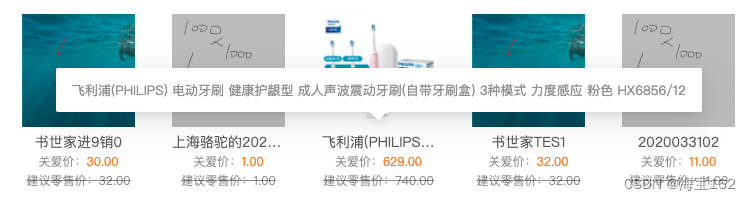
在antd Design中,已经有了ToolTip文字提示组件(文字提示 Tooltip - Ant Design),但是一行能够完全展示时,不需要文字提示,所以本文基于antd开发了ToolTip文字提示组件,核心思路是初始化组件时判断一行内容是否展示的下。
具体做法是设置一个canvas容器,容器的宽、高和字体,将content填充到容器中并测量填充的宽度,若超过容器宽度则认为一行无法展示的下,需要注意的是,该容器透明度为0,并且设置z-index属性为-1,防止遮挡住其他内容,具体代码如下:
import React, { useState, useEffect, useRef } from "react";
import { Popover } from "antd";

// 使用canvas计算字体宽度
export const ToolTips = (props: any) => {
	const [showTooltip, setShowTooltip] = useState(-1);
	const refs = useRef();

	useEffect(() => {
		const doms = document.getElementById(props?.id || "ToolTipsId");
		const { offsetHeight, offsetWidth } = doms;
		const fontSize = getComputedStyle(doms, null).getPropertyValue("font-size");
		const fontFamily = getComputedStyle(doms, null).getPropertyValue("font-family");
		// 创建canvas标签
		const canvas = document.createElement("canvas");
		canvas.width = offsetWidth;
		canvas.height = offsetHeight;
		const ctx = canvas.getContext("2d");
		ctx.font = `${fontSize} ${fontFamily}`;
		// 获取展示的实际宽度是否超过容器宽度
		ctx.fillText(props?.content, 0, offsetHeight);
		const measureWidth = ctx.measureText(props?.content).width;
		setShowTooltip(measureWidth > offsetWidth ? 1 : 2);
	}, [props?.content]);

	return <div ref={refs} key={props?.innerKey || props?.content} style={{ position: "relative" }}>
		{
			React.cloneElement(props.children, {
				className: `${props.children?.props?.className}`,
				id: props?.id || "ToolTipsId",
				style: { opacity: 0, position: "absolute", zIndex: "-1", width: props?.width || 160 },
			})
		}
		{
			showTooltip === 1 &&
			<Popover placement="top" content={<div style={{ width: 250, fontSize: "13px", color: "#999", wordBreak: "break-all" }}>{props?.content}</div>} trigger="hover">
				{
					React.cloneElement(props.children, {
						className: `ellipsis ${props.children?.props?.className}`,
						// style: {wordBreak: "break-all" }
					})
				}
			</Popover>}
		{
			showTooltip === 2 && <>{props.children}</>
		}
	</div>;
};
React.cloneElement函数用于复制一个和props.children一样的dom元素,用来获取children元素的宽度(offsetHeight属性)和高度(offsetWeight属性),offsetHeight和offsetWeight包含了内边距(padding)和边框(border), 并且props.children的id最好在使用数组map的时候根据index进行传值,否则页面上存在多个id=ToolTipsId时,永远取的第一个dom:
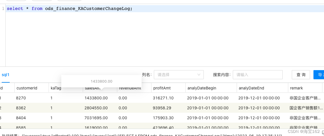
如上图,1433800.00的宽度取的是第一列id的宽度,导致显示了气泡。当然如果不想传id,也可以在const { offsetHeight, offsetWidth } = doms这一行执行之前,取offsetWidth=props?.width。
当显示气泡时,showToolTip值为1,默认给props.children添加ellipsis样式,让其显示省略号:index.less里的.ellipsis如下:
.ellipsis {
	width: 100%;
	overflow: hidden;
	text-overflow: ellipsis;
	white-space: nowrap;
}
调用时需要指定宽度,格式如下:
import { ToolTips } from "@src/core/components/TooltipEllipsis";

<ToolTips content={content} width="171px">
	<div className="address-area">{content}</div>
</ToolTips>
address-area里设置了width为171px,如果不想重复设置的话,可以满足条件:
showTooltip === 2 && <>{props.children}</>时,将<>{props.children}</>改成:
<div style={{ width: props?.width }}>{props?.children}</div>如果props?.children不是ReactNode类型,或者是span:
<ToolTips content={content} width="171px">
	{content}
</ToolTips>

<ToolTips content={content} width="171px">
	<span>{content}</span>
</ToolTips>
组件里可以加一层判断:showTooltip == 2时,children不是ReactNode类型(或者判断children是string类型和number类型,即reactElement所能支持的基本类型)时外面包一层div。
如果是span,还需设置span是display: inline-block。
另外如果调用的地方,外部包了div,设置了样式可能会影响ToolTips,需自行调整,如:
 <div className='current-key-container'>

                  <ToolTips content={currentKey} width="250px">
                    <div style={{ width: "250px" }}>{currentKey}</div>
                  </ToolTips>

                </div>
最后,使用Tab组件切换显示不同商品时,会复用同一块区域的DOM,此时如果ToolTip显示错误,需自行调整.


 1646
1646


 被折叠的 条评论
为什么被折叠?
被折叠的 条评论
为什么被折叠?
 到【灌水乐园】发言


