


简介
本文内容基本是来源于STHDA,这是一份十分详细的ggplot2使用指南,因此我将其翻译成中文,一是有助于我自己学习理解,另外其他R语言爱好者或者可视化爱好者可以用来学习。翻译过程肯定不能十全十美,各位读者有建议或改进的话,十分欢迎发Email(tyan@zju.edu.cn)给我。
ggplot2是由Hadley Wickham创建的一个十分强大的可视化R包。按照ggplot2的绘图理念,Plot(图)= data(数据集)+ Aesthetics(美学映射)+ Geometry(几何对象):
-
data: 数据集,主要是data frame;
-
Aesthetics: 美学映射,比如将变量映射给x,y坐标轴,或者映射给颜色、大小、形状等图形属性;
-
Geometry: 几何对象,比如柱形图、直方图、散点图、线图、密度图等。
在ggplot2中有两个主要绘图函数:qplot()以及ggplot()。
-
qplot(): 顾名思义,快速绘图;
-
ggplot():此函数才是ggplot2的精髓,远比qplot()强大,可以一步步绘制十分复杂的图形。
由ggplot2绘制出来的ggplot图可以作为一个变量,然后由print()显示出来。
图形类型
根据数据集,ggplot2提供不同的方法绘制图形,主要是为下面几类数据类型提供绘图方法:
-
一个变量x: 连续或离散
-
两个变量x&y:连续和(或)离散
-
连续双变量分布x&y: 都是连续
-
误差棒
-
三变量
安装及加载
安装ggplot2提供三种方式:
#直接安装tidyverse,一劳永逸(推荐,数据分析大礼包)
install.packages("tidyverse")
#直接安装ggplot2
install.packages("ggplot2")
#从Github上安装最新的版本,先安装devtools(如果没安装的话)
devtools::install_github("tidyverse/ggplot2")
加载
library(ggplot2)数据准备
数据集应该数据框data.frame
本文将使用数据集mtcars。
#load the data set
data(mtcars)
df <- mtcars[, c("mpg","cyl","wt")]
#将cyl转为因子型factor
df$cyl <- as.factor(df$cyl)
head(df)
## mpg cyl wt
## Mazda RX4 21.0 6 2.620
## Mazda RX4 Wag 21.0 6 2.875
## Datsun 710 22.8 4 2.320
## Hornet 4 Drive 21.4 6 3.215
## Hornet Sportabout 18.7 8 3.440
## Valiant 18.1 6 3.460qplot()
qplot()类似于R基本绘图函数plot(),可以快速绘制常见的几种图形:散点图、箱线图、小提琴图、直方图以及密度曲线图。其绘图格式为:
qplot(x, y=NULL, data, geom="auto")其中:
-
x,y: 根据需要绘制的图形使用;
-
data:数据集;
-
geom:几何图形,变量x,y同时指定的话默认为散点图,只指定x的话默认为直方图。
散点图
qplot(x=mpg, y=wt, data=df, geom = "point")
也可以添加平滑曲线
qplot(x=mpg, y=wt, data = df, geom = c("point", "smooth"))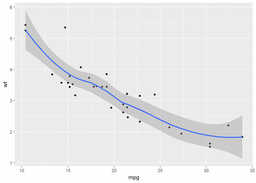
还有其他参数可以修改,比如点的形状、大小、颜色等
#将变量cyl映射给颜色和形状
qplot(x=mpg, y=wt, data = df, colour=cyl, shape=cyl)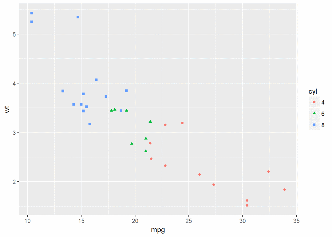
箱线图、小提琴图、点图
#构造数据集
set.seed(1234)
wdata <- data.frame(
  sex=factor(rep(c("F", "M"), each=200)),
  weight=c(rnorm(200, 55), rnorm(200, 58))
)
head(wdata)
## sex weight
## 1 F 53.79293
## 2 F 55.27743
## 3 F 56.08444
## 4 F 52.65430
## 5 F 55.42912
## 6 F 55.50606箱线图
qplot(sex, weight, data = wdata, geom = "boxplot", fill=sex)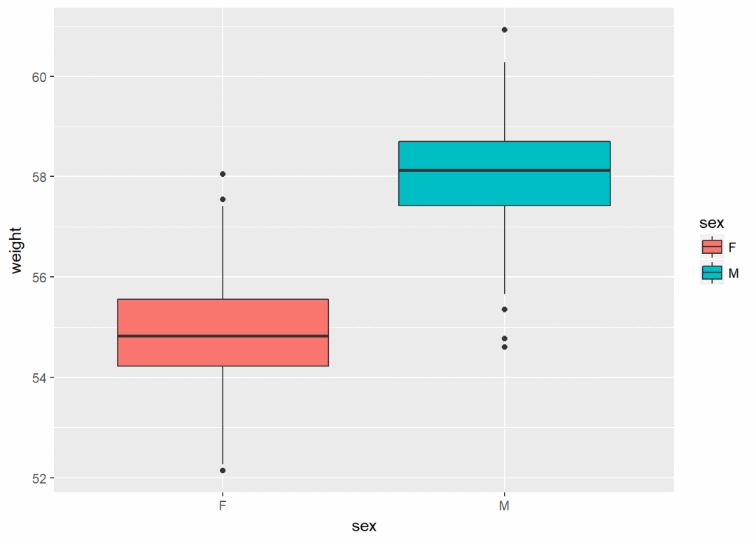
小提琴图
qplot(sex, weight, data = wdata, geom = "violin")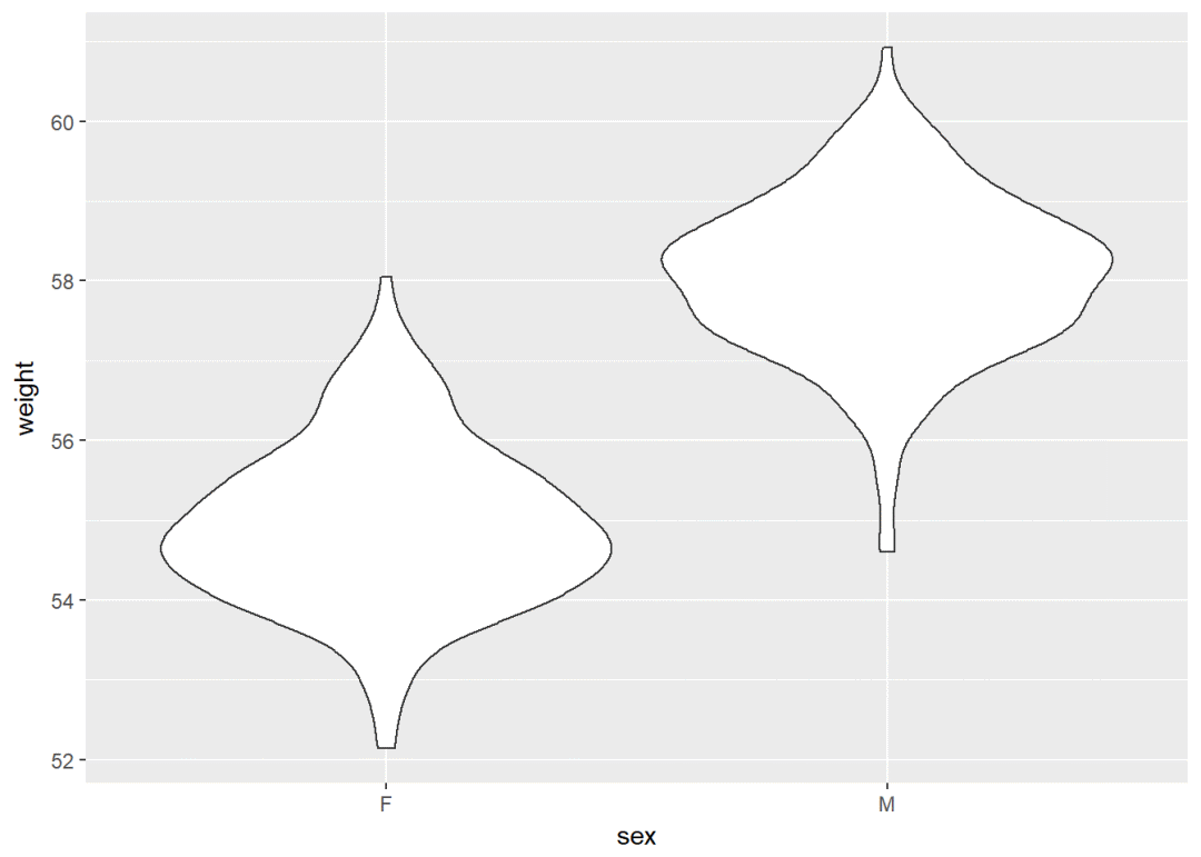
点图
qplot(sex, weight, data = wdata, geom = "dotplot", stackdir="center", binaxis="y", dotsize=0.5, color=sex)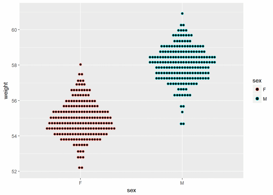
直方图、密度图
直方图
qplot(weight, data = wdata, geom = "histogram", fill=sex)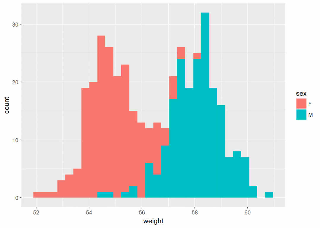
密度图
qplot(weight, data = wdata, geom = "density", color=sex, linetype=sex)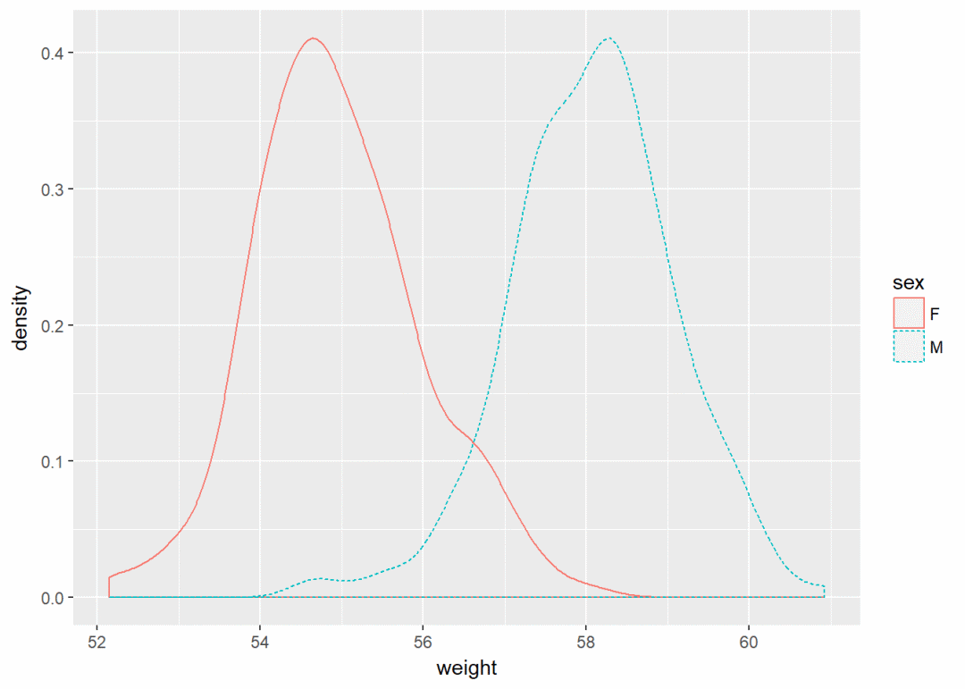
ggplot()
上文中的qplot()绘制散点图:
qplot(x=mpg, y=wt, data=df, geom = "point")在ggplot()中完全可以如下实现:
ggplot(data=df, aes(x=mpg, y=wt))+
  geom_point()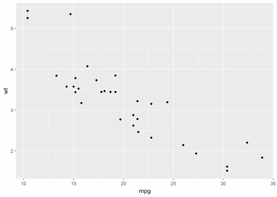
改变点形状、大小、颜色等属性
ggplot(data=df, aes(x=mpg, y=wt))+geom_point(color="blue", size=2, shape=23)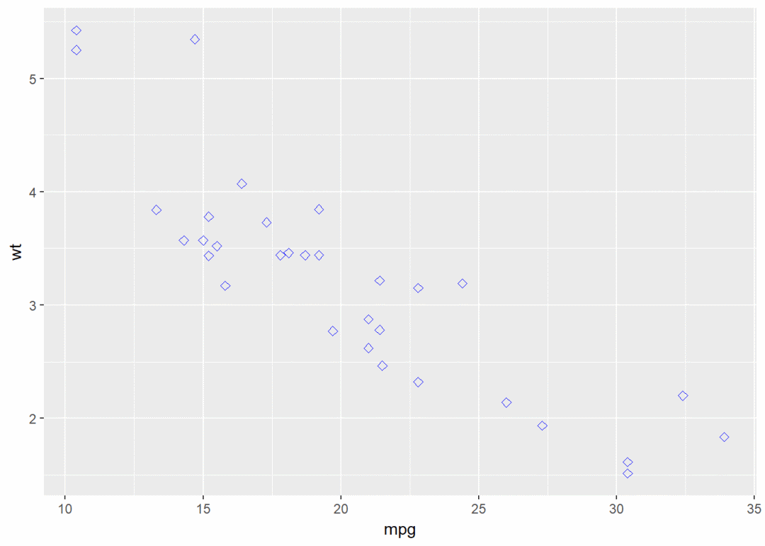
绘图过程中常常要用到转换(transformation),这时添加图层的另一个方法是用stat_*()函数。
下例中的geom_density()与stat_density()是等价的
ggplot(wdata, aes(x=weight))+geom_density()等价于
ggplot(wdata, aes(x=weight))+stat_density()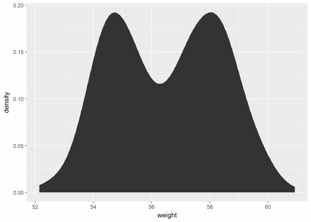
对于每一种几何图形。ggplot2 基本都提供了 geom()和 stat()
一个变量:连续型
使用数据集wdata,先计算出不同性别的体重平均值
library(plyr)
mu <- ddply(wdata, "sex", summarise, grp.mean=mean(weight))
先绘制一个图层a,后面逐步添加图层
a <- ggplot(wdata, aes(x=weight))可能添加的图层有:
-
对于一个连续变量:
-
面积图geom_area()
-
密度图geom_density()
-
点图geom_dotplot()
-
频率多边图geom_freqpoly()
-
直方图geom_histogram()
-
经验累积密度图stat_ecdf()
-
QQ图stat_qq()
-
-
对于一个离散变量:
-
条形图geom_bar()
-

面积图
a+geom_area(stat = "bin")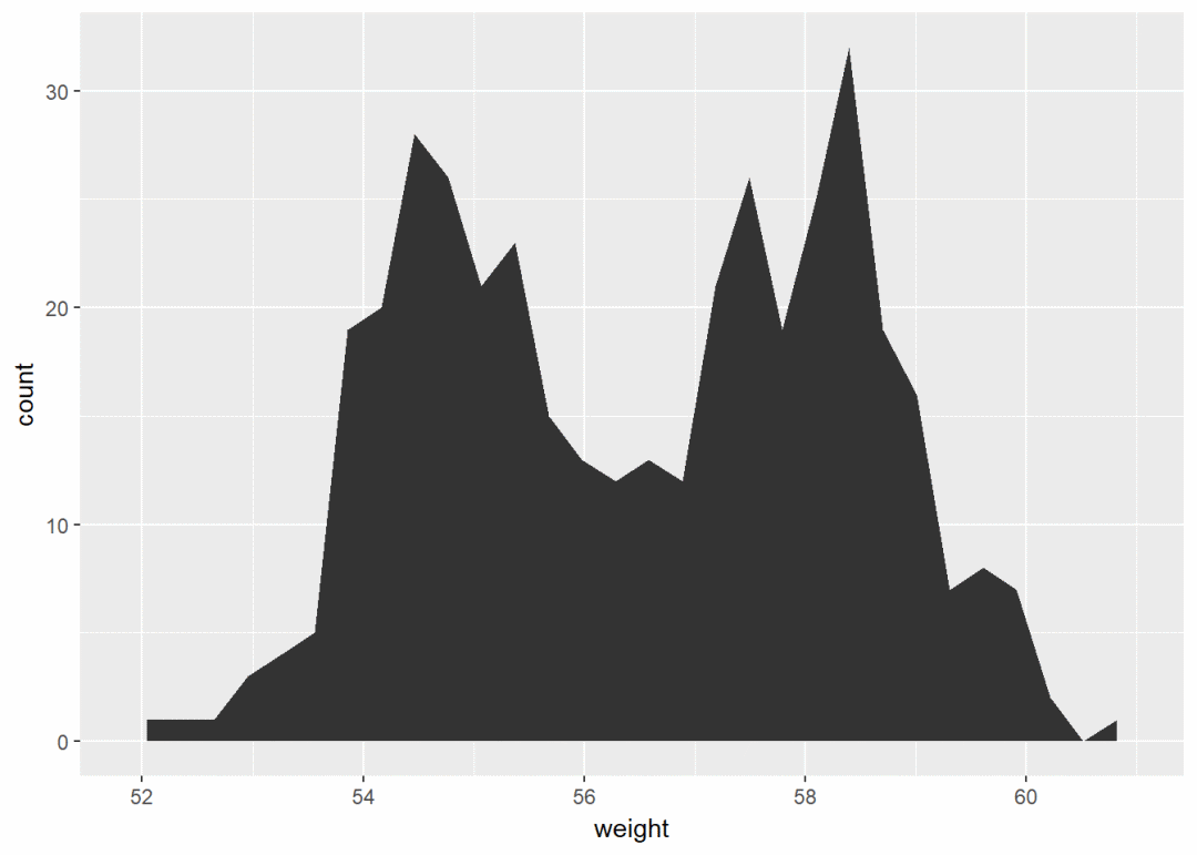
改变颜色
a+geom_area(aes(fill=sex), stat = "bin", alpha=0.6)+
  theme_classic()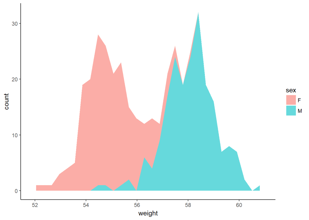
注意:y轴默认为变量weight的数量即count,如果y轴要显示密度,可用以下代码:
a+geom_area(aes(y=..density..), stat = "bin")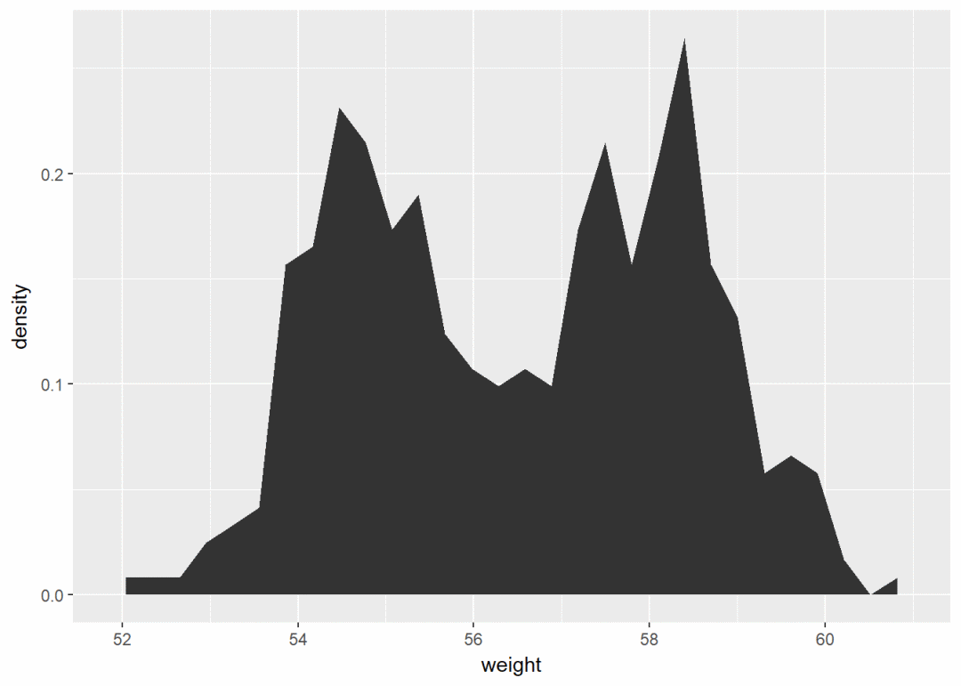
可以通过修改不同属性如透明度、填充颜色、大小、线型等自定义图形:
密度图
使用以下函数:
-
geom_density():绘制密度图
-
geom_vline():添加竖直线
-
scale_color_manual():手动修改颜色
a+geom_density()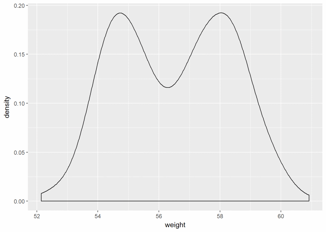
根据sex修改颜色,将sex映射给line颜色
a+geom_density(aes(color=sex))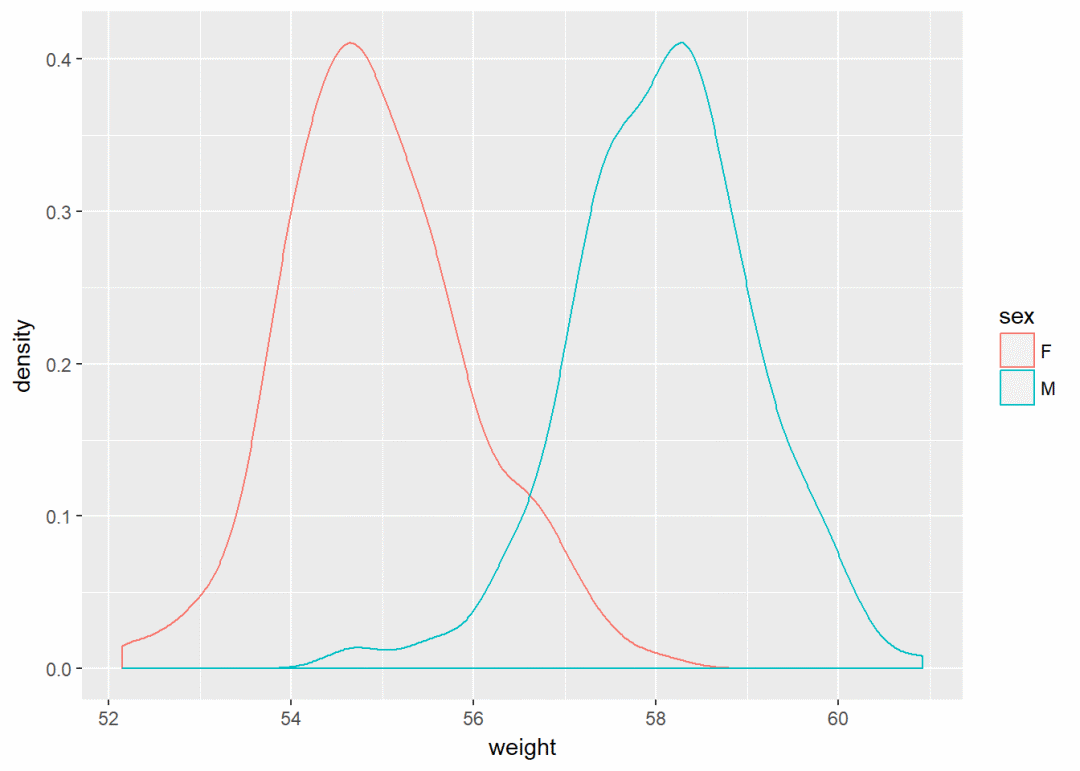
修改填充颜色以及透明度
a+geom_density(aes(fill=sex), alpha=0.4)
添加均值线以及手动修改颜色
a+geom_density(aes(color=sex))+
  geom_vline(data=mu, aes(xintercept=grp.mean, color=sex), linetype="dashed")+
  scale_color_manual(values = c("red", "blue"))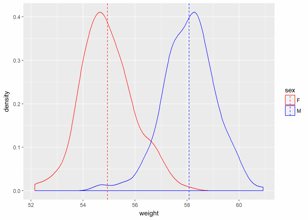
点图
a+geom_dotplot()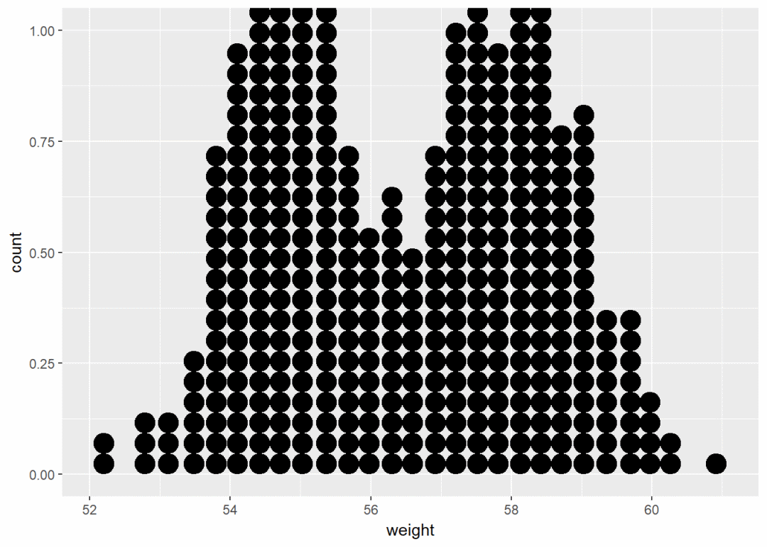
将sex映射给颜色
a+geom_dotplot(aes(fill=sex))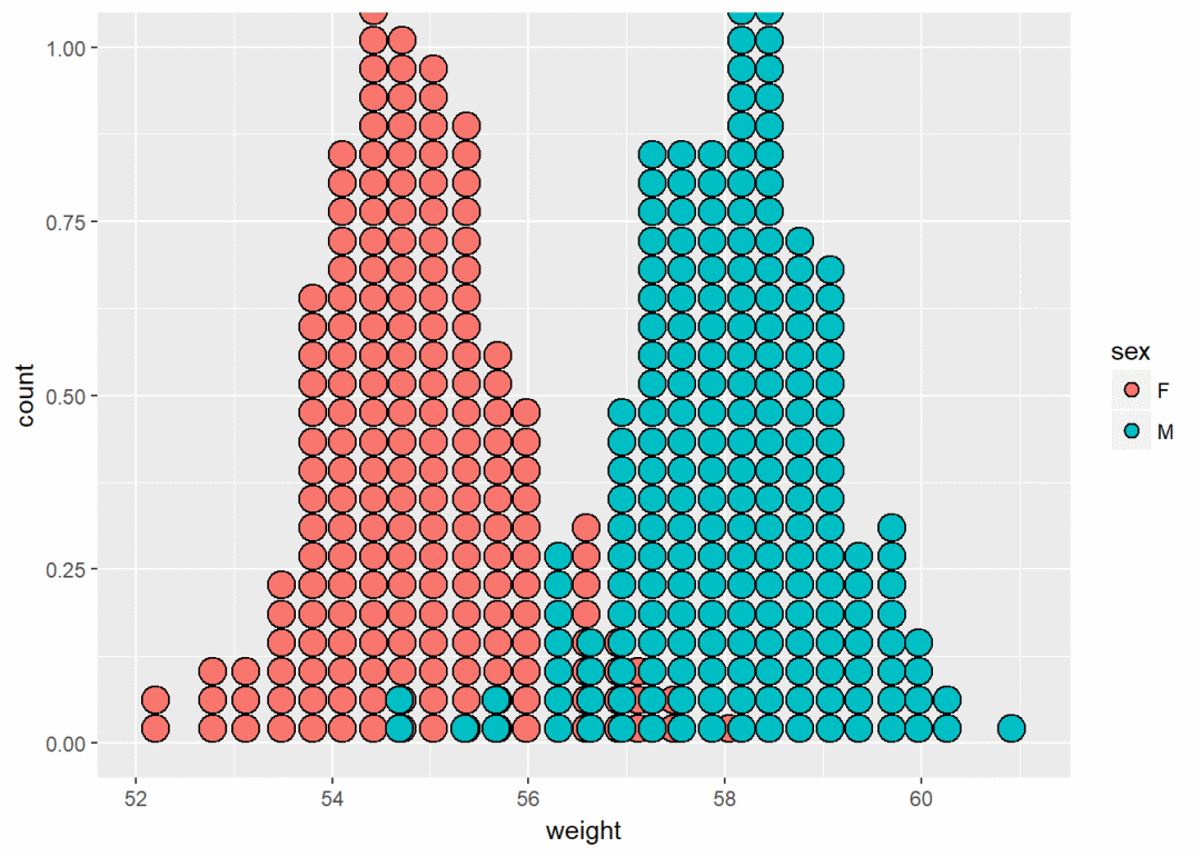
手动修改颜色
a+geom_dotplot(aes(fill=sex))+
  scale_fill_manual(values=c("#999999", "#E69F00"))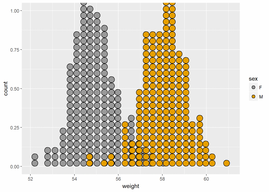
频率多边图
a+geom_freqpoly()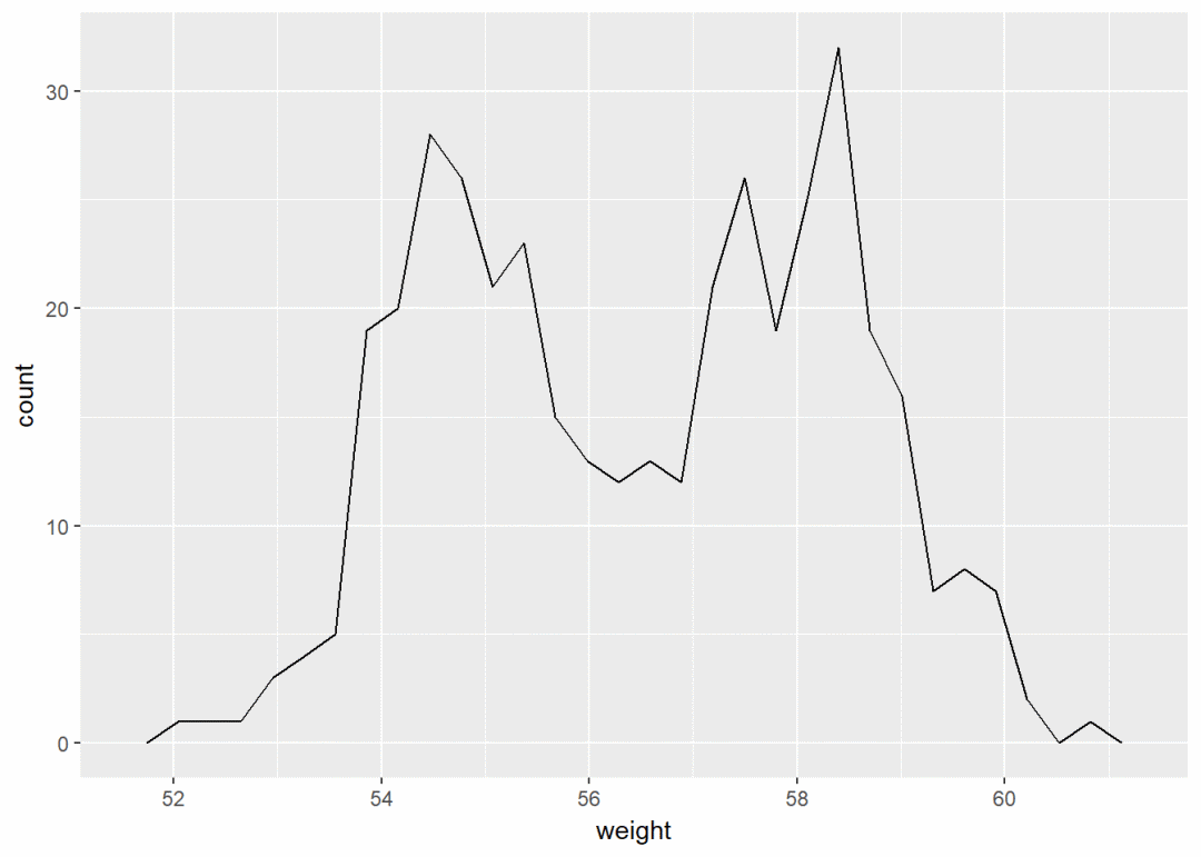
y轴显示为密度
a+geom_freqpoly(aes(y=..density..))+
  theme_minimal()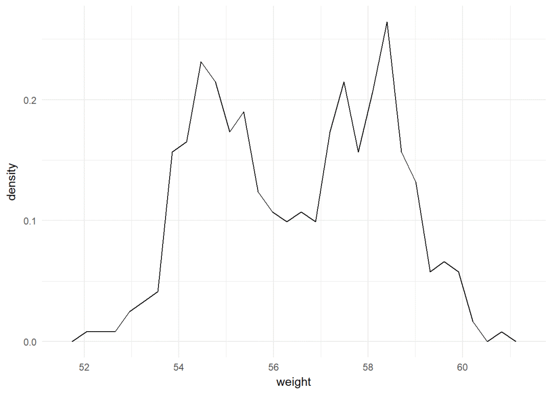
修改颜色以及线型
a+geom_freqpoly(aes(color=sex, linetype=sex))+
  theme_minimal()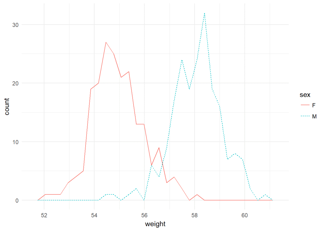
直方图
a+geom_histogram()
将sex映射给线颜色
a+geom_histogram(aes(color=sex), fill="white", position = "dodge")+theme_classic()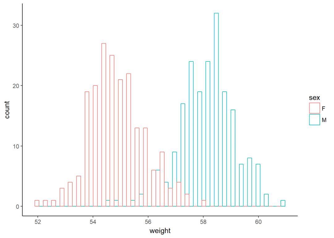
经验累积密度图
a+stat_ecdf()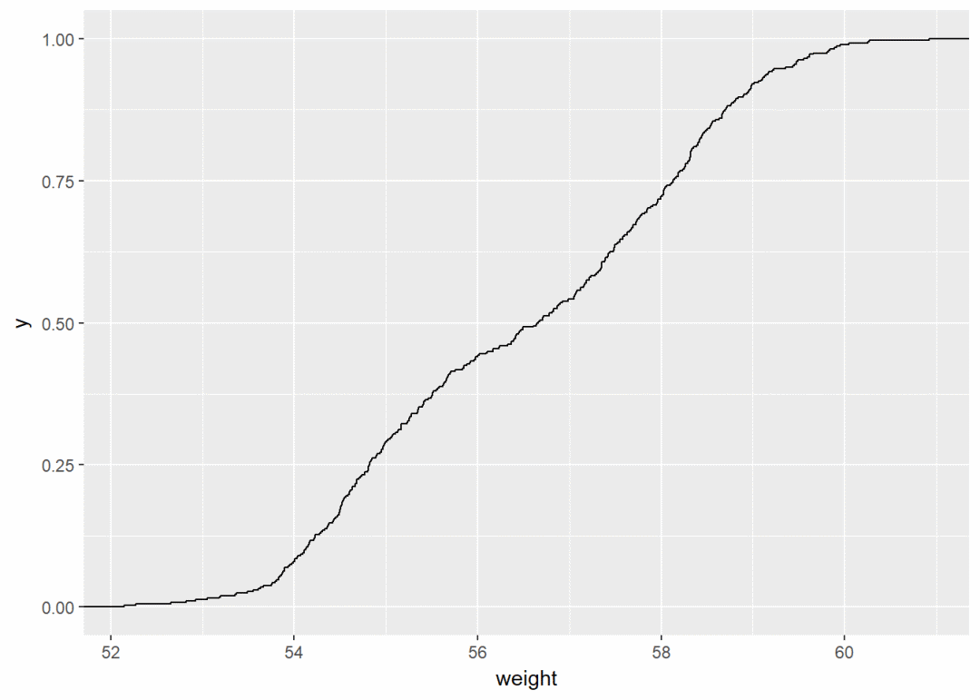
QQ图
ggplot(data = mtcars, aes(sample=mpg))+stat_qq()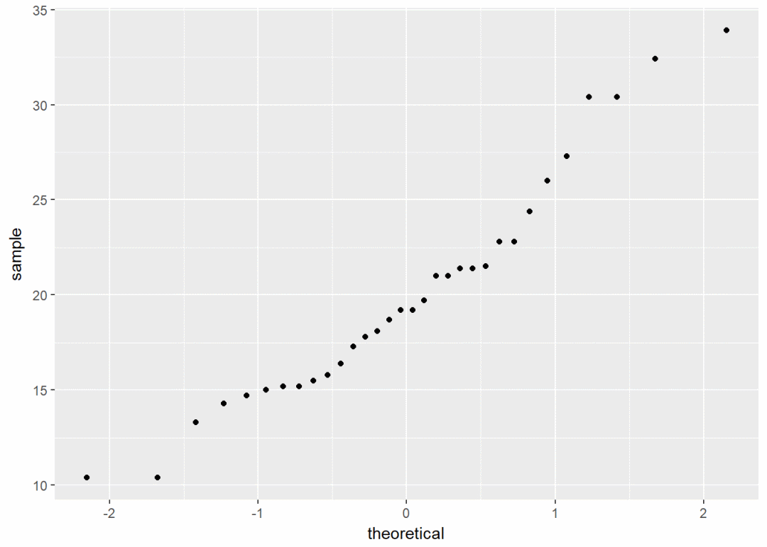
一个离散变量
#加载数据集
data(mpg)
b <- ggplot(mpg, aes(x=fl))
b+geom_bar()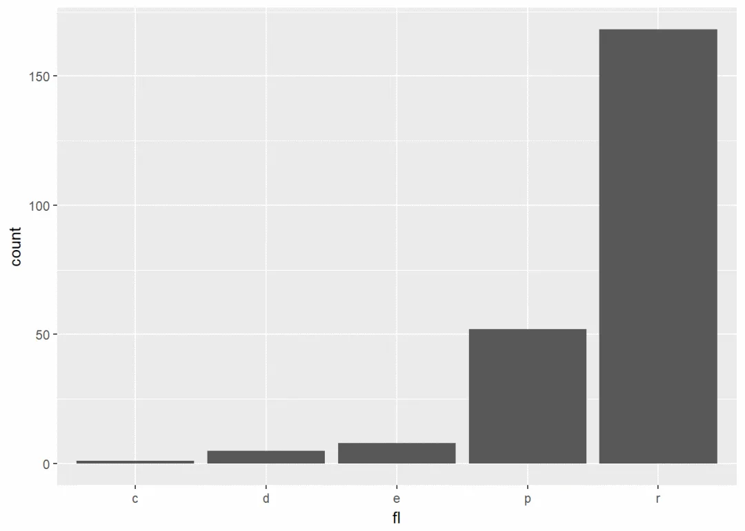
修改填充颜色
b+geom_bar(fill="steelblue", color="black")+theme_classic()
两个变量:x,y皆连续
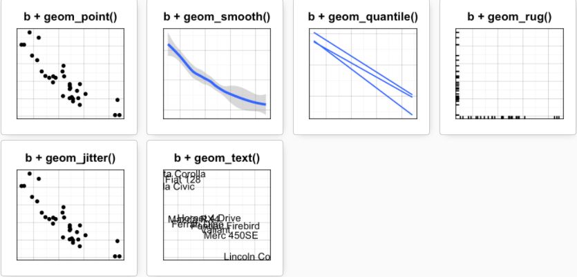
使用数据集mtcars, 先创建一个ggplot图层
b <- ggplot(data = mtcars, aes(x=wt, y=mpg))可能添加的图层有:
-
geom_point():散点图
-
geom_smooth():平滑线
-
geom_quantile():分位线
-
geom_rug():边际地毯线
-
geom_jitter():避免重叠
-
geom_text():添加文本注释
散点图
b+geom_point()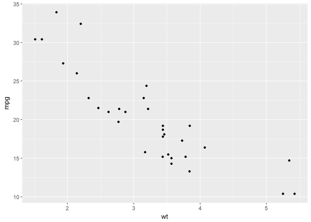
将变量cyl映射给点的颜色和形状
b + geom_point(aes(color = factor(cyl), shape = factor(cyl)))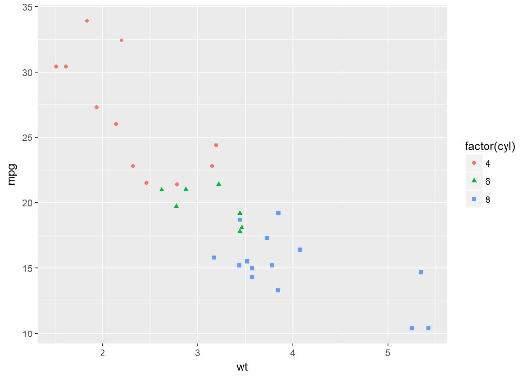
自定义颜色
b+geom_point(aes(color=factor(cyl), shape=factor(cyl)))+
  scale_color_manual(values=c("#999999", "#E69F00", "#56B4E9"))+theme_classic()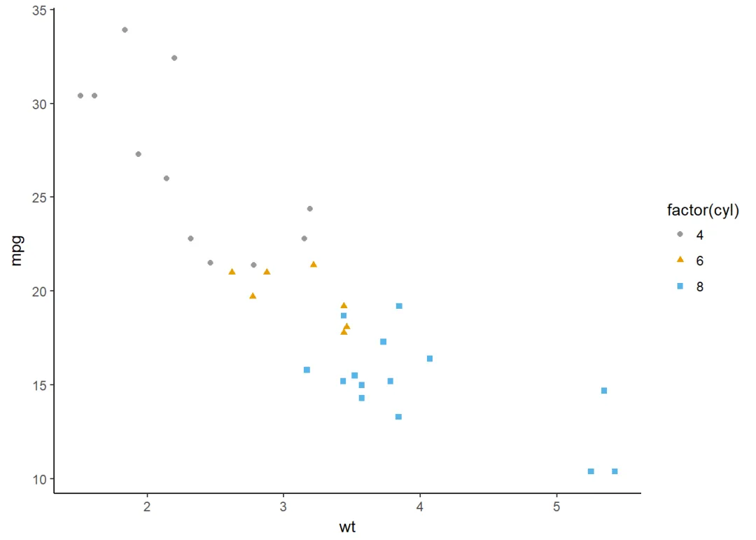
平滑线
可以添加回归曲线
b+geom_smooth()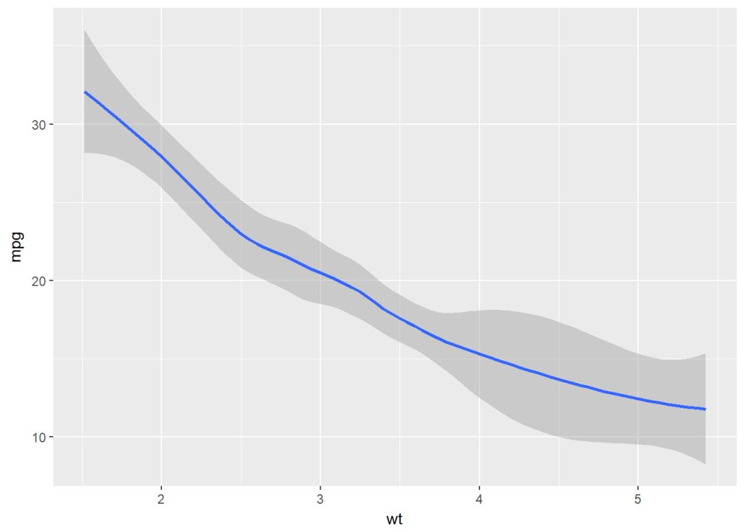
散点图+回归线
b+geom_point()+
  geom_smooth(method = "lm", se=FALSE)#去掉置信区间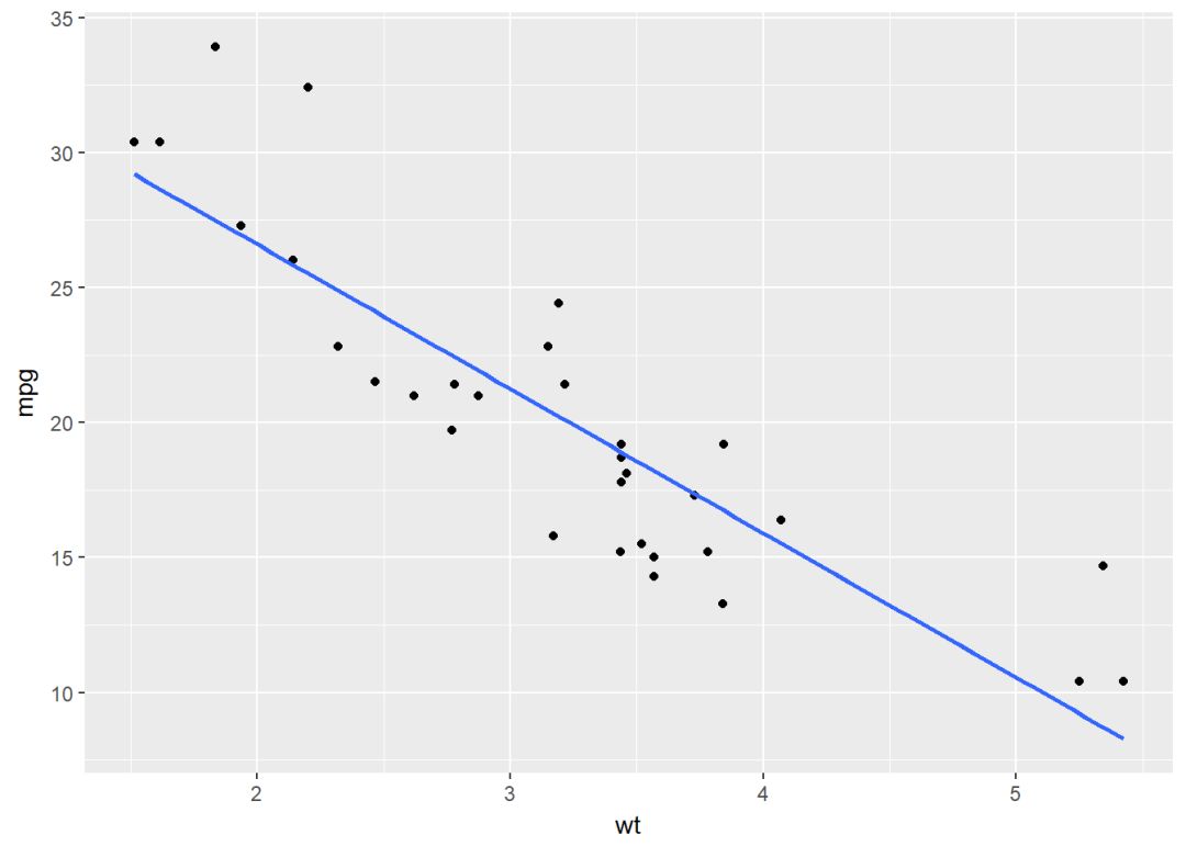
使用loess方法
b+geom_point()+
  geom_smooth(method = "loess")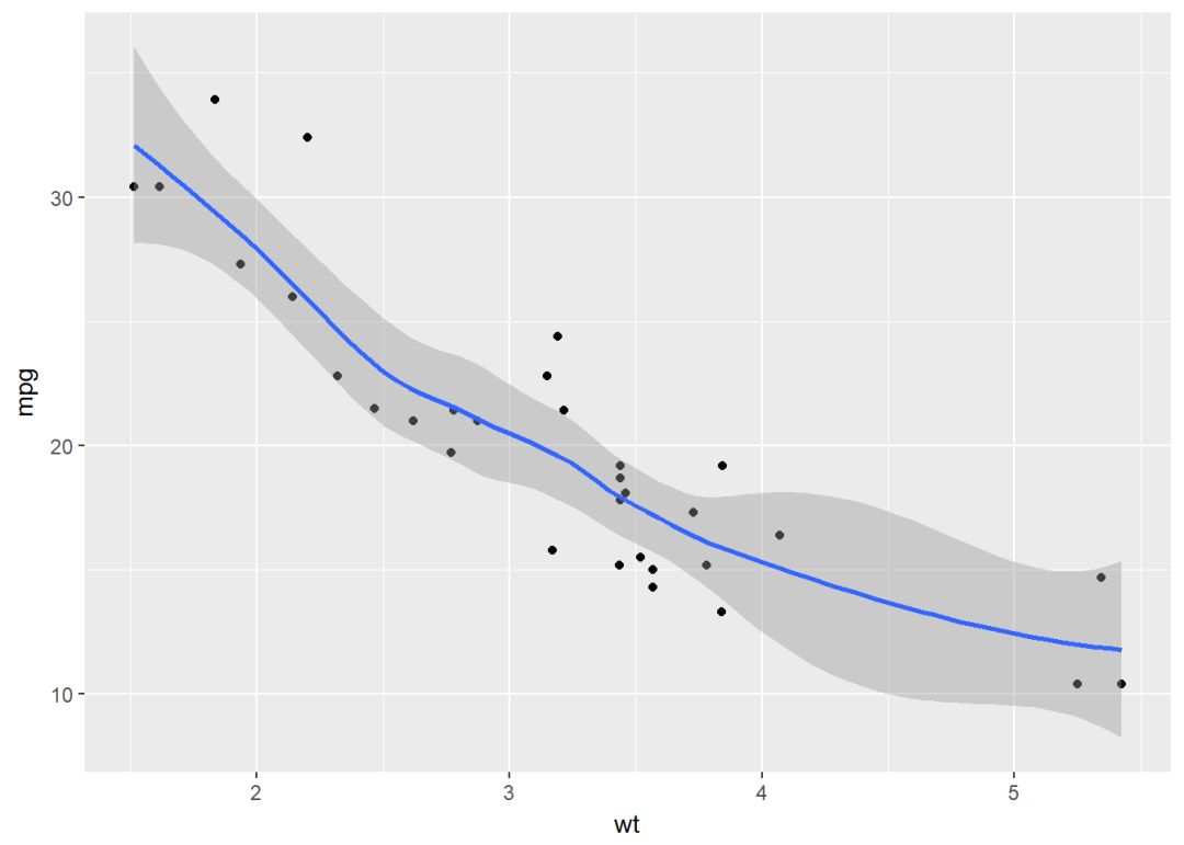
将变量映射给颜色和形状
b+geom_point(aes(color=factor(cyl), shape=factor(cyl)))+
  geom_smooth(aes(color=factor(cyl), shape=factor(cyl)), method = "lm", se=FALSE, fullrange=TRUE)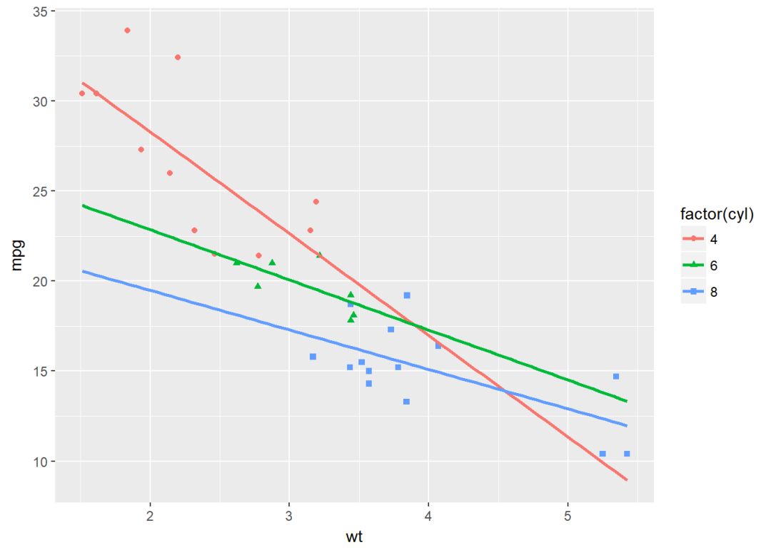
分位线
ggplot(data = mpg, aes(cty, hwy))+
  geom_point()+geom_quantile()+
  theme_minimal()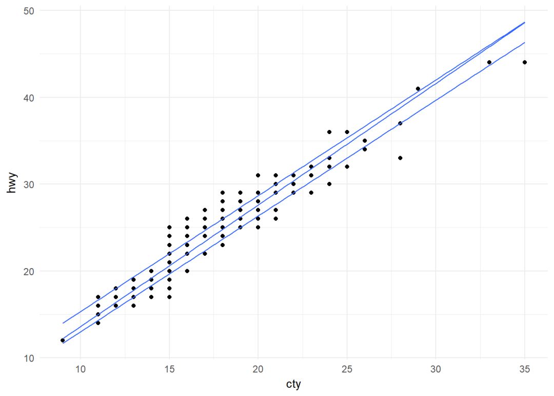
边际地毯线
使用数据集faithful
ggplot(data = faithful, aes(x=eruptions, y=waiting))+
  geom_point()+geom_rug()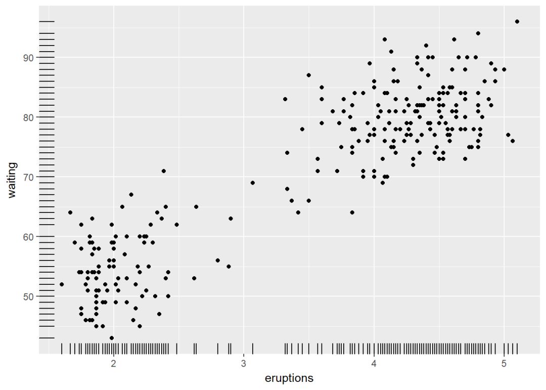
避免重叠
实际上geom_jitter()是geom_point(position="jitter")的简称,下面使用数据集mpg
p <- ggplot(data = mpg, aes(displ, hwy))
p+geom_point()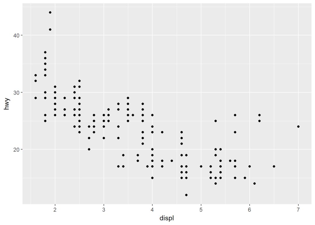
增加抖动防止重叠
p+geom_jitter(width = 0.5, height = 0.5)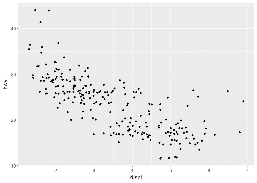
其中两个参数:
-
width:x轴方向的抖动幅度
-
height:y轴方向的抖动幅度
文本注释
参数label用来指定注释标签 (ggrepel可以避免标签重叠)
b+geom_text(aes(label=rownames(mtcars)))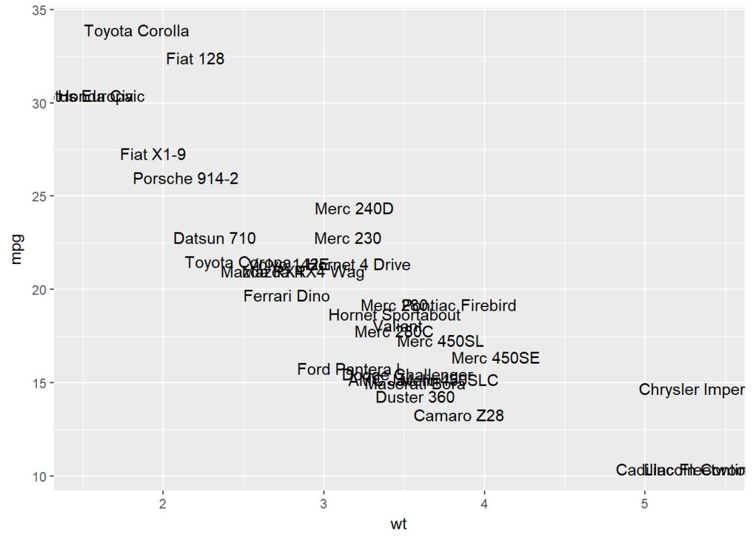
两个变量:连续二元分布
使用数据集diamonds
head(diamonds[, c("carat", "price")])## # A tibble: 6 x 2
## carat price
## <dbl> <int>
## 1 0.23 326
## 2 0.21 326
## 3 0.23 327
## 4 0.29 334
## 5 0.31 335
## 6 0.24 336创建ggplot图层,后面再逐步添加图层
c <- ggplot(data=diamonds, aes(carat, price))可添加的图层有:
-
geom_bin2d(): 二维封箱热图
-
geom_hex(): 六边形封箱图
-
geom_density_2d(): 二维等高线密度图
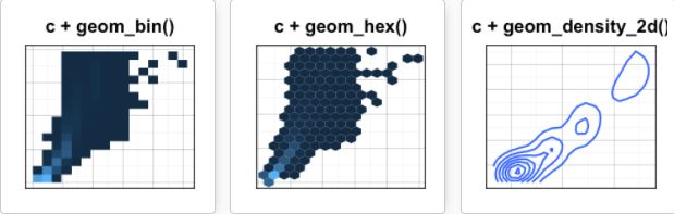
二维封箱热图
geom_bin2d()将点的数量用矩形封装起来,通过颜色深浅来反映点密度
c+geom_bin2d()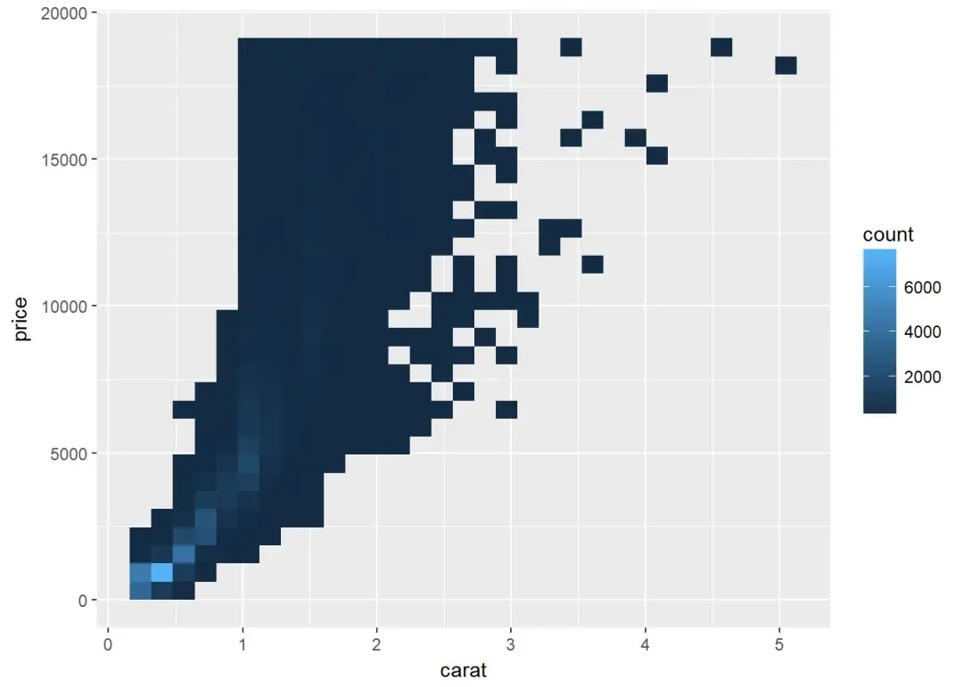
设置bin的数量
c+geom_bin2d(bins=150)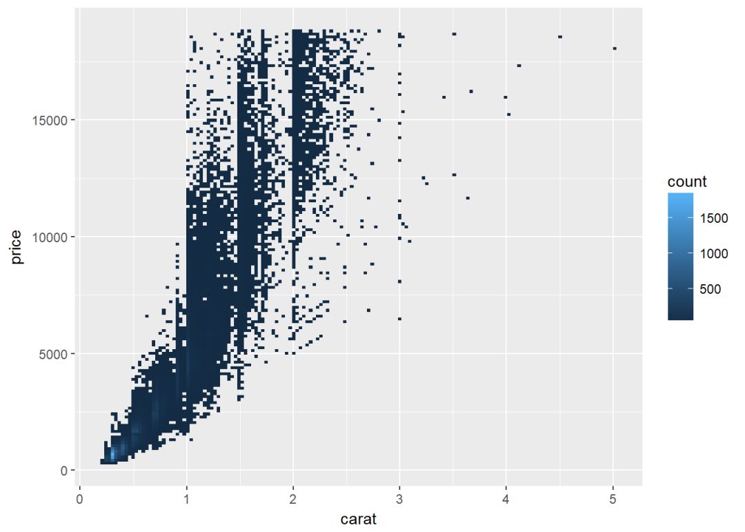
六边形封箱图
geom_hex()依赖于另一个R包hexbin,所以没安装的先安装:
install.packages("hexbin")library(hexbin)
c+geom_hex()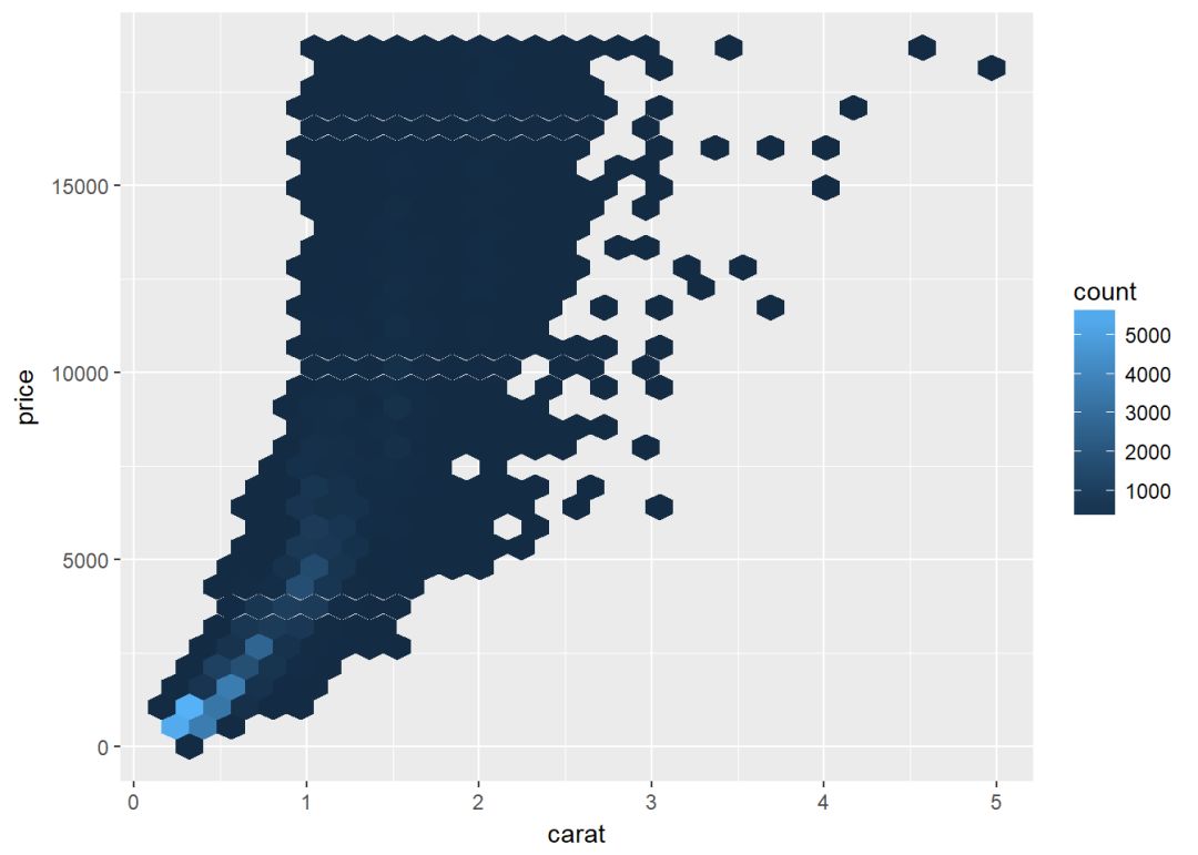
修改bin的数目
c+geom_hex(bins=10)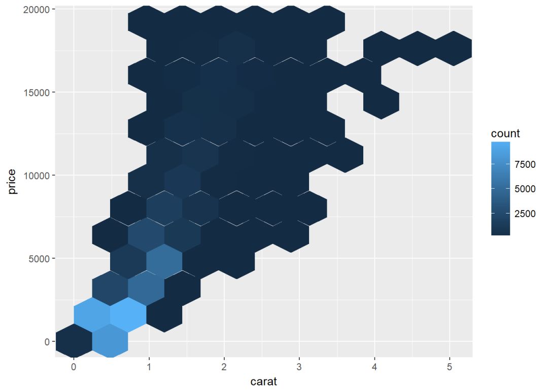
二维等高线密度图
sp <- ggplot(faithful, aes(x=eruptions, y=waiting))
sp+geom_point()+ geom_density_2d()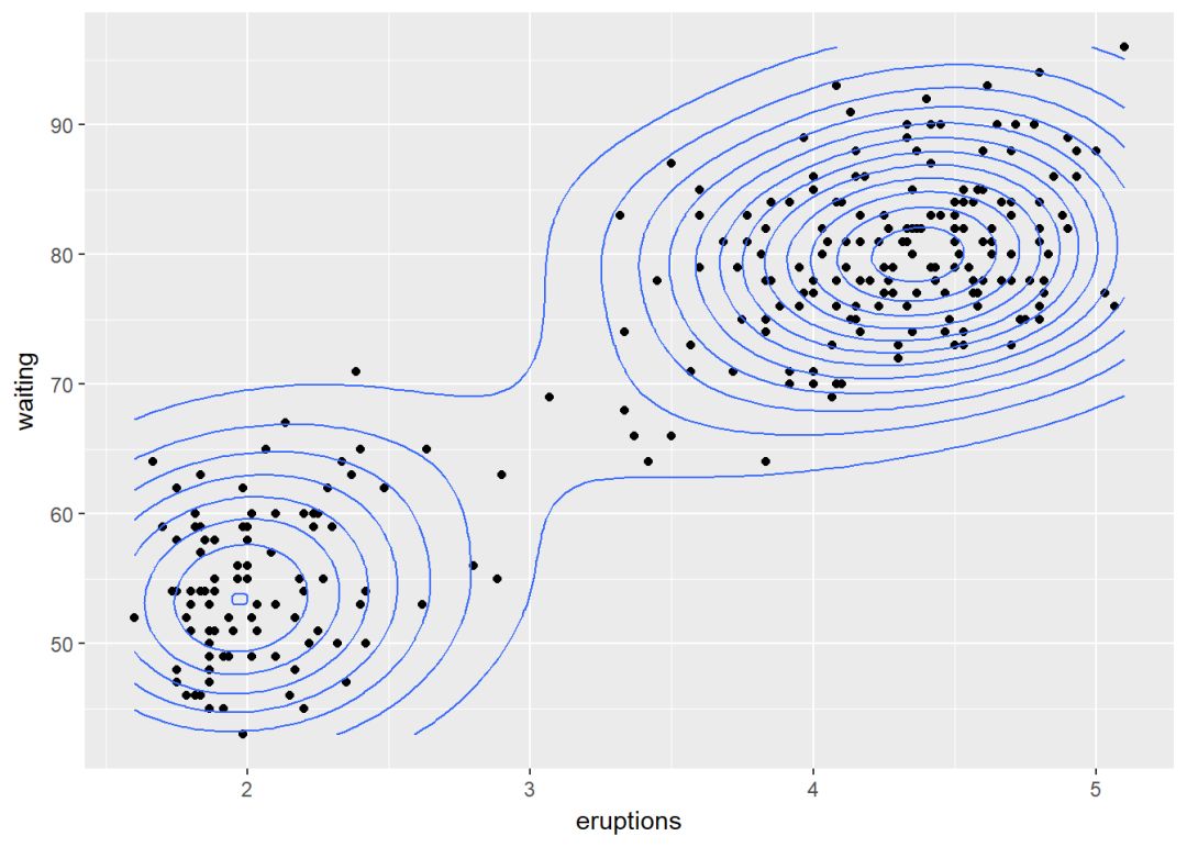
两个变量:连续函数
主要是如何通过线来连接两个变量,使用数据集economics。
head(economics)## # A tibble: 6 x 6
## date pce pop psavert uempmed unemploy
## <date> <dbl> <int> <dbl> <dbl> <int>
## 1 1967-07-01 507.4 198712 12.5 4.5 2944
## 2 1967-08-01 510.5 198911 12.5 4.7 2945
## 3 1967-09-01 516.3 199113 11.7 4.6 2958
## 4 1967-10-01 512.9 199311 12.5 4.9 3143
## 5 1967-11-01 518.1 199498 12.5 4.7 3066
## 6 1967-12-01 525.8 199657 12.1 4.8 3018先创建一个ggplot图层,后面逐步添加图层
d <- ggplot(data = economics, aes(x=date, y=unemploy))可添加的图层有:
-
geom_area():面积图
-
geom_line():折线图
-
geom_step(): 阶梯图
面积图
d+geom_area()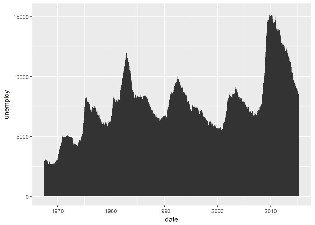
线图
d+geom_line()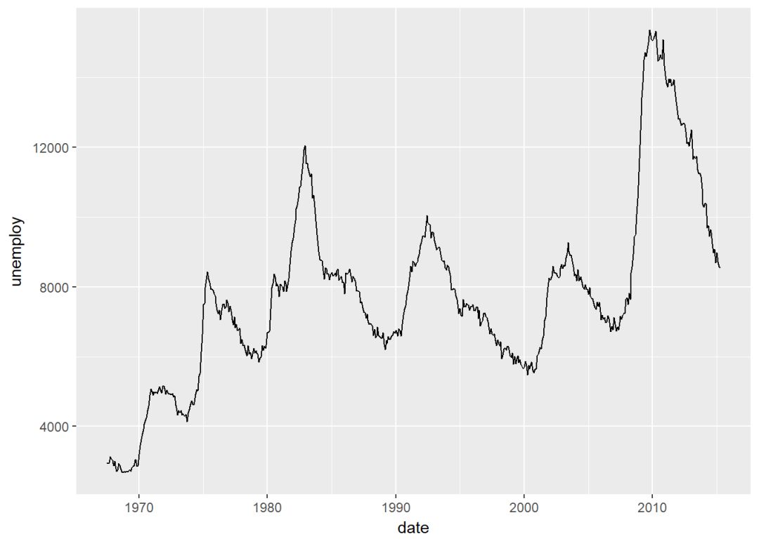
阶梯图
set.seed(1111)
ss <- economics[sample(1:nrow(economics), 20),]
ggplot(ss, aes(x=date, y=unemploy))+
  geom_step()
两个变量:x离散,y连续
使用数据集ToothGrowth,其中的变量len(Tooth length)是连续变量,dose是离散变量。
ToothGrowth$dose <- as.factor(ToothGrowth$dose)
head(ToothGrowth)
## len supp dose
## 1 4.2 VC 0.5
## 2 11.5 VC 0.5
## 3 7.3 VC 0.5
## 4 5.8 VC 0.5
## 5 6.4 VC 0.5
## 6 10.0 VC 0.5创建图层
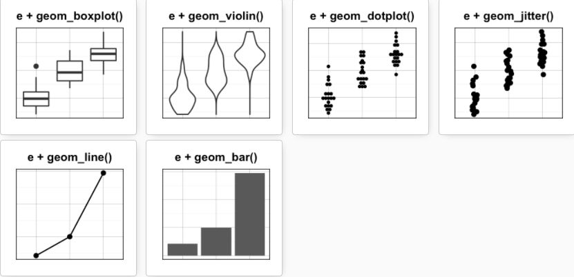
e <- ggplot(data = ToothGrowth, aes(x=dose, y=len))可添加的图层有:
-
geom_boxplot(): 箱线图
-
geom_violin():小提琴图
-
geom_dotplot():点图
-
geom_jitter(): 带状图
-
geom_line(): 线图
-
geom_bar(): 条形图
箱线图
e+geom_boxplot()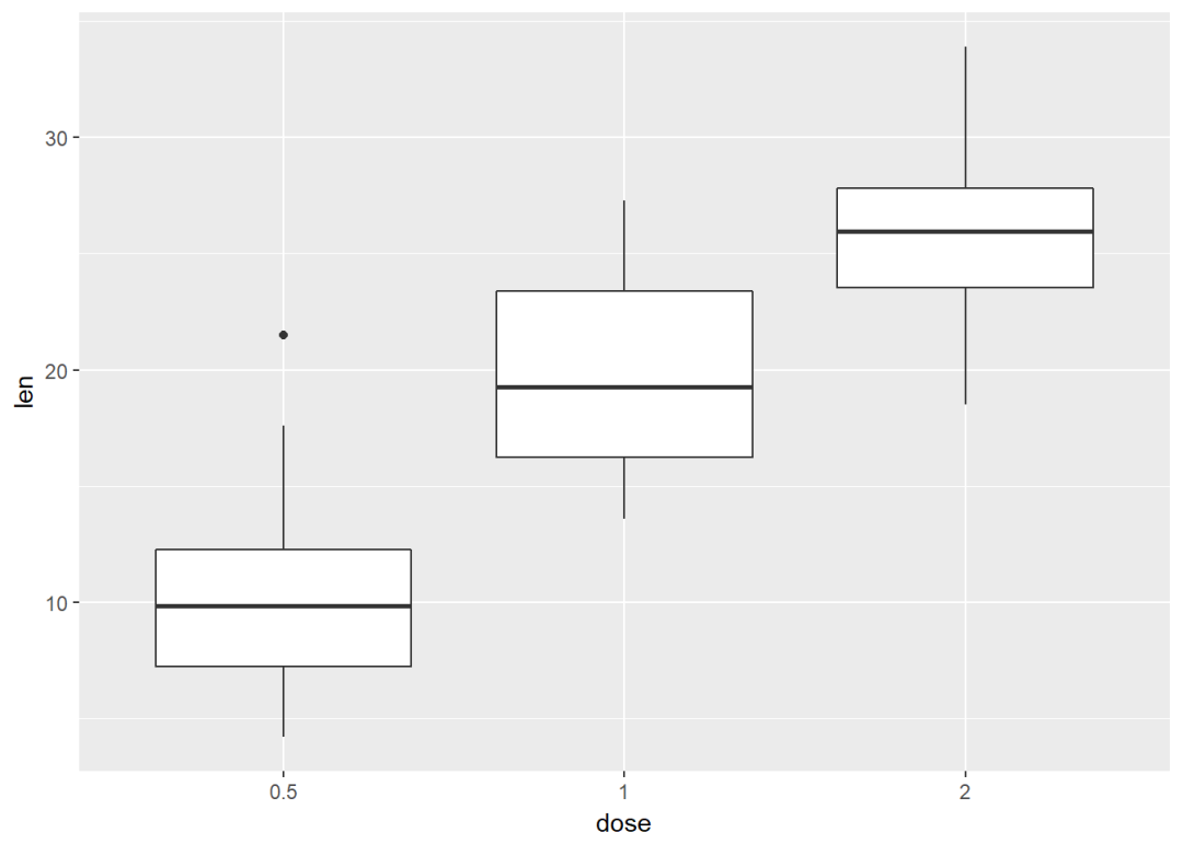
添加有缺口的箱线图
e+geom_boxplot(notch = TRUE)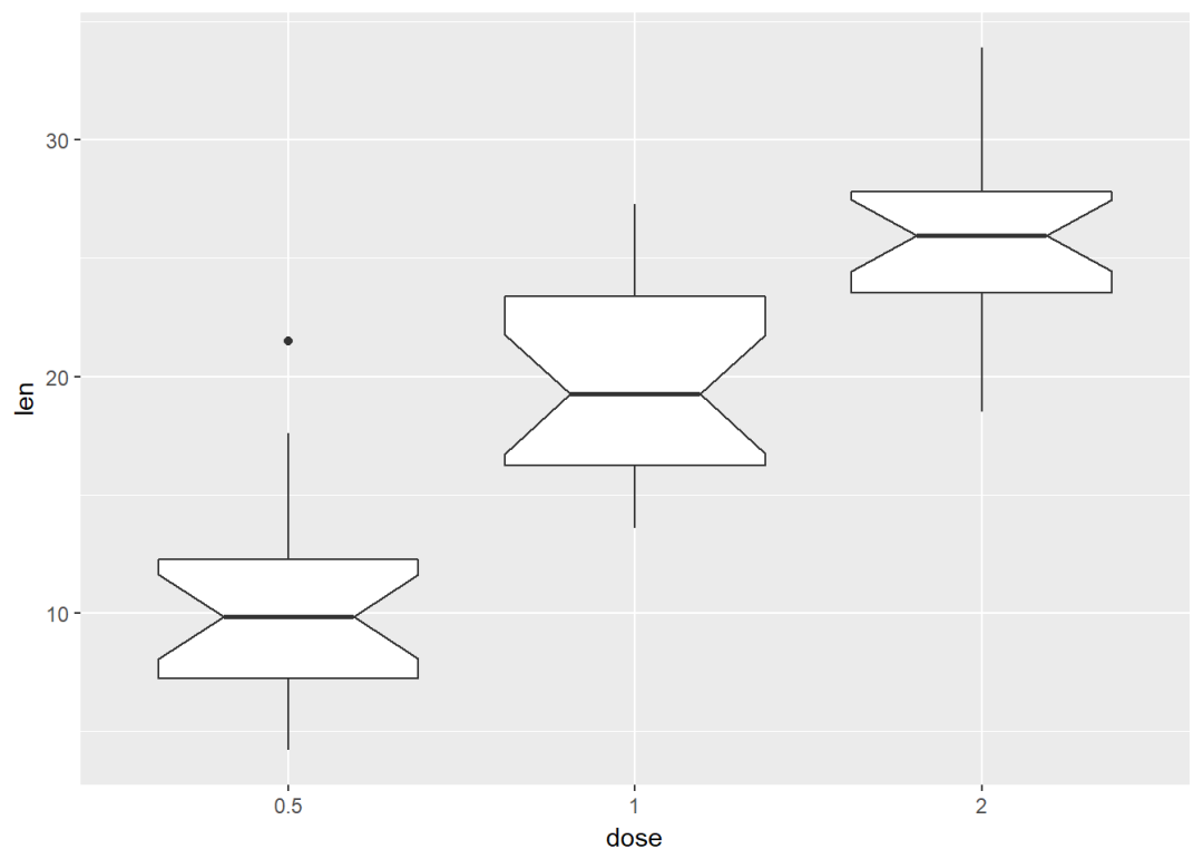
按dose分组映射给颜色
e+geom_boxplot(aes(color=dose))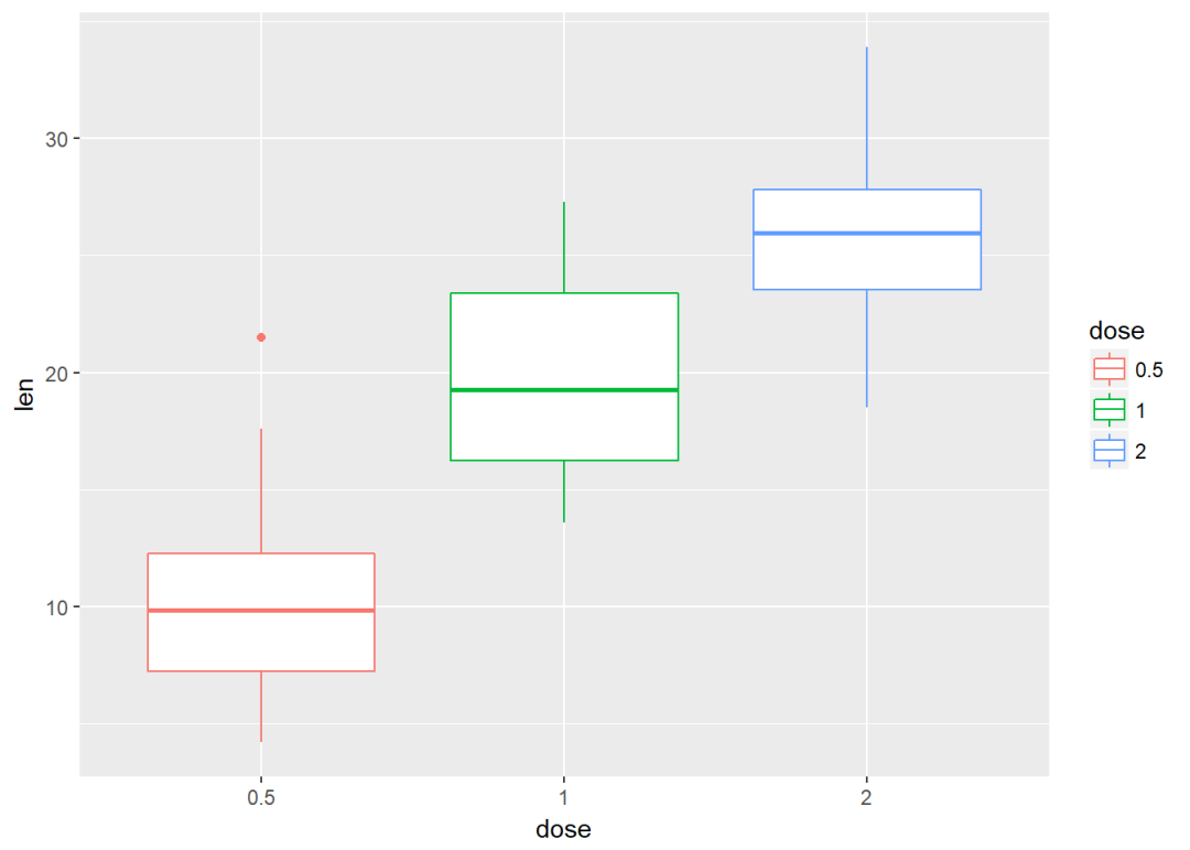
将dose映射给填充颜色
e+geom_boxplot(aes(fill=dose))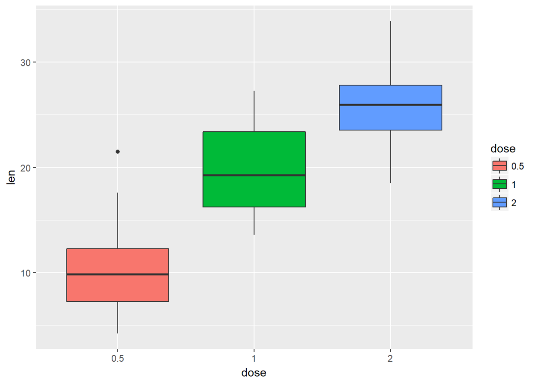
按supp进行分类并映射给填充颜色
ggplot(ToothGrowth, aes(x=dose, y=len))+ geom_boxplot(aes(fill=supp))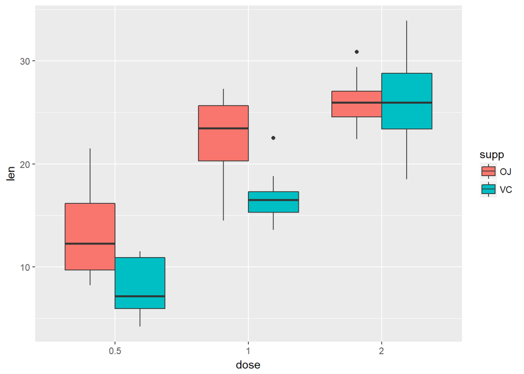
小提琴图
e+geom_violin(trim = FALSE)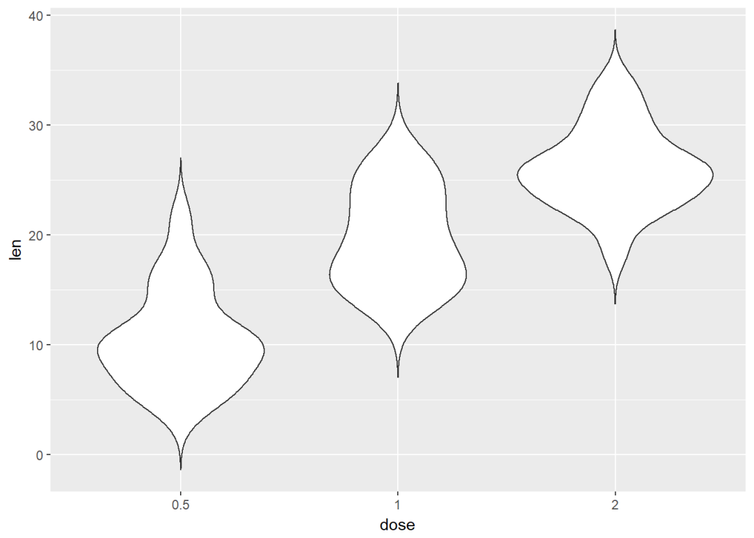
添加中值点
e+geom_violin(trim = FALSE)+
  stat_summary(fun.data = mean_sdl, fun.args = list(mult=1),
               geom="pointrange", color="red")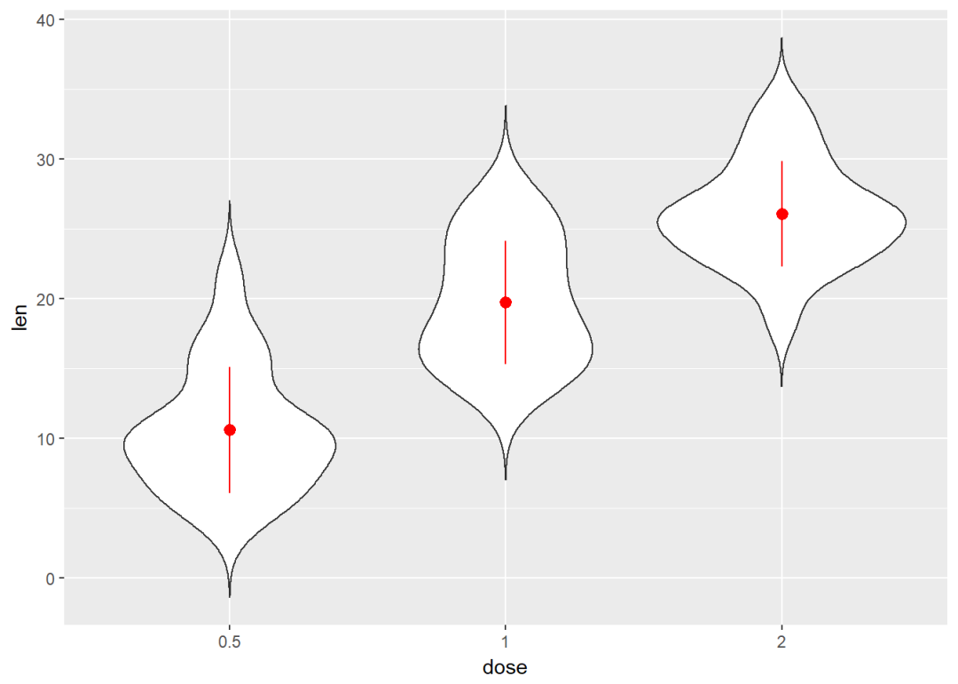
与箱线图结合
e+geom_violin(trim = FALSE)+
  geom_boxplot(width=0.2)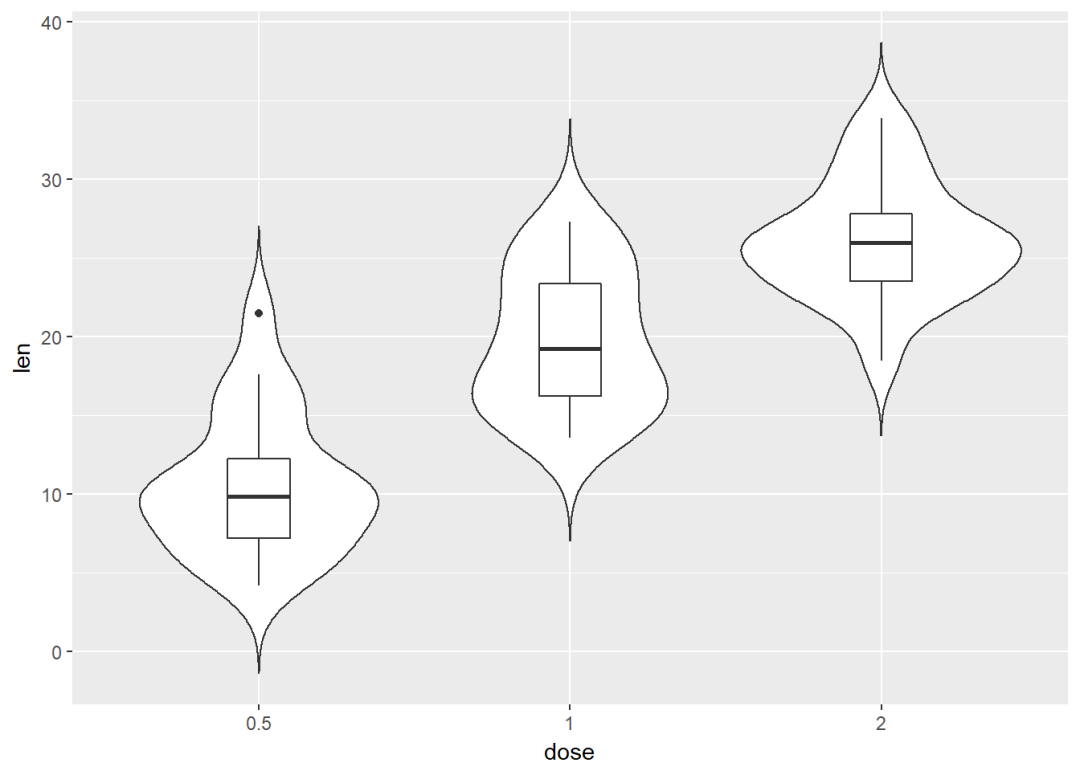
将dose映射给颜色进行分组
e+geom_violin(aes(color=dose), trim = FALSE)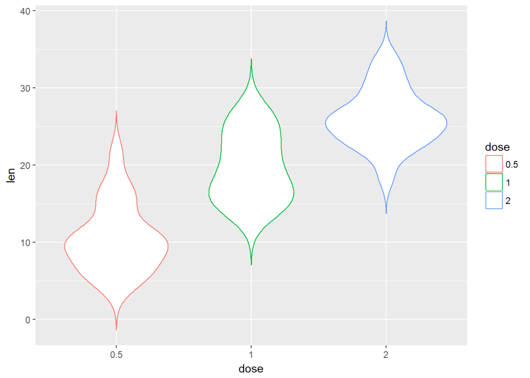
点图
e+geom_dotplot(binaxis = "y", stackdir = "center")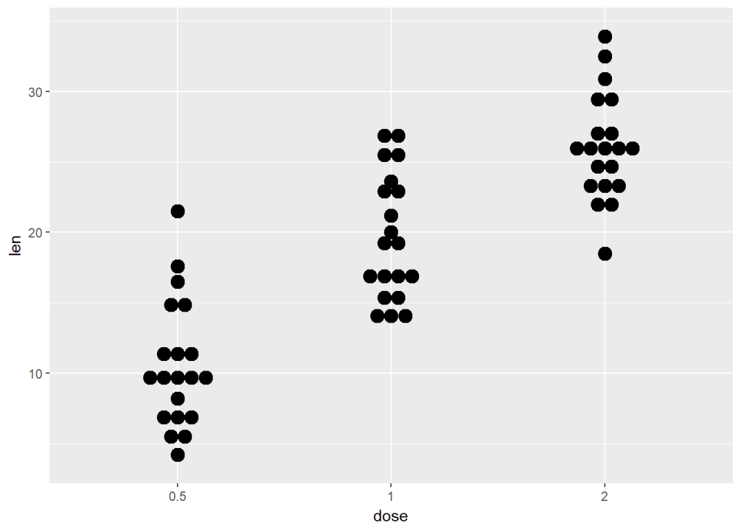
添加中值点
e + geom_dotplot(binaxis = "y", stackdir = "center") +
  stat_summary(fun.data=mean_sdl, color = "red",geom = "pointrange",fun.args=list(mult=1))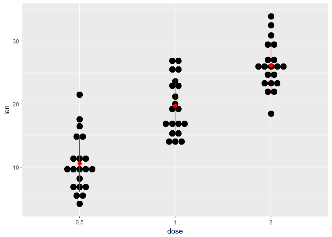
与箱线图结合
e + geom_boxplot() +
  geom_dotplot(binaxis = "y", stackdir = "center")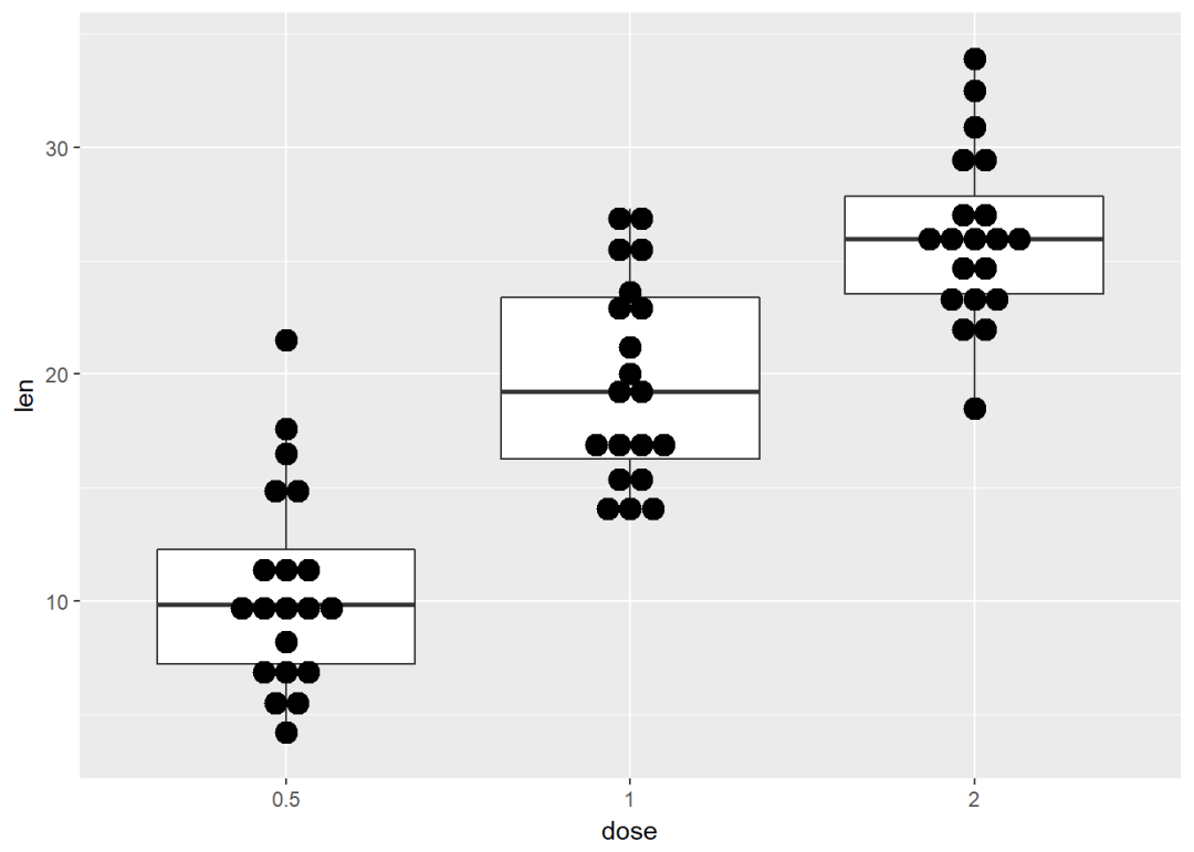
添加小提琴图
e + geom_violin(trim = FALSE) +
  geom_dotplot(binaxis='y', stackdir='center')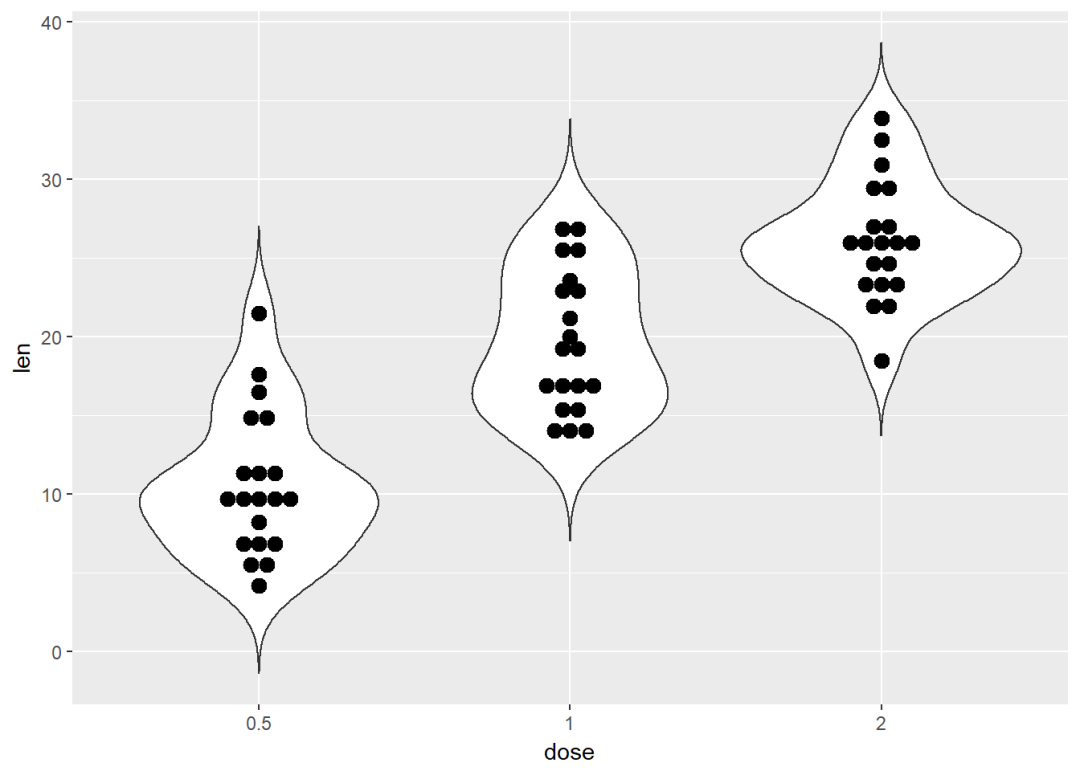
将dose映射给颜色以及填充色
e + geom_dotplot(aes(color = dose, fill = dose),
                 binaxis = "y", stackdir = "center")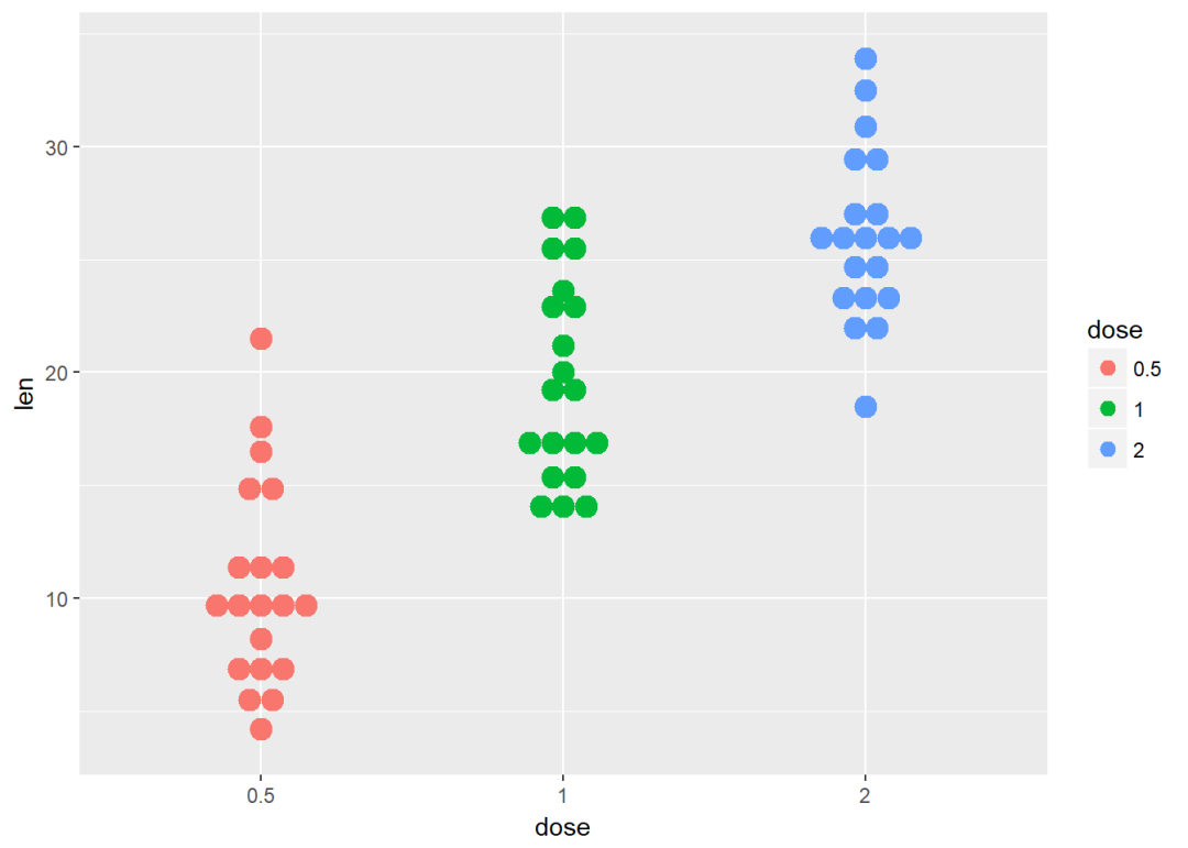
带状图
带状图是一种一维散点图,当样本量很小时,与箱线图相当
e + geom_jitter(position=position_jitter(0.2))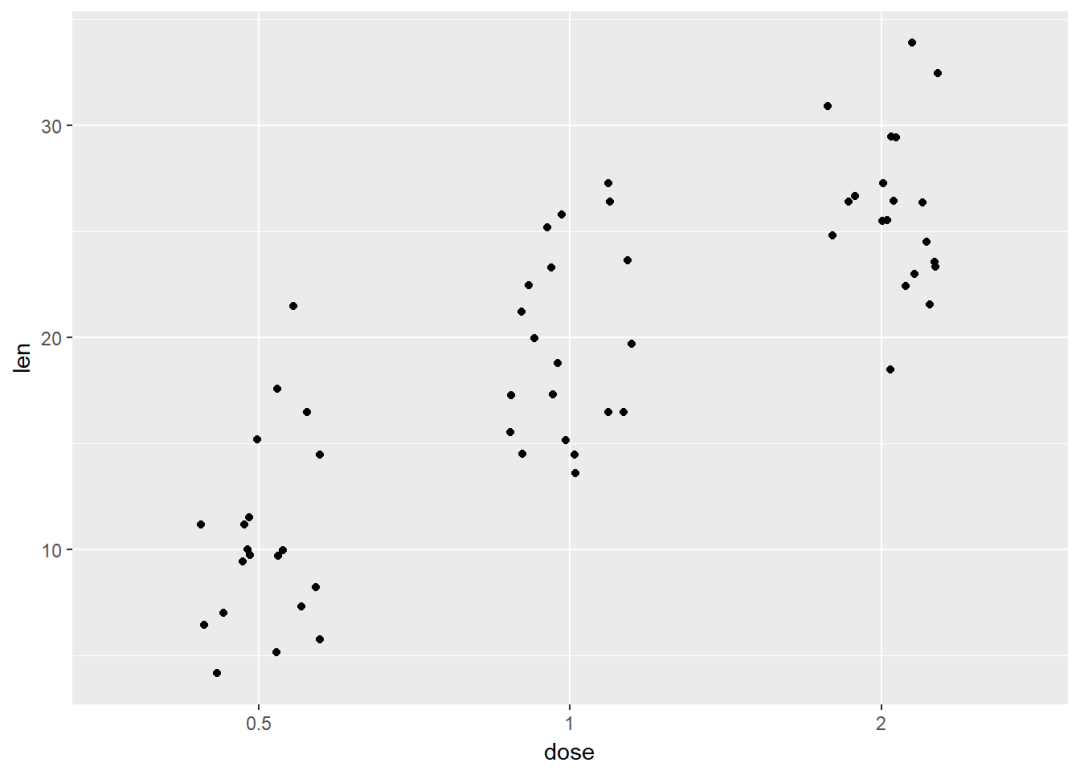
添加中值点
e + geom_jitter(position=position_jitter(0.2)) +
  stat_summary(fun.data="mean_sdl",  fun.args = list(mult=1),
               geom="pointrange", color = "red")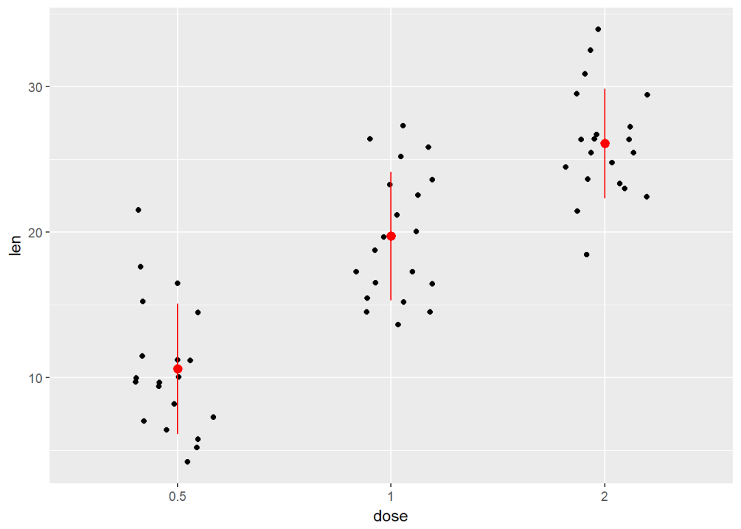
与点图结合
e + geom_jitter(position=position_jitter(0.2)) +
  geom_dotplot(binaxis = "y", stackdir = "center")
与小提琴图结合
e + geom_violin(trim = FALSE) +
  geom_jitter(position=position_jitter(0.2))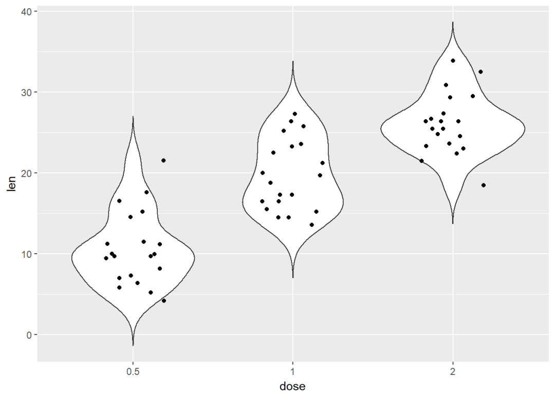
将dose映射给颜色和形状
e +  geom_jitter(aes(color = dose, shape = dose),
                 position=position_jitter(0.2))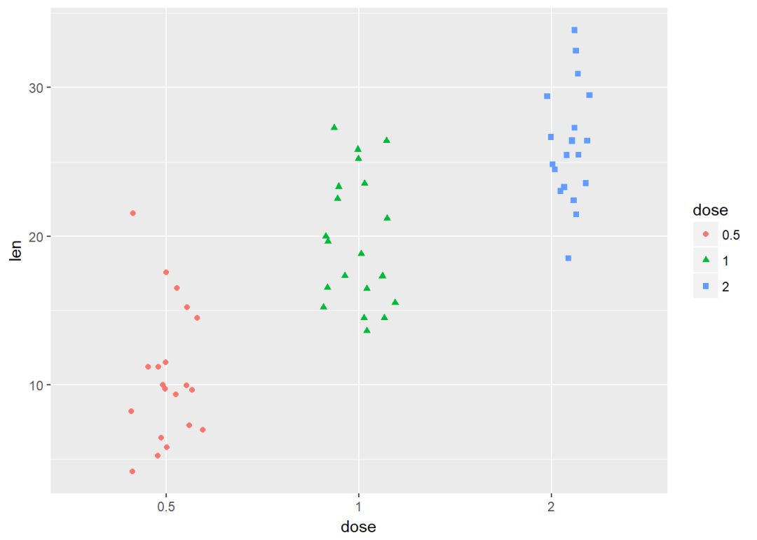
线图
#构造数据集
df <- data.frame(supp=rep(c("VC", "OJ"), each=3),
                dose=rep(c("D0.5", "D1", "D2"),2),
                len=c(6.8, 15, 33, 4.2, 10, 29.5))
head(df)
## supp dose len
## 1 VC D0.5 6.8
## 2 VC D1 15.0
## 3 VC D2 33.0
## 4 OJ D0.5 4.2
## 5 OJ D1 10.0
## 6 OJ D2 29.5将supp映射线型
ggplot(df, aes(x=dose, y=len, group=supp)) +
  geom_line(aes(linetype=supp))+
  geom_point()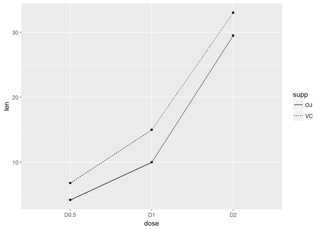
修改线型、点的形状以及颜色
ggplot(df, aes(x=dose, y=len, group=supp)) +
  geom_line(aes(linetype=supp, color = supp))+
  geom_point(aes(shape=supp, color = supp))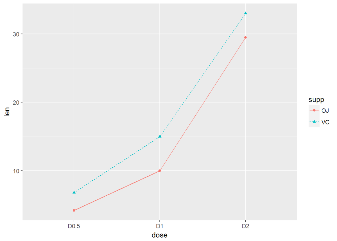
条形图
#构造数据集
df <- data.frame(dose=c("D0.5", "D1", "D2"),
                len=c(4.2, 10, 29.5))
head(df)
## dose len
## 1 D0.5 4.2
## 2 D1 10.0
## 3 D2 29.5df2 <- data.frame(supp=rep(c("VC", "OJ"), each=3),
dose=rep(c("D0.5", "D1", "D2"),2),
len=c(6.8, 15, 33, 4.2, 10, 29.5))
head(df2)## supp dose len
## 1 VC D0.5 6.8
## 2 VC D1 15.0
## 3 VC D2 33.0
## 4 OJ D0.5 4.2
## 5 OJ D1 10.0
## 6 OJ D2 29.5创建图层
f <- ggplot(df, aes(x = dose, y = len))
f + geom_bar(stat = "identity")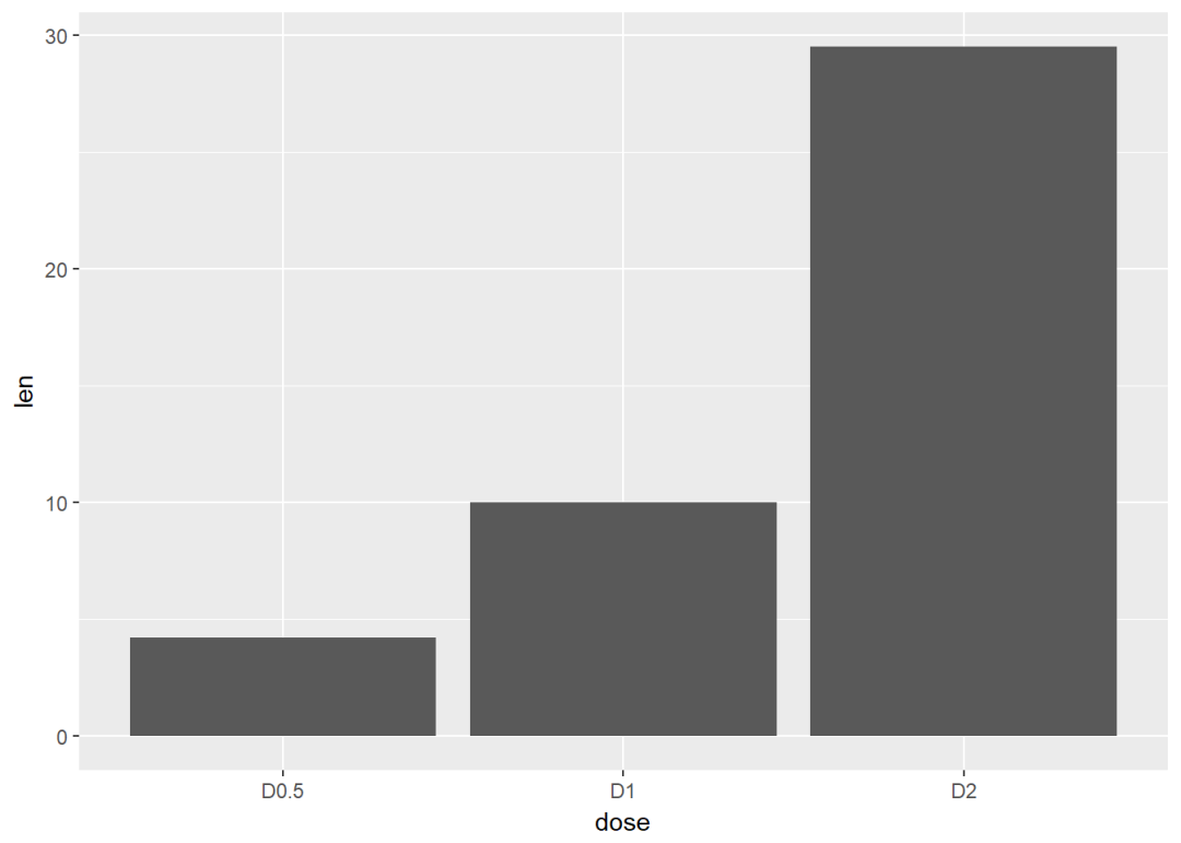
修改填充色以及添加标签
f + geom_bar(stat="identity", fill="steelblue")+
  geom_text(aes(label=len), vjust=-0.3, size=3.5)+
  theme_minimal()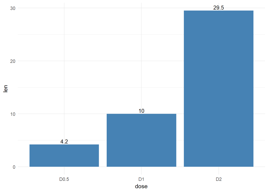
将dose映射给条形图颜色
f + geom_bar(aes(color = dose),
             stat="identity", fill="white")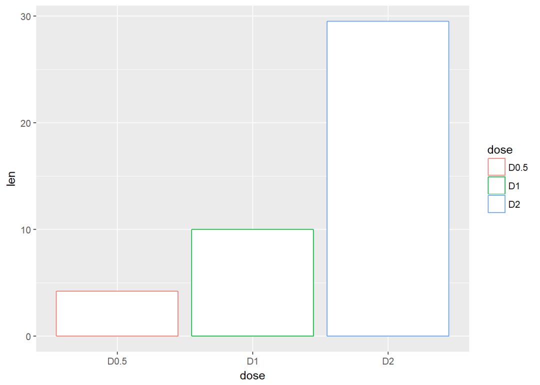
修改填充色
f + geom_bar(aes(fill = dose), stat="identity")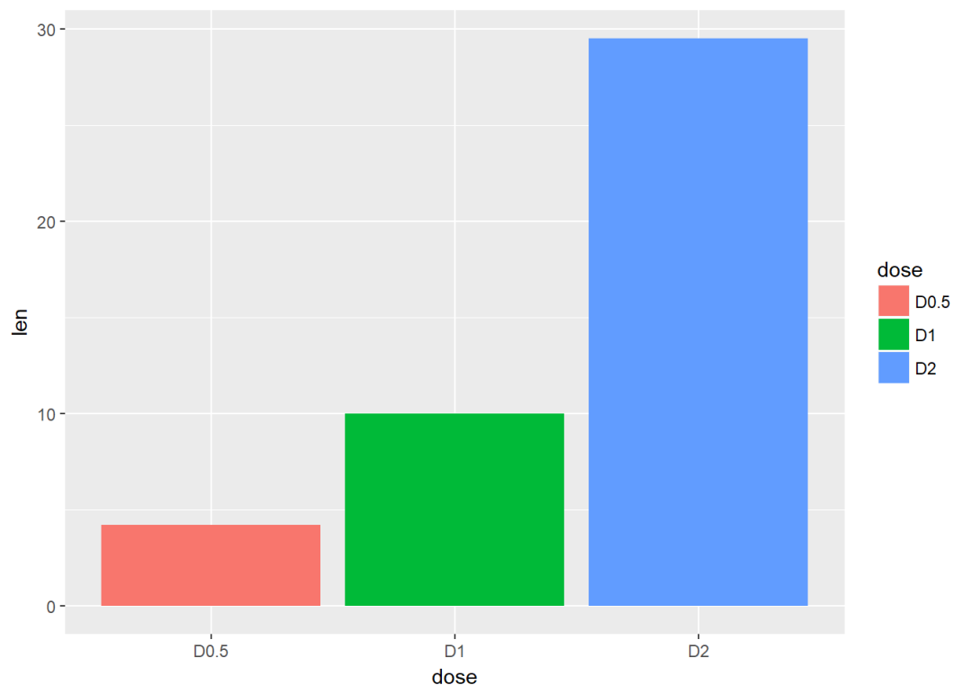
将变量supp映射给填充色,从而达到分组效果
g <- ggplot(data=df2, aes(x=dose, y=len, fill=supp))
g + geom_bar(stat = "identity")#position默认为stack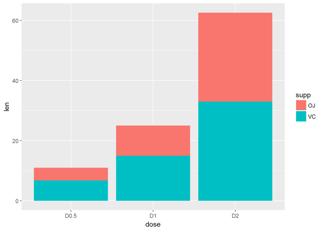
修改position为dodge
g + geom_bar(stat="identity", position=position_dodge())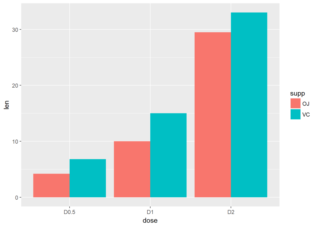
两个变量:x、y皆离散
使用数据集diamonds中的两个离散变量color以及cut
ggplot(diamonds, aes(cut, color)) +
  geom_jitter(aes(color = cut), size = 0.5)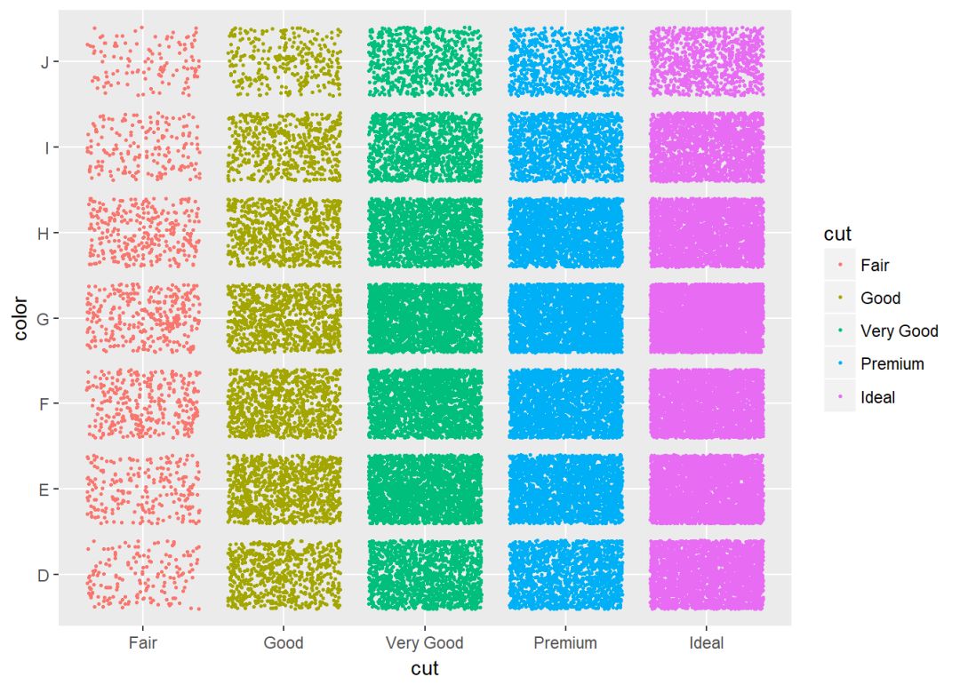
两个变量:绘制误差图
df <- ToothGrowth
df$dose <- as.factor(df$dose)
head(df)
## len supp dose
## 1 4.2 VC 0.5
## 2 11.5 VC 0.5
## 3 7.3 VC 0.5
## 4 5.8 VC 0.5
## 5 6.4 VC 0.5
## 6 10.0 VC 0.5绘制误差图需要知道均值以及标准误,下面这个函数用来计算每组的均值以及标准误。
data_summary <- function(data, varname, grps){
  require(plyr)
  summary_func <- function(x, col){
    c(mean = mean(x[[col]], na.rm=TRUE),
      sd = sd(x[[col]], na.rm=TRUE))
  }
  data_sum<-ddply(data, grps, .fun=summary_func, varname)
  data_sum <- rename(data_sum, c("mean" = varname))
 return(data_sum)
}
计算均值以及标准误
df2 <- data_summary(df, varname="len", grps= "dose")
# Convert dose to a factor variable
df2$dose=as.factor(df2$dose)
head(df2)
## dose len sd
## 1 0.5 10.605 4.499763
## 2 1 19.735 4.415436
## 3 2 26.100 3.774150创建图层
f <- ggplot(df2, aes(x = dose, y = len,
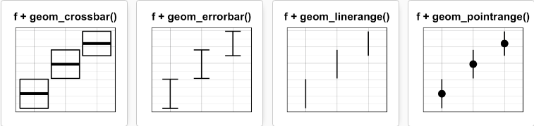
ymin = len-sd, ymax = len+sd))可添加的图层有:
-
geom_crossbar(): 空心柱,上中下三线分别代表ymax、mean、ymin
-
geom_errorbar(): 误差棒
-
geom_errorbarh(): 水平误差棒
-
geom_linerange():竖直误差线
-
geom_pointrange():中间为一点的误差线
具体如下:
geom_crossbar()
f+geom_crossbar()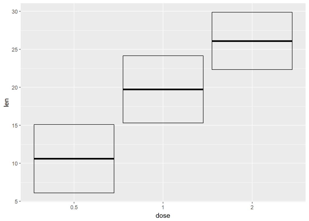
将dose映射给颜色
f+geom_crossbar(aes(color=dose))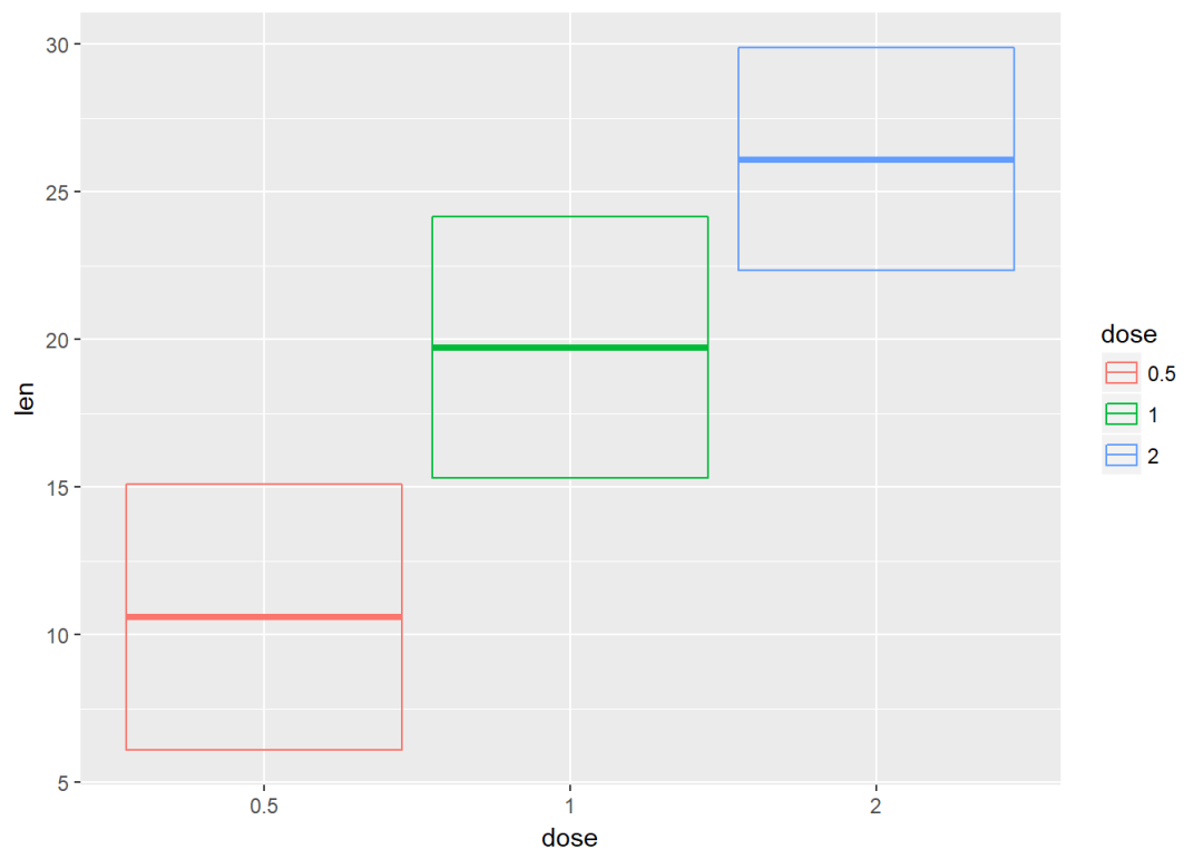
自定义颜色
f+geom_crossbar(aes(color=dose))+
  scale_color_manual(values = c("#999999", "#E69F00", "#56B4E9"))+theme_classic()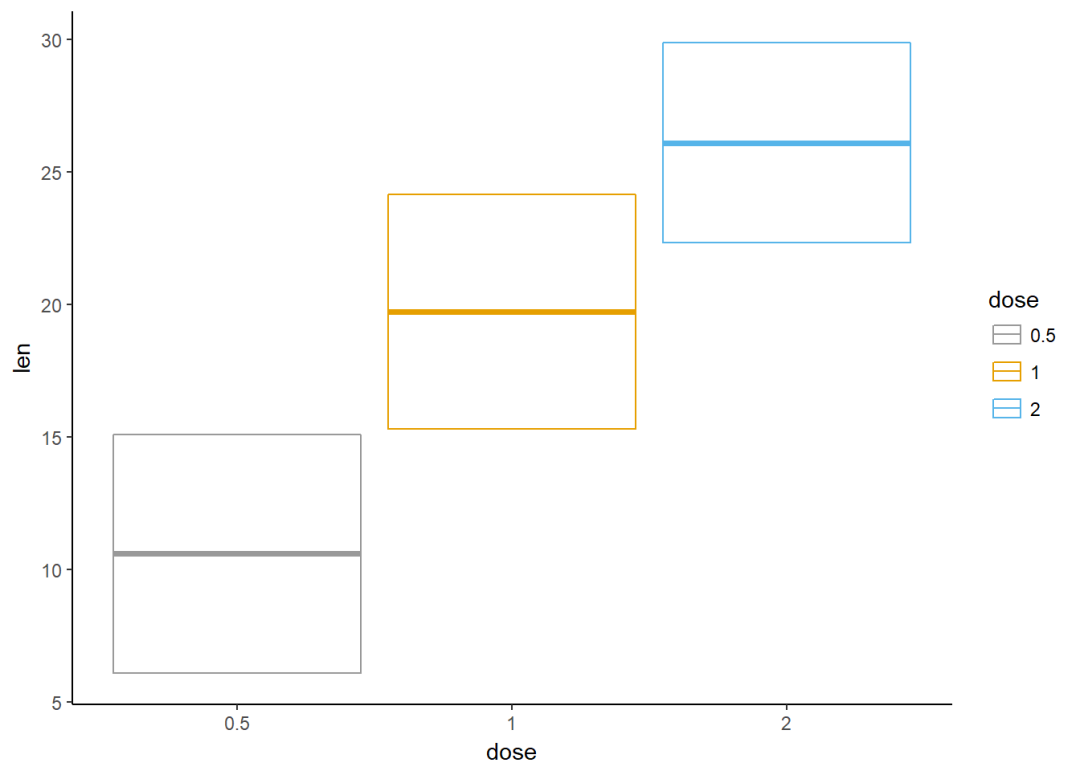
修改填充色
f+geom_crossbar(aes(fill=dose))+
  scale_fill_manual(values = c("#999999", "#E69F00", "#56B4E9"))+
  theme_classic()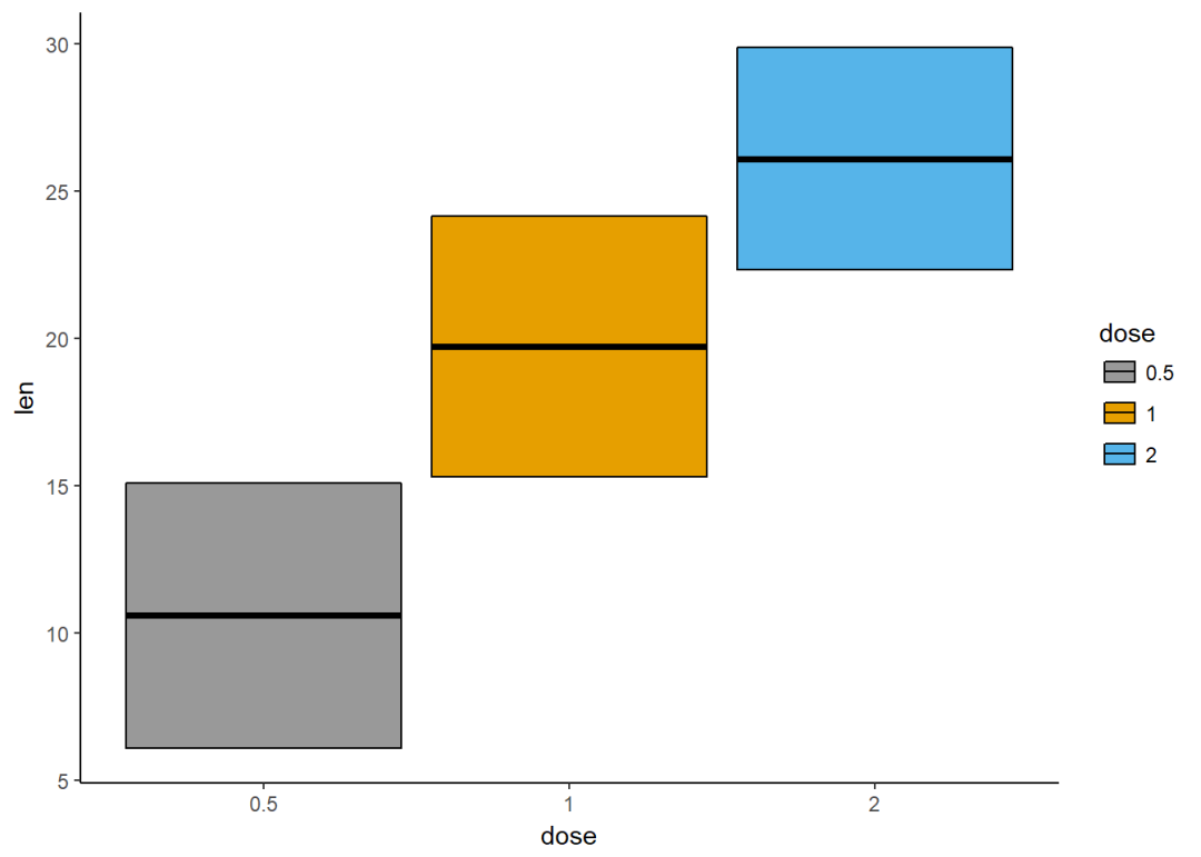
通过将supp映射给颜色实现分组,可以利用函数stat_summary()来计算mean和sd
f <- ggplot(df, aes(x=dose, y=len, color=supp))
f+stat_summary(fun.data = mean_sdl, fun.args = list(mult=1), geom="crossbar", width=0.6, position = position_dodge(0.8))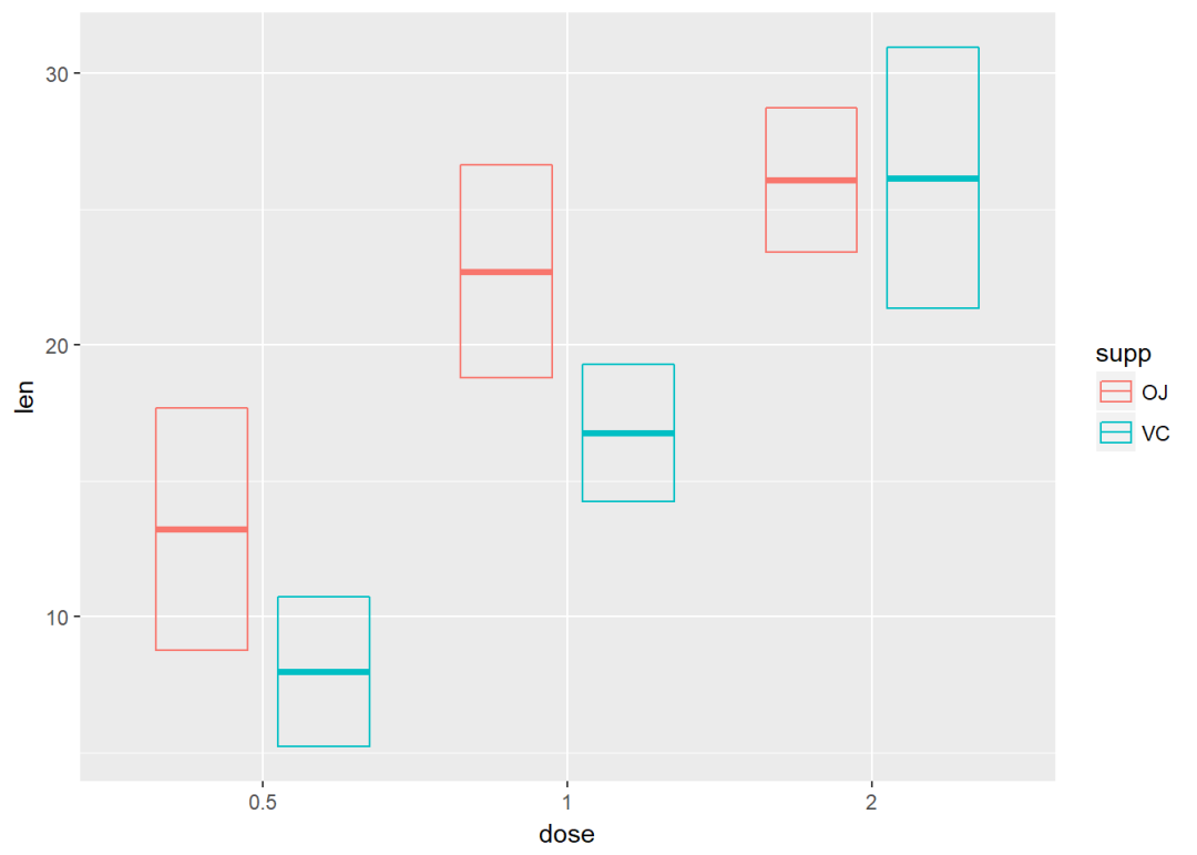
误差棒
f <- ggplot(df2, aes(x=dose, y=len, ymin=len-sd, ymax=len+sd))将dose映射给颜色
f+geom_errorbar(aes(color=dose), width=0.2)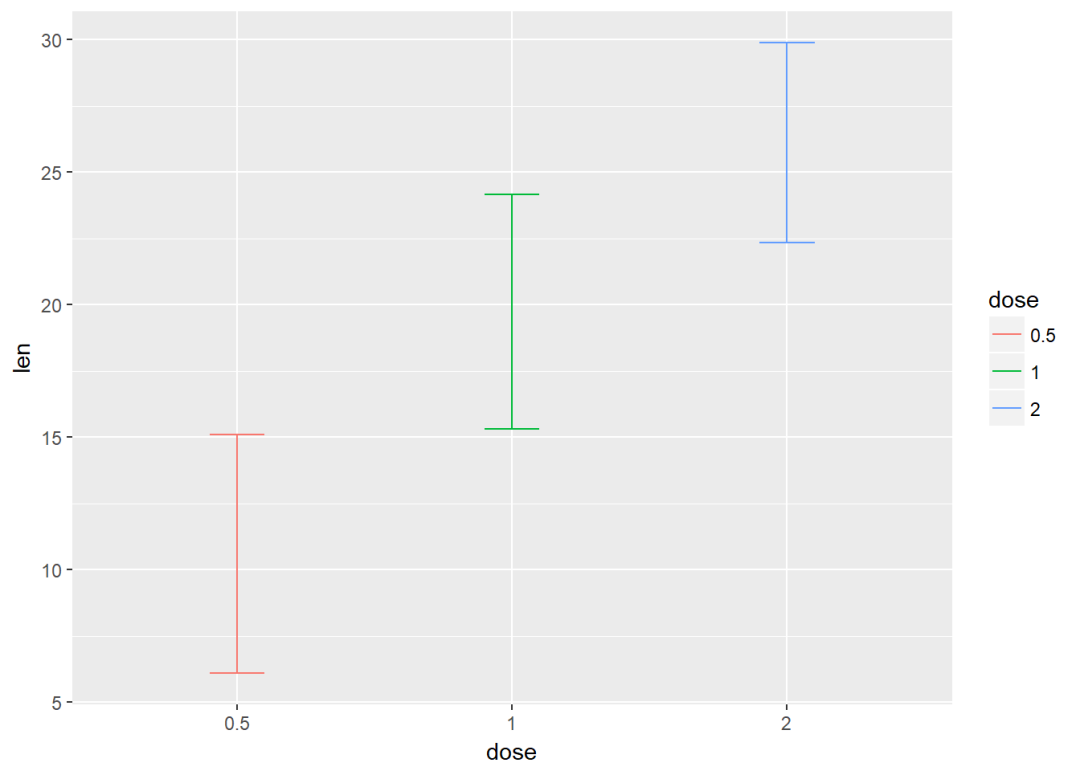
与线图结合
f+geom_line(aes(group=1))+
  geom_errorbar(width=0.15)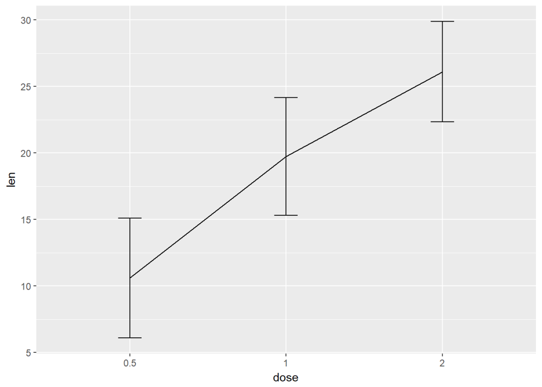
与条形图结合,并将变量dose映射给颜色
f+geom_bar(aes(color=dose), stat = "identity", fill="white")+
  geom_errorbar(aes(color=dose), width=0.1)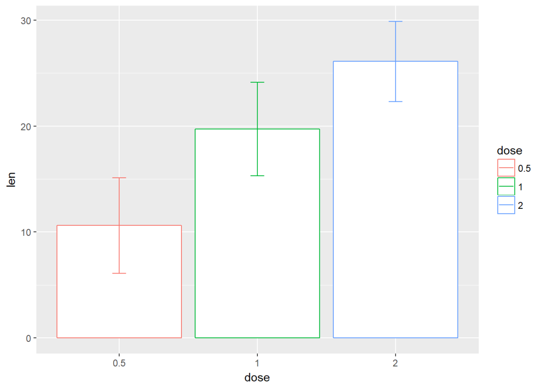


 被折叠的 条评论
为什么被折叠?
被折叠的 条评论
为什么被折叠?
 到【灌水乐园】发言


