


概念篇
ECharts 中的样式简介
本文主要是大略概述,用哪些方法,可以在 Apache EChartsTM 中设置样式,改变图形元素或者文字的颜色、明暗、大小等。
本文介绍这几种方式,他们的功能范畴可能会有交叉(即同一种细节的效果可能可以用不同的方式实现),但是他们各有各的场景偏好。
- 颜色主题(Theme)
- 调色盘
- 直接样式设置(itemStyle、lineStyle、areaStyle、label、…)
- 视觉映射(visualMap)
颜色主题(Theme)
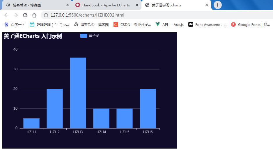
最简单的更改全局样式的方式,是直接采用颜色主题(theme)。例如,在 示例集合 中,可以通过切换深色模式,直接看到采用主题的效果。
ECharts5 除了一贯的默认主题外,还内置了'dark'主题。可以像这样切换成深色模式:
<!DOCTYPE html>
<html lang="zh">

<head>
    <meta charset="UTF-8">
    <meta http-equiv="X-UA-Compatible" content="IE=edge">
    <meta name="viewport" content="width=device-width, initial-scale=1.0">
    <title>黄子涵学习Echarts</title>
    <script src="echarts.js"></script>
</head>

<body>
    <!-- 为 ECharts 准备一个定义了宽高的 DOM -->
    <div id="huangzihan" style="width: 600px;height:400px;"></div>
    <script type="text/javascript">
        // 基于准备好的dom,初始化echarts实例
        var HZHChart = echarts.init(document.getElementById('huangzihan'),'dark');

        // 指定图表的配置项和数据
        var option = {
            title: {
                text: '黄子涵ECharts 入门示例'
            },
            tooltip: {},
            legend: {
                data: ['黄子涵']
            },
            xAxis: {
                data: ['HZH1', 'HZH2', 'HZH3', 'HZH4', 'HZH5', 'HZH6']
            },
            yAxis: {},
            series: [
                {
                    name: '黄子涵',
                    type: 'bar',
                    data: [5, 20, 36, 10, 10, 20]
                }
            ]
        };

        // 使用刚指定的配置项和数据显示图表。
        HZHChart.setOption(option);
    </script>
    </script>
</body>

</html>
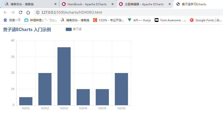
其他的主题,没有内置在 ECharts 中,需要自己加载。这些主题可以在 主题编辑器 里访问到。

也可以使用这个主题编辑器,自己编辑主题。
下载下来的主题可以这样使用:
JS文件方式
如果主题保存为 JS 文件,例如:
- 下载或复制以下的主题保存至
*.js文件; - 将该文件在
HTML中引用; - 使用
echarts.init(dom, 'westeros')创建图表,第二个参数即为*.js文件中注册的主题名字。
<!DOCTYPE html>
<html lang="zh">

<head>
    <meta charset="UTF-8">
    <meta http-equiv="X-UA-Compatible" content="IE=edge">
    <meta name="viewport" content="width=device-width, initial-scale=1.0">
    <title>黄子涵学习Echarts</title>
    <script src="echarts.js"></script>
    <script src="westeros.js"></script>
</head>

<body>
    <!-- 为 ECharts 准备一个定义了宽高的 DOM -->
    <div id="huangzihan" style="width: 600px;height:400px;"></div>
    <script type="text/javascript">
        // 基于准备好的dom,初始化echarts实例
        var HZHChart = echarts.init(document.getElementById('huangzihan'),'westeros');

        // 指定图表的配置项和数据
        var option = {
            title: {
                text: '黄子涵ECharts 入门示例'
            },
            tooltip: {},
            legend: {
                data: ['黄子涵']
            },
            xAxis: {
                data: ['HZH1', 'HZH2', 'HZH3', 'HZH4', 'HZH5', 'HZH6']
            },
            yAxis: {},
            series: [
                {
                    name: '黄子涵',
                    type: 'bar',
                    data: [5, 20, 36, 10, 10, 20]
                }
            ]
        };

        // 使用刚指定的配置项和数据显示图表。
        HZHChart.setOption(option);
    </script>
    </script>
</body>

</html>
JSON 文件(暂时还不会)
如果主题保存为 JSON 文件,则需要自行加载和注册,例如:
- 下载或复制以下的主题保存至
*.json文件; - 读取该 JSON 文件,并使用
obj = JSON.parse(data)将其转换成对象; - 调用
echarts.registerTheme('walden', obj)注册主题; - 使用
echarts.init(dom, 'walden')创建图表,第二个参数即为刚才注册的主题名字。
// 假设主题名称是 "vintage"
$.getJSON('xxx/xxx/vintage.json', function(themeJSON) {
  echarts.registerTheme('vintage', JSON.parse(themeJSON));
  var chart = echarts.init(dom, 'vintage');
});
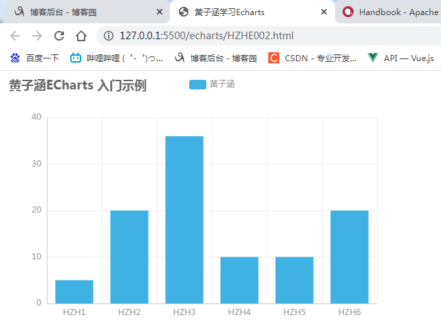
UMD 格式的 JS 文件
如果保存为 UMD 格式的 JS 文件,文件内部已经做了自注册,直接引入 JS 即可:
<!DOCTYPE html>
<html lang="zh">

<head>
    <meta charset="UTF-8">
    <meta http-equiv="X-UA-Compatible" content="IE=edge">
    <meta name="viewport" content="width=device-width, initial-scale=1.0">
    <title>黄子涵学习Echarts</title>
    <script src="echarts.js"></script>
    <script src="walden.js"></script>
</head>

<body>
    <!-- 为 ECharts 准备一个定义了宽高的 DOM -->
    <div id="huangzihan" style="width: 600px;height:400px;"></div>
    <script type="text/javascript">
        // 基于准备好的dom,初始化echarts实例
        var HZHChart = echarts.init(document.getElementById('huangzihan'),'walden');

        // 指定图表的配置项和数据
        var option = {
            title: {
                text: '黄子涵ECharts 入门示例'
            },
            tooltip: {},
            legend: {
                data: ['黄子涵']
            },
            xAxis: {
                data: ['HZH1', 'HZH2', 'HZH3', 'HZH4', 'HZH5', 'HZH6']
            },
            yAxis: {},
            series: [
                {
                    name: '黄子涵',
                    type: 'bar',
                    data: [5, 20, 36, 10, 10, 20]
                }
            ]
        };

        // 使用刚指定的配置项和数据显示图表。
        HZHChart.setOption(option);
    </script>
    </script>
</body>

</html>
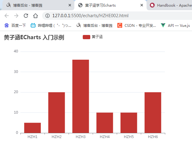
调色盘
调色盘,可以在 option 中设置。它给定了一组颜色,图形、系列会自动从其中选择颜色。 可以设置全局的调色盘,
<!DOCTYPE html>
<html lang="zh">

<head>
    <meta charset="UTF-8">
    <meta http-equiv="X-UA-Compatible" content="IE=edge">
    <meta name="viewport" content="width=device-width, initial-scale=1.0">
    <title>黄子涵学习Echarts</title>
    <script src="echarts.js"></script>
</head>

<body>
    <!-- 为 ECharts 准备一个定义了宽高的 DOM -->
    <div id="huangzihan" style="width: 600px;height:400px;"></div>
    <script type="text/javascript">
        // 基于准备好的dom,初始化echarts实例
        var HZHChart = echarts.init(document.getElementById('huangzihan'));

        // 指定图表的配置项和数据
        var option = {
            title: {
                text: '黄子涵ECharts 入门示例'
            },
            tooltip: {},
            legend: {
                data: ['黄子涵']
            },
            xAxis: {
                data: ['HZH1', 'HZH2', 'HZH3', 'HZH4', 'HZH5', 'HZH6']
            },
            yAxis: {},
            series: [
                {
                    name: '黄子涵',
                    type: 'bar',
                    data: [5, 20, 36, 10, 10, 20],
                },

            ],
            color: [
                '#c23531',
                '#2f4554',
                '#61a0a8',
                '#d48265',
                '#91c7ae',
                '#749f83',
                '#ca8622',
                '#bda29a',
                '#6e7074',
                '#546570',
                '#c4ccd3'
            ],
        };

        // 使用刚指定的配置项和数据显示图表。
        HZHChart.setOption(option);
    </script>
    </script>
</body>

</html>
也可以设置系列自己专属的调色盘。
<!DOCTYPE html>
<html lang="zh">

<head>
    <meta charset="UTF-8">
    <meta http-equiv="X-UA-Compatible" content="IE=edge">
    <meta name="viewport" content="width=device-width, initial-scale=1.0">
    <title>黄子涵学习Echarts</title>
    <script src="echarts.js"></script>
</head>

<body>
    <!-- 为 ECharts 准备一个定义了宽高的 DOM -->
    <div id="huangzihan" style="width: 600px;height:400px;"></div>
    <script type="text/javascript">
        // 基于准备好的dom,初始化echarts实例
        var HZHChart = echarts.init(document.getElementById('huangzihan'));

        // 指定图表的配置项和数据
        var option = {
            title: {
                text: '黄子涵ECharts 入门示例'
            },
            tooltip: {},
            legend: {
                data: ['黄子涵']
            },
            xAxis: {
                data: ['HZH1', 'HZH2', 'HZH3', 'HZH4', 'HZH5', 'HZH6']
            },
            yAxis: {},
            series: [
                {
                    name: '黄子涵',
                    type: 'bar',
                    data: [5, 20, 36, 10, 10, 20],

                    type: 'bar',
                    // 此系列自己的调色盘。
                    color: [
                        '#dd6b66',
                        '#759aa0',
                        '#e69d87',
                        '#8dc1a9',
                        '#ea7e53',
                        '#eedd78',
                        '#73a373',
                        '#73b9bc',
                        '#7289ab',
                        '#91ca8c',
                        '#f49f42'
                    ]
                },

            ],
        };

        // 使用刚指定的配置项和数据显示图表。
        HZHChart.setOption(option);
    </script>
    </script>
</body>

</html>

直接的样式设置 itemStyle, lineStyle, areaStyle, label, …
直接的样式设置是比较常用设置方式。纵观 ECharts 的 option 中,很多地方可以设置 itemStyle、lineStyle、areaStyle、label等等。这些的地方可以直接设置图形元素的颜色、线宽、点的大小、标签的文字、标签的样式等等。
一般来说,ECharts 的各个系列和组件,都遵从这些命名习惯,虽然不同图表和组件中,itemStyle、label 等可能出现在不同的地方。
在下面例子中我们给气泡图设置了阴影,渐变色等复杂的样式,你可以修改代码中的样式看修改后的效果:
实例代码
<!DOCTYPE html>
<html lang="zh">

<head>
    <meta charset="UTF-8">
    <meta http-equiv="X-UA-Compatible" content="IE=edge">
    <meta name="viewport" content="width=device-width, initial-scale=1.0">
    <title>黄子涵学习Echarts</title>
    <script src="echarts.js"></script>
</head>

<body>
    <!-- 为 ECharts 准备一个定义了宽高的 DOM -->
    <div id="huangzihan" style="width: 600px;height:400px;"></div>
    <script type="text/javascript">
        // 基于准备好的dom,初始化echarts实例
        var HZHChart = echarts.init(document.getElementById('huangzihan'));
        var data = [
            [
                [28604, 77, 17096869, 'Australia', 1990],
                [31163, 77.4, 27662440, 'Canada', 1990],
                [1516, 68, 1154605773, 'China', 1990],
                [13670, 74.7, 10582082, 'Cuba', 1990],
                [28599, 75, 4986705, 'Finland', 1990],
                [29476, 77.1, 56943299, 'France', 1990],
                [31476, 75.4, 78958237, 'Germany', 1990],
                [28666, 78.1, 254830, 'Iceland', 1990],
                [1777, 57.7, 870601776, 'India', 1990],
                [29550, 79.1, 122249285, 'Japan', 1990],
                [2076, 67.9, 20194354, 'North Korea', 1990],
                [12087, 72, 42972254, 'South Korea', 1990],
                [24021, 75.4, 3397534, 'New Zealand', 1990],
                [43296, 76.8, 4240375, 'Norway', 1990],
                [10088, 70.8, 38195258, 'Poland', 1990],
                [19349, 69.6, 147568552, 'Russia', 1990],
                [10670, 67.3, 53994605, 'Turkey', 1990],
                [26424, 75.7, 57110117, 'United Kingdom', 1990],
                [37062, 75.4, 252847810, 'United States', 1990]
            ],
            [
                [44056, 81.8, 23968973, 'Australia', 2015],
                [43294, 81.7, 35939927, 'Canada', 2015],
                [13334, 76.9, 1376048943, 'China', 2015],
                [21291, 78.5, 11389562, 'Cuba', 2015],
                [38923, 80.8, 5503457, 'Finland', 2015],
                [37599, 81.9, 64395345, 'France', 2015],
                [44053, 81.1, 80688545, 'Germany', 2015],
                [42182, 82.8, 329425, 'Iceland', 2015],
                [5903, 66.8, 1311050527, 'India', 2015],
                [36162, 83.5, 126573481, 'Japan', 2015],
                [1390, 71.4, 25155317, 'North Korea', 2015],
                [34644, 80.7, 50293439, 'South Korea', 2015],
                [34186, 80.6, 4528526, 'New Zealand', 2015],
                [64304, 81.6, 5210967, 'Norway', 2015],
                [24787, 77.3, 38611794, 'Poland', 2015],
                [23038, 73.13, 143456918, 'Russia', 2015],
                [19360, 76.5, 78665830, 'Turkey', 2015],
                [38225, 81.4, 64715810, 'United Kingdom', 2015],
                [53354, 79.1, 321773631, 'United States', 2015]
            ]
        ];
        // 指定图表的配置项和数据
        var option = {
            backgroundColor: {
                type: 'radial',
                x: 0.3,
                y: 0.3,
                r: 0.8,
                colorStops: [
                    {
                        offset: 0,
                        color: '#f7f8fa'
                    },
                    {
                        offset: 1,
                        color: '#cdd0d5'
                    }
                ]
            },
            grid: {
                left: 10,
                containLabel: true,
                bottom: 10,
                top: 10,
                right: 30
            },
            xAxis: {
                splitLine: {
                    show: false
                }
            },
            yAxis: {
                splitLine: {
                    show: false
                },
                scale: true
            },
            series: [
                {
                    name: '1990',
                    data: data[0],
                    type: 'scatter',
                    symbolSize: function (data) {
                        return Math.sqrt(data[2]) / 5e2;
                    },
                    emphasis: {
                        focus: 'series',
                        label: {
                            show: true,
                            formatter: function (param) {
                                return param.data[3];
                            },
                            position: 'top'
                        }
                    },
                    itemStyle: {
                        shadowBlur: 10,
                        shadowColor: 'rgba(120, 36, 50, 0.5)',
                        shadowOffsetY: 5,
                        color: {
                            type: 'radial',
                            x: 0.4,
                            y: 0.3,
                            r: 1,
                            colorStops: [
                                {
                                    offset: 0,
                                    color: 'rgb(251, 118, 123)'
                                },
                                {
                                    offset: 1,
                                    color: 'rgb(204, 46, 72)'
                                }
                            ]
                        }
                    }
                },
                {
                    name: '2015',
                    data: data[1],
                    type: 'scatter',
                    symbolSize: function (data) {
                        return Math.sqrt(data[2]) / 5e2;
                    },
                    emphasis: {
                        focus: 'series',
                        label: {
                            show: true,
                            formatter: function (param) {
                                return param.data[3];
                            },
                            position: 'top'
                        }
                    },
                    itemStyle: {
                        shadowBlur: 10,
                        shadowColor: 'rgba(25, 100, 150, 0.5)',
                        shadowOffsetY: 5,
                        color: {
                            type: 'radial',
                            x: 0.4,
                            y: 0.3,
                            r: 1,
                            colorStops: [
                                {
                                    offset: 0,
                                    color: 'rgb(129, 227, 238)'
                                },
                                {
                                    offset: 1,
                                    color: 'rgb(25, 183, 207)'
                                }
                            ]
                        }
                    }
                }
            ]
        };

        // 使用刚指定的配置项和数据显示图表。
        HZHChart.setOption(option);
    </script>
    </script>
</body>

</html>
实例效果
高亮的样式:emphasis
在鼠标悬浮到图形元素上时,一般会出现高亮的样式。默认情况下,高亮的样式是根据普通样式自动生成的。但是高亮的样式也可以自己定义,主要是通过 emphasis 属性来定制。emphasis 中的结构,和普通样式的结构相同,例如:
option = {
  series: {
    type: 'scatter',

    // 普通样式。
    itemStyle: {
      // 点的颜色。
      color: 'red'
    },
    label: {
      show: true,
      // 标签的文字。
      formatter: 'This is a normal label.'
    },

    // 高亮样式。
    emphasis: {
      itemStyle: {
        // 高亮时点的颜色。
        color: 'blue'
      },
      label: {
        show: true,
        // 高亮时标签的文字。
        formatter: 'This is a emphasis label.'
      }
    }
  }
};
通过 visualMap 组件设定样式
visualMap 组件 组件 能指定数据到颜色、图形尺寸的映射规则,详见 数据的视觉映射。


 968
968


 被折叠的 条评论
为什么被折叠?
被折叠的 条评论
为什么被折叠?
 到【灌水乐园】发言


