


Material Design出来这么长时间了。今天抽空总结下 Material Design 新增加的一些UI,算是一个总结吧。
首先在gradle脚本中添加
compile 'com.android.support:design:22.2.0'接下来我们看看design包里面新加了些什么玩意。
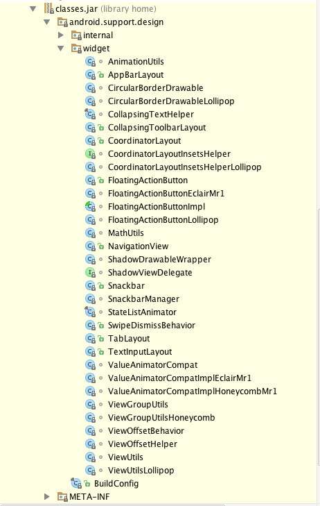
可以看出多出来这么些个UI:
- AppBarLayout
- CollapsingToolbarLayout
- CoordinatorLayout
- FloatingActionButton
- NavigationView
- Snackbar
- Tablayout
- TextInputLayout
接下来我们一一介绍
- AppBarLayout
用法
<android.support.design.widget.AppBarLayout
        android:id="@+id/appbar_layout"
        android:layout_width="match_parent"
        android:layout_height="wrap_content"
        android:fitsSystemWindows="true">
        ...
</android.support.design.widget.AppBarLayout>
就是一个ViewGroup,配合ToolBar与CollapsingToolbarLayout等使用。
- CollapsingToolbarLayout
可伸缩折叠的Toobar,具体的用法参考这篇文章CollapsingToolbarLayout - CoordinatorLayout
这其实也是个viewgroup
<android.support.design.widget.CoordinatorLayout
    xmlns:android="http://schemas.android.com/apk/res/android"
    xmlns:app="http://schemas.android.com/apk/res-auto"
    android:id="@+id/coordinator_layout"
    android:layout_width="match_parent"
    android:layout_height="match_parent"
    >

    <android.support.design.widget.AppBarLayout
        android:layout_width="match_parent"
        android:layout_height="wrap_content"
        android:fitsSystemWindows="true"
        >

        <android.support.v7.widget.Toolbar
            android:id="@+id/toolBar"
            android:layout_width="match_parent"
            android:layout_height="?attr/actionBarSize"
            android:background="#ffbb55"
            app:layout_scrollFlags="scroll|enterAlways" />

        <android.support.design.widget.TabLayout
            android:id="@+id/tabLayout"
            android:layout_width="match_parent"
            android:layout_height="wrap_content"
            android:background="#30469b"
            app:tabGravity="fill"
            app:layout_collapseMode="pin"
            app:tabMode="scrollable"
            app:tabSelectedTextColor="#ff0000"
            app:tabTextColor="#ffffff" />
    </android.support.design.widget.AppBarLayout>


        <android.support.v4.view.ViewPager
            app:layout_behavior="@string/appbar_scrolling_view_behavior"
            android:id="@+id/viewpager"
            android:layout_width="match_parent"
            android:layout_height="match_parent" />


</android.support.design.widget.CoordinatorLayout>
该控件也是Design包下的一个控件,然而这个控件可以被称为Design包中最复杂、功能最强大的控件:CoordinatorLayout。为什么这样说呢?原因是:它是组织它众多子view之间互相协作的一个ViewGroup。CoordinatorLayout 的神奇之处就在于 Behavior 对象。怎么理解呢?CoordinatorLayout使得子view之间知道了彼此的存在,一个子view的变化可以通知到另一个子view,CoordinatorLayout 所做的事情就是当成一个通信的桥梁,连接不同的view,使用 Behavior 对象进行通信。比如:在CoordinatorLayout中使用AppBarLayout,如果AppBarLayout的子View(如ToolBar、TabLayout)标记了app:layout_scrollFlags滚动事件,那么在CoordinatorLayout布局里其它标记了app:layout_behavior的子View(LinearLayout、RecyclerView、NestedScrollView等)就能够响应(如ToolBar、TabLayout)控件被标记的滚动事件。
上面有一点错误,就是标记了app:layout_behavior的子view必须是ReayclerView。
- FloatingActionButton
将这个控件当成ImageButton用即可。具体的用法参考FloatingActionButton 完全解析[Design Support Library(2)]
我这里不多说了。 NavigationView
具体用法继续参考百万的博客Android 自己实现 NavigationView [Design Support Library(1)]Snackbar
用法
Snackbar.make(textinputlayout,"quanshijie",Snackbar.LENGTH_LONG)
                .setAction("dosomething", new View.OnClickListener() {
                    @Override
                    public void onClick(View v) {

                    }
                })
                .show();
SnackBar提供了极其多的方法,我们看下
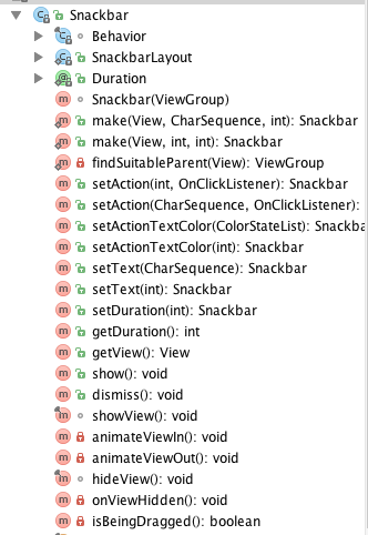
有设置显示时间、ActionText颜色、进入动画、退出动画等。
- TabLayout
<android.support.design.widget.TabLayout
            android:id="@+id/tabLayout"
            android:layout_width="match_parent"
            android:layout_height="wrap_content"
            android:background="#30469b"
            app:tabGravity="fill"
            app:layout_collapseMode="pin"
            app:tabMode="scrollable"
            app:tabSelectedTextColor="#ff0000"
            app:tabTextColor="#ffffff" />
一般来说,tablayout会配合上viewpager来使用。
ViewPager mViewpager = (ViewPager) findViewById(R.id.viewpager);
        MyviewPagerAdapter adapter=new MyviewPagerAdapter(getSupportFragmentManager());
        adapter.addFragment(new FragmentDemo(),"Tab one");
        adapter.addFragment(new FragmentDemo(),"Tab two");
        adapter.addFragment(new FragmentDemo(),"Tab three");
        adapter.addFragment(new FragmentDemo(),"Tab four");
        adapter.addFragment(new FragmentDemo(), "Tab five");
        mViewpager.setAdapter(adapter);

        TabLayout mTablayout = (TabLayout) findViewById(R.id.tabLayout);
        mTablayout.addTab(mTablayout.newTab().setText("1"));
        mTablayout.addTab(mTablayout.newTab().setText("2"));
        mTablayout.addTab(mTablayout.newTab().setText("3"));
mTablayout.setupWithViewPager(mViewpager);mTablayout.setupWithViewPager(mViewpager);通过这个就把tablayout和viewpager关联上了。
- TextInputLayout
<android.support.design.widget.TextInputLayout
        android:id="@+id/textinputlayout"
        android:layout_width="match_parent"
        android:layout_height="wrap_content"
        >
        <EditText
            android:layout_width="match_parent"
            android:layout_height="wrap_content"
            android:layout_marginTop="20dp"
            android:hint="user_password" />
    </android.support.design.widget.TextInputLayout>
内部只能有一个EditText
textinputlayout= (TextInputLayout) findViewById(R.id.textinputlayout);
        textinputlayout.getEditText().addTextChangedListener(new TextWatcher() {
            @Override
            public void beforeTextChanged(CharSequence s, int start, int count, int after) {

            }

            @Override
            public void onTextChanged(CharSequence s, int start, int before, int count) {

            }

            @Override
            public void afterTextChanged(Editable s) {
                if (textinputlayout.getEditText().getText().length()<6){
                    textinputlayout.setErrorEnabled(true);
                    textinputlayout.setError("密码长度不能小于6位");
                }else{
                    textinputlayout.setErrorEnabled(false);
                }
            }
        });
最后,重点戏来了。有的同学不知道控件有啥子属性。没关系,我在这里就给出方法。
我们知道自定义控件的时候会写attr.xml文件中写属性。并在xml文件中引用进来。同样我们使用design的时候也引用了。引用的是哪里的呢。Design包下面的。values.xml文件下看看。那个下面就是属性了。比如说
<declare-styleable name="FloatingActionButton">
    <attr name="android:background"/>
    <attr name="backgroundTint"/>
    <attr name="backgroundTintMode"/>
    <attr format="color" name="rippleColor"/>
    <attr name="fabSize">
        <enum name="normal" value="0"/>
        <enum name="mini" value="1"/>
    </attr>
    <attr name="elevation"/>
    <attr format="dimension" name="pressedTranslationZ"/>
    <attr format="dimension" name="borderWidth"/>
</declare-styleable>
这个我们就知道控件有哪些属性了吧。
好,今天就到这里。


 295
295

 被折叠的 条评论
为什么被折叠?
被折叠的 条评论
为什么被折叠?
 到【灌水乐园】发言


