


 本文介绍了作者对Material-UI的使用体验,Material-UI是一个基于React的UI组件库,遵循Material Design规范,提供了丰富的组件和设计元素,帮助开发者快速构建美观的React应用。
material-ui
I have heard many great things about Material-UI the popular React.js framework. As stated in their about page:
我听说过Material-UI的流行React.js框架有很多很棒的东西。 如其关于页面所述 :
Material-UI started back in 2014 to unify React and Material Design.
Material-UI始于2014年,以统一React和Material Design。
Today, Material-UI has grown to become one of the world’s most popular React UI libraries — backed by a vibrant community of more than 1M developers in over 180 countries.
如今,Material-UI已成长为世界上最受欢迎的React UI库之一,它由来自180多个国家/地区的超过100万开发人员组成的充满活力的社区提供支持。
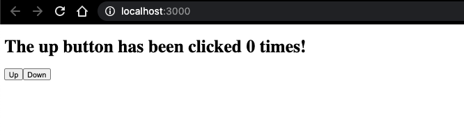
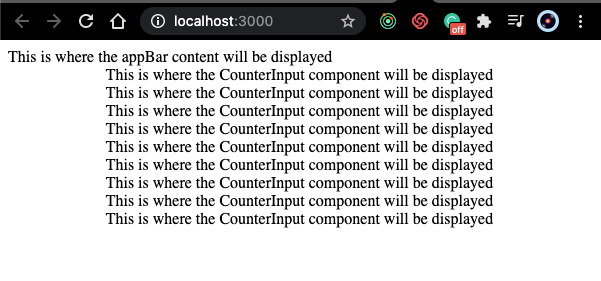
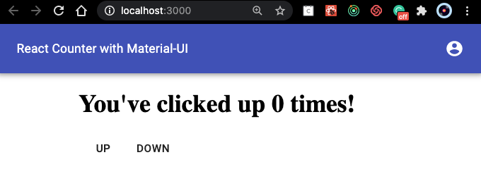
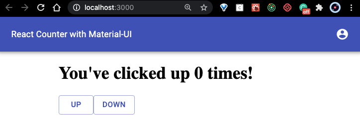
Their mission is to provide components to make the development of a React UI easier and faster. They had me at easier, so I decided to take it out for a spin! For this example, I’ll be referring to the Material-UI framework as MUI. I am using a simple React app with no styling. The app displays a counter with 2 buttons “up” and “down”. The counter goes up by one when the “up” button is clicked and down by one when the “down” button is clicked. Currently, it looks like this on the browser.
他们的任务是提供使React UI的开发变得更加轻松和快速的组件。 他们让我轻松了,所以我决定带它出去兜风! 对于此示例,我将把Material-UI框架称为MUI。 我正在使用一个没有样式的简单React应用 。 该应用程序显示带有2个按钮“上”和“下”的计数器。 单击“向上”按钮时,计数器将递增一,单击“向下”按钮时,计数器将递减一。 当前,在浏览器上看起来像这样。
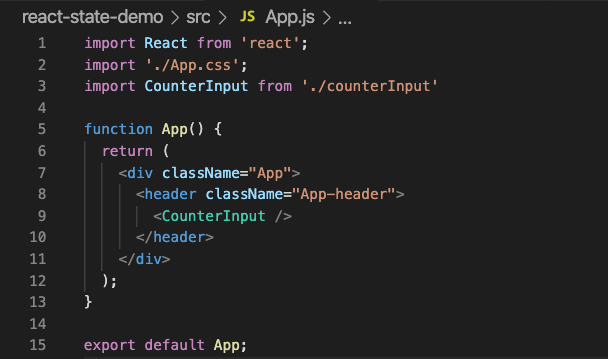
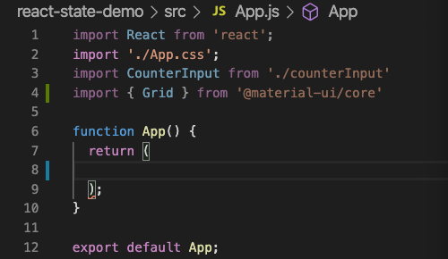
Our App.js file looks like this.
我们的App.js文件如下所示。
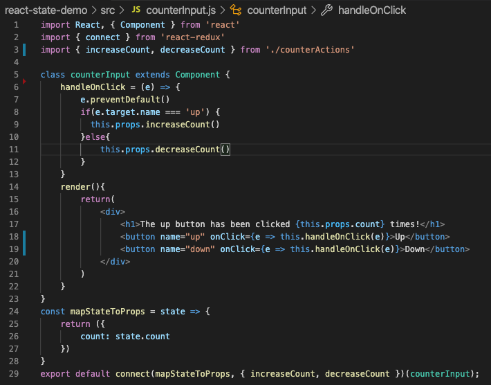
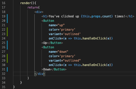
Our CounterInput component is fairly basic.
我们的CounterInput组件是相当基本的。
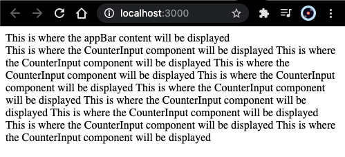
As you can see, we are using the standard div, header, button, and h1 tags in our components. Let’s try to give this a bit more life. I’d like for it to have a bar on top with the name, maybe some icons, nicer buttons, and be responsive. Ok, I think that should be good for now. Let’s get to it.
如您所见,我们在组件中使用了标准的div , header , button和h1标签。 让我们尝试赋予它更多的生命。 我希望它的顶部有一个带有名称的栏,也许有一些图标,更漂亮的按钮,并且能够响应。 好的,我认为目前应该很好。 让我们开始吧。
1-安装必要的MUI软件包 (1 - Install Necessary MUI Packages)
We can use either NPM or Yarn to install our packages.
我们可以使用NPM或Yarn来安装我们的软件包。
// With npm
//
npm install @material-ui/core//
npm install @material-ui/icons// styles gives us access to things like the makeStyles hook and themes provider
npm install @material-ui/styles// With yarn
yarn add @material-ui/core
yarn add @material-ui/icons
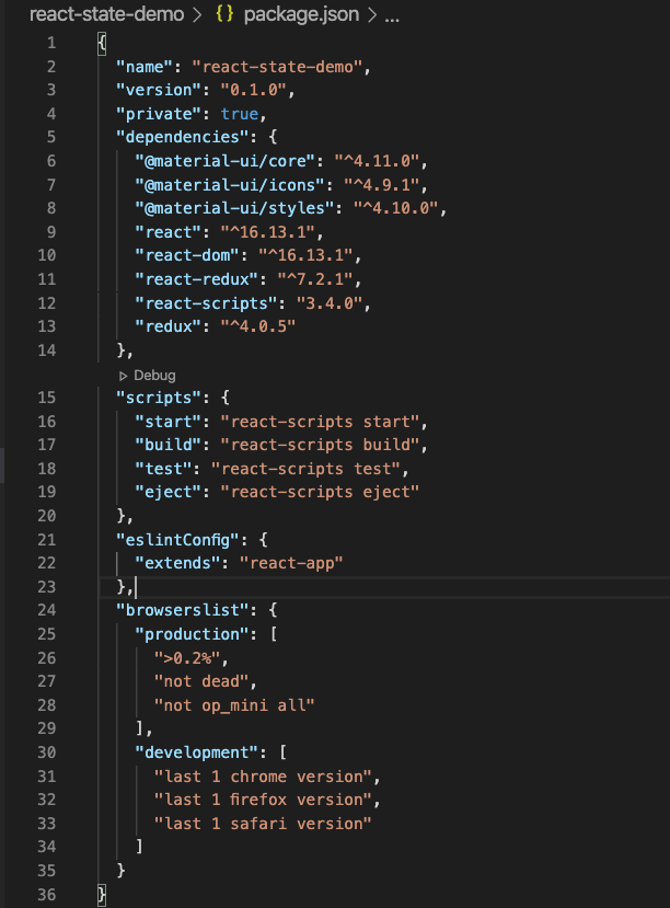
yarn add @material-ui/stylesOnce installed our package.json file should look similar to this.
安装后,我们的package.json文件应该看起来与此类似。
2-导入字体 (2 - Import Fonts)
When using MUI, you are responsible for importing the fonts used in your application even when using the default theme. We will be using the default theme so we will import the Roboto font. MUI will not auto-import the Roboto font for you so be sure to do this.
使用MUI时,即使使用默认主题,您也有责任导入应用程序中使用的字体。 我们将使用默认主题,因此我们将导入Roboto字体。 MUI不会自动为您导入Roboto字体,因此请确保执行此操作。
// In your index.html file inside the head tag add
<link rel="stylesheet" href="https://fonts.googleapis.com/css?family=Roboto:300,400,500,700&display=swap" />
3-创建布局 (3 - Create Layout)
This can be a bit confusing so I will break it down into a few steps.
这可能会有些混乱,因此我将其分解为几个步骤。
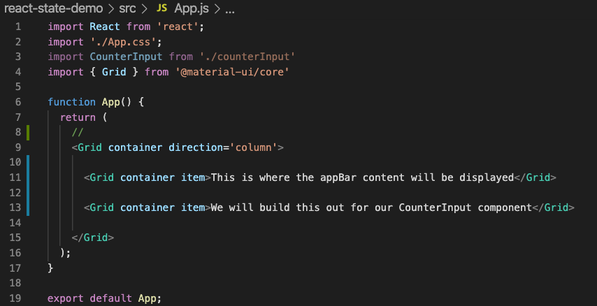
For this layout, we will be using the Grid component from MUI. The goal here is to have one large container that has 2 items inside of it displayed in one column — the appBar on top and our CounterInput component below it.
对于此布局,我们将使用MUI中的Grid组件。 这里的目标是拥有一个具有2项里面显示在一列一个大型的集装箱- appBar在上面,我们CounterInput它下面的组成部分。
3.1 —导入网格 (3.1 — Import Grid)
We import Gridat the top of our App.js file and remove all the code from inside our return statement.
我们将Grid导入App.js文件的顶部,并从return语句中删除所有代码。
3.2 —结构网格组件 (3.2 — Structure Grid Components)
In order to achieve the structure we want we need to use a few attributes provided to us by theGrid API . In MUI, we use the container boolean attribute to ensure our Grid adopts the container behavior. We will set the direction using the direction= attribute with the direction value set equal to 'column’. This way the items inside will appear on top of each other.
为了实现该结构,我们需要使用Grid API提供给我们的一些属性。 在MUI中,我们使用container布尔值属性来确保我们的Grid采用容器行为。 我们将使用direction=属性设置方向,并将方向值设置为等于'column' 。 这样,内部的项目将彼此重叠。

We continue by adding the Grid container that will hold our appBar as well as the one that will hold our CounterInput component. In MUI, when adding a Grid within a Grid we must identify the inner Gridusing theitem attribute. In our case, we need another container because the appBar will have other items within. MUI allows us to have containers within containers by combining the item and container attributes.
我们继续添加将容纳我们的appBar和将容纳我们的CounterInput组件的Grid容器。 在MUI中,在Grid中添加Grid ,必须使用item属性标识内部Grid 。 在我们的例子中,我们需要另一个容器,因为appBar将在其中包含其他项。 MUI允许我们通过组合item和container属性在容器内放置容器。
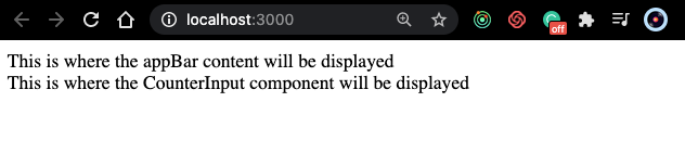
Here is what it should look like on the browser.
这是浏览器上的外观。
Now, we want to make sure this is centered so we want to add some space between the left edge of the screen and do the same on the right side of the screen. We can do that by adding some more Grid items.
现在,我们要确保它居中,以便在屏幕的左边缘之间添加一些空间,并在屏幕的右侧进行相同的操作。 我们可以通过添加更多Grid项目来实现。
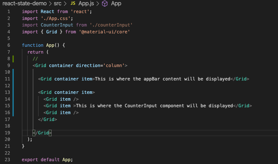
Let’s break this down. We added 3 new Grid item components inside our second Grid container item. We’ve added 2 self-closing Grid item components — lines 14 and 16 will create the spaces we wanted on either side of our CounterInput component.
让我们分解一下。 我们在第二个Grid container item添加了3个新的Grid item组件。 我们添加了2个自动关闭的Grid item组件-第14和16行将在CounterInput组件的任一侧创建所需的空间。
3.3 —为响应功能添加断点 (3.3 — Add Breakpoints For Responsive Features)
MUI was built with a Mobile-First design in mind. This means that our breakpoints work from the smallest size up. Here is a good article describing this design strategy.
MUI的构建考虑了“移动优先”的设计。 这意味着我们的断点从最小的尺寸开始工作。 这是一篇很好的文章,描述了这种设计策略。
From the Material-UI docs.
来自Material-UI文档。
The grid creates visual consistency between layouts while allowing flexibility across a wide variety of designs. Material Design’s responsive UI is based on a 12-column grid layout.
网格在布局之间创建了视觉一致性,同时允许跨多种设计的灵活性。 Material Design的响应式UI基于12列网格布局。
How it worksThe grid system is implemented with the
Gridcomponent:工作原理网格系统是通过
Grid组件实现的:- It uses CSS’s Flexible Box module for high flexibility.
-它使用CSS的Flexible Box模块来实现高度的灵活性。
- There are two types of layout: containers and items.
-布局有两种类型: 容器和项目 。
- Item widths are set in percentages, so they’re always fluid and sized relative to their parent element.
-项目宽度以百分比设置,因此相对于其父元素而言,它们始终是可变的且大小合适。
- Items have padding to create the spacing between individual items.
-项目具有填充,以在各个项目之间创建间距。
- There are five grid breakpoints: xs, sm, md, lg, and xl.
-有五个网格断点:xs,sm,md,lg和xl。
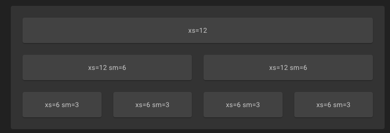
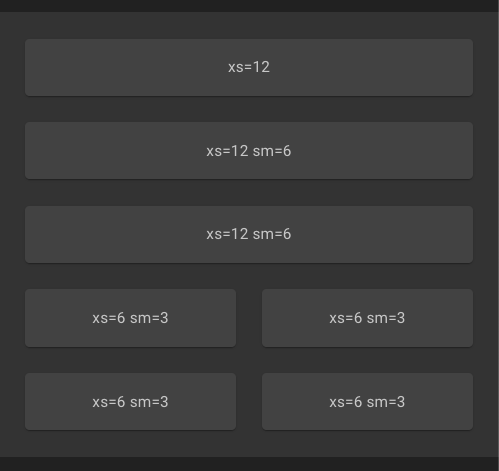
NOTE: The example above is emulating a small size screen.
注意 :上面的示例模拟一个小尺寸的屏幕。
On the first row, we have one item with a breakpoint of xs=12. This means that the item will occupy 12 columns on screen sizes extra small and above. On the second row, we see two items with a breakpoint of xs=12 sm=6. This means that the item will occupy 12 columns on extra small screens and occupy only 6 columns on screen sizes small and above. On the third row, we have 4 items that each take up 3 columns on small screens and 6 columns on extra small screens. Once we shrink the screen we can see the result.
在第一行中,我们有一个断点为xs=12 。 这意味着该项目将在屏幕尺寸超小及以上时占据12列。 在第二行上,我们看到断点为xs=12 sm=6两个项目。 这意味着该项目将占用额外的小屏幕12列,并在屏幕上只占据6列尺寸小及以上。 在第三行中,我们有4个项目,每个项目在小屏幕上占据3列,在超小屏幕上占据6列。 缩小屏幕后,我们可以看到结果。
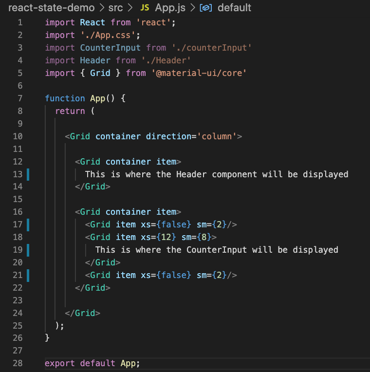
Ok, so we’ve added the breakpoints in lines 17 through 21 above that will cause spaces to appear on either side of our CounterInput in screens that are small and above and will take them away when the screen size is extra small.On line 18, we indicate that we want this grid to take up all 12 columns on extra small screens and to take up only 8 columns on screens with sizes small and above.
好的,所以我们在上面的第17至21行中添加了断点,这些断点将使CounterInput在较小和上方的屏幕中的两侧出现,并在屏幕尺寸过小时将其带走。第18行我们表明,我们希望这个网格为占用所有12列上额外的小屏幕,并采取了只有8列在屏幕上用小尺寸及以上。
This should look a bit different on the browser.
在浏览器上应该看起来有些不同。
It may not look centered if we don’t have enough data to display. If we add some more we can see the space we are actually using.
如果我们没有足够的数据来显示,它看起来可能不会居中。 如果再添加一些,我们可以看到我们实际使用的空间。
Now, we have extra spaces on both sides when the screen is small or larger.If it is extra small we have no spaces and we can move on to the next step.
现在,我们有两侧多余的空格时,屏幕小或larger.If它是超小型我们没有空间,我们可以继续下一步。
4-构建页眉组件 (4 - Build The Header Component)
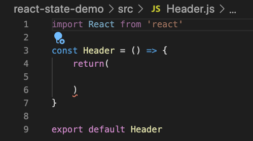
From within your project directory, run the following command in your terminal to create the new file.
在项目目录中,在终端中运行以下命令以创建新文件。
touch src/Header.js Inside this file, add the following code.
在此文件中,添加以下代码。
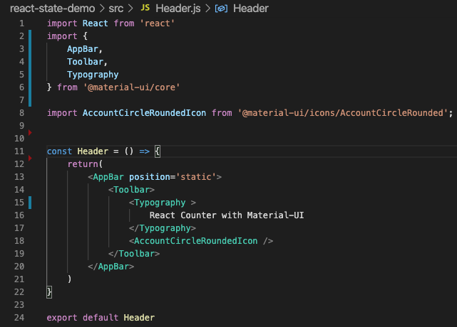
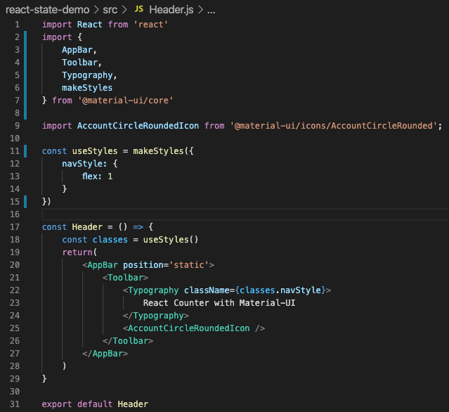
Now, we need to import the following components from MUI:
现在,我们需要从MUI导入以下组件:
<AppBar><AppBar><ToolBar><ToolBar><Typography><Typography>
You can simply start adding code and React will auto-import for us.
您可以简单地开始添加代码,React将为我们自动导入。
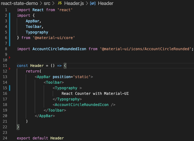
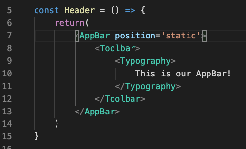
Since this is our AppBar we want it to be there all the time. We can do this by using the position= attribute and set it equal to'static'.
由于这是我们的AppBar我们希望它一直存在。 我们可以通过使用position=属性并将其设置为'static' 。
5-导入标题组件 (5 - Import Header Component)
Now, we just need to import this in the App.js file.
现在,我们只需要将其导入App.js文件即可。
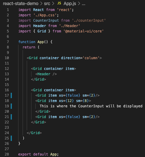
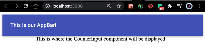
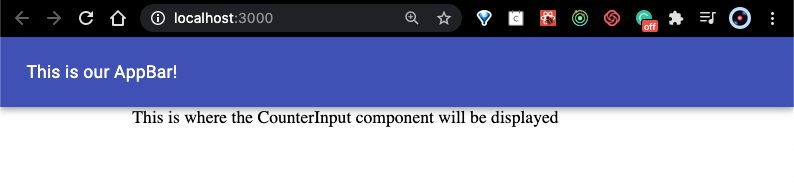
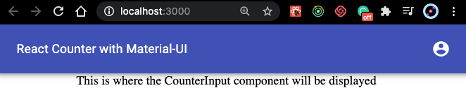
Here, we’ve imported the Header component on line 4 and added it inside our first Grid container item on line 13. It should look something like this on the browser.
在这里,我们在第4行导入了Header组件,并将其添加到了第13行的第一个Grid container item中。它在浏览器中看起来应该像这样。
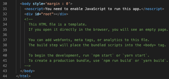
You may see a space between the AppBar and the browser search bar when using MUI. There is a quick fix for this. In our index.html file we can add the following code inside the firstbody tag.
使用MUI时,您可能会在AppBar和浏览器搜索栏之间看到一个空格。 有一个快速解决方案。 在我们的index.html文件中,我们可以在第一个body标签内添加以下代码。
<body style='margin : 0'>It should look like this:
它看起来应该像这样:
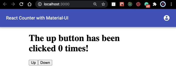
On the browser you should see this:
在浏览器上,您应该看到以下内容:
6-将一些图标添加到应用栏 (6 - Add Some Icons To App Bar)
Ok, we have our AppBar ready. Now we want to spruce it up with some icons.
好的,我们已经准备好AppBar 。 现在我们想用一些图标来修饰它。
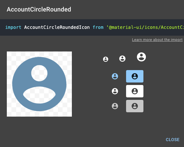
Browse all available icons in the @material-ui/icons package by visiting the Material Icons search page and find the one you want to use. Click on the icon and copy the import statement provided in the pop-up.
通过访问“ 材质图标”搜索页面 ,浏览@material-ui/icons包中的所有可用图标,并找到要使用的图标 。 单击图标,然后复制弹出窗口中提供的导入语句。
Open up the Header component and paste in the import statement and add the selected icon component inside our Toolbar component.
打开Header组件并粘贴import语句,然后将所选图标组件添加到我们的Toolbar组件中。
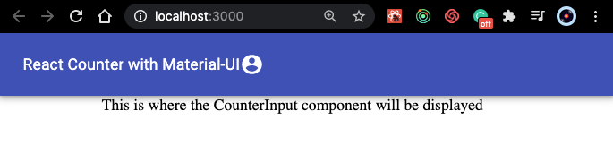
It should now look like this on the browser.
现在在浏览器上看起来应该像这样。
Hmm… I’d like that icon to be on the opposite end of the AppBar.
嗯...我希望该图标位于AppBar的另一端。
The
makeStyles(hook generator) andwithStyles(HOC) APIs allow the creation of multiple style rules per style sheet. Each style rule has its own class name. The class names are provided to the component with theclassesvariable. This is particularly useful when styling nested elements in a component.所述
makeStyles(钩发生器)和withStyles(HOC)API允许的每样式表多个样式规则的创建。 每个样式规则都有其自己的类名。 类名称通过classes变量 提供给组件 。 在对组件中的嵌套元素进行样式设置时,这特别有用。
Sweet, let’s use the makeStyles hook generator to get that icon where we want it. We want to import makeStyles and create a constant called useStyles and give it a value of the makeStyles() function. We pass our style object in as an argument.
makeStyles ,让我们使用makeStyles挂钩生成器在需要的位置获取该图标。 我们要导入makeStyles并创建一个名为useStyles的常量,并useStyles赋予makeStyles()函数的值。 我们传入样式对象作为参数。
You should now see that the icon is now where we want it.
您现在应该看到该图标现在就在我们想要的位置。
7-将MUI按钮添加到CounterInput (7 - Add MUI Buttons To CounterInput)
Currently, our CounterInput component is using basic button tags for the buttons but we want to spruce up our component with some MUI dopeness.
当前,我们的CounterInput组件正在为按钮使用基本的button标签,但是我们希望通过一些MUI修饰来修饰我们的组件。
Let’s add our CounterImput component to App.js so we can see our buttons.
让我们将CounterImput组件添加到App.js以便我们可以看到按钮。

We’ve imported the component on line 3 and are returning it on line 19 above. Now, we should be able to see our CounterInput on the browser.
我们已经在第3行中导入了该组件,并在上面的第19行中将其返回。 现在,我们应该能够在浏览器上看到我们的CounterInput 。
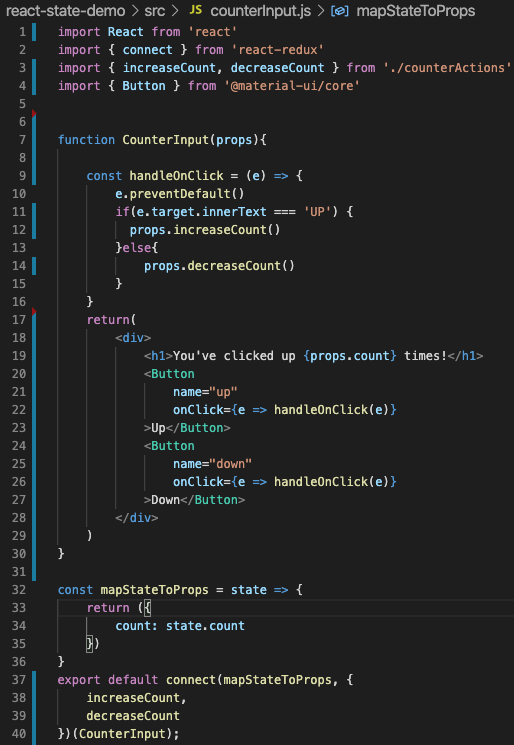
Let’s give these bland buttons some love. I’d also like to make this component a bit cooler perhaps use a card and some styling for the text. We’ve imported the Button component from MUI Core and replaced our existing button tags with it. We are going to use the makeStyles() hook generator again so we want to convert this class component to a functional component.
让我们给这些平淡的按钮一些爱。 我还想使这个组件更酷,也许使用卡片和一些样式的文本。 我们已经从MUI Core导入了Button组件,并用它替换了现有的button标签。 我们将再次使用makeStyles()钩子生成器,因此我们希望将此类组件转换为功能组件。
We’re going from this.
我们要从这里开始。
To this.
对此。
It should look like this on the browser.
在浏览器上看起来应该像这样。
There are a few options for the type of button you use. The options are outlined, contained, and text which is the default. To choose one of the options we use the variant= attribute in the Button.
您使用的按钮类型有几个选项。 这些选项已概述,包含和默认为文本。 要选择选项之一,我们使用Button中的variant=属性。
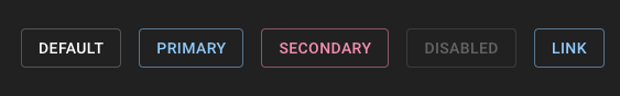
If we want to change the color, we can use the color= attribute and choose from the available options listed as primary, secondary, disabled, and link or we can use the makeStyles hook generator as we did before to override default styles.
如果要更改颜色,可以使用color=属性,并从列出的可用选项中进行选择,这些选项包括主,次,禁用和链接,或者可以像以前一样使用makeStyles钩子生成器来覆盖默认样式。
These are the available colors in the default theme.
这些是默认主题中的可用颜色。
We’ll use the outlined variant with the color attribute set to primary.
我们将使用colored属性设置为primary的轮廓变体。
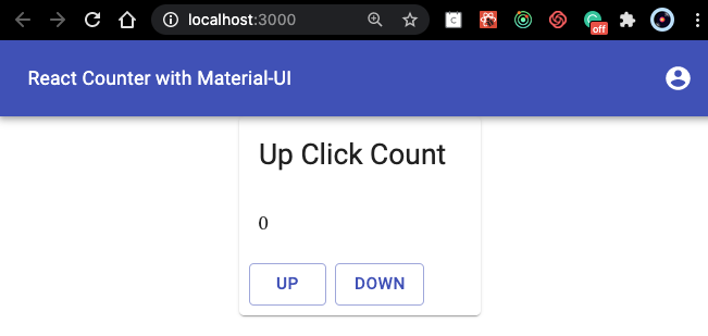
On the browser, we should see our new buttons.
在浏览器上,我们应该看到我们的新按钮。
Yells Very Nice!! in Borat's voice…
大喊很好! 用波拉特的声音…
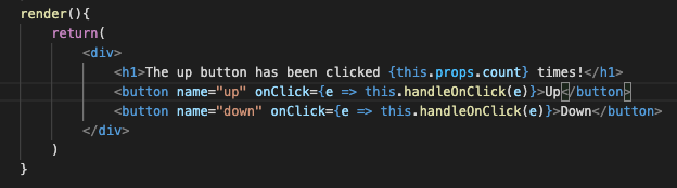
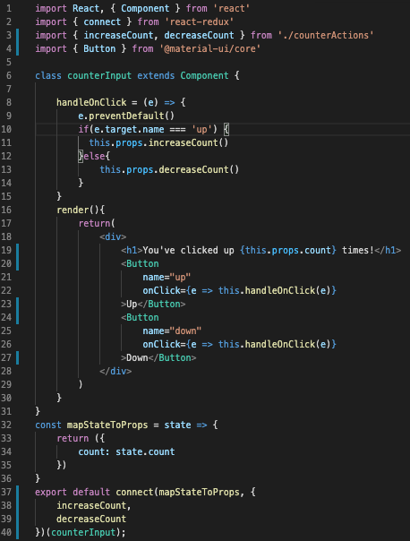
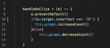
Cool, so one thing I noticed is that our buttons no longer work as expected. Now, each time I click the “up” button I get a negative number, and when I click the “down” button the negative number increases. NOOOOOOOO…
很酷,所以我注意到的一件事是我们的按钮不再能按预期工作。 现在,每次我单击“上”按钮都会得到一个负数,而当我单击“下”按钮时,该负数会增加。 不!
To me, that meant that only one of the conditions in the if statement inside the handleOnClick() function is triggering.
对我而言,这意味着仅在handleOnClick()函数内的if语句中的条件之一被触发。
Our event listener was looking for the event target name or e.target.name . To investigate I added console.log(e.target.name) inside the handleOnClick() function. With that, I learned that the target name was coming up as undefined.
我们的事件侦听器正在寻找事件目标名称或e.target.name 。 为了进行调查,我在handleOnClick()函数内部添加了console.log(e.target.name) 。 这样,我了解到目标名称即将变得不确定。
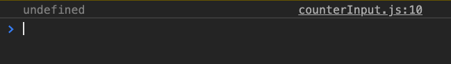
Ok, so if the target name is undefined what happened to our target? I removed the name from the console log and looked at the target itself console.log(e.target). I was a bit surprised by my discovery.
好的,如果目标名称未定义,我们的目标发生了什么? 我从控制台日志中删除了该名称,然后查看了目标本身console.log(e.target) 。 我为自己的发现感到惊讶。

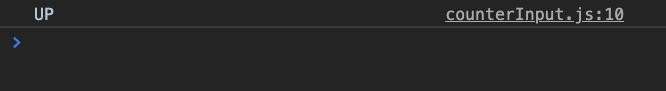
Ok…Where did this come from? Well… At least it has the button name correctly. It turns out that MUI creates these for each Button component. Ok fair enough, all we need is the name of the button which we can see the span has. I tried using JavaScripts innerText attribute to access the name of the button in my console.log(e.target.innerText) and voila!
好吧...这是从哪里来的? 好吧……至少它的按钮名称正确。 事实证明,MUI为每个Button组件创建了这些。 好的,我们只需要看到跨度的按钮名称即可。 我尝试使用JavaScripts innerText属性访问console.log(e.target.innerText)和按钮中的按钮名称!
Now that we have what we need we update our function accordingly.
现在我们有了所需的东西,我们将相应地更新我们的功能。
Woot Woot! We got over that hurdle pretty easy. Now we can move along to styling this component.
呜呜! 我们很容易克服了这一障碍。 现在我们可以继续对该组件进行样式设置。
8-添加卡片组件和样式 (8 - Add Card Components And Styling)
Now we just need to import all the components we need and pass them in our return statement. The Card component has a few other components that we will need to structure properly within one another as follows.
现在,我们只需要导入所需的所有组件并将它们传递到return语句中即可。 Card组件还有一些其他组件,我们将需要按照以下说明在彼此内部正确地构造它们。
<Card> <CardHeader title="title goes here"/> <CardContent>
   Content here
 </CardContent> <CardActions>
  buttons go here
 </CardActions></Card>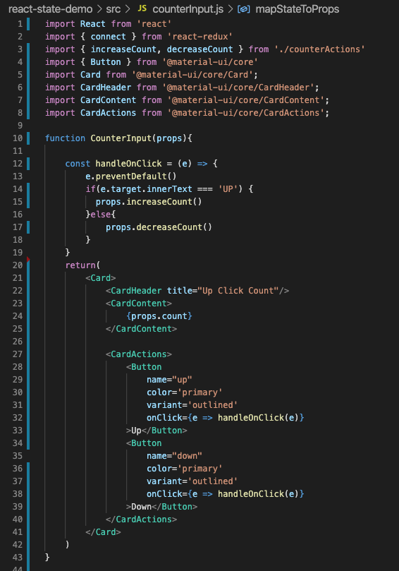
We’ve imported all the necessary card components and refactored our return statement to include our components with the correct structure. You should see this on the browser.
我们已经导入了所有必需的卡组件,并重构了return语句,以包含具有正确结构的组件。 您应该在浏览器中看到它。
As mentioned, we will use the makeStyles() hook generator again. We import it then create the function for our hook and add a variable called classes and make it equal to the useStyles() function and pass it our props. Then we are able to use the className= attribute to override the default styling with our own. Also, we want to make the counter bigger so we can use the component= attribute to change the type to an h1 for example.
如前所述,我们将再次使用makeStyles()钩子生成器。 我们导入它,然后为钩子创建函数,并添加一个名为classes的变量,使其等于useStyles()函数,并将其传递给我们的道具。 然后,我们可以使用className=属性来覆盖我们自己的默认样式。 另外,我们希望增大计数器的大小,因此可以使用component=属性将类型更改为h1 。
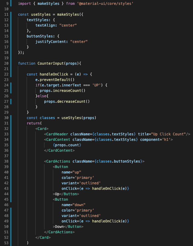
You should see this on the browser.
您应该在浏览器中看到它。

And just like that we are done! Whew, I hope that wasn’t too long for ya! Here is a quick video showing the working app.
就这样,我们完成了! 哇,我希望这对你来说不会太久! 这是显示正在运行的应用程序的快速视频。
I really hope this was fun, helpful and informative. I’d love to hear your feedback in the comments. Stay healthy, stay curious!
我真的希望这是有趣,有益和有益的。 我很想听听您在评论中的反馈。 保持健康,保持好奇心!
翻译自: https://medium.com/swlh/taking-material-ui-for-a-spin-79ec46db72e3
material-ui


 扫一扫
扫一扫


 被折叠的 条评论
为什么被折叠?
被折叠的 条评论
为什么被折叠?
 到【灌水乐园】发言


