


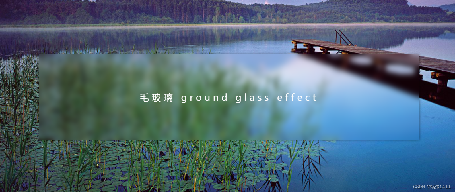
1.效果展示
2.DOM结构很简单
<body>
    <div class="glass">
        毛玻璃 ground glass effect
    </div>
</body>
3.实现原理——backdrop-filter
利用backdrop-filter对容器本身设置模糊达到毛玻璃的效果
backdrop-filter有以下属性值:
| 滤镜 | 释义 |
|---|---|
| blur | 模糊 |
| brightness | 亮度 |
| contras t | 对比 |
| drop-shadow | 投影 |
| grayscale | 灰度 |
| hue-rotate | 色调变化 |
| invert | 反相 |
| opacity | 透明度 |
| saturate | 饱和度 |
| sepia | 褐色 |
我的例子中只用了饱和度(saturate)和模糊(blur)
4.完整代码如下
<!DOCTYPE html>
<html lang="en">
<head>
    <meta charset="UTF-8">
    <meta http-equiv="X-UA-Compatible" content="IE=edge">
    <meta name="viewport" content="width=device-width, initial-scale=1.0">
    <title>毛玻璃</title>
    <style>
        *{
            margin: 0;
            padding: 0;
            box-sizing: border-box;
        }
        body {
            display: flex;
            align-items: center;
            justify-content: center;
            height: 100vh;
            background: url("./bg3.jpg") center no-repeat;
        }
        .glass {
            width: 80%;
            height: 300px;
            line-height: 260px;
            /* background: rgba(255,255,255,.05); */
            box-shadow: 0 0px 10px rgba(0,0,0,.5);
            backdrop-filter: saturate(100%) blur(10px);
            padding: 20px;
            text-align: center;
            color: #ffffff;
            font-size: 32px;
            letter-spacing: 10px;
        }
    </style>
</head>
<body>
    <div class="glass">
        毛玻璃 ground glass effect
    </div>
</body>
</html>


 918
918


 被折叠的 条评论
为什么被折叠?
被折叠的 条评论
为什么被折叠?
 到【灌水乐园】发言


