


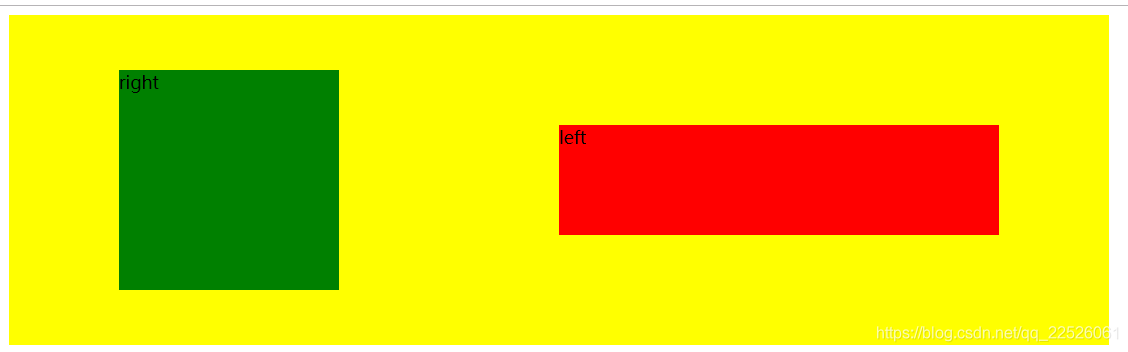
flex布局,是div包含div,外层div称为容器,内层div称为项目
当不设置外层属性为flex布局时,默认时一行一行排列
<!DOCTYPE html>
<html lang="en">
<head>
    <meta charset="UTF-8">
    <title></title>

    <style type="text/css">

        .container{
            height:300px;
            width: 1000px;
            /*display:flex;*/
            background-color: yellow;
            /*flex-direction: row;*/
            /*flex-wrap:nowrap;*/
            /*flex-flow:flex-direction 和flex-wrap的简写方式;*/
            /*justify-content:flex-start;*/
            /*align-items:flex-start;*/
            /*align-content:stretch;*/
        }
        .left{
            background-color:red;
            /*flex:0.9 1 800px;*/
            /*text-align: center;*/
            /*line-height: 500px;*/
            /*vertical-align: middle;*/
            /*width:900px;*/
            /*height:200px;*/
            /*margin:0 auto;*/
        }
        .right{
            background-color:green;
            /*flex:0.1 1 100px;*/
            /*text-align: right;*/
            /*width:200px;*/
            /*height:200px;*/
        }
        </style>
</head>
<body>
    <div class=container>
        <div class='left'>left</div>
        <div class='right'>right</div>
    </div>
</body>
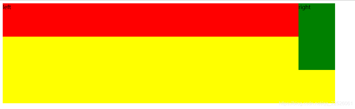
当外层div,display属性设置为flex时,默认按行排列,且flex属性生效,包含容器属性和项目属性
<!DOCTYPE html>
<html lang="en">
<head>
    <meta charset="UTF-8">
    <title></title>

    <style type="text/css">

        .container{
            height:300px;
            width: 1000px;
            display:flex;
            background-color: yellow;
            /*flex-direction: row-reverse;*/
            /*flex-wrap:nowrap;*/
            /*flex-flow:flex-direction 和flex-wrap的简写方式;*/
            /*justify-content:flex-start;*/
            /*align-items:flex-start;*/
            /*align-content:stretch;*/
        }
        .left{
            background-color:red;
            /*flex:0.9 1 800px;*/
            /*text-align: center;*/
            /*line-height: 500px;*/
            /*vertical-align: middle;*/
            /*width:900px;*/
            /*height:200px;*/
            /*margin:0 auto;*/
        }
        .right{
            background-color:green;
            /*flex:0.1 1 100px;*/
            /*text-align: right;*/
            /*width:200px;*/
            /*height:200px;*/
        }
        </style>
</head>
<body>
    <div class=container>
        <div class='left'>left</div>
        <div class='right'>right</div>
    </div>
</body>
容器属性一共有七种
- flex-direction
- flex-wrap
- flex-flow
- justify-content
- align-items
- align-content
项目属性一共有六种
- order
- flex-basis
- flex-grow
- flex-shrink
- flex
- align-self
首先讲解项目属性
1 flex-direction: 决定主轴的方向(即项目的排列方向)
flex-direction: row | row-reverse | column | column-reverse;4种可选,默认时row,按行从左到右排列,其他可以类比,以row-reverse和column-reverse为例,看下效果
<!DOCTYPE html>
<html lang="en">
<head>
    <meta charset="UTF-8">
    <title></title>

    <style type="text/css">

        .container{
            height:300px;
            width: 1000px;
            display:flex;
            background-color: yellow;
            flex-direction: row-reverse;
            /*flex-wrap:nowrap;*/
            /*flex-flow:flex-direction 和flex-wrap的简写方式;*/
            /*justify-content:flex-start;*/
            /*align-items:flex-start;*/
            /*align-content:stretch;*/
        }
        .left{
            background-color:red;
            /*flex:0.9 1 800px;*/
            /*text-align: center;*/
            /*line-height: 500px;*/
            /*vertical-align: middle;*/
            /*width:900px;*/
            /*height:200px;*/
            /*margin:0 auto;*/
        }
        .right{
            background-color:green;
            /*flex:0.1 1 100px;*/
            /*text-align: right;*/
            /*width:200px;*/
            /*height:200px;*/
        }
        </style>
</head>
<body>
    <div class=container>
        <div class='left'>left</div>
        <div class='right'>right</div>
    </div>
</body> 
<!DOCTYPE html>
<html lang="en">
<head>
    <meta charset="UTF-8">
    <title></title>

    <style type="text/css">

        .container{
            height:300px;
            width: 1000px;
            display:flex;
            background-color: yellow;
            flex-direction: column-reverse;
            /*flex-wrap:nowrap;*/
            /*flex-flow:flex-direction 和flex-wrap的简写方式;*/
            /*justify-content:flex-start;*/
            /*align-items:flex-start;*/
            /*align-content:stretch;*/
        }
        .left{
            background-color:red;
            /*flex:0.9 1 800px;*/
            /*text-align: center;*/
            /*line-height: 500px;*/
            /*vertical-align: middle;*/
            /*width:900px;*/
            /*height:200px;*/
            /*margin:0 auto;*/
        }
        .right{
            background-color:green;
            /*flex:0.1 1 100px;*/
            /*text-align: right;*/
            /*width:200px;*/
            /*height:200px;*/
        }
        </style>
</head>
<body>
    <div class=container>
        <div class='left'>left</div>
        <div class='right'>right</div>
    </div>
</body>

2. flex-wrap: 决定容器内项目是否可换行
flex-wrap: nowrap | wrap | wrap-reverse;第二个属性 当项目宽度超出容器宽度时 是否换行,默认不换行
这里设置一下每个项目的宽度,使它超出,看下效果,这里容器宽度时1000,left900,right200,900+200超出了容器宽度1000了,由于设置的时nowarp属性,自动将left的900长度调整为了818.182,right长度也减小了
<!DOCTYPE html>
<html lang="en">
<head>
    <meta charset="UTF-8">
    <title></title>

    <style type="text/css">

        .container{
            height:300px;
            width: 1000px;
            display:flex;
            background-color: yellow;
            flex-direction: row;
            flex-wrap:nowrap;
            /*flex-flow:flex-direction 和flex-wrap的简写方式;*/
            /*justify-content:flex-start;*/
            /*align-items:flex-start;*/
            /*align-content:stretch;*/
        }
        .left{
            background-color:red;
            /*flex:0.9 1 800px;*/
            /*text-align: center;*/
            /*line-height: 500px;*/
            /*vertical-align: middle;*/
            width:900px;
            height:200px;
            /*margin:0 auto;*/
        }
        .right{
            background-color:green;
            /*flex:0.1 1 100px;*/
            /*text-align: right;*/
            width:200px;
            height:200px;
        }
        </style>
</head>
<body>
    <div class=container>
        <div class='left'>left</div>
        <div class='right'>right</div>
    </div>
</body>

如果设置 wrap为wrap的话,显示效果如下,可以看到自动换行了,容器高度不够会溢出
 下面把容器高度调高

可以看到多出来的行 会自动均匀填充在容器 的中间,这也就引出了另一个属性
3 align-content: 定义了多根轴线的对齐方式,如果项目只有一根轴线,那么该属性将不起作用
align-content: flex-start | flex-end | center | space-between | space-around | stretch;定义了如果有多行的话,多行的对齐方式,比如设置为flex-start
<!DOCTYPE html>
<html lang="en">
<head>
    <meta charset="UTF-8">
    <title></title>

    <style type="text/css">

        .container{
            height:700px;
            width: 1000px;
            display:flex;
            background-color: yellow;
            flex-direction: row;
            flex-wrap:wrap;
            /*flex-flow:flex-direction 和flex-wrap的简写方式;*/
            /*justify-content:flex-start;*/
            /*align-items:flex-start;*/
            align-content:flex-start;
        }
        .left{
            background-color:red;
            /*flex:0.9 1 800px;*/
            /*text-align: center;*/
            /*line-height: 500px;*/
            /*vertical-align: middle;*/
            width:900px;
            height:200px;
            /*margin:0 auto;*/
        }
        .right{
            background-color:green;
            /*flex:0.1 1 100px;*/
            /*text-align: right;*/
            width:200px;
            height:200px;
        }
        </style>
</head>
<body>
    <div class=container>
        <div class='left'>left</div>
        <div class='right'>right</div>
    </div>
</body>
可以copy我的代码 自己都换换,理解更加深入
4 flex-flow: flex-direction 和 flex-wrap 的简写形式 不再赘述
5 justify-content:定义了项目在主轴的对齐方式。 以space-around为例
justify-content: flex-start | flex-end | center | space-between | space-around;<!DOCTYPE html>
<html lang="en">
<head>
<meta charset="UTF-8">
<title></title>
<style type="text/css">
.container{
height:300px;
width: 1000px;
display:flex;
background-color: yellow;
flex-direction: row;
flex-wrap:nowrap;
/*flex-flow:flex-direction 和flex-wrap的简写方式;*/
justify-content:space-around;
/*align-items:flex-start;*/
align-content:flex-start;
}
.left{
background-color:red;
/*flex:0.9 1 800px;*/
/*text-align: center;*/
/*line-height: 500px;*/
/*vertical-align: middle;*/
width:400px;
height:200px;
/*margin:0 auto;*/
}
.right{
background-color:green;
/*flex:0.1 1 100px;*/
/*text-align: right;*/
width:200px;
height:200px;
}
</style>
</head>
<body>
<div class=container>
<div class='left'>left</div>
<div class='right'>right</div>
</div>
</body>
6. align-items: 定义了项目在交叉轴上的对齐方式
align-items: flex-start | flex-end | center | baseline | stretch;<!DOCTYPE html>
<html lang="en">
<head>
<meta charset="UTF-8">
<title></title>
<style type="text/css">
.container{
height:300px;
width: 1000px;
display:flex;
background-color: yellow;
flex-direction: row;
flex-wrap:nowrap;
/*flex-flow:flex-direction 和flex-wrap的简写方式;*/
justify-content:space-around;
align-items:center;
/*align-content:flex-start;*/
}
.left{
background-color:red;
/*flex:0.9 1 800px;*/
/*text-align: center;*/
/*line-height: 500px;*/
/*vertical-align: middle;*/
width:400px;
height:100px;
/*margin:0 auto;*/
}
.right{
background-color:green;
/*flex:0.1 1 100px;*/
/*text-align: right;*/
width:200px;
height:200px;
}
</style>
</head>
<body>
<div class=container>
<div class='left'>left</div>
<div class='right'>right</div>
</div>
</body>
接下来是项目属性
1 order 项目 的顺序 ,越小越靠前
比如设置order之后,可以把上面的左右反过来
flex属性
- flex-basis
- flex-grow
- flex-shrink
这3个可以简写为flex,一起说
flex: <'flex-grow'> <'flex-shrink'>? || <'flex-basis'> ]flex-grow和flex-shrink都是 当项目主轴(row主轴为行方向,column主轴为列方向) 长度加起来大于或者小于容器长度时所做的调整比例,而flex-basis就是用来计算项目主轴上的长度的,当设置flex-basis后,width或height一定有一个失效(哪个失效取决于那个是主轴)
比如当设置的参数如下
<!DOCTYPE html>
<html lang="en">
<head>
    <meta charset="UTF-8">
    <title></title>

    <style type="text/css">

        .container{
            height:300px;
            width: 1000px;
            display:flex;
            background-color: yellow;
            flex-direction: row;
            flex-wrap:nowrap;
            /*flex-flow:flex-direction 和flex-wrap的简写方式;*/
            /*justify-content:space-around;*/
            /*align-items:center;*/
            /*align-content:flex-start;*/
        }
        .left{
            background-color:red;
            /*flex-basis:700px;*/
            flex:0.9 1 800px;
            /*text-align: center;*/
            /*line-height: 500px;*/
            /*vertical-align: middle;*/
            width:400px;
            height:100px;
            /*order:2;*/
            /*margin:0 auto;*/
        }
        .right{
            background-color:green;
            flex:0.1 1 100px;
            /*text-align: right;*/
            width:200px;
            height:200px;
            /*order:1;*/
        }
        </style>
</head>
<body>
    <div class=container>
        <div class='left'>left</div>
        <div class='right'>right</div>
    </div>
</body>
由于是row方向则主轴为行方向,设置flex-basis后则width失效,容器宽度1000,left800,right100,left,right加起来不够1000,则flex-grow生效,1000-(100+800)=100 需要再加上100正好充满一行,则left填充长度100*0.9=90,right填充长度100*0.1=10长度,left最终长度一共为800+90=890,right为100+10=110
f
flex-grow和flex-shrink一定只有一个可以生效 ,或者都不生效
示例1:


 1704
1704


 被折叠的 条评论
为什么被折叠?
被折叠的 条评论
为什么被折叠?
 到【灌水乐园】发言


