


目录
从本章开始将详细介绍ttkbootstrap中支持的常用组件,从按钮BUTTON开始,在各类界面设计中按钮几乎是必不可少的一个组件。
一:Button接口
查看Button的接口可以通过help来看
print(help(ttk.Button))Help on class Button in module tkinter.ttk:
class Button(Widget)
| Button(*args, **kwargs)
|
| Ttk Button widget, displays a textual label and/or image, and
| evaluates a command when pressed.
|
| Method resolution order:
| Button
| Widget
| tkinter.Widget
| tkinter.BaseWidget
| tkinter.Misc
| tkinter.Pack
| tkinter.Place
| tkinter.Grid
| builtins.object
|
| Methods defined here:
|
| __init__(self, *args, **kwargs)
|
| config = configure(self, cnf=None, **kwargs)
|
| configure(self, cnf=None, **kwargs)
|
| invoke(self)
| Invokes the command associated with the button.
|
| ----------------------------------------------------------------------
| Methods inherited from Widget:
|
| identify(self, x, y)
| Returns the name of the element at position x, y, or the empty
| string if the point does not lie within any element.
|
| x and y are pixel coordinates relative to the widget.
|
| instate(self, statespec, callback=None, *args, **kw)
| Test the widget's state.
|
| If callback is not specified, returns True if the widget state
| matches statespec and False otherwise. If callback is specified,
| then it will be invoked with *args, **kw if the widget state
| matches statespec. statespec is expected to be a sequence.
|
| state(self, statespec=None)
| Modify or inquire widget state.
|
| Widget state is returned if statespec is None, otherwise it is
| set according to the statespec flags and then a new state spec
| is returned indicating which flags were changed. statespec is
| expected to be a sequence.
|
| ----------------------------------------------------------------------
| Methods inherited from tkinter.BaseWidget:
|
| destroy(self)
| Destroy this and all descendants widgets.
|
...
...
...
通过dir来查看Button支持的属性和方法
['_Misc__winfo_getint', '_Misc__winfo_parseitem', '__class__', '__delattr__', '__dict__', '__dir__', '__doc__', '__eq__', '__format__', '__ge__', '__getattribute__', '__getitem__', '__getstate__', '__gt__', '__hash__', '__init__', '__init_subclass__', '__le__', '__lt__', '__module__', '__ne__', '__new__', '__reduce__', '__reduce_ex__', '__repr__', '__setattr__', '__setitem__', '__sizeof__', '__str__', '__subclasshook__', '__weakref__', '_bind', '_configure', '_displayof', '_do', '_getboolean', '_getconfigure', '_getconfigure1', '_getdoubles', '_getints', '_grid_configure', '_gridconvvalue', '_last_child_ids', '_nametowidget', '_noarg_', '_options', '_register', '_report_exception', '_root', '_setup', '_subst_format', '_subst_format_str', '_substitute', '_tclCommands', '_unbind', '_windowingsystem', 'after', 'after_cancel', 'after_idle', 'anchor', 'bbox', 'bell', 'bind', 'bind_all', 'bind_class', 'bindtags', 'cget', 'clipboard_append', 'clipboard_clear', 'clipboard_get', 'columnconfigure', 'config', 'configure', 'deletecommand', 'destroy', 'event_add', 'event_delete', 'event_generate', 'event_info', 'focus', 'focus_displayof', 'focus_force', 'focus_get', 'focus_lastfor', 'focus_set', 'forget', 'getboolean', 'getdouble', 'getint', 'getvar', 'grab_current', 'grab_release', 'grab_set', 'grab_set_global', 'grab_status', 'grid', 'grid_anchor', 'grid_bbox', 'grid_columnconfigure', 'grid_configure', 'grid_forget', 'grid_info', 'grid_location', 'grid_propagate', 'grid_remove', 'grid_rowconfigure', 'grid_size', 'grid_slaves', 'identify', 'image_names', 'image_types', 'info', 'info_patchlevel', 'instate', 'invoke', 'keys', 'lift', 'location', 'lower', 'mainloop', 'nametowidget', 'option_add', 'option_clear', 'option_get', 'option_readfile', 'pack', 'pack_configure', 'pack_forget', 'pack_info', 'pack_propagate', 'pack_slaves', 'place', 'place_configure', 'place_forget', 'place_info', 'place_slaves', 'propagate', 'quit', 'register', 'rowconfigure', 'selection_clear', 'selection_get', 'selection_handle', 'selection_own', 'selection_own_get', 'send', 'setvar', 'size', 'slaves', 'state', 'tk_bisque', 'tk_focusFollowsMouse', 'tk_focusNext', 'tk_focusPrev', 'tk_setPalette', 'tk_strictMotif', 'tkraise', 'unbind', 'unbind_all', 'unbind_class', 'update', 'update_idletasks', 'wait_variable', 'wait_visibility', 'wait_window', 'waitvar', 'winfo_atom', 'winfo_atomname', 'winfo_cells', 'winfo_children', 'winfo_class', 'winfo_colormapfull', 'winfo_containing', 'winfo_depth', 'winfo_exists', 'winfo_fpixels', 'winfo_geometry', 'winfo_height', 'winfo_id', 'winfo_interps', 'winfo_ismapped', 'winfo_manager', 'winfo_name', 'winfo_parent', 'winfo_pathname', 'winfo_pixels', 'winfo_pointerx', 'winfo_pointerxy', 'winfo_pointery', 'winfo_reqheight', 'winfo_reqwidth', 'winfo_rgb', 'winfo_rootx', 'winfo_rooty', 'winfo_screen', 'winfo_screencells', 'winfo_screendepth', 'winfo_screenheight', 'winfo_screenmmheight', 'winfo_screenmmwidth', 'winfo_screenvisual', 'winfo_screenwidth', 'winfo_server', 'winfo_toplevel', 'winfo_viewable', 'winfo_visual', 'winfo_visualid', 'winfo_visualsavailable', 'winfo_vrootheight', 'winfo_vrootwidth', 'winfo_vrootx', 'winfo_vrooty', 'winfo_width', 'winfo_x', 'winfo_y']
二:Button创建
先来看一个简单示例
import tkinter as tk
import ttkbootstrap as ttk
from ttkbootstrap.constants import *

root = ttk.Window(  title="主窗口",        #设置窗口的标题
                    themename="yeti",     #设置主题yeti
                    size=(300,200),        #窗口的大小
                 )

b1 = ttk.Button(root, text="Button 1", bootstyle=SUCCESS)
b1.pack(side=LEFT, padx=5, pady=10)

b2 = ttk.Button(root, text="Button 2", bootstyle=(INFO, OUTLINE))
b2.pack(side=LEFT, padx=5, pady=10)

b3=tk.Button(root,text="Button 3")
b3.pack(side=LEFT, padx=5, pady=10)

root.mainloop()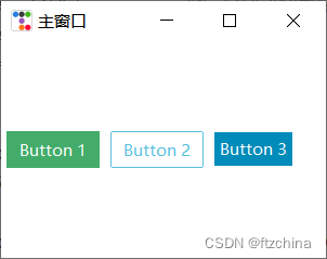
上面例子中,我们分别用ttk和tk新老两个方法来创建了按钮,有些初接触的同学可能有些好奇,Button都支持哪些参数些,可以通过keys方法来查看,为了便于比较我们将新老两种的参数都打印出来
ttk.button的参数如下:
['command', 'default', 'takefocus', 'text', 'textvariable', 'underline', 'width', 'image', 'compound', 'padding', 'state', 'cursor', 'style', 'class']
tk.button的参数如下:
['activebackground', 'activeforeground', 'anchor', 'background', 'bd', 'bg', 'bitmap', 'borderwidth', 'command', 'compound', 'cursor', 'default', 'disabledforeground', 'fg', 'font', 'foreground', 'height', 'highlightbackground', 'highlightcolor', 'highlightthickness', 'image', 'justify', 'overrelief', 'padx', 'pady', 'relief', 'repeatdelay', 'repeatinterval', 'state', 'takefocus', 'text', 'textvariable', 'underline', 'width', 'wraplength']
从上面可以看到ttk.button的参数比tk.button少了很多,是不是意味着这些老的参数设置在新的里面就不支持了呢,其实并不是的,老的很多参数设置可以在style中设置,在官方文档中也详细描述了参数的前后兼容情况
官方文档:29. ttk.Button
Table 35. ttk.Button options
class_ | The widget class name. This may be specified when the widget is created, but cannot be changed later. For an explanation of widget classes, see Section 27, “Standardizing appearance”. |
command | A function to be called when the button is pressed. |
compound | If you provide both When you provide both |
cursor | The cursor that will appear when the mouse is over the button; see Section 5.8, “Cursors”. |
image | An image to appear on the button; see Section 5.9, “Images”. |
style | The style to be used in rendering this button; see Section 49, “Using and customizing ttk styles”. |
takefocus | By default, a ttk.Button will be included in focus traversal; see Section 53, “Focus: routing keyboard input”. To remove the widget from focus traversal, use takefocus=False. |
text | The text to appear on the button, as a string. |
textvariable | A variable that controls the text that appears on the button; see Section 52, “Control variables: the values behind the widgets”. |
underline | If this option has a nonnegative value n, an underline will appear under the character at position n. |
width | If the label is text, this option specifies the absolute width of the text area on the button, as a number of characters; the actual width is that number multiplied by the average width of a character in the current font. For image labels, this option is ignored. The option may also be configured in a style. |
These options of the Tkinter Button widget are not supported by the ttk.Button constructor:
Table 36. Tkinter Button options not in ttk.Button
activebackground | Use a style map to control the background option; see Section 50.2, “ttk style maps: dynamic appearance changes”. |
activeforeground | Use a style map to control the foreground option. |
anchor | Configure this option using a style; see Section 49, “Using and customizing ttk styles”. Use this option to specify the position of the text when the For example, if you specify options When the button displays an image but no text, this option is ignored. |
background or bg | Configure the background option using a style. The bg abbreviation is not supported. |
bitmap | Not supported. |
borderwidth or bd | Configure the borderwidth option using a style. The bd abbreviation is not supported. |
cursor | The cursor that will appear when the mouse is over the checkbutton; see Section 5.8, “Cursors”. |
default | Not supported; see Section 50.2, “ttk style maps: dynamic appearance changes”. |
disabledforeground | Use a style map for the foreground option; see Section 50.2, “ttk style maps: dynamic appearance changes”. |
font | Configure this option using a style. |
foreground or fg | Configure this option using a style. |
height | Not supported. |
highlightbackground | To control the color of the focus highlight when the button does not have focus, use a style map to control the highlightcolor option; see Section 50.2, “ttk style maps: dynamic appearance changes”. |
highlightcolor | You may specify the default focus highlight color by setting this option in a style. You may also control the focus highlight color using a style map. |
highlightthickness | Configure this option using a style. This option may not work in all themes. |
justify | If the text contains newline ('\n') characters, the text will occupy multiple lines on the button. The justify option controls how each line is positioned horizontally. Configure this option using a style; values may be tk.LEFT, tk.CENTER, or tk.RIGHT for lines that are left-aligned, centered, or right-aligned, respectively. |
overrelief | Use a style map to control the relief option; see Section 50.2, “ttk style maps: dynamic appearance changes”. |
padx | Not supported. |
pady | Not supported. |
relief | Configure this option using a style; see Section 49, “Using and customizing ttk styles”. |
repeatdelay | Not supported. |
repeatinterval | Not supported. |
state | In ttk, there is no option with this name. The state mechanism has been generalized; see Section 50.2, “ttk style maps: dynamic appearance changes”. |
wraplength | If you use a style with this option set to some dimensions, the text will be sliced into pieces no longer than that dimension. |
三:Button主题
Button如果不设置主题就会用默认的框架主题,如果在框架下想为Button设置单独的主题可以用style来设置
import tkinter as tk
import ttkbootstrap as ttk
from ttkbootstrap.constants import *

root = ttk.Window(  title="主窗口",        #设置窗口的标题
                    themename="yeti",     #设置主题yeti
                    size=(400,200),        #窗口的大小
                 )

style = ttk.Style()
style.configure('TButton', font=('宋体', 10))
style.map('TButton', font=[('active', ('宋体', 15))])#所有Button生效
style.configure('custom.TButton',  font=('宋体', 20),background='red')

b1 = ttk.Button(root, text="Button 1", bootstyle=SUCCESS)
b1.pack(side=LEFT, padx=5, pady=10)
print(b1.keys())

b2 = ttk.Button(root, text="Button 2", bootstyle=(INFO, OUTLINE))
b2.pack(side=LEFT, padx=5, pady=10)

b3 = ttk.Button(root, text="Button 2", style='custom.TButton')
b3.pack(side=LEFT, padx=5, pady=10)

root.mainloop()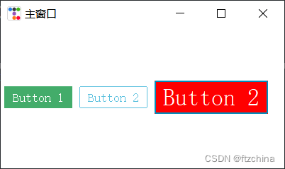
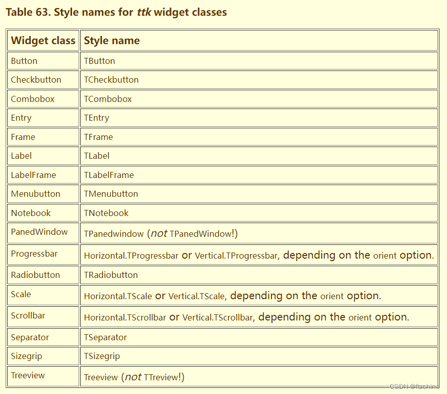
需要注意的是configure中的‘custom.TButton’并不是随便命名的,点后边的组件是有要求,大部分样式名都在组件类名的前面加大写的T
官网:49. Using and customizing ttk styles
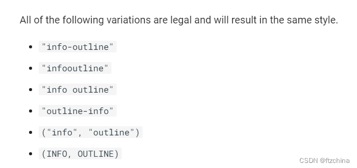
另外图省事的话也可以通过bootstyle来设置,bootstyle的写法也是比较灵活的,下边的都是支持的
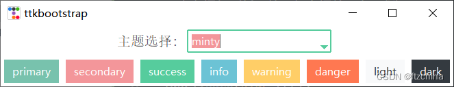
如何在已创建窗口下切换主题风格
import ttkbootstrap as ttk
from ttkbootstrap.constants import *

# 定义函数,与组合框相互结合,当组合框选中一条时,切换选中的主题
def select_theme(event):
    ttk.Style(theme_select_combo.get())

# 在创建窗口时
root = ttk.Window(themename="vapor")

# 定义框架(将标签和组合框并列在一行)
frame1 = ttk.Frame(root)
frame1.pack()

label = ttk.Label(frame1,text="主题选择:",font=15)
label.pack(side=LEFT)

# 主题选择组合框
var = ttk.StringVar()
theme_select_combo = ttk.Combobox(frame1,textvariable=var,values=["cosmo","flatly","minty","vapor"],bootstyle=SUCCESS)
theme_select_combo.bind("<<ComboboxSelected>>", select_theme) # 绑定事件
theme_select_combo.pack(side=LEFT,padx=10,pady=5)

for color in root.style.colors:
    btn = ttk.Button(root,text=color,bootstyle=color)
    btn.pack(side=LEFT,padx=5,pady=5)

root.mainloop()
四:Button样式
Button样式总共有三种
1,实心按钮:solid
2,外框按钮:outline
3,链接按钮:link
import tkinter as tk
import ttkbootstrap as ttk
from ttkbootstrap.constants import *

root = ttk.Window(  title="主窗口",        #设置窗口的标题
                    themename="yeti",     #设置主题yeti
                    size=(400,200),        #窗口的大小
                 )

b1 = ttk.Button(root, text="solid", bootstyle="info-solid")
b1.pack(side=LEFT, padx=5, pady=10)
print(b1.keys())

b2 = ttk.Button(root, text="outline", bootstyle="dark-outline")
b2.pack(side=LEFT, padx=5, pady=10)

b3 = ttk.Button(root, text="link", bootstyle="danger-link")
b3.pack(side=LEFT, padx=5, pady=10)

root.mainloop()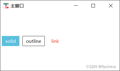
五:Button状态
按钮一共有三大状态:
1,normal
2,active
3,disabled
以下两种方法均可以设置按钮状态
from ttkbootstrap.constants import *

root = ttk.Window(  title="主窗口",        #设置窗口的标题
                    themename="yeti",     #设置主题yeti
                    size=(400,200),        #窗口的大小
                 )

b1 = ttk.Button(root, text="solid", bootstyle="info-solid")
b1.pack(side=LEFT, padx=5, pady=10)
b1.configure(state="disabled")

b2 = ttk.Button(root, text="outline", bootstyle="dark-outline",state=DISABLED)
b2.pack(side=LEFT, padx=5, pady=10)


root.mainloop()


 扫一扫
扫一扫


 892
892

 被折叠的 条评论
为什么被折叠?
被折叠的 条评论
为什么被折叠?
 到【灌水乐园】发言


