


本篇文章已授权微信公众号 YYGeeker 独家发布转载请标明出处
AnimatedDefaultTextStyle
1、简介
AnimatedDefaultTextStyle控件表示一个具有变化文本样式的动画控件AnimatedDefaultTextStyle通过修改组件的style属性,系统将会通过动画的方式自动切换到新的style样式
2、构造函数
AnimatedDefaultTextStyle({
    Key key,
    @required this.child,
    @required this.style,
    this.textAlign,
    this.softWrap = true,
    this.overflow = TextOverflow.clip,
    this.maxLines,
    Curve curve = Curves.linear,
    @required Duration duration,
    Duration reverseDuration,
})
- child:子控件,通常用Text组件
- style:子控件的样式,用于动画变化
- textAlign:如果文本超过1行时,所有换行的字体的对齐方式,可以是左对齐、右对齐
- softWrap:文本是否应该在软换行符处换行,软换行和硬换行是word用法,具体自阅
- overflow:超过文本行数区域的裁剪方式
- maxLines:文本最大行数,默认是1
- curve:动画插值器
- duration:动画播放时长
- reverseDuration:倒退动画播放时长
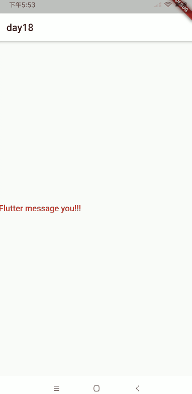
3、例子
通过_isSelected的值控制样式的切换
AnimatedDefaultTextStyle(
  softWrap: false,
  textAlign: TextAlign.right,
  maxLines: 2,
  overflow: TextOverflow.ellipsis,
  curve: Curves.linear,
  duration: Duration(seconds: 1),
  child: Text("Flutter message you!!!"),
  style: _isSelected
      ? TextStyle(
          fontSize: 10.0,
          color: Colors.red,
          fontWeight: FontWeight.bold,
        )
      : TextStyle(
          fontSize: 50.0,
          color: Colors.black,
          fontWeight: FontWeight.w300,
        ),
),
通过计时器控制样式的切换
Timer.periodic(Duration(seconds: 1), (timer) {
  setState(() {
    switch (time % 4) {
      case 0:
        _isSelected = false;
        break;
      case 2:
        _isSelected = true;
        break;
    }
    time++;
  });
});
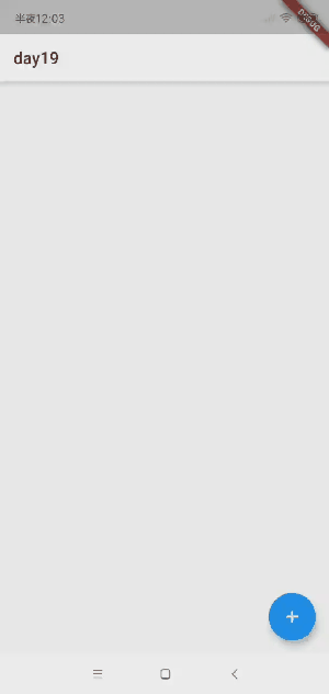
AnimatedListState/AnimatedList
1、简介
AnimatedListState控件表示一个具有动画的列表控件AnimatedListState控件作为AnimatedList控件的key进行使用,可以控制列表动画和增删操作
2、构造函数
const AnimatedList({
    Key key,
    @required this.itemBuilder,
    this.initialItemCount = 0,
    this.scrollDirection = Axis.vertical,
    this.reverse = false,
    this.controller,
    this.primary,
    this.physics,
    this.shrinkWrap = false,
    this.padding,
})
- itemBuilder:列表条目的构建者
- initialItemCount:列表初始化条目的个数
- scrollDirection:滚动的方向
- reverse:是否翻转
- controller:滚动控制器
- primary:是否当用户点击状态栏时,该视图会滚动到顶部,只适用于iOS,默认支持
- physics:控制用户滚动视图的交互
- AlwaysScrollableScrollPhysics:列表总是可滚动的
- PageScrollPhysics:一页一页的列表滑动,一般用于PageView控件用的滑动效果,滑动到末尾会有比较大的弹起
- ClampingScrollPhysics:滚动时没有回弹效果
- NeverScrollableScrollPhysics:就算内容超过列表范围也不会滑动
- BouncingScrollPhysics:不论什么平台都会有回弹效果
- FixedExtentScrollPhysics:仅滚动到子项而不存在任何偏移,必须与使用FixedExtentScrollController的可滚动对象一起使用
- shrinkWrap:是否根据子widget的总长度来设置ListView的长度
- padding:父控件的内边距
3、例子
通过点击加号随机生成字符串,对列表进行增加操作,通过点击条目的删除图标,对列表进行删除操作
class WeWidgetState extends State<WeWidget> {
  var data = <String>[];
  var tween = Tween<Offset>(begin: Offset(1, 0), end: Offset(0, 0));
  final animatedKey = GlobalKey<AnimatedListState>();

  @override
  Widget build(BuildContext context) {
    return Scaffold(
      appBar: AppBar(
        title: Text('day19'),
      ),
      floatingActionButton: FloatingActionButton(
        onPressed: () {
          var str = Random().nextInt(1000).toString();
          data.add(str);
          var index = data.lastIndexOf(str);
          animatedKey.currentState.insertItem(index);
        },
        child: Icon(Icons.add),
      ),
      body: AnimatedList(
        physics: BouncingScrollPhysics(),
        padding: EdgeInsets.all(12.0),
        scrollDirection: Axis.vertical,
        primary: true,
        reverse: false,
        shrinkWrap: false,
        key: animatedKey,
        initialItemCount: data.length,
        itemBuilder: (context, int index, Animation<double> animation) {
          return animationListItem(data[index], animation);
        },
      ),
    );
  }

  Widget animationListItem(String str, animation) {
    return SlideTransition(
      position: animation.drive(tween),
      child: listItem(str),
    );
  }

  Widget listItem(String str) {
    return ListTile(
      title: Text('$str', style: TextStyle(fontSize: 30)),
      trailing: IconButton(
        icon: Icon(Icons.delete_forever),
        onPressed: () {
          var index = data.indexOf(str);
          data.remove(str);
          animatedKey.currentState.removeItem(
              index, (context, animation) => animationListItem(str, animation));
        },
      ),
    );
  }
}
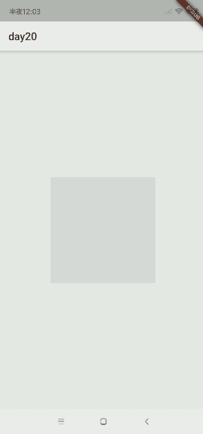
AnimatedModalBarrier
1、简介
AnimatedModalBarrier控件表示一个具有颜色值变化的动画控件AnimatedModalBarrier控件可防止用户与其自身背后的小部件进行交互,并且可以使用颜色动画进行过渡AnimatedModalBarrier控件举例说明,当屏幕上出现对话框时,对话框下方的页面通常会被ModalBarrier变暗
2、构造函数
const AnimatedModalBarrier({
    Key key,
    Animation<Color> color,
    this.dismissible = true,
    this.semanticsLabel,
    this.barrierSemanticsDismissible,
})
- color:颜色值动画变化
- dismissible:是否触摸当前
ModalBarrier将弹出当前路由,配合点击事件弹出路由使用 - semanticsLabel:语义化标签
- barrierSemanticsDismissible:语义树中是否包括
ModalBarrier语义
3、例子
Widget _buildColumn() {
    return Center(
      child: Container(
        width: 200,
        height: 200,
        child: AnimatedModalBarrier(
          semanticsLabel: "StackBarrier",
          barrierSemanticsDismissible: true,
          dismissible: true,
          color: _animation,
        ),
      ),
    );
}
AnimatedOpacity
1、简介
AnimatedOpacity控件表示一个具有透明度变化的动画控件
2、构造函数
const AnimatedOpacity({
    Key key,
    this.child,
    @required this.opacity,
    Curve curve = Curves.linear,
    @required Duration duration,
})
- child:子控件
- opacity:透明度动画变化值
- curve:动画的插值器
- duration:动画的时长
3、例子
通过定时器改变透明度的大小
class WeWidgetState extends State<WeWidget> {
WeWidgetState() {
Timer.periodic(Duration(milliseconds: 1000), (timer) {
setState(() {
switch (time % 2) {
case 0:
_opacity = 0.3;
break;
case 1:
_opacity = 1.0;
break;
}
time++;
});
});
}
@override
Widget build(BuildContext context) {
return Scaffold(
appBar: AppBar(
title: Text("day21"),
),
body: _buildColumn(),
);
}
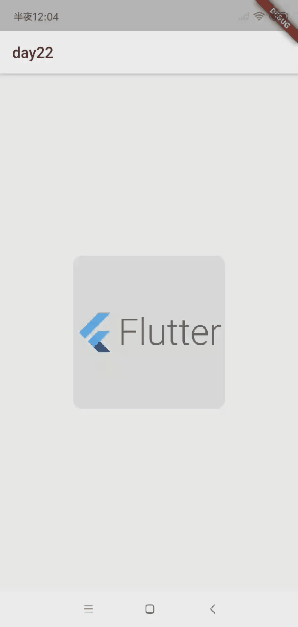
Widget _buildColumn() {
return Center(
child: AnimatedOpacity(
curve: Curves.fastOutSlowIn,
opacity: _opacity,
duration: Duration(seconds: 1),
child: FlutterLogo(
style: FlutterLogoStyle.horizontal,
size: 200,
),
),
);
}
}
AnimatedPhysicalModel
1、简介
AnimatedPhysicalModel控件表示一个具有阴影背景动画的控件
2、构造函数
const AnimatedPhysicalModel({
    Key key,
    @required this.child,
    @required this.shape,
    this.clipBehavior = Clip.none,
    this.borderRadius = BorderRadius.zero,
    @required this.elevation,
    @required this.color,
    this.animateColor = true,
    @required this.shadowColor,
    this.animateShadowColor = true,
    Curve curve = Curves.linear,
    @required Duration duration,
})
- child:子控件
- shape:阴影的形状
- clipBehavior:阴影的裁剪方式
- Clip.none:无模式
- Clip.hardEdge:裁剪速度稍快,但容易失真,有锯齿
- Clip.antiAlias:裁剪边缘抗锯齿,使得裁剪更平滑,这种模式裁剪速度比antiAliasWithSaveLayer快,但是比hardEdge慢
- Clip.antiAliasWithSaveLayer:裁剪后具有抗锯齿特性并分配屏幕缓冲区,所有后续操作在缓冲区进行
- borderRadius:背景的边框
- elevation:阴影颜色值的深度
- color:背景色
- animateColor:背景色是否用动画形式展示
- shadowColor:阴影的动画值
- animateShadowColor:阴影是否用动画形式展示
- curve:动画的插值器
- duration:动画的时长
3、例子
Widget _buildColumn() {
    return Center(
      child: AnimatedPhysicalModel(
        curve: Curves.fastOutSlowIn,
        color: Colors.grey.withOpacity(0.2),
        clipBehavior: Clip.antiAliasWithSaveLayer,
        borderRadius: BorderRadius.circular(12.0),
        animateColor: true,
        animateShadowColor: true,
        shape: BoxShape.rectangle,
        shadowColor: _shadowColor,
        elevation: 20.0,
        duration: Duration(seconds: 1),
        child: FlutterLogo(
          style: FlutterLogoStyle.horizontal,
          size: 200,
        ),
      ),
    );
  }
AnimatedPositioned
1、简介
AnimatedPositioned控件表示一个具有位置变化动画的控件
2、构造函数
const AnimatedPositioned({
    Key key,
    @required this.child,
    this.left,
    this.top,
    this.right,
    this.bottom,
    this.width,
    this.height,
    Curve curve = Curves.linear,
    @required Duration duration,
})
- child:子控件
- left:左边距离
- top:上边距离
- right:右边距离
- bottom:下边距离
- width:控件的宽度
- height:控件的高度
- curve:动画的插值器
- duration:动画的时长
3、例子
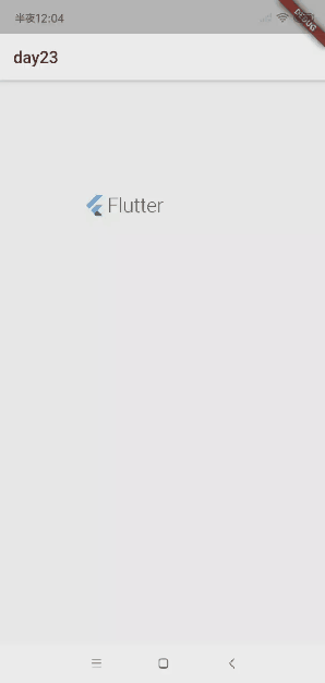
通过改变左上角位置和宽高进行动画播放
class WeWidgetState extends State<WeWidget> {
  WeWidgetState() {
    Timer.periodic(Duration(milliseconds: 1000), (timer) {
      setState(() {
        switch (time % 2) {
          case 0:
            _width = 100.0;
            break;
          case 1:
            _width = 200.0;
            break;
        }
        time++;
      });
    });
  }

  @override
  Widget build(BuildContext context) {
    return Scaffold(
      appBar: AppBar(
        title: Text("day23"),
      ),
      body: _buildColumn(),
    );
  }

  Widget _buildColumn() {
    return Stack(
      children: <Widget>[
        AnimatedPositioned(
          curve: Curves.fastOutSlowIn,
          width: _width,
          height: _width,
          top: _width,
          left: _width,
          duration: Duration(seconds: 1),
          child: FlutterLogo(
            style: FlutterLogoStyle.horizontal,
            size: 200,
          ),
        ),
      ],
    );
  }
}
AnimatedSize
1、简介
AnimatedSize控件表示一个具有尺寸变化动画的控件
2、构造函数
const AnimatedSize({
    Key key,
    Widget child,
    this.alignment = Alignment.center,
    this.curve = Curves.linear,
    @required this.duration,
    this.reverseDuration,
    @required this.vsync,
})
- child:子控件
- alignment:子控件的对齐方式
- curve:动画的插值器
- duration:动画的时长
- reverseDuration:翻转动画的时长
- vsync:是否开启垂直同步
3、例子
class WeWidgetState extends State<WeWidget>
with SingleTickerProviderStateMixin {
WeWidgetState() {
Timer.periodic(Duration(milliseconds: 1000), (timer) {
setState(() {
switch (time % 2) {
case 0:
_width = 100.0;
break;
case 1:
_width = 200.0;
break;
}
time++;
});
});
}
@override
Widget build(BuildContext context) {
return Scaffold(
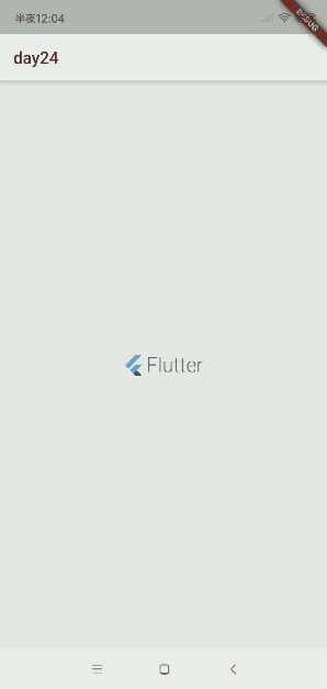
appBar: AppBar(
title: Text("day24"),
),
body: _buildColumn(),
);
}
Widget _buildColumn() {
return Center(
child: AnimatedSize(
alignment: Alignment.center,
curve: Curves.fastOutSlowIn,
vsync: this,
duration: Duration(seconds: 1),
reverseDuration: Duration(seconds: 2),
child: FlutterLogo(
style: FlutterLogoStyle.horizontal,
size: _width,
),
),
);
}
}


 1万+
1万+


 被折叠的 条评论
为什么被折叠?
被折叠的 条评论
为什么被折叠?
 到【灌水乐园】发言


