


参考资料:
https://mp.weixin.qq.com/s/5c7gpO2mJ2BqJevePJz3CQ
tricolore包教程:https://github.com/jschoeley/tricolore
学习笔记:Ternary choropleth maps
1、测试实例
代码:
library(ggplot2)
library(rnaturalearthdata)
library("tricolore")#用于绘制三元地图
library("ggtern")#设置图例

#test
# 生成模拟数据
P <- as.data.frame(prop.table(matrix(runif(3^6), ncol = 3), 1))
# 使用Tricolore生成需要的数据:该步骤最为重要
colors_and_legend <- Tricolore(P, 'V1', 'V2', 'V3')
# 展示生成的数据(部分)
head(colors_and_legend$rgb)
# colors_and_legend$key#显示作为图例的三元相图
#地图绘制
# color-code the data set and generate a color-key
#用Tricolore()函数,对euro_example数据集中的每个教育组成进行颜色编码,
#并将生成的十六进制srgb颜色向量作为新变量添加到数据帧中,颜色键单独存放
tric_educ <- Tricolore(euro_example,
                       p1 = 'ed_0to2', p2 = 'ed_3to4', p3 = 'ed_5to8')

#将生成的颜色向量存放到数据集中
# add the vector of colors to the `euro_example` data
euro_example$educ_rgb <- tric_educ$rgb
#绘制地图
plot_educ <-
  # using data sf data `euro_example`...
  ggplot(euro_example) +
  # ...draw a choropleth map
  geom_sf(aes(fill = educ_rgb, geometry = geometry), size = 0.1) +
  # ...and color each region according to the color-code
  # in the variable `educ_rgb`
  scale_fill_identity()

#设置图例
plot_educ +
  annotation_custom(
    ggplotGrob(tric_educ$key +
                 labs(L = '0-2', T = '3-4', R = '5-8')),#tric_educ$key
    xmin = 55e5, xmax = 75e5, ymin = 8e5, ymax = 80e5
  )
代码来源:https://github.com/jschoeley/tricolore
结果:

2、R语言绘图学习
(1)绘图布局设置
方法一、layout()函数:
layout(mat, widths = rep.int(1, ncol(mat)),
heights = rep.int(1, nrow(mat)), respect = FALSE)
使用方法:
l <- layout(matrix(c(1, 2,  # First, second
                     3, 3), # and third plot
            nrow = 2,
            ncol = 2,
            byrow = TRUE))
layout.show(l)
结果:
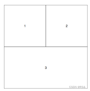
还可以设置不同行之间的比例:(如第三行是第一行的3倍)
mat <- matrix(c(1, 1,  # First
                2, 3), # second and third plot
              nrow = 2, ncol = 2,
              byrow = TRUE)
layout(mat = mat,
       heights = c(1, 3)) # First and second row
                          # relative heights
方法二、par() 函数:
使用方法:
# Data
set.seed(6)
x <- rexp(50)

# Two rows, two columns
par(mfcol = c(2, 2))

# Plots
hist(x, main = "Top left")                   # Top left
boxplot(x, main = "Bottom left")             # Bottom left
plot(x, main = "Top right")                  # Top right
pie(table(round(x)), main = "Bottom right")  # Bottom right

# Back to the original graphics device
par(mfcol = c(1, 1))
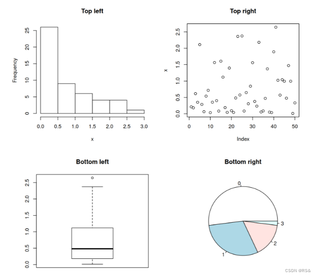
图片来源:https://r-charts.com/base-r/combining-plots/
(2)加载点矢量数据,并显示在地图上
library(sf)
library(ggplot2)
library(rnaturalearthdata)

#加载点shp,并显示
points_shp <- st_read("path/points.shp")

#绘制全球海岸线
coast <- ne_coastline(scale = "small", returnclass = "sf")
xlim <- c(-175, 175)  # 经度范围
ylim <- c(-55, 80)    # 纬度范围

ggplot(data = coast) +
  geom_sf() +
  coord_sf(xlim = xlim, ylim = ylim) +
  theme_classic()+
  geom_sf(data = points_shp, color = "red", size = 2)
(3)根据某变量大小显示点的大小
可以直接设置size=points_shp$v1,但一一般情况下,需要自己根据值来定义具体大小:
安装包:install.packages("dplyr")
points_shp <- points_shp %>%
  mutate(size = case_when(
    v1 > 0.8 ~ 9,
    v1 > 0.6 & v1 <= 0.8 ~ 4,
    TRUE ~ 1  # 默认情况下设置为1
  ))
调用:geom_sf(data = points_shp, aes(size = size), color = "red")绘制不同大小的点。
aes是"aesthetic"的缩写,用于ggplot2包中的函数,用来映射数据到图形属性,例如颜色、形状、大小等。
(4)点显示为圆环
geom_sf(data = points_shp, aes(size = size), shape = 21, fill = "transparent", color = "red", stroke = 2)
其中,shape = 21表示将点的形状设置为圆环,fill = "transparent"表示圆环内部透明填充,color = "red"表示圆环的颜色为红色,stroke = 2表示圆环的线宽为2。


 3652
3652

 被折叠的 条评论
为什么被折叠?
被折叠的 条评论
为什么被折叠?
 到【灌水乐园】发言


