


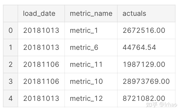
指标值的突然上升或下降是一种异常行为,这两种情况都需要注意。如果我们在建模之前就有异常行为的信息,那么异常检测可以通过监督学习算法来解决,但在没有反馈的情况下,最初很难识别这些点。因此,我们可以使用孤立森林(Isolation Forest)、支持向量机和LSTM等算法将其建模为一个无监督问题。下面使用孤立森林识别异常点。
这里的数据是一个用例(如收益、流量等),每天有12个指标。我们必须首先确定在用例级别上是否存在异常。然后,为了获得更好的可操作性,我们深入到单个指标,并识别其中的异常情况。
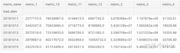
现在在数据框中做一个透视,来创建一个数据框,在一个日期级别上包含所有指标。
metrics_df=pd.pivot_table(df,values='actuals',index='load_date',columns='metric_name')
metrics_df.head()
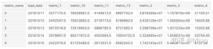
将数据框展平,并填充nan值为0
metrics_df.reset_index(inplace=True)
metrics_df.fillna(0,inplace=True)
metrics_df.head()
定义孤立森林并指定参数:
隔离森林试图分离数据中的每个点。在2D的情况下,它随机创建一条线,并试图选出一个点。在这种情况下,一个异常点只需几步就可以分离出来,而距离较近的正常点则需要相当多的步骤才能分离出来。
这里举例几个重要的参数。Contamination在这里是一个重要的参数,但是没有为它指定任何值,因为它是无监督的,我们没有关于异常值百分比的信息。
这里还可以通过在2D绘图中使用离群值验证其结果时的试错来指定它,或者如果数据是有监督的,则使用该信息来指定它,代表数据中离群点的百分比。
这里使用sklearn中自带的孤立森林,因为它是一个只有几个月数据的小数据集,而最近h2o的孤立森林也可用,它在高容量数据集上更可扩展,值得探索。
这个算法的更多细节可以参考这篇论文:https://cs.nju.edu.cn/zhouzh/zhouzh.files/publication/icdm08b.pdf
h2o孤立森林更多细节可以参考这个github链接:https://github.com/h2oai/h2o-tutorials/tree/master/tutorials/isolation-forest
metrics_df.columns

Index(['load_date', 'metric_1', 'metric_10', 'metric_11', 'metric_12',
       'metric_2', 'metric_3', 'metric_4', 'metric_5', 'metric_6', 'metric_7',
       'metric_8', 'metric_9'],
      dtype='object', name='metric_name')

#specify the 12 metrics column names to be modelled
to_model_columns=metrics_df.columns[1:13]

from sklearn.ensemble import IsolationForest
clf=IsolationForest(n_estimators=100, max_samples='auto', \
                        max_features=1.0, bootstrap=False, n_jobs=-1, random_state=42, verbose=0)
clf.fit(metrics_df[to_model_columns])

IsolationForest(behaviour='old', bootstrap=False, contamination='legacy',
        max_features=1.0, max_samples='auto', n_estimators=100, n_jobs=-1,
        random_state=42, verbose=0)

pred = clf.predict(metrics_df[to_model_columns])
metrics_df['anomaly']=pred
outliers=metrics_df.loc[metrics_df['anomaly']==-1]
outlier_index=list(outliers.index)
#print(outlier_index)
#Find the number of anomalies and normal points here points classified -1 are anomalous
print(metrics_df['anomaly'].value_counts())

 1    109
-1     12
Name: anomaly, dtype: int64
/opt/conda/lib/python3.6/site-packages/sklearn/ensemble/iforest.py:417: DeprecationWarning: threshold_ attribute is deprecated in 0.20 and will be removed in 0.22.
  " be removed in 0.22.", DeprecationWarning)
现在我们有了12个指标根据孤立森林的情况对异常情况进行了分类。我们将尝试将结果可视化,并检查分类是否有意义。
将指标归一化并拟合到PCA上,以减少维数,然后以3D方式将其绘制出来,突出显示异常。
import matplotlib.pyplot as plt
from sklearn.decomposition import PCA
from sklearn.preprocessing import StandardScaler
from mpl_toolkits.mplot3d import Axes3D
pca = PCA(n_components=3)  # Reduce to k=3 dimensions
scaler = StandardScaler()
#normalize the metrics
X = scaler.fit_transform(metrics_df[to_model_columns])
X_reduce = pca.fit_transform(X)

fig = plt.figure()
ax = fig.add_subplot(111, projection='3d')
ax.set_zlabel("x_composite_3")

# Plot the compressed data points
ax.scatter(X_reduce[:, 0], X_reduce[:, 1], zs=X_reduce[:, 2], s=4, lw=1, label="inliers",c="green")

# Plot x's for the ground truth outliers
ax.scatter(X_reduce[outlier_index,0],X_reduce[outlier_index,1], X_reduce[outlier_index,2],
           lw=2, s=60, marker="x", c="red", label="outliers")
ax.legend()
plt.show()
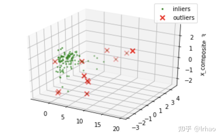
我们可以看到3D点,异常点大多是集群正常点,但一个2D点将帮助我们更好地判断。接下来,我们试着把同样的绘制成缩小到二维的主成分分析。
from sklearn.decomposition import PCA
pca = PCA(2)
pca.fit(metrics_df[to_model_columns])


res=pd.DataFrame(pca.transform(metrics_df[to_model_columns]))

Z = np.array(res)
figsize=(12, 7)
plt.figure(figsize=figsize)
plt.title("IsolationForest")
plt.contourf( Z, cmap=plt.cm.Blues_r)

b1 = plt.scatter(res[0], res[1], c='blue',
                 s=40,label="normal points")

b1 = plt.scatter(res.iloc[outlier_index,0],res.iloc[outlier_index,1], c='red',
                 s=40,  edgecolor="red",label="predicted outliers")
plt.legend(loc="upper right")
plt.show()
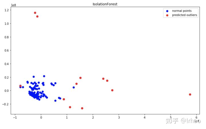
因此,2D绘图为我们提供了一幅清晰的画面,表明算法正确地分类了用例中的异常点。
异常用红色边缘突出显示,正常点用绿色点表示。
在这里,Contamination参数起着很大的作用。我们的想法是捕获系统中所有的异常点。因此,最好是识别几个可能是正常的异常点(假阳性),但不要错过捕捉异常点(真阴性)。(所以我指定了12%作为Contamination,这取决于具体用例)
#Installing specific version of plotly to avoid Invalid property for color error in recent version which needs change in layout
!pip install plotly==2.7.0
现在我们已经发现了用例级别的异常行为。但是,要对异常采取行动,重要的是识别并提供信息,单独说明哪些指标标准是异常的。
当业务用户可以直观地看到(突然的下降/峰值)算法识别的异常时,就可以对其采取行动。所以在这个过程中,创造一个好的视觉效果也同样重要。
这个函数在时间序列上创建实际绘图,并在其上突出显示异常点。还有一个表,它提供了实际数据、更改和基于异常的条件格式化。
from plotly.offline import download_plotlyjs, init_notebook_mode, plot, iplot
import plotly.plotly as py
import matplotlib.pyplot as plt
from matplotlib import pyplot
import plotly.graph_objs as go
init_notebook_mode(connected=True)
def plot_anomaly(df,metric_name):
    df.load_date = pd.to_datetime(df['load_date'].astype(str), format="%Y%m%d")
    dates = df.load_date
    #identify the anomaly points and create a array of its values for plot
    bool_array = (abs(df['anomaly']) > 0)
    actuals = df["actuals"][-len(bool_array):]
    anomaly_points = bool_array * actuals
    anomaly_points[anomaly_points == 0] = np.nan
    #A dictionary for conditional format table based on anomaly
    color_map = {0: "'rgba(228, 222, 249, 0.65)'", 1: "yellow", 2: "red"}

    #Table which includes Date,Actuals,Change occured from previous point
    table = go.Table(
        domain=dict(x=[0, 1],
                    y=[0, 0.3]),
        columnwidth=[1, 2],
        # columnorder=[0, 1, 2,],
        header=dict(height=20,
                    values=[['<b>Date</b>'], ['<b>Actual Values </b>'], ['<b>% Change </b>'],
                            ],
                    font=dict(color=['rgb(45, 45, 45)'] * 5, size=14),
                    fill=dict(color='#d562be')),
        cells=dict(values=[df.round(3)[k].tolist() for k in ['load_date', 'actuals', 'percentage_change']],
                   line=dict(color='#506784'),
                   align=['center'] * 5,
                   font=dict(color=['rgb(40, 40, 40)'] * 5, size=12),
                   # format = [None] + [",.4f"] + [',.4f'],
                   # suffix=[None] * 4,
                   suffix=[None] + [''] + [''] + ['%'] + [''],
                   height=27,
                   fill=dict(color=[test_df['anomaly_class'].map(color_map)],#map based on anomaly level from dictionary
                   )
                   ))
    #Plot the actuals points
    Actuals = go.Scatter(name='Actuals',
                         x=dates,
                         y=df['actuals'],
                         xaxis='x1', yaxis='y1',
                         mode='line',
                         marker=dict(size=12,
                                     line=dict(width=1),
                                     color="blue"))

    #Highlight the anomaly points
    anomalies_map = go.Scatter(name="Anomaly",
                               showlegend=True,
                               x=dates,
                               y=anomaly_points,
                               mode='markers',
                               xaxis='x1',
                               yaxis='y1',
                               marker=dict(color="red",
                                           size=11,
                                           line=dict(
                                               color="red",
                                               width=2)))


    axis = dict(
        showline=True,
        zeroline=False,
        showgrid=True,
        mirror=True,
        ticklen=4,
        gridcolor='#ffffff',
        tickfont=dict(size=10))

    layout = dict(
        width=1000,
        height=865,
        autosize=False,
        title=metric_name,
        margin=dict(t=75),
        showlegend=True,
        xaxis1=dict(axis, **dict(domain=[0, 1], anchor='y1', showticklabels=True)),
        yaxis1=dict(axis, **dict(domain=[2 * 0.21 + 0.20, 1], anchor='x1', hoverformat='.2f')))

    fig = go.Figure(data=[table, anomalies_map, Actuals], layout=layout)

    iplot(fig)
    pyplot.show()
    #return res
一个helper函数来查找百分比变化,根据严重程度对异常进行分类。
预测函数根据决策函数的结果,对数据进行异常分类。如果企业需要发现下一个可能产生影响的异常,可以使用这个来识别这些点。
前12个分位数为识别异常(高严重性),根据决策函数识别12-24个分位数点,将其分类为低严重性异常。
def classify_anomalies(df,metric_name):
    df['metric_name']=metric_name
    df = df.sort_values(by='load_date', ascending=False)
    #Shift actuals by one timestamp to find the percentage chage between current and previous data point
    df['shift'] = df['actuals'].shift(-1)
    df['percentage_change'] = ((df['actuals'] - df['shift']) / df['actuals']) * 100
    #Categorise anomalies as 0-no anomaly, 1- low anomaly , 2 - high anomaly
    df['anomaly'].loc[df['anomaly'] == 1] = 0
    df['anomaly'].loc[df['anomaly'] == -1] = 2
    df['anomaly_class'] = df['anomaly']
    max_anomaly_score = df['score'].loc[df['anomaly_class'] == 2].max()
    medium_percentile = df['score'].quantile(0.24)
    df['anomaly_class'].loc[(df['score'] > max_anomaly_score) & (df['score'] <= medium_percentile)] = 1
    return df
识别单个指标的异常并绘制结果。
X轴-日期,Y轴-实际值和异常点。
指标的实际值显示在蓝线中,异常点以红点突出显示。在表中,背景红色表示高异常,黄色表示低异常。
import warnings
warnings.filterwarnings('ignore')
for i in range(1,len(metrics_df.columns)-1):
    clf.fit(metrics_df.iloc[:,i:i+1])
    pred = clf.predict(metrics_df.iloc[:,i:i+1])
    test_df=pd.DataFrame()
    test_df['load_date']=metrics_df['load_date']
    #Find decision function to find the score and classify anomalies
    test_df['score']=clf.decision_function(metrics_df.iloc[:,i:i+1])
    test_df['actuals']=metrics_df.iloc[:,i:i+1]
    test_df['anomaly']=pred
    #Get the indexes of outliers in order to compare the metrics with use case anomalies if required
    outliers=test_df.loc[test_df['anomaly']==-1]
    outlier_index=list(outliers.index)
    test_df=classify_anomalies(test_df,metrics_df.columns[i])
    plot_anomaly(test_df,metrics_df.columns[i])
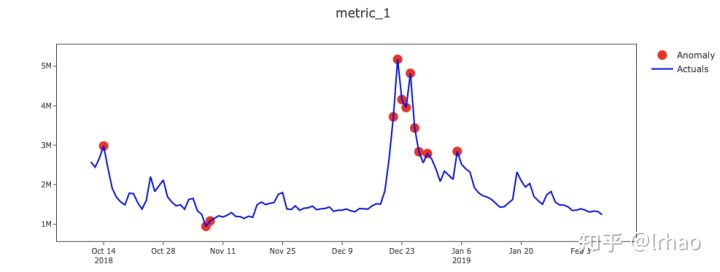
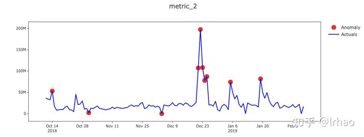
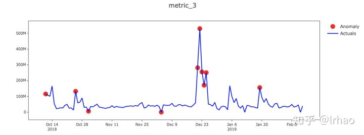
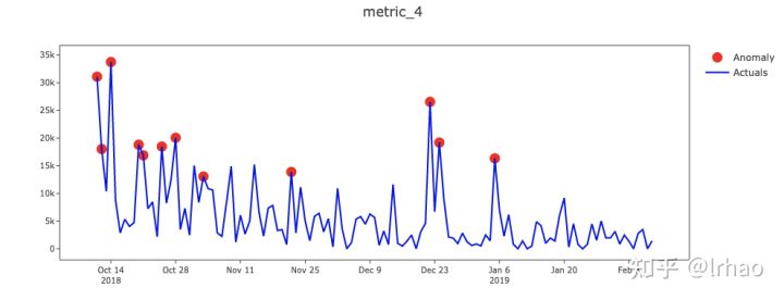
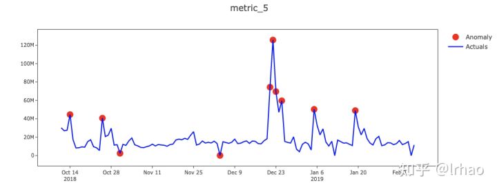
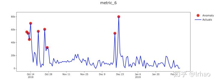

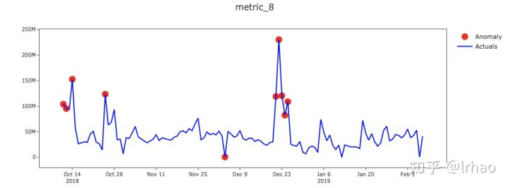
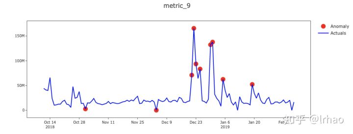
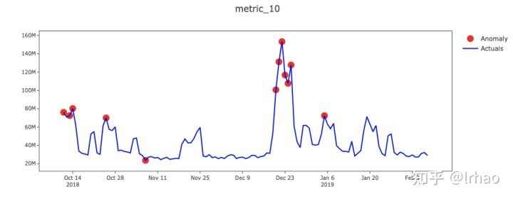
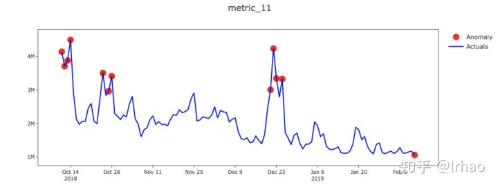
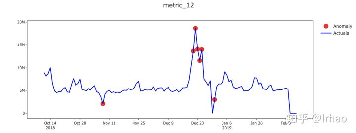
从图中,我们能够捕捉到指标的突然峰值和低谷,并将它们投射出来。
此外,条件格式的表(可以运行代码获取,这里太占用篇幅没有展现)还可以让我们了解一些情况,比如数据不存在(值为零),这可能是数据处理过程中pipeline破裂的潜在结果,需要修复,并突出显示高级别和低级别异常。
如何使用呢?
- 如果当前时间戳对于用例来说是异常的,那么深入到指标,找出时间戳中有高度异常的指标集,以便在其上执行PCA。
- 此外,业务用户的反馈可以更新回数据中,这将有助于将其转换为监督/半监督学习问题,并比较其结果。
- 这里的一种增强是将不断发生的反常行为结合起来。如,大促销日(游戏绑定:可能会导致数天内的指标飙升)可以显示为单一行为。
本文我们将用更多的算法模型,如SARIMA、Auto Arima、LSTM用于检测时间序列预测中的异常点。
时间序列是任何与时间相关的数据(日、小时、月等)。例如:商店每天的收入是一天级别的时间序列数据。需求估计、销售预测等许多用例是典型的时间序列预测问题。
时间序列预测通过使用当前数据进行估计,帮助我们为未来的需要做好准备。一旦我们有了预测,我们就可以使用这些数据来检测异常,并将其与实际数据进行比较。
本文将一一实现这些算法模型,看看他们的优缺点。
# This Python 3 environment comes with many helpful analytics libraries installed
# It is defined by the kaggle/python docker image: https://github.com/kaggle/docker-python
# For example, here's several helpful packages to load in

import numpy as np # linear algebra
import pandas as pd # data processing, CSV file I/O (e.g. pd.read_csv)

# Input data files are available in the "../input/" directory.
# For example, running this (by clicking run or pressing Shift+Enter) will list the files in the input directory

import os
print(os.listdir("../input"))
import warnings
warnings.filterwarnings('ignore')

# Any results you write to the current directory are saved as output.- 可视化包
#Installing specific version of plotly to avoid Invalid property for color error in recent version which needs change in layout
!pip install plotly==2.7.0
from plotly.offline import download_plotlyjs, init_notebook_mode, plot, iplot
import plotly.plotly as py
import matplotlib.pyplot as plt
from matplotlib import pyplot
import plotly.graph_objs as go
init_notebook_mode(connected=True)- 这里的时间序列数据是从1月11日到12月11日的每日数值。
import pandas as pd
time_series_df=pd.read_csv('../input/time-series-data/time_series_data.csv')
time_series_df.head()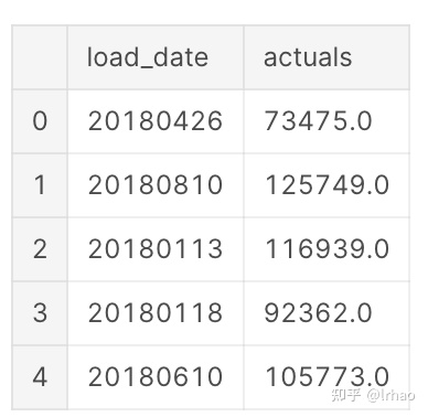
- 将其按时间顺序排列,因为我们要预测下一个点。将load_date列转换为datetime格式,并根据日期对数据进行排序。
time_series_df.load_date = pd.to_datetime(time_series_df.load_date, format='%Y%m%d')
time_series_df = time_series_df.sort_values(by="load_date")
time_series_df = time_series_df.reset_index(drop=True)
time_series_df.head()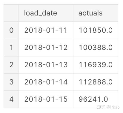
- 数值结果应用对数变换来稳定数据中的方差,或者在将其输入模型之前使其平稳。
actual_vals = time_series_df.actuals.values
actual_log = np.log10(actual_vals)- 将数据划分为训练集和测试集(包含70个点)
SARIMA & Auto Arima
首先尝试应用SARIMA算法进行预测。SARIMA代表Seasonal Auto Regressive Integrated Moving Average。它有一个季节性参数,由于销售数据的每周季节性(即周期性是一周),我们将其初始化为7。其他参数是p,d,q,这些参数是基于ACF和PACF图识别出来的,或者我们最好使用误差最小的参数进行预测。
SARIMA更多细节可以参考这里:https://people.duke.edu/~rnau/arimrule.htm
这里我将差分因子(d)指定为1。它帮助我们消除数据中的趋势和周期。
import math
import statsmodels.api as sm
import statsmodels.tsa.api as smt
from sklearn.metrics import mean_squared_error
from matplotlib import pyplot
import matplotlib.pyplot as plt
import plotly.plotly as py
import plotly.tools as tls

train, test = actual_vals[0:-70], actual_vals[-70:]

train_log, test_log = np.log10(train), np.log10(test)

my_order = (1, 1, 1)
my_seasonal_order = (0, 1, 1, 7)
每次我们预测下一个数据点,我们通过训练数据循环预测下一个数据,并在预测后添加下一个数据点,以进一步预测。这就像一个移动窗口每日水平数据(例如:前90点用于预测任何给定时间的下一个点),然后将预测数据转换回10倍变换,并绘制结果。
history = [x for x in train_log]
predictions = list()
predict_log=list()
for t in range(len(test_log)):
    model = sm.tsa.SARIMAX(history, order=my_order, seasonal_order=my_seasonal_order,enforce_stationarity=False,enforce_invertibility=False)
    model_fit = model.fit(disp=0)
    output = model_fit.forecast()
    predict_log.append(output[0])
    yhat = 10**output[0]
    predictions.append(yhat)
    obs = test_log[t]
    history.append(obs)
   # print('predicted=%f, expected=%f' % (output[0], obs))
#error = math.sqrt(mean_squared_error(test_log, predict_log))
#print('Test rmse: %.3f' % error)
# plot
figsize=(12, 7)
plt.figure(figsize=figsize)
pyplot.plot(test,label='Actuals')
pyplot.plot(predictions, color='red',label='Predicted')
pyplot.legend(loc='upper right')
pyplot.show()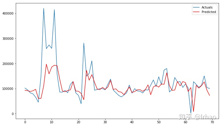
这是一个很好的时间序列预测。趋势、季节性是时间序列数据中的两个重要因素,如果您的算法能够捕获数据的趋势(向上/向下),如果您的数据是季节性的(每天、每周、每个季度、每年的模式),那么您的算法就适合就是一个不错的选择。
在这里,我们可以观察SARIMA算法从峰值捕获趋势,并很好地预测了正常日子的实际情况。
我们在这里指定的参数似乎可以很好地用于度量,但验证、调优参数并绘图将是一项艰难的任务。解决这个问题的一个方法是Auto Arima,它在我们指定的范围内返回算法的最佳参数集。
- 安装pyramid-arima
!pip install pyramid-arima让我们使用auto_arima找到p和q参数,并指定d为1的一阶差分和季节性为7的每周季节性。
from pyramid.arima import auto_arima
stepwise_model = auto_arima(train_log, start_p=1, start_q=1,
                           max_p=3, max_q=3, m=7,
                           start_P=0, seasonal=True,
                           d=1, D=1, trace=True,
                           error_action='ignore',
                           suppress_warnings=True,
                           stepwise=True)
print(stepwise_model)
auo-arim模型可以用同样的方法进行逐步预测
import math
import statsmodels.api as sm
import statsmodels.tsa.api as smt
from sklearn.metrics import mean_squared_error
train, test = actual_vals[0:-70], actual_vals[-70:]

train_log, test_log = np.log10(train), np.log10(test)

# split data into train and test-sets

history = [x for x in train_log]
predictions = list()
predict_log=list()
for t in range(len(test_log)):
    #model = sm.tsa.SARIMAX(history, order=my_order, seasonal_order=my_seasonal_order,enforce_stationarity=False,enforce_invertibility=False)
    stepwise_model.fit(history)
    output = stepwise_model.predict(n_periods=1)
    predict_log.append(output[0])
    yhat = 10**output[0]
    predictions.append(yhat)
    obs = test_log[t]
    history.append(obs)
    #print('predicted=%f, expected=%f' % (output[0], obs))
#error = math.sqrt(mean_squared_error(test_log, predict_log))
#print('Test rmse: %.3f' % error)
# plot
figsize=(12, 7)
plt.figure(figsize=figsize)
pyplot.plot(test,label='Actuals')
pyplot.plot(predictions, color='red',label='Predicted')
pyplot.legend(loc='upper right')
pyplot.show()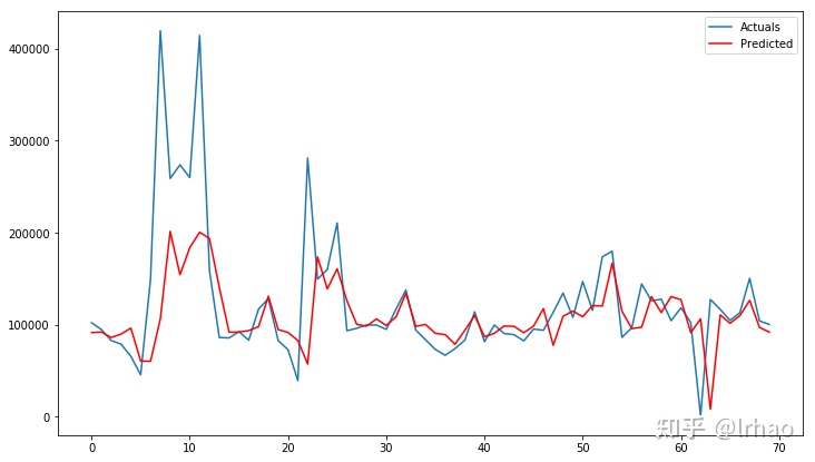
在这种情况下,auto arima和我们最初的SARIMA在预测方面也做得很好,因为它们不会去过拟合数据集。
下一步让创建一个可用数据框与实际数据和预测的结果可视化
predicted_df=pd.DataFrame()
predicted_df['load_date']=time_series_df['load_date'][-70:]
predicted_df['actuals']=test
predicted_df['predicted']=predictions
predicted_df.reset_index(inplace=True)
del predicted_df['index']
predicted_df.head()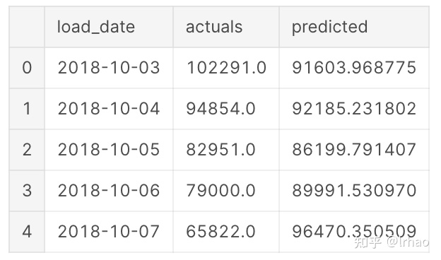
我们有预测和实际的结果,以检测异常点这一信息。
注意:只有当数据是正态分布/高斯分布时,这才有效。
检测异常的步骤:
- 计算误差项(实际-预测)。
- 计算滑动窗口均值和标准差(这里窗口为一周)。
- 将误差为1.5、1.75、2个标准差的数据划分为低、中、高异常值。(根据该特性,5%的数据点将被识别为异常)
这里使用lambda函数对基于误差和标准偏差的异常进行分类,而不是为其提供单独的循环和函数。
import numpy as np
def detect_classify_anomalies(df,window):
df.replace([np.inf, -np.inf], np.NaN, inplace=True)
df.fillna(0,inplace=True)
df['error']=df['actuals']-df['predicted']
df['percentage_change'] = ((df['actuals'] - df['predicted']) / df['actuals']) * 100
df['meanval'] = df['error'].rolling(window=window).mean()
df['deviation'] = df['error'].rolling(window=window).std()
df['-3s'] = df['meanval'] - (2 * df['deviation'])
df['3s'] = df['meanval'] + (2 * df['deviation'])
df['-2s'] = df['meanval'] - (1.75 * df['deviation'])
df['2s'] = df['meanval'] + (1.75 * df['deviation'])
df['-1s'] = df['meanval'] - (1.5 * df['deviation'])
df['1s'] = df['meanval'] + (1.5 * df['deviation'])
cut_list = df[['error', '-3s', '-2s', '-1s', 'meanval', '1s', '2s', '3s']]
cut_values = cut_list.values
cut_sort = np.sort(cut_values)
df['impact'] = [(lambda x: np.where(cut_sort == df['error'][x])[1][0])(x) for x in
range(len(df['error']))]
severity = {0: 3, 1: 2, 2: 1, 3: 0, 4: 0, 5: 1, 6: 2, 7: 3}
region = {0: "NEGATIVE", 1: "NEGATIVE", 2: "NEGATIVE", 3: "NEGATIVE", 4: "POSITIVE", 5: "POSITIVE", 6: "POSITIVE",
7: "POSITIVE"}
df['color'] = df['impact'].map(severity)
df['region'] = df['impact'].map(region)
df['anomaly_points'] = np.where(df['color'] == 3, df['error'], np.nan)
df = df.sort_values(by='load_date', ascending=False)
df.load_date = pd.to_datetime(df['load_date'].astype(str), format="%Y-%m-%d")
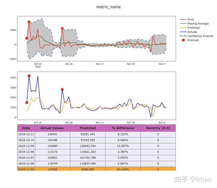
return df下面是一个可视化结果的函数。同样,清晰全面的可视化的重要性可以帮助业务用户对异常情况提供反馈,并使结果具有可操作性。
第一个图具有指定上下限边界的误差项。
异常突出显示的实际图形将很容易为用户解释/验证,因此第二幅图突出了异常的实际值和预测值。
- 蓝线-实际值
- 橙色线-预测值
- 红色-误差值
- 绿色-移动平均
- 虚线-正常行为的上下限
def plot_anomaly(df,metric_name):
    #error = pd.DataFrame(Order_results.error.values)
    #df = df.sort_values(by='load_date', ascending=False)
    #df.load_date = pd.to_datetime(df['load_date'].astype(str), format="%Y%m%d")
    dates = df.load_date
    #meanval = error.rolling(window=window).mean()
    #deviation = error.rolling(window=window).std()
    #res = error

    #upper_bond=meanval + (2 * deviation)
    #lower_bond=meanval - (2 * deviation)

    #anomalies = pd.DataFrame(index=res.index, columns=res.columns)
    #anomalies[res < lower_bond] = res[res < lower_bond]
    #anomalies[res > upper_bond] = res[res > upper_bond]
    bool_array = (abs(df['anomaly_points']) > 0)


    #And a subplot of the Actual Values.
    actuals = df["actuals"][-len(bool_array):]
    anomaly_points = bool_array * actuals
    anomaly_points[anomaly_points == 0] = np.nan

    #Order_results['meanval']=meanval
    #Order_results['deviation']=deviation

    color_map= {0: "'rgba(228, 222, 249, 0.65)'", 1: "yellow", 2: "orange", 3: "red"}
    table = go.Table(
    domain=dict(x=[0, 1],
                y=[0, 0.3]),
    columnwidth=[1, 2 ],
    #columnorder=[0, 1, 2,],
    header = dict(height = 20,
                  values = [['<b>Date</b>'],['<b>Actual Values </b>'],
                            ['<b>Predicted</b>'], ['<b>% Difference</b>'],['<b>Severity (0-3)</b>']],
                 font = dict(color=['rgb(45, 45, 45)'] * 5, size=14),
                  fill = dict(color='#d562be')),
    cells = dict(values = [df.round(3)[k].tolist() for k in ['load_date', 'actuals', 'predicted',
                                                               'percentage_change','color']],
                 line = dict(color='#506784'),
                 align = ['center'] * 5,
                 font = dict(color=['rgb(40, 40, 40)'] * 5, size=12),
                 #format = [None] + [",.4f"] + [',.4f'],

                 #suffix=[None] * 4,
                 suffix=[None] + [''] + [''] + ['%'] + [''],
                 height = 27,
                 #fill = dict(color=['rgb(235, 193, 238)', 'rgba(228, 222, 249, 0.65)']))
                 fill=dict(color=  # ['rgb(245,245,245)',#unique color for the first column
                      [df['color'].map(color_map)],
                      )
    ))


    #df['ano'] = np.where(df['color']==3, df['error'], np.nan)

    anomalies = go.Scatter(name="Anomaly",
                       x=dates,
                       xaxis='x1',
                       yaxis='y1',
                       y=df['anomaly_points'],
                       mode='markers',
                       marker = dict(color ='red',
                      size = 11,line = dict(
                                         color = "red",
                                         width = 2)))

    upper_bound = go.Scatter(hoverinfo="skip",
                         x=dates,
                         showlegend =False,
                         xaxis='x1',
                         yaxis='y1',
                         y=df['3s'],
                         marker=dict(color="#444"),
                         line=dict(
                             color=('rgb(23, 96, 167)'),
                             width=2,
                             dash='dash'),
                         fillcolor='rgba(68, 68, 68, 0.3)',
                         fill='tonexty')

    lower_bound = go.Scatter(name='Confidence Interval',
                          x=dates,
                         xaxis='x1',
                         yaxis='y1',
                          y=df['-3s'],
                          marker=dict(color="#444"),
                          line=dict(
                              color=('rgb(23, 96, 167)'),
                              width=2,
                              dash='dash'),
                          fillcolor='rgba(68, 68, 68, 0.3)',
                          fill='tonexty')

    Actuals = go.Scatter(name= 'Actuals',
                     x= dates,
                     y= df['actuals'],
                    xaxis='x2', yaxis='y2',
                     mode='line',
                     marker=dict(size=12,
                                 line=dict(width=1),
                                 color="blue"))

    Predicted = go.Scatter(name= 'Predicted',
                     x= dates,
                     y= df['predicted'],
                    xaxis='x2', yaxis='y2',
                     mode='line',
                     marker=dict(size=12,
                                 line=dict(width=1),
                                 color="orange"))


    # create plot for error...
    Error = go.Scatter(name="Error",
                   x=dates, y=df['error'],
                   xaxis='x1',
                   yaxis='y1',
                   mode='line',
                   marker=dict(size=12,
                               line=dict(width=1),
                               color="red"),
                   text="Error")


    anomalies_map = go.Scatter(name = "anomaly actual",
                                   showlegend=False,
                                   x=dates,
                                   y=anomaly_points,
                                   mode='markers',
                                   xaxis='x2',
                                   yaxis='y2',
                                    marker = dict(color ="red",
                                  size = 11,
                                 line = dict(
                                     color = "red",
                                     width = 2)))

    Mvingavrg = go.Scatter(name="Moving Average",
                           x=dates,
                           y=df['meanval'],
                           mode='line',
                           xaxis='x1',
                           yaxis='y1',
                           marker=dict(size=12,
                                       line=dict(width=1),
                                       color="green"),
                           text="Moving average")


    axis=dict(
    showline=True,
    zeroline=False,
    showgrid=True,
    mirror=True,
    ticklen=4,
    gridcolor='#ffffff',
    tickfont=dict(size=10))

    layout = dict(
    width=1000,
    height=865,
    autosize=False,
    title= metric_name,
    margin = dict(t=75),
    showlegend=True,
    xaxis1=dict(axis, **dict(domain=[0, 1], anchor='y1', showticklabels=True)),
    xaxis2=dict(axis, **dict(domain=[0, 1], anchor='y2', showticklabels=True)),
    yaxis1=dict(axis, **dict(domain=[2 * 0.21 + 0.20 + 0.09, 1], anchor='x1', hoverformat='.2f')),
    yaxis2=dict(axis, **dict(domain=[0.21 + 0.12, 2 * 0.31 + 0.02], anchor='x2', hoverformat='.2f')))


    fig = go.Figure(data = [table,anomalies,anomalies_map,
                        upper_bound,lower_bound,Actuals,Predicted,
                        Mvingavrg,Error], layout = layout)

    iplot(fig)
    pyplot.show()

classify_df=detect_classify_anomalies(predicted_df,7)
classify_df.reset_index(inplace=True)
del classify_df['index']
classify_df.head()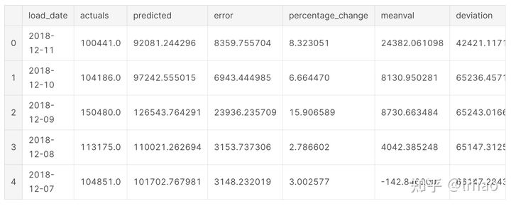
调用plot函数并将结果可视化。
plot_anomaly(classify_df.iloc[:-6,:],"metric_name")- 通过使用滑动窗口均值和标准偏差,我们可以避免在大销售日等情况下出现连续的虚假异常。
- 第一个峰值或下降是突出显示后,阈值得到调整。
- 表格还提供了实际数据、预测值、变化量和条件格式的基础上的异常级别。
LSTM
接下来,我们也尝试使用LSTM这种递归神经网络进行预测。
LSTM时间序列预测的更多细节参考这里:https://machinelearningmastery.com/time-series-prediction-lstm-recurrent-neural-networks-python-keras/
from pandas import DataFrame
from pandas import Series
from pandas import concat
from pandas import read_csv
from pandas import datetime
from sklearn.metrics import mean_squared_error
from sklearn.preprocessing import MinMaxScaler
from keras.models import Sequential
from keras.layers import Dense
from keras.layers import LSTM
from math import sqrt
下面是LSTM的差分、缩放和逆函数以及训练、预测的helper函数。
# frame a sequence as a supervised learning problem
def timeseries_to_supervised(data, lag=1):
    df = DataFrame(data)
    columns = [df.shift(i) for i in range(1, lag+1)]
    columns.append(df)
    df = concat(columns, axis=1)
    df.fillna(0, inplace=True)
    return df

# create a differenced series
def difference(dataset, interval=1):
    diff = list()
    for i in range(interval, len(dataset)):
        value = dataset[i] - dataset[i - interval]
        diff.append(value)
    return Series(diff)

# invert differenced value
def inverse_difference(history, yhat, interval=1):
    return yhat + history[-interval]

# scale train and test data to [-1, 1]
def scale(train, test):
    # fit scaler
    scaler = MinMaxScaler(feature_range=(-1, 1))
    scaler = scaler.fit(train)
    # transform train
    train = train.reshape(train.shape[0], train.shape[1])
    train_scaled = scaler.transform(train)
    # transform test
    test = test.reshape(test.shape[0], test.shape[1])
    test_scaled = scaler.transform(test)
    return scaler, train_scaled, test_scaled

# inverse scaling for a forecasted value
def invert_scale(scaler, X, value):
    new_row = [x for x in X] + [value]
    array = np.array(new_row)
    array = array.reshape(1, len(array))
    inverted = scaler.inverse_transform(array)
    return inverted[0, -1]

# fit an LSTM network to training data
def fit_lstm(train, batch_size, nb_epoch, neurons):
    X, y = train[:, 0:-1], train[:, -1]
    X = X.reshape(X.shape[0], 1, X.shape[1])
    model = Sequential()
    model.add(LSTM(neurons, batch_input_shape=(batch_size, X.shape[1], X.shape[2]), stateful=True))
    model.add(Dense(1))
    model.compile(loss='mean_squared_error', optimizer='adam')
    for i in range(nb_epoch):
        model.fit(X, y, epochs=1, batch_size=batch_size, verbose=0, shuffle=False)
        model.reset_states()
    return model

# make a one-step forecast
def forecast_lstm(model, batch_size, X):
    X = X.reshape(1, 1, len(X))
    yhat = model.predict(X, batch_size=batch_size)
    return yhat[0,0]

#### LSTM
supervised = timeseries_to_supervised(actual_log, 1)
supervised_values = supervised.values

# split data into train and test-sets
train_lstm, test_lstm = supervised_values[0:-70], supervised_values[-70:]

# transform the scale of the data
scaler, train_scaled_lstm, test_scaled_lstm = scale(train_lstm, test_lstm)
对训练数据进行LSTM神经网络训练。
# fit the model                 batch,Epoch,Neurons
lstm_model = fit_lstm(train_scaled_lstm, 1, 850 , 3)
# forecast the entire training dataset to build up state for forecasting
train_reshaped = train_scaled_lstm[:, 0].reshape(len(train_scaled_lstm), 1, 1)
#lstm_model.predict(train_reshaped, batch_size=1)
利用LSTM对预测数据进行分析并绘制结果
from matplotlib import pyplot
import matplotlib.pyplot as plt
import plotly.plotly as py
import plotly.tools as tls

# walk-forward validation on the test data
predictions = list()
for i in range(len(test_scaled_lstm)):
#make one-step forecast
    X, y = test_scaled_lstm[i, 0:-1], test_scaled_lstm[i, -1]
    yhat = forecast_lstm(lstm_model, 1, X)
    # invert scaling
    yhat = invert_scale(scaler, X, yhat)
    # invert differencing
    #yhat = inverse_difference(raw_values, yhat, len(test_scaled)+1-i)
    # store forecast
    predictions.append(10**yhat)
    expected = actual_log[len(train_lstm) + i ]
# line plot of observed vs predicted
figsize=(12, 7)
plt.figure(figsize=figsize)
pyplot.plot(actual_vals[-70:],label='Actuals')
pyplot.plot(predictions, color = "red",label='Predicted')
pyplot.legend(loc='upper right')
pyplot.show()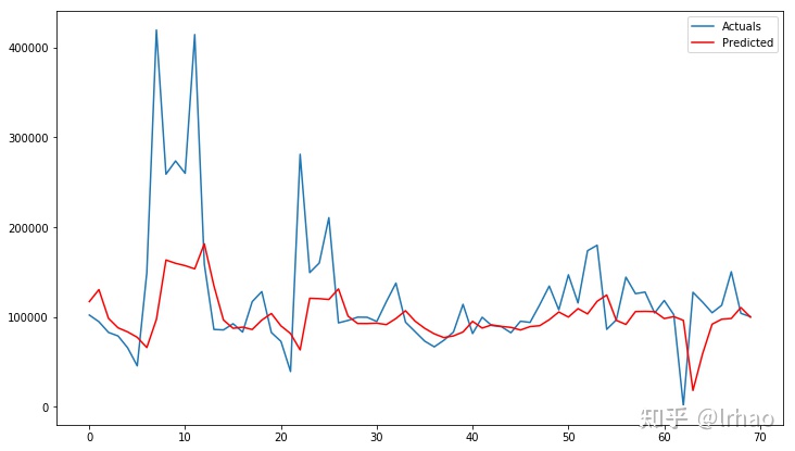
LSTM也可以很好地用于这个指标预测。LSTM神经网络的重要参数是激活函数、神经元数量、批处理规模和epochs,这些参数需要进行调整以获得更好的结果
现在让我们在一个不同的指标数据中尝试一下,数据为同一时间段。
tf_df=pd.read_csv('../input/forecast-metric2/time_series_metric2.csv')
tf_df.head()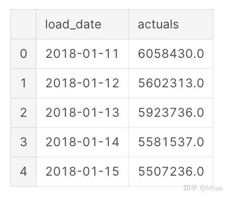
在此基础上,利用auto arima算法得到最佳参数并逐步进行预测,绘制实际和预测的结果。
actual_vals = tf_df.actuals.values
train, test = actual_vals[0:-70], actual_vals[-70:]
train_log, test_log = np.log10(train), np.log10(test)
from pyramid.arima import auto_arima
stepwise_model = auto_arima(train_log, start_p=1, start_q=1,
                           max_p=3, max_q=3, m=7,
                           start_P=0, seasonal=True,
                           d=1, D=1, trace=True,
                           error_action='ignore',
                           suppress_warnings=True,
                           stepwise=True)
history = [x for x in train_log]
predictions = list()
predict_log=list()
for t in range(len(test_log)):
    #model = sm.tsa.SARIMAX(history, order=my_order, seasonal_order=my_seasonal_order,enforce_stationarity=False,enforce_invertibility=False)
    stepwise_model.fit(history,enforce_stationarity=False,enforce_invertibility=False)
    output = stepwise_model.predict(n_periods=1)
    predict_log.append(output[0])
    yhat = 10**output[0]
    predictions.append(yhat)
    obs = test_log[t]
    history.append(obs)
    #print('predicted=%f, expected=%f' % (output[0], obs))
#error = math.sqrt(mean_squared_error(test_log, predict_log))
#print('Test rmse: %.3f' % error)
# plot
figsize=(12, 7)
plt.figure(figsize=figsize)
pyplot.plot(test,label='Actuals')
pyplot.plot(predictions, color='red',label='Predicted')
pyplot.legend(loc='upper right')
pyplot.show()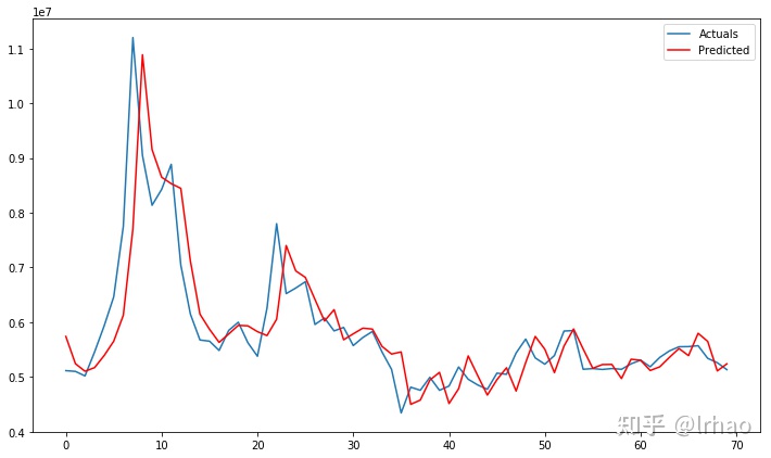
感受总结
- 在这里,算法试图追踪实际数据。虽然这可能是一个很好的预测,其中错误是低的,但实际中的异常行为不能用它来识别。
- 这是一个利用预测技术进行异常检测的问题。我们试图捕捉数据中的趋势/季节性,同时优化错误以获得实际数据的精确脚本(这使得我们很难发现异常)。
- 每个指标都需要通过参数进行微调来验证,以便在使用预测检测异常时检测到异常。
- 对于数据分布不同的指标标准,还需要采用不同的方法来识别异常。
- 上篇文章中孤立森林检测了一次由多个指标组成的用例的异常,我们深入研究了其中单个指标的异常,孤立森林这样的算法将异常行为从数据中分离出来,可以用于推广到多个指标。


 2万+
2万+


 被折叠的 条评论
为什么被折叠?
被折叠的 条评论
为什么被折叠?
 到【灌水乐园】发言


