


 本文通过携程移动端页面布局为例,介绍了使用rem、flexible.js和less进行响应式布局的技术实现。首先分析了效果图,然后详细讲解了技术选型,包括重置样式、设置自适应屏幕宽度和应用flexible.js。接着,阐述了如何限制body的最大最小宽度以保持内容居中,并使用flex布局使内容纵向排列。最后,提到了项目案例的链接,供读者进一步研究。
移动端页面布局-以 携程为例
效果图分析
效果图详解: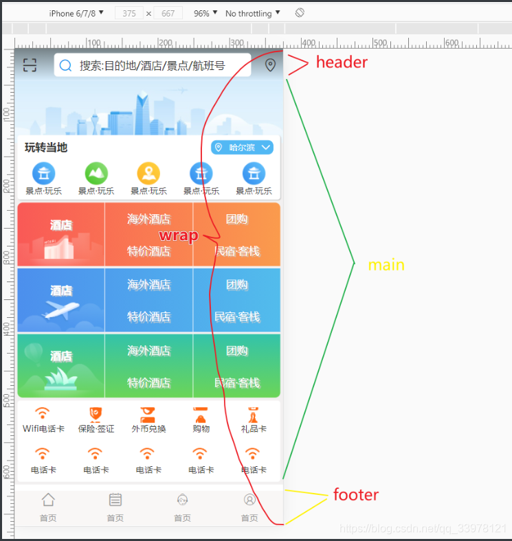
技术选型:rem+flexible.js+less
1.技术详解重置样式:引入<link rel="stylesheet" href="./css/base.css"> 重置样式,其中最重要的是html,body{ height: 100%; } 为了下面的flex布局
/* =====================reset================= */
body,h1,h2,h3,h4,h5,h6,a,p,img,ul,li,ol,dl,dt,dd,figcaption,figure,input{
padding: 0;
}
img{
display: block;
border: none;
}
input{
outline: none;
}
ul,ol{
list-style: none;
}
body{
font-size: 12px;
font-family: "微软雅黑";
color: #333333;
}
a{
text-decoration: none;
color: #999;
}
header,footer,nav,aside,section,article,figure,figcaption
 最低0.47元/天 解锁文章


 扫一扫
扫一扫


 669
669

 被折叠的 条评论
为什么被折叠?
被折叠的 条评论
为什么被折叠?
 到【灌水乐园】发言


