本篇文章详细介绍flex-direction
	flex-direction 是控制盒模型容器下一级子元素的排列方式的属性 一共有四种
		row(默认值):主轴为水平方向,起点在左端。
		row-reverse:主轴为水平方向,起点在右端。
		column:主轴为垂直方向,起点在上沿。
		column-reverse:主轴为垂直方向,起点在下沿。
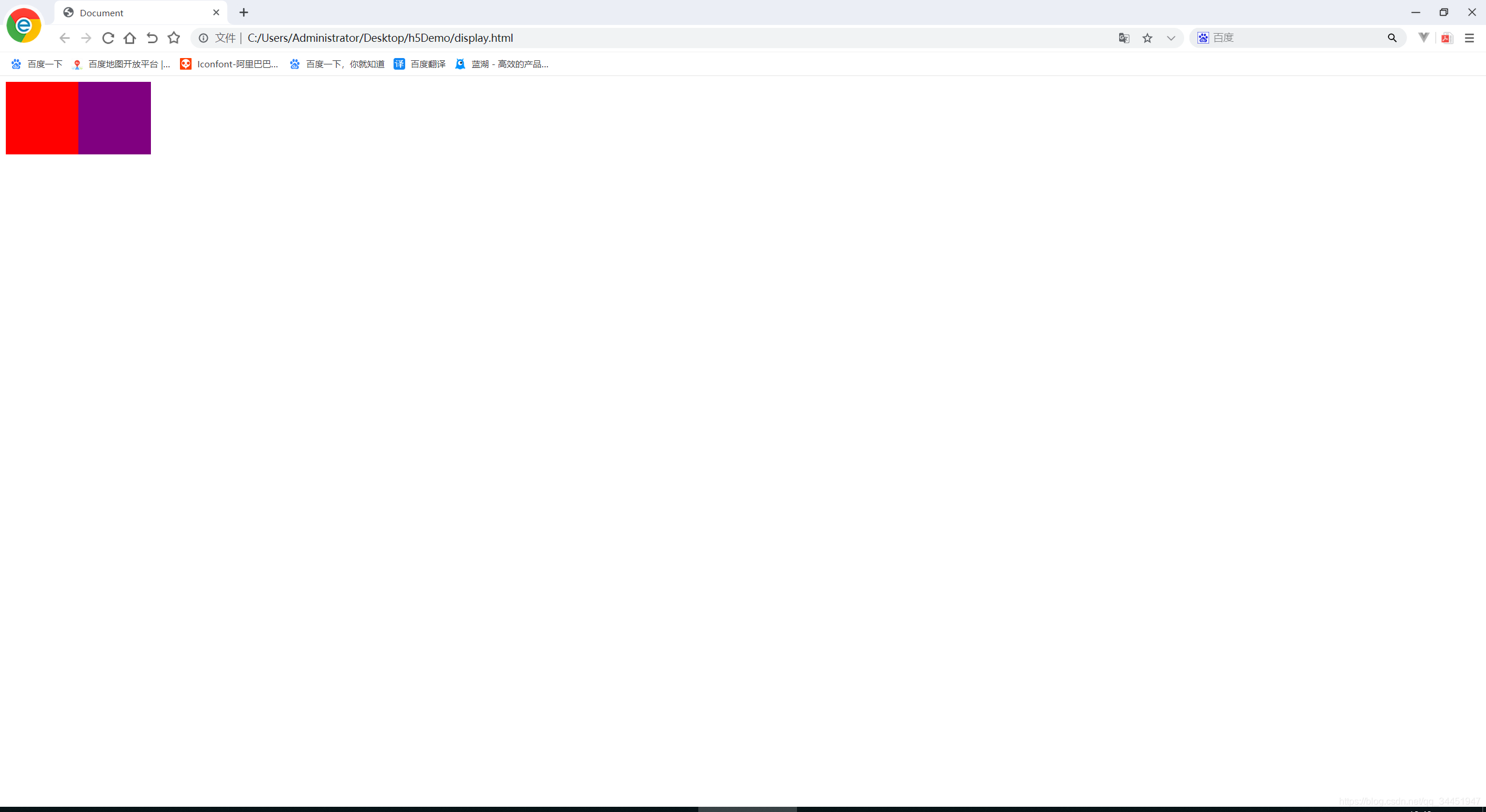
//第一种属性  flex-direction:row  该属性默认存在即创建了盒模型就会是默认这一条  行排列 靠左
<style>
    .flex-box{
         display: flex;
     }

     .box1{
         width: 100px;
         height: 100px;
         background-color: red;
     }.box2{
         width: 100px;
         height: 100px;
         background-color: purple;
     }
 </style>
<div class="flex-box">
    <div class="box1"></div>
    <div class="box2"></div>
</div>
效果演示如下: //在演示中可以看出来两个盒子box1和box2 没有浮动 没有定位也没有改变作用域 就在一行显示
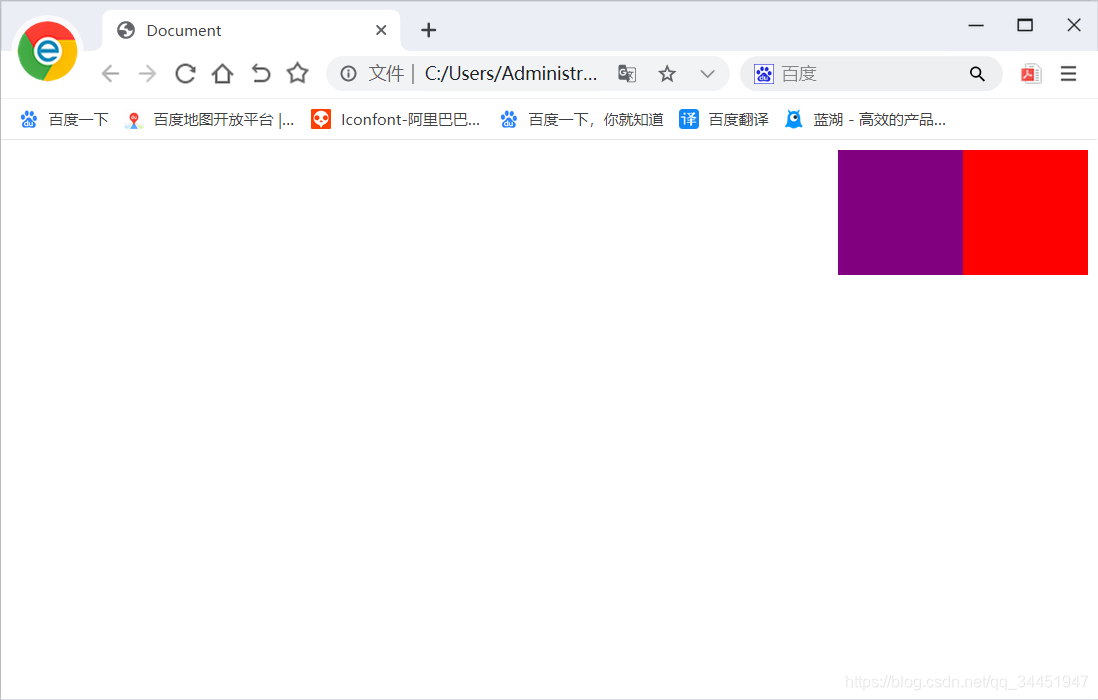
//第二种属性 flex-direction: row-reverse;:主轴为水平方向,起点在右端。  该 行排列 靠右
<!DOCTYPE html>
<html lang="en">
<head>
    <meta charset="UTF-8">
    <meta name="viewport" content="width=device-width, initial-scale=1.0">
    <meta http-equiv="X-UA-Compatible" content="ie=edge">
    <title>Document</title>
    <style>
        .flex-box{
            display: flex;
            flex-direction: row-reverse;
        }

        .box1{
            width: 100px;
            height: 100px;
            background-color: red;
        }.box2{
            width: 100px;
            height: 100px;
            background-color: purple;
        }
    </style>
</head>
<body>
    <div class="flex-box">
        <div class="box1"></div>
        <div class="box2"></div>
    </div>
</body>
</html>
效果演示如下:
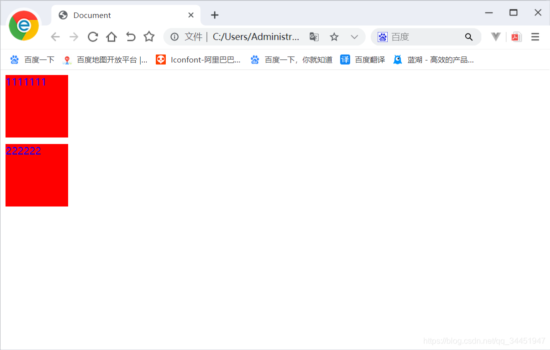
//第三种属性 flex-direction: column:主轴为垂直方向,起点在左端。   列排序 由上向下正常排列

<!DOCTYPE html>
<html lang="en">
<head>
    <meta charset="UTF-8">
    <meta name="viewport" content="width=device-width, initial-scale=1.0">
    <meta http-equiv="X-UA-Compatible" content="ie=edge">
    <title>Document</title>
    <style>
        .flex-box{
            display: flex;
            flex-direction: column;
        }

        .box{
            width: 100px;
            height: 100px;
            background-color: red;
            margin-bottom: 10px;
        }
    </style>
</head>
<body>
    <div class="flex-box">
        <div class="box">1111111</div>
        <div class="box">222222</div>
    </div>
</body>
</html>
效果演示如下:
//第四种属性 flex-direction: column-reverse:主轴为垂直方向,起点在左端。    列排序 由下向上

<!DOCTYPE html>
<html lang="en">
<head>
    <meta charset="UTF-8">
    <meta name="viewport" content="width=device-width, initial-scale=1.0">
    <meta http-equiv="X-UA-Compatible" content="ie=edge">
    <title>Document</title>
    <style>
        .flex-box{
            display: flex;
            flex-direction:column-reverse;
        }

        .box{
            width: 100px;
            height: 100px;
            background-color: red;
            margin-bottom: 10px;
            color: blue;
        }
    </style>
</head>
<body>
    <div class="flex-box">
        <div class="box">1111111</div>
        <div class="box">222222</div>
    </div>
</body>
</html>
效果演示如下:


 4万+
4万+


 被折叠的 条评论
为什么被折叠?
被折叠的 条评论
为什么被折叠?
 到【灌水乐园】发言


