


目录
明确定义什么样式
要统一窗体风格样式,就要明确自己要使用什么样的风格样式,我这里使用统一的 圆角边框,调整原始窗体的最大化最小化和关闭按钮的窗体样式。
抛弃原始样式
定义圆角窗体样式
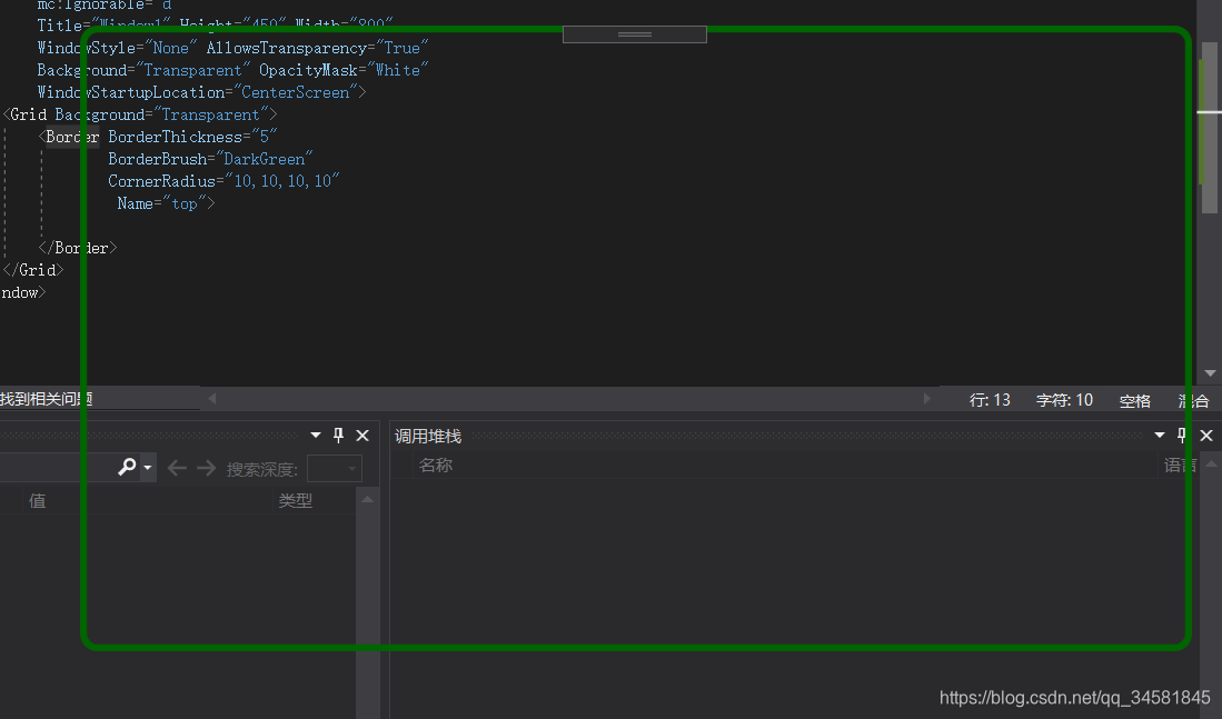
我们需要设置WPF的窗体样式为None,其次,我们需要设置AllowTransParency为True,BackGround为Transparent,OpacityMask为White,这样设置才能保证当我们设置为圆角的时候,四个角能够透明显示。圆角使用Border元素即可简单实现,首先要明确它的几个属性,BorderThickness用来表示Border的粗细程度,BorderBrush用来表示Border的颜色,CornerRadius表明四个角的弯曲度。实现代码如下:
<Window x:Class="WpfApp1.Point.Window1"
        xmlns="http://schemas.microsoft.com/winfx/2006/xaml/presentation"
        xmlns:x="http://schemas.microsoft.com/winfx/2006/xaml"
        xmlns:d="http://schemas.microsoft.com/expression/blend/2008"
        xmlns:mc="http://schemas.openxmlformats.org/markup-compatibility/2006"
        xmlns:local="clr-namespace:WpfApp1.Point"
        mc:Ignorable="d"
        Title="Window1" Height="450" Width="800"
        WindowStyle="None" AllowsTransparency="True"
        Background="Transparent" OpacityMask="White"
        WindowStartupLocation="CenterScreen">
    <Grid Background="Transparent">
        <Border BorderThickness="5"
                BorderBrush="DarkGreen"
                CornerRadius="10,10,10,10"
                 Name="top">

        </Border>
    </Grid>
</Window>
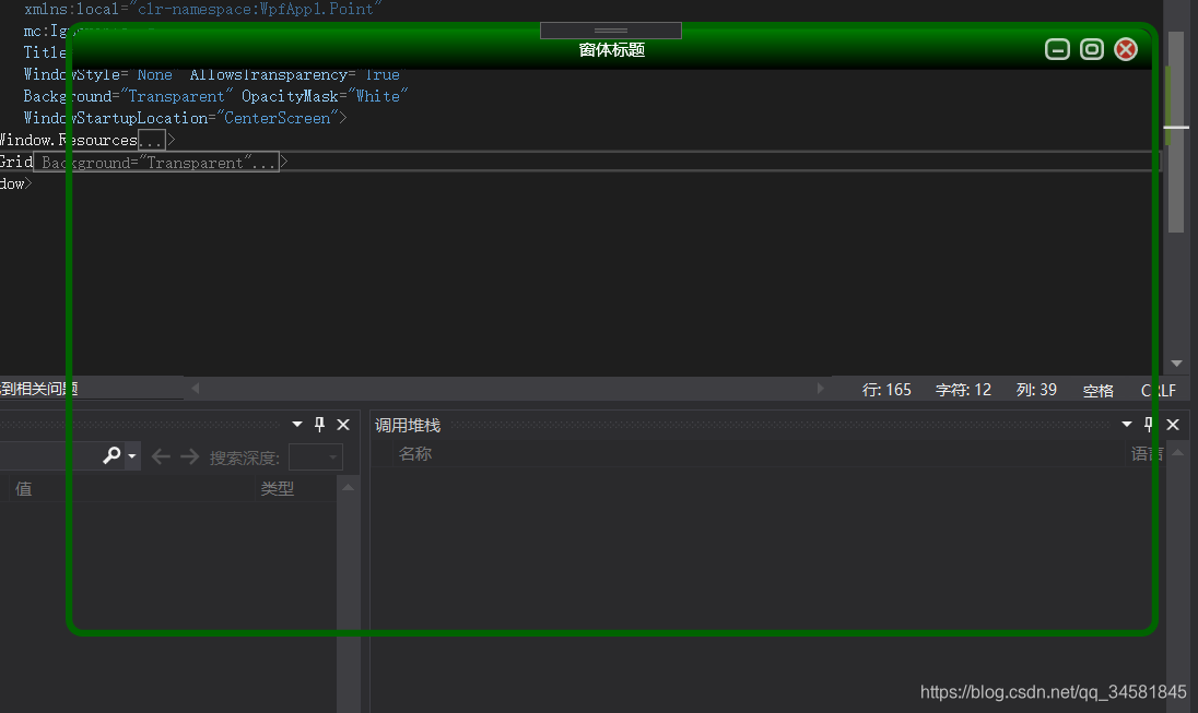
运行效果如下(窗体圆角透明):
调整窗体最大化最小化和关闭样式
代码如下:
    <Window.Resources>
        <!-- Close Button -->
        <Style x:Key="CloseRadialButton" TargetType="Button">
            <Setter Property="SnapsToDevicePixels" Value="true" />
            <Setter Property="OverridesDefaultStyle" Value="true" />
            <Setter Property="MinHeight" Value="13" />
            <Setter Property="MinWidth" Value="13" />
            <Setter Property="Opacity" Value=".75"/>
            <Setter Property="Template">
                <Setter.Value>
                    <ControlTemplate TargetType="Button">
                        <Grid>
                            <Ellipse x:Name="borderBtn" Width="18" Height="18" StrokeThickness="2" Fill="#FFE52B2B" Stroke="White"></Ellipse>

                            <!--按钮内容-->
                            <Grid>
                                <Canvas HorizontalAlignment="Left" VerticalAlignment="Top" Margin="5">
                                    <Line StrokeThickness="2" Stroke="White" X1="0" Y1="0" X2="8" Y2="8"></Line>
                                    <Line StrokeThickness="2" Stroke="White" X1="0" Y1="8" X2="8" Y2="0"></Line>
                                </Canvas>
                            </Grid>
                        </Grid>
                        <ControlTemplate.Triggers>
                            <Trigger Property="Button.IsMouseOver"  Value="True">
                                <Setter Property="Opacity" Value="1" />
                            </Trigger>
                        </ControlTemplate.Triggers>
                    </ControlTemplate>
                </Setter.Value>
            </Setter>
        </Style>
        <!-- Minimize Button -->
        <Style x:Key="MinimizeRadialButton" TargetType="Button">
            <Setter Property="SnapsToDevicePixels" Value="true" />
            <Setter Property="OverridesDefaultStyle" Value="true" />
            <Setter Property="MinHeight" Value="13" />
            <Setter Property="MinWidth" Value="13" />
            <Setter Property="Opacity" Value=".75" />
            <Setter Property="Template">
                <Setter.Value>
                    <ControlTemplate TargetType="Button">
                        <Grid>
                            <Rectangle Width="18" Height="16" Fill="White" Opacity=".1" RadiusX="4" RadiusY="4" StrokeThickness="2"></Rectangle>
                            <Rectangle Width="18" Height="16" StrokeThickness="2" RadiusX="4" RadiusY="4" Stroke="White"></Rectangle>
                            <!--按钮内容-->
                            <Grid>
                                <Canvas HorizontalAlignment="Left" VerticalAlignment="Top" Margin="5">
                                    <Line StrokeThickness="2" Stroke="White" X1="0" Y1="4" X2="8" Y2="4"></Line>
                                </Canvas>
                            </Grid>
                        </Grid>
                        <ControlTemplate.Triggers>
                            <Trigger Property="Button.IsMouseOver"  Value="True">
                                <Setter Property="Opacity" Value="1" />
                            </Trigger>
                        </ControlTemplate.Triggers>
                    </ControlTemplate>
                </Setter.Value>
            </Setter>
        </Style>
        <!-- Maximize Button -->
        <Style x:Key="MaximizeRadialButton" TargetType="Button">
            <Setter Property="SnapsToDevicePixels" Value="true" />
            <Setter Property="OverridesDefaultStyle" Value="true" />
            <Setter Property="MinHeight" Value="13" />
            <Setter Property="MinWidth" Value="13" />
            <Setter Property="Opacity" Value=".75" />
            <Setter Property="Template">
                <Setter.Value>
                    <ControlTemplate TargetType="Button">
                        <Grid>
                            <Rectangle Width="18" Height="16" Fill="White" Opacity=".1" RadiusX="4" RadiusY="4" StrokeThickness="2"></Rectangle>
                            <Rectangle Width="18" Height="16" StrokeThickness="2" RadiusX="4" RadiusY="4" Stroke="White"></Rectangle>
                            <!--按钮内容-->
                            <Grid>
                                <Canvas HorizontalAlignment="Left" VerticalAlignment="Top"  Margin="4">
                                    <Rectangle Width="10" Height="8" StrokeThickness="2" RadiusX="2" RadiusY="2" Stroke="White"></Rectangle>
                                </Canvas>
                            </Grid>
                        </Grid>
                        <ControlTemplate.Triggers>
                            <Trigger Property="Button.IsMouseOver"  Value="True">
                                <Setter Property="Opacity" Value="1" />
                            </Trigger>
                        </ControlTemplate.Triggers>
                    </ControlTemplate>
                </Setter.Value>
            </Setter>
        </Style>
        <!-- Skin Button -->
        <Style x:Key="SkinRadialButton" TargetType="Button">
            <Setter Property="SnapsToDevicePixels" Value="true" />
            <Setter Property="OverridesDefaultStyle" Value="true" />
            <Setter Property="MinHeight" Value="13" />
            <Setter Property="MinWidth" Value="13" />
            <Setter Property="Opacity" Value=".75" />
            <Setter Property="Template">
                <Setter.Value>
                    <ControlTemplate TargetType="Button">
                        <Grid>
                            <!--按钮内容-->
                            <Grid>
                                <Image Source="../Images/Skin.png" Width="18" Height="18" ></Image>
                            </Grid>
                        </Grid>
                        <ControlTemplate.Triggers>
                            <Trigger Property="Button.IsMouseOver"  Value="True">
                                <Setter Property="Opacity" Value="1" />
                            </Trigger>
                        </ControlTemplate.Triggers>
                    </ControlTemplate>
                </Setter.Value>
            </Setter>
        </Style>

    </Window.Resources>
    <Grid Background="Transparent">
        <Border BorderThickness="5"
                BorderBrush="DarkGreen"
                CornerRadius="10,10,10,10"
                 Name="top">
            <Grid>
                <Grid.RowDefinitions>
                    <RowDefinition Height="Auto" />
                    <RowDefinition />
                </Grid.RowDefinitions>
                <Border    Padding="15" CornerRadius="10, 10, 0, 0">
                    <Border.Background>
                        <LinearGradientBrush EndPoint="0.5,1" StartPoint="0.5,0">
                            <GradientStop Color="Green"/>
                            <GradientStop Color="Black" Offset="1"/>
                        </LinearGradientBrush>
                    </Border.Background>
                </Border>
                <TextBlock Foreground="White" Text="窗体标题" HorizontalAlignment="Center" VerticalAlignment="Center" FontWeight="Normal" />
                <StackPanel Orientation="Horizontal" FlowDirection="RightToLeft">
                    <Button x:Name="CloseBtn" Style="{StaticResource CloseRadialButton}"
                                HorizontalAlignment="Left" VerticalAlignment="Center"
                            Margin="10,0,0,0" />

                    <Button x:Name="MaxBtn" Style="{StaticResource MaximizeRadialButton}"
                                HorizontalAlignment="Left" VerticalAlignment="Center"
                            Margin="7,0,0,0" />

                    <Button x:Name="MinBtn" Style="{StaticResource MinimizeRadialButton}"
                                HorizontalAlignment="Left" VerticalAlignment="Center"
                            Margin="7,0,0,0" />
                    <Button x:Name="SkinBtn" Style="{StaticResource SkinRadialButton}"
                                HorizontalAlignment="Left" VerticalAlignment="Center"
                            Margin="7,0,0,0" />
                </StackPanel>
            </Grid>
        </Border>
    </Grid>
运行效果如下:
定义样式文件
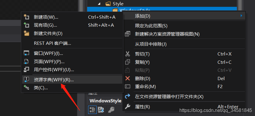
使用这种方式应用样式不可能减少我们工作量的,我们需要把它定义成样式文件,这样新的窗体直接引用该样式即可实现这样的样式风格。
1:添加一个用户资源字典存储样式信息
 样式文件1:
<ResourceDictionary xmlns="http://schemas.microsoft.com/winfx/2006/xaml/presentation"
                    xmlns:x="http://schemas.microsoft.com/winfx/2006/xaml"
                    x:Class="Demo_Common.Resource_Dictionaries.MacStyledWindow">

    <ResourceDictionary.MergedDictionaries>
        <!-- Resource Dictionary containing Buttons used for the Mac Window titlebar buttons-->
        <ResourceDictionary Source="MacStyledTitleBarButtons.xaml" />
    </ResourceDictionary.MergedDictionaries>

    <!-- Border defining the frame of the Window -->
    <Style x:Key="MacwindowBorder" TargetType="Border">
        <Setter Property="CornerRadius" Value="10, 10, 0, 0" />
        <Setter Property="Background" Value="#ababab" />
        <Setter Property="BorderBrush" Value="DimGray" />
        <Setter Property="BorderThickness" Value="1" />
        <Setter Property="HorizontalAlignment" Value="Stretch" />
        <Setter Property="VerticalAlignment" Value="Stretch" />
    </Style>

    <!-- Window Template -->
    <ControlTemplate x:Key="MacWindowTemplate" TargetType="{x:Type Window}">
        <Grid>
            <!--this border(MacWindowFrame) used for Drag-Resize-->
            <Border Name="MacWindowFrame" Style="{StaticResource MacwindowBorder}">

                <Grid>
                    <Grid.RowDefinitions>
                        <RowDefinition Height="Auto" />
                        <RowDefinition />
                    </Grid.RowDefinitions>
                    <!-- The title bar. -->
                    <Border    Padding="15" CornerRadius="10, 10, 0, 0" Name="top">
                        <Border.Background>
                            <LinearGradientBrush EndPoint="0.5,1" StartPoint="0.5,0">
                                <GradientStop Color="Green"/>
                                <GradientStop Color="Black" Offset="1"/>
                            </LinearGradientBrush>
                        </Border.Background>
                    </Border>
                    <TextBlock Foreground="White" Text="{TemplateBinding Title}" HorizontalAlignment="Center" VerticalAlignment="Center" FontWeight="Normal" />
                    <StackPanel Orientation="Horizontal" FlowDirection="RightToLeft">
                        <Button x:Name="CloseBtn" Style="{StaticResource CloseRadialButton}"
                                HorizontalAlignment="Left" VerticalAlignment="Center"
                            Margin="10,0,0,0" />

                        <Button x:Name="MaxBtn" Style="{StaticResource MaximizeRadialButton}"
                                HorizontalAlignment="Left" VerticalAlignment="Center"
                            Margin="7,0,0,0" />

                        <Button x:Name="MinBtn" Style="{StaticResource MinimizeRadialButton}"
                                HorizontalAlignment="Left" VerticalAlignment="Center"
                            Margin="7,0,0,0" />
                    </StackPanel>
                    <Border  Grid.Row="1 ">
                        <Border.Background>
                            <ImageBrush x:Name="MyBgImg" TileMode="Tile" Viewbox="0, 0, 100, 100" ViewboxUnits="Absolute" Viewport="0, 0, 100, 100" ViewportUnits="Absolute" ImageSource="../Image/slider.png" Opacity=".25"/>
                        </Border.Background>
                    </Border>
                </Grid>
            </Border>
        </Grid>
    </ControlTemplate>

    <!-- Mac Window Style -->
    <Style x:Key="MacWindowStyle" TargetType="Window">
        <Setter Property="Background" Value="Transparent" />
        <Setter Property="WindowStyle" Value="None" />
        <Setter Property="AllowsTransparency" Value="True" />
        <Setter Property="Opacity" Value="0.95" />
        <Setter Property="Template" Value="{StaticResource MacWindowTemplate}" />
    </Style>

</ResourceDictionary>
样式文件2:
<ResourceDictionary xmlns="http://schemas.microsoft.com/winfx/2006/xaml/presentation"
                    xmlns:x="http://schemas.microsoft.com/winfx/2006/xaml">

    <!-- Close Button -->
    <Style x:Key="CloseRadialButton" TargetType="Button">
        <Setter Property="SnapsToDevicePixels" Value="true" />
        <Setter Property="OverridesDefaultStyle" Value="true" />
        <Setter Property="MinHeight" Value="13" />
        <Setter Property="MinWidth" Value="13" />
        <Setter Property="Opacity" Value=".75"/>
        <Setter Property="Template">
            <Setter.Value>
                <ControlTemplate TargetType="Button">
                    <Grid>
                        <Ellipse x:Name="borderBtn" Width="18" Height="18" StrokeThickness="2" Fill="#FFE52B2B" Stroke="White"></Ellipse>

                        <!--按钮内容-->
                        <Grid>
                            <Canvas HorizontalAlignment="Left" VerticalAlignment="Top" Margin="5">
                                <Line StrokeThickness="2" Stroke="White" X1="0" Y1="0" X2="8" Y2="8"></Line>
                                <Line StrokeThickness="2" Stroke="White" X1="0" Y1="8" X2="8" Y2="0"></Line>
                            </Canvas>
                        </Grid>
                    </Grid>
                    <ControlTemplate.Triggers>
                        <Trigger Property="Button.IsMouseOver"  Value="True">
                            <Setter Property="Opacity" Value="1" />
                        </Trigger>
                    </ControlTemplate.Triggers>
                </ControlTemplate>
            </Setter.Value>
        </Setter>
    </Style>

    <!-- Minimize Button -->
    <Style x:Key="MinimizeRadialButton" TargetType="Button">
        <Setter Property="SnapsToDevicePixels" Value="true" />
        <Setter Property="OverridesDefaultStyle" Value="true" />
        <Setter Property="MinHeight" Value="13" />
        <Setter Property="MinWidth" Value="13" />
        <Setter Property="Opacity" Value=".75" />
        <Setter Property="Template">
            <Setter.Value>
                <ControlTemplate TargetType="Button">
                    <Grid>
                        <Rectangle Width="18" Height="16" Fill="White" Opacity=".1" RadiusX="4" RadiusY="4" StrokeThickness="2"></Rectangle>
                        <Rectangle Width="18" Height="16" StrokeThickness="2" RadiusX="4" RadiusY="4" Stroke="White"></Rectangle>
                        <!--按钮内容-->
                        <Grid>
                            <Canvas HorizontalAlignment="Left" VerticalAlignment="Top" Margin="5">
                                <Line StrokeThickness="2" Stroke="White" X1="0" Y1="4" X2="8" Y2="4"></Line>
                            </Canvas>
                        </Grid>
                    </Grid>
                    <ControlTemplate.Triggers>
                        <Trigger Property="Button.IsMouseOver"  Value="True">
                            <Setter Property="Opacity" Value="1" />
                        </Trigger>
                    </ControlTemplate.Triggers>
                </ControlTemplate>
            </Setter.Value>
        </Setter>
    </Style>

    <!-- Maximize Button -->
    <Style x:Key="MaximizeRadialButton" TargetType="Button">
        <Setter Property="SnapsToDevicePixels" Value="true" />
        <Setter Property="OverridesDefaultStyle" Value="true" />
        <Setter Property="MinHeight" Value="13" />
        <Setter Property="MinWidth" Value="13" />
        <Setter Property="Opacity" Value=".75" />
        <Setter Property="Template">
            <Setter.Value>
                <ControlTemplate TargetType="Button">
                    <Grid>
                        <Rectangle Width="18" Height="16" Fill="White" Opacity=".1" RadiusX="4" RadiusY="4" StrokeThickness="2"></Rectangle>
                        <Rectangle Width="18" Height="16" StrokeThickness="2" RadiusX="4" RadiusY="4" Stroke="White"></Rectangle>
                        <!--按钮内容-->
                        <Grid>
                            <Canvas HorizontalAlignment="Left" VerticalAlignment="Top"  Margin="4">
                                <Rectangle Width="10" Height="8" StrokeThickness="2" RadiusX="2" RadiusY="2" Stroke="White"></Rectangle>
                            </Canvas>
                        </Grid>
                    </Grid>
                    <ControlTemplate.Triggers>
                        <Trigger Property="Button.IsMouseOver"  Value="True">
                            <Setter Property="Opacity" Value="1" />
                        </Trigger>
                    </ControlTemplate.Triggers>
                </ControlTemplate>
            </Setter.Value>
        </Setter>
    </Style>

</ResourceDictionary>
使用统一样式的方式
引用样式达到达到统一风格
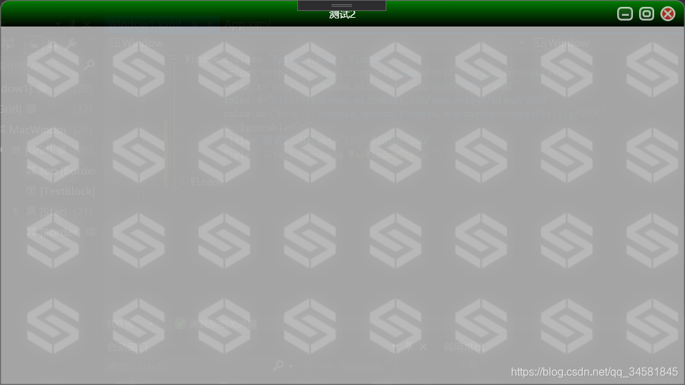
样式创建完成其实就可以通过应用样式(Style="{StaticResource MacWindowStyle}")的方式达到统一的效果了,如下:
<Window x:Class="WpfApp1.Point.Window1"
        xmlns="http://schemas.microsoft.com/winfx/2006/xaml/presentation"
        xmlns:x="http://schemas.microsoft.com/winfx/2006/xaml"
        xmlns:d="http://schemas.microsoft.com/expression/blend/2008"
        xmlns:mc="http://schemas.openxmlformats.org/markup-compatibility/2006"
        mc:Ignorable="d"
        Title="测试2" Height="450" Width="800"
        Style="{StaticResource MacWindowStyle}">

</Window>
运行效果:
窗体的事件处理
引用完样式启动程序你会发现,窗体不能拖动,不能最大最小化,关闭按钮也只是摆设,因为我们没有给窗体做事件处理。
窗体拖动事件处理
可以在窗体初始化是注册鼠标左键按下事件,调用Window.DragMove()方法完成工作区域内拖动处理。
代码如下:
public Window1()
{
    InitializeComponent();
    this.MouseLeftButtonDown += DragWindow;
}
private void DragWindow(object sender, MouseButtonEventArgs e)
{
    this.DragMove();
}
窗体大小调整事件处理
由于要涉及到和Win32交互,我们需要订阅SourceInitialized事件。
一样的我们需要在窗体初始化时订阅该事件。
代码如下:
 public Window1()
   {
       InitializeComponent();
       this.SourceInitialized += new EventHandler(WSInitialized);//调整大小
   }
由于涉及到SourceInitialized Event,我们就需要使用到HwndSource,它主要功能就是WPF放入到Win32窗体中。让我们看看WindowSourceInitialized事件:
void WSInitialized(object sender, EventArgs e)
{
    hs = PresentationSource.FromVisual(this) as HwndSource;
    hs.AddHook(new HwndSourceHook(WndProc));
}
接下来我们看到,窗体Hook了一个 HwndSourceHook的委托,这个委托能够接受所有经过Windows的消息。我们来看看WndProc函数:
Dictionary<int, int> messages = new Dictionary<int, int>();

private IntPtr WndProc(IntPtr hwnd, int msg, IntPtr wParam, IntPtr lParam, ref bool handled)
{
    Debug.Print(string.Format("窗体消息: {0}, wParam: {1} , lParam: {2}", msg.ToString(), wParam.ToString(), lParam.ToString()));
    if (messages.ContainsKey(msg) == false)
    {
        messages.Add(msg, msg);
        // 添加接收到的WIndows信息到ListBox中
        listMsg.Items.Add(msg);
    }
    return new IntPtr();
}
这个函数会接收到所有windows消息,打印到Debug台上。
接下来,知道了事件处理流程,我们开始讨论拖拉窗体的问题。
首先,我们先给窗体添加一个ResetCursor事件,以便于拖拉结束后,恢复鼠标指针:
<Window x:Class="WpfApplication1.MsgWindow"
    xmlns="http://schemas.microsoft.com/winfx/2006/xaml/presentation"
    xmlns:x="http://schemas.microsoft.com/winfx/2006/xaml"
    Title="TestWindow" Height="391" Width="418" WindowStyle="None" AllowsTransparency="True" Background="Transparent" OpacityMask="White" ResizeMode="NoResize" PreviewMouseMove="ResetCursor" WindowStartupLocation="CenterScreen">
其次,我们给Border元素添加一个MouseMove事件,用来显示鼠标特定情况下的鼠标指针形状(如达到了窗体边缘,则变换为拖拉的鼠标形状),同时添加一个PreviewMouseDown事件,用来进行Resize操作(也就是鼠标左键按下,开始进行拖放):
<Border BorderThickness="5" BorderBrush="DarkGreen" CornerRadius="10,10,10,10" MouseMove="DisplayResizeCursor" PreviewMouseDown="Resize" Name="top">
这样,当事件添加好以后,我们转换到后台代码:
由于窗体总共有八个地方可以进行拖拉,分别是Top,TopRight,Right,BottomRight,Bottom,BottomLeft,Left,TopLeft,那么我们先声明一个Enum:
public enum ResizeDirection
        {
            Left = ,
            Right = ,
            Top = ,
            TopLeft = ,
            TopRight = ,
            Bottom = ,
            BottomLeft = ,
            BottomRight = ,
        }
在Win32中,由于61440+1 代表左边,61440+2代表右边,一次类推,所以我们需要进行如下设计:
[DllImport("user32.dll", CharSet = CharSet.Auto)]
private static extern IntPtr SendMessage(IntPtr hWnd, uint Msg, IntPtr wParam, IntPtr lParam);

private void ResizeWindow(ResizeDirection direction)
{
    SendMessage(hs.Handle, WM_SYSCOMMAND, (IntPtr)( + direction), IntPtr.Zero);
}
这样,通过上面的函数,我们就可以实现窗体的Resize,下面我们来响应鼠标事件:
首先是窗体的ResetCursor事件,这个主要是用来恢复鼠标形状:
private void ResetCursor(object sender, MouseEventArgs e)
{
    if (Mouse.LeftButton != MouseButtonState.Pressed)
    {
        this.Cursor = Cursors.Arrow;
    }
}
然后我们来看看DisplayResizeCursor事件,它主要是用来改变鼠标形状,当鼠标达到一定区域,则显示拖拉的鼠标形状(<->):
其计算方式,如下:
private void DisplayResizeCursor(object sender, MouseEventArgs e)
        {
            Border clickBorder = sender as Border;

            Point pos = Mouse.GetPosition(this);
            double x = pos.X;
            double y = pos.Y;
            double w= this.Width;
            double h= this.Height;

            this.label1.Content = x + "--" + y;

            if (x <= relativeClip & y <= relativeClip) // left top
            {
                this.Cursor = Cursors.SizeNWSE;
            }
            if (x >= w - relativeClip & y <= relativeClip) //right top
            {
                this.Cursor = Cursors.SizeNESW;
            }

            if (x >= w - relativeClip & y >= h - relativeClip) //bottom right
            {
                this.Cursor = Cursors.SizeNWSE;
            }

            if (x <= relativeClip & y >= h - relativeClip)  // bottom left
            {
                this.Cursor = Cursors.SizeNESW;
            }

            if ((x >= relativeClip & x <= w - relativeClip) & y <= relativeClip) //top
            {
                this.Cursor = Cursors.SizeNS;
            }

            if (x >= w - relativeClip & (y >= relativeClip & y <= h - relativeClip)) //right
            {
                this.Cursor = Cursors.SizeWE;
            }

            if ((x >= relativeClip & x <= w - relativeClip) & y > h - relativeClip) //bottom
            {
                this.Cursor = Cursors.SizeNS;
            }

            if (x <= relativeClip & (y <= h - relativeClip & y >= relativeClip)) //left
            {
                this.Cursor = Cursors.SizeWE;
            }
        }
最后就是Resize的函数,和上面的计算方式类似,只是拖拉的时候需要调用ResizeWindow函数来改变大小:
private void Resize(object sender, MouseButtonEventArgs e)
        {
            Border clickedBorder = sender as Border;

            Point pos = Mouse.GetPosition(this);
            double x = pos.X;
            double y = pos.Y;
            double w = this.Width;
            double h = this.Height;

            if (x <= relativeClip & y <= relativeClip) // left top
            {
                this.Cursor = Cursors.SizeNWSE;
                ResizeWindow(ResizeDirection.TopLeft);
            }
            if (x >= w - relativeClip & y <= relativeClip) //right top
            {
                this.Cursor = Cursors.SizeNESW;
                ResizeWindow(ResizeDirection.TopRight);
            }

            if (x >= w - relativeClip & y >= h - relativeClip) //bottom right
            {
                this.Cursor = Cursors.SizeNWSE;
                ResizeWindow(ResizeDirection.BottomRight);
            }

            if (x <= relativeClip & y >= h - relativeClip)  // bottom left
            {
                this.Cursor = Cursors.SizeNESW;
                ResizeWindow(ResizeDirection.BottomLeft);
            }

            if ((x >= relativeClip & x <= w - relativeClip) & y <= relativeClip) //top
            {
                this.Cursor = Cursors.SizeNS;
                ResizeWindow(ResizeDirection.Top);
            }

            if (x >= w - relativeClip & (y >= relativeClip & y <= h - relativeClip)) //right
            {
                this.Cursor = Cursors.SizeWE;
                ResizeWindow(ResizeDirection.Right);
            }

            if ((x >= relativeClip & x <= w - relativeClip) & y > h - relativeClip) //bottom
            {
                this.Cursor = Cursors.SizeNS;
                ResizeWindow(ResizeDirection.Bottom);
            }

            if (x <= relativeClip & (y <= h - relativeClip & y >= relativeClip)) //left
            {
                this.Cursor = Cursors.SizeWE;
                ResizeWindow(ResizeDirection.Left);
            }
        }


 383
383


 被折叠的 条评论
为什么被折叠?
被折叠的 条评论
为什么被折叠?
 到【灌水乐园】发言


