


原文链接: svg 线条动画
上一篇: 按照笔画顺序写汉字
下一篇: cocos 刚体碰撞 台球游戏
https://zhuanlan.zhihu.com/p/151598924
https://www.cnblogs.com/coco1s/p/6225973.html
使用css变量, 控制线条动画
<!DOCTYPE html>
<html lang="en">
  <head>
    <meta charset="UTF-8" />
    <meta name="viewport" content="width=device-width, initial-scale=1.0" />
    <title>Document</title>
    <style>
      path {
        animation: move 3s linear forwards infinite;
        /* --main-path-len: 511px; */
      }

      @keyframes move {
        0% {
          stroke-dasharray: 0, var(--main-path-len);
        }
        100% {
          stroke-dasharray: var(--main-path-len), 0;
        }
      }
    </style>
  </head>
  <body>
    <svg width="400px" height="400px" viewBox="0 0 800 800">
      <path
        id="path"
        fill="none"
        stroke="#000"
        stroke-width="1px"
        d="M452,293c0,0,0-61,72-44c0,0-47,117,81,57
    s5-110,10-67s-51,77.979-50,33.989"
      />
    </svg>
    <script>
      const p = document.getElementsByTagName("path")[0]
      console.log(p.getTotalLength())
      const s = p.getTotalLength() + "px"
      console.log(p.style, s)
      p.style.setProperty("--main-path-len", s)
    </script>
  </body>
</html>
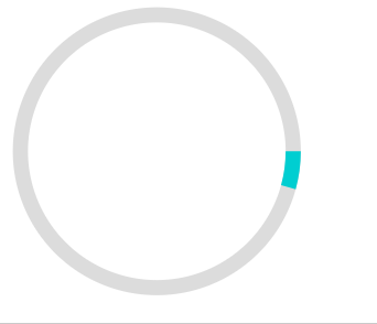
圆环进度条填充
<!DOCTYPE html>
<html lang="en">
  <head>
    <meta charset="UTF-8" />
    <meta name="viewport" content="width=device-width, initial-scale=1.0" />
    <title>Document</title>
    <style>
      .circle-load {
        position: absolute;
        width: 200px;
        height: 200px;
        top: 50%;
        left: 50%;
        transform: translate(-50%, -50%);
      }

      .circle-load-svg {
        stroke-dasharray: 0 570;
        animation: rot 8s linear infinite;
      }

      @keyframes rot {
        100% {
          stroke-dasharray: 570 570;
        }
      }
    </style>
  </head>
  <body>
    <svg
      width="240px"
      height="240px"
      version="1.1"
      xmlns="http://www.w3.org/2000/svg"
    >
      <circle
        cx="110"
        cy="110"
        r="90"
        stroke-width="10"
        stroke="gainsboro"
        fill="none"
      ></circle>
      <circle
        cx="110"
        cy="110"
        r="90"
        stroke-width="10"
        stroke="darkturquoise"
        fill="none"
        class="circle-load-svg"
      ></circle>
    </svg>
  </body>
</html>


 1373
1373


 被折叠的 条评论
为什么被折叠?
被折叠的 条评论
为什么被折叠?
 到【灌水乐园】发言


