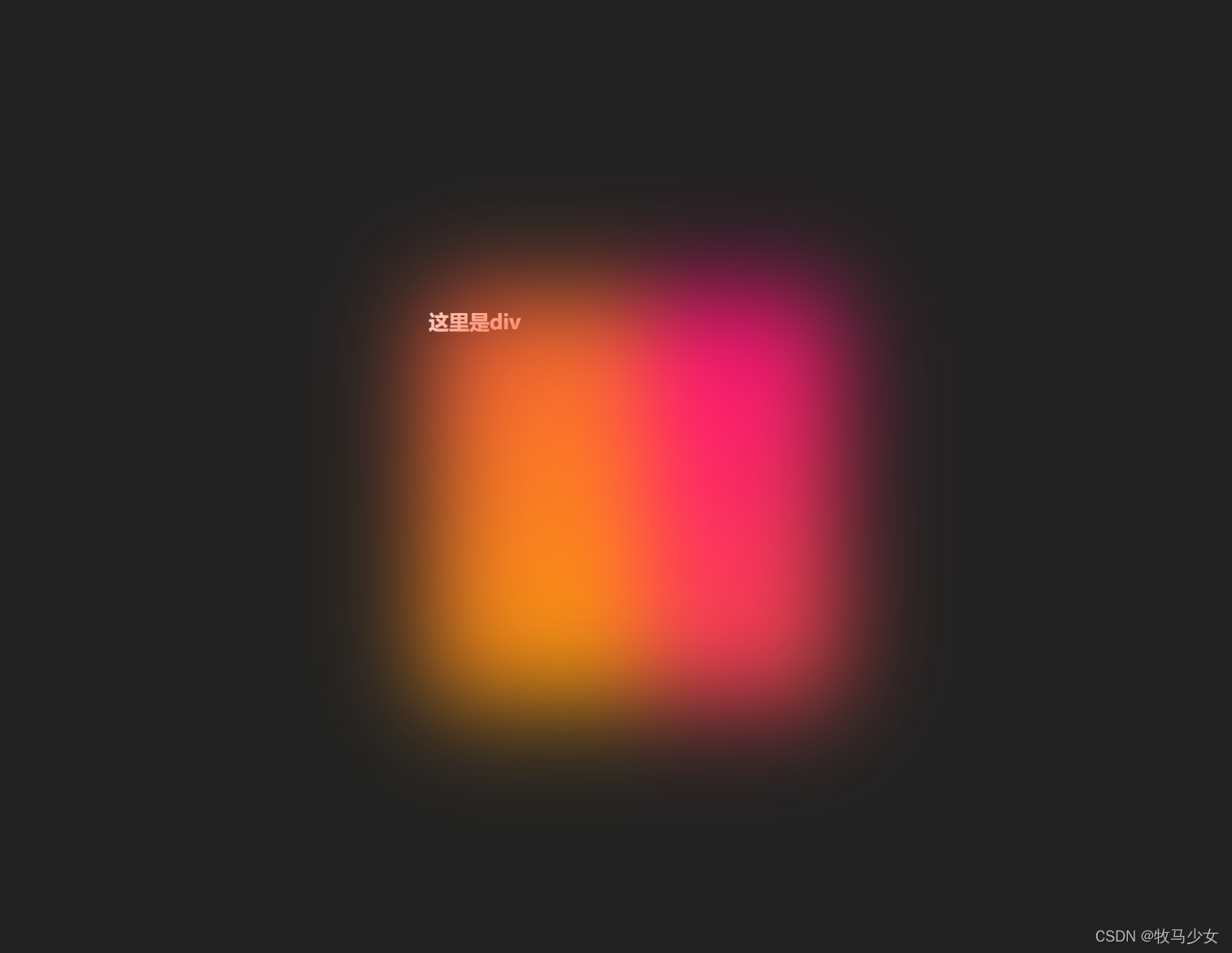
效果如图:
代码:
<!DOCTYPE html>
<html>
<head>
<meta charset="utf-8">
<title>canvas demo</title>
<style>
html {
font-size: 62.5%;
}
body {
margin: 0px;
}
#demo {
width: 100vw;
min-height: 100vh;
background-color: #222;
}
#box {
width: 40rem;
height: 40rem;
position: absolute;
left: 50%;
top: 50%;
transform: translate(-50%, -50%);
}
#box::before {
width: 100%;
height: 100%;
position: absolute;
background: linear-gradient(135deg, #ff0087, #fba900);
left: 0rem;
top: 0rem;
filter: blur(5rem);
content: "";
background-size: 200%;
animation: around 2s linear infinite;
}
@keyframes around {
0% {
background-position-x: 0%;
}
100% {
background-position-x: 200%;
}
}
</style>
</head>
<body>
<div id="demo">
<div id="box">
<h1 style="color: white;">这里是div</h1>
</div>
</div>
<script>
</script>
</body>
</html>


 6574
6574


 被折叠的 条评论
为什么被折叠?
被折叠的 条评论
为什么被折叠?
 到【灌水乐园】发言


