


因为工作需要开发的程序经常和图表打交道,所以记录echart简单封装折线图,柱状图,饼状图组件。
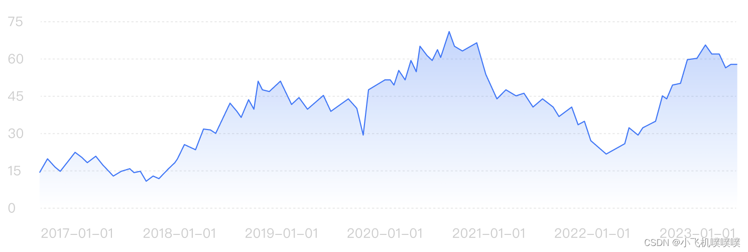
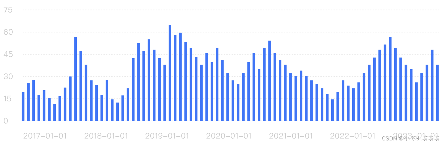
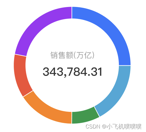
1、首先展示echarts封装后的结果展示
2、下面是具体实现的文件和方法
首先是折线图的部分
<template>
  <div ref="main" :style="{ width, height }"></div>
</template>

<script>
export default {
  name: "lineChart",
  props: {
    chartData: {
      type: Object,
      default: () => ([
        {
          xData: [],
          yData: [],
        },
      ]),
    },
    width: {
      type: String,
      default: "100%",
    },
    height: {
      type: String,
      default: "300px",
    },
    isSimple: { // 是否是简单显示模式
      type: Boolean,
      default: false,
    }
  },
  watch: {
      chartData: {
        handler() {
          this.myEcharts();
        },
        // 深度观察监听
        deep: true
      }
  },
  data() {
    return {
      myChart:null
    };
  },
  watch: {
    chartData: {
      handler() {
        this.myEcharts();
      },
      // 深度观察监听
      deep: true,
    },
  },
  mounted() {
    this.myChart = this.$echarts.init(this.$refs.main);
    this.myEcharts();
  },
  methods: {
    myEcharts() {
      const space = "                    ";
      const that = this;
      //配置图表
      var option = {
        tooltip: {
          show: !this.isSimple,
          trigger: "axis",
          axisPointer: {
            type: "cross",
            snap: true,
          },
          //   formatter(params) {
          //     props.handleTooltipClick && props.handleTooltipClick(params); // 点击使用
          //   },
        },
        color: ["#2977FF"],
        grid: {
          top: "10%",
          left: this.isSimple ? "-10%" : '0', // 去掉Y轴后,去掉左侧间距
          right: "0",
          bottom: this.isSimple ? "-10%" : '0', // 去掉X轴后,去掉底部间距
          containLabel: true,
        },
        xAxis: {
          show: !this.isSimple,
          boundaryGap: false, // 起始空间
          axisLine: { // 0轴x线样式
            lineStyle: {
              color: "rgba(153, 153, 153, 0.2)",
              type: "dashed",
            },
          },
          axisLabel: {
            // x轴显示内容样式
            fontSize: "12px",
            color: "#ccc",
            margin: 26,
            interval: (index) =>
              index === 0 ||
              index === this.chartData.xData.length - 1 ||
              index === Math.floor(this.chartData.xData.length / 2),
            formatter(value, index) {
              if (index === 0) {
                return `${space}${value}`;
              } else if (index === that.chartData.xData.length - 1) {
                return `${value}${space}`;
              }
              return value;
            },
          },
          axisPointer: {
            // 竖着指示线的样式
            label: {
              formatter(obj) {
                return obj.value;
              },
              show: true,
              padding: [2, 4, 2, 4],
              fontSize: "12px",
              borderRadius: 0,
              backgroundColor: "#2977FF",
            },
            lineStyle: {
              color: "#2977FF", // 指示线颜色
              type: "dashed",
              height: 0.4,
            },
          },
          data: this.chartData.xData,
        },
        yAxis: {
          show: !this.isSimple,
          axisLabel: {
            // y轴显示内容样式
            fontSize: "12px",
            color: "#ccc",
          },
          splitLine: {
            lineStyle: {
              color: "rgba(153, 153, 153, 0.2)",
              type: "dashed",
            },
          },
          axisPointer: {
            show: false, // 隐藏y轴指示线
          },
          splitNumber: 5,
          scale: true,
        },
        series: [
          {
            name: "",
            type: "line",
            markLine: {
              show: !this.isSimple,
              // 横着线的样式
              data: [],
              animation: false,
              label: {
                formatter(obj) {
                  const plus = parseFloat(obj.value) > 0 ? "+" : "";
                  return plus + parseFloat(obj.value).toFixed(toFixed) + sign;
                },
                position: "start",
                padding: [2, 4, 2, 4],
                fontSize: "12px",
                borderRadius: 0,
                backgroundColor: "#2977FF",
                color: "#fff",
              },
              lineStyle: {
                color: "#FF5800", // 指示线颜色
                type: "dashed",
                height: 0.4,
              },
              symbol: "none", // 去掉箭头
            },
            lineStyle: {
              // 折线样式
              normal: {
                width: 1,
              },
            },
            symbol: "none", // 圆点
            areaStyle: {
              color: {
                type: "linear",
                x: 0,
                y: 1,
                x2: 0,
                y2: 0,
                colorStops: [
                  { offset: 0, color: 'rgba(41, 119, 255, 0)' },
                  { offset: 1, color: 'rgba(41, 119, 255, 100%)' },
                ],
                global: false, // 缺省为 false
              },
              origin: "start",
            },
            data: [...this.chartData.yData],
          },
        ],
      };
      this.myChart.setOption(option);
    },
  },
};
</script>

<style scoped lang="less" src="./index.less"></style>
然后是柱状图的代码
<template>
  <div ref="main" :style="{ width, height }"></div>
</template>

<script>
export default {
  name: "barChart",
  props: {
    chartData: {
      type: Object,
      default: () => ([
        {
          xData: [],
          yData: [],
        },
      ]),
    },
    width: {
      type: String,
      default: "100%",
    },
    height: {
      type: String,
      default: "300px",
    }
  },
  watch: {
      chartData: {
        handler() {
          this.myEcharts();
        },
        // 深度观察监听
        deep: true
      }
  },
  data() {
    return {
      myChart:null
    };
  },
  watch: {
    chartData: {
      handler() {
        this.myEcharts();
      },
      // 深度观察监听
      deep: true,
    },
  },
  mounted() {
    this.myChart = this.$echarts.init(this.$refs.main);
    this.myEcharts();
  },
  methods: {
    myEcharts() {
      const space = "                    ";
      const that = this;
      //配置图表
      var option = {
        tooltip: {
          axisPointer: {
            type: "cross",
          },
        },
        color: ["#2977FF"],
        grid: {
          top: "10%",
          left: "0",
          right: "0",
          bottom: "0",
          containLabel: true,
        },
        xAxis: {
          boundaryGap: true, // 起始空间
          axisLine: { // 0轴x线样式
            lineStyle: {
              color: "rgba(153, 153, 153, 0.2)",
              type: "dashed",
            },
          },
          axisLabel: {
            // x轴显示内容样式
            fontSize: "12px",
            color: "#ccc",
            margin: 26,
            interval: (index) =>
              index === 0 ||
              index === this.chartData.xData.length - 1 ||
              index === Math.floor(this.chartData.xData.length / 2),
            formatter(value, index) {
              if (index === 0) {
                return `${space}${value}`;
              } else if (index === that.chartData.xData.length - 1) {
                return `${value}${space}`;
              }
              return value;
            },
          },
          axisPointer: {
            // 竖着指示线的样式
            label: {
              formatter(obj) {
                return obj.value;
              },
              show: true,
              padding: [2, 4, 2, 4],
              fontSize: "12px",
              borderRadius: 0,
              backgroundColor: "#2977FF",
            },
            lineStyle: {
              color: "#2977FF", // 指示线颜色
              type: "dashed",
              height: 0.4,
            },
          },
          data: this.chartData.xData,
        },
        yAxis: {
          axisLabel: {
            // y轴显示内容样式
            fontSize: "12px",
            color: "#ccc",
          },
          splitLine: {
            lineStyle: {
              color: "rgba(153, 153, 153, 0.2)",
              type: "dashed",
            },
          },
          axisPointer: {
            show: false, // 隐藏y轴指示线
          },
          splitNumber: 5,
          scale: true,
        },
        series: [
          {
            name: "",
            type: "bar",
            data: this.chartData.yData,
          },
        ],
      };
      this.myChart.setOption(option);
    },
  },
};
</script>

<style scoped lang="less" src="./index.less"></style>
最后是饼图的代码
<template>
  <div ref="main" :style="{ width, height }"></div>
</template>

<script>
export default {
  name: "barChart",
  props: {
    chartData: {
      type: Object,
      default: () => ([
        {
          yData: [],
        },
      ]),
    },
    width: {
      type: String,
      default: "100%",
    },
    height: {
      type: String,
      default: "300px",
    },
    colors: {
      type: Array,
      default: () => ([
          "#FF6801",
          "#FFAE5F",
          "#F9E619",
          "#36A2DA",
          "#3ACEF1",
          "#F14CEC",
          "#4CF1DD",
      ]),
    }
  },
  watch: {
      chartData: {
        handler() {
          this.myEcharts();
        },
        // 深度观察监听
        deep: true
      }
  },
  data() {
    return {
      myChart:null
    };
  },
  watch: {
    chartData: {
      handler() {
        this.myEcharts();
      },
      // 深度观察监听
      deep: true,
    },
  },
  mounted() {
    this.myChart = this.$echarts.init(this.$refs.main);
    this.myEcharts();
  },
  methods: {
    myEcharts() {

      //配置图表
      var option = {
        color: this.colors,
        legend: {
          show: true,
          left: 230,
          itemGap: -11, //间距
          type: "plain",
          top: "center",
          orient: "vertical",
          icon: "circle",
          selectedMode: false,
          itemWidth: 8,
          itemHeight: 8,
          pageIconSize: 20,
          textStyle: {
            fontFamily: 'PingFangSC-Regular, PingFang SC',
            fontWeight: 400,
            verticalAlign: 'middle',
            overflow: 'break',
            lineHeight: 15,
            rich: {
              a: {
                align: 'left',
                padding: [0, 8, 0, 0]
              },
              b: {
                align: 'left',
                verticalAlign: 'middle'
              },
              c: {
                align: 'left',
                verticalAlign: 'top'
                // padding: [-10, 0, 0, 0]
              }
            }
          }
        },
        series: [
          {
            type: "pie",
            minAngle: "0.5",
            center: ['50%', '50%'],
            radius: ['60%', '80%'],
            label: { show: false },
            animation: false,
            data: this.chartData.yData,
          },
        ],
      };
      this.myChart.setOption(option);
    },
  },
};
</script>

<style scoped lang="less" src="./index.less"></style>
3、最后差点忘了放模拟数据了
(1)柱状图和折线图的数据:
chartData: {
        xData: [
          "2017-01-01",
          "2017-01-02",
          "2017-01-03",
          "2017-01-04",
          "2017-01-05",
          "2017-01-06",
          "2018-01-01",
          "2018-01-02",
          "2018-01-03",
          "2018-01-04",
          "2018-01-05",
          "2018-01-06",
          "2019-01-01",
          "2019-01-02",
          "2019-01-03",
          "2019-01-04",
          "2019-01-05",
          "2019-01-06",
          "2020-01-01",
          "2020-01-02",
          "2020-01-03",
          "2020-01-04",
          "2020-01-05",
          "2020-01-06",
          "2021-01-01",
          "2021-01-02",
          "2021-01-03",
          "2021-01-04",
          "2021-01-05",
          "2021-01-06",
          "2022-01-01",
          "2022-01-02",
          "2022-01-03",
          "2022-01-04",
          "2022-01-05",
          "2022-01-06",
        ],
        yData: [
          6, 20, 1, 10, 10, 20, 6, 20, 36, 10, 10, 20, 6, 20, 36, 10, 10, 20, 6,
          20, 40, 10, 10, 20, 6, 20, 36, 10, 10, 20, 6, 20, 36, 10, 10, 20,
        ],
      },
(2)饼图的数据:
pieData: {
        yData: [36, 20, 16, 10, 9, 9],
 }


 925
925


 被折叠的 条评论
为什么被折叠?
被折叠的 条评论
为什么被折叠?
 到【灌水乐园】发言


