


在开发的过程会晕倒各种切角的图案,利用css3实现切角图案
css3实现切角图案

实现方式
1. 伪元素实现
<div class="bgc element"></div>
.bgc{
  width: 120px;
  height: 80px;
  background: #58a;
} /* 下文元素都使用了此样式 */

.element{
    position: relative;
}
.element::before {
    content: '';
    width: 0;
    height: 0;
    position: absolute;
    right: 0;
    bottom: 0;
    border: 5px solid #fff;
    border-top-color: transparent;
    border-left-color: transparent;
}
.element::after{
    content: '';
    width: 0;
    height: 0;
    position: absolute;
    left: 0;
    top: 0;
    border: 5px solid #fff;
    border-bottom-color: transparent;
    border-right-color: transparent;
}
2. 渐变实现
<div class="item"></div>
.business_item{
    width: 450px;
    height: 710px;
    border-radius: 5px;
    background: linear-gradient(-45deg, transparent 75px, #0C5C97 0);
    position: relative;
}
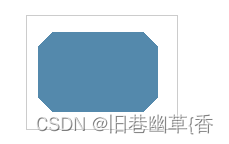
实现多个角
<div class="bgc corner"></div>
.corner{
  background: linear-gradient(135deg, transparent 10px, #58a 0) top left,
          linear-gradient(-135deg, transparent 10px, #58a 0) top right,
          linear-gradient(-45deg, transparent 10px, #58a 0) bottom right,
          linear-gradient(45deg, transparent 10px, #58a 0) bottom left;
  background-size: 50% 50%;
  background-repeat: no-repeat;
  /* Internet Explorer 9 及更早版本 IE 浏览器不支持渐变。 */
}
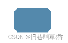
实现圆弧切角
<div class="bgc corner"></div>
.corner{
  background: radial-gradient(circle at top left, transparent 10px, #58a 0) top left,
          radial-gradient(circle at top right, transparent 10px, #58a 0) top right,
          radial-gradient(circle at bottom right, transparent 10px, #58a 0) bottom right,
          radial-gradient(circle at bottom left, transparent 10px, #58a 0) bottom left;
  background-size: 50% 50%;
  background-repeat: no-repeat;
}


 1459
1459


 被折叠的 条评论
为什么被折叠?
被折叠的 条评论
为什么被折叠?
 到【灌水乐园】发言


