


目录
一、背景【教学赛】金融数据分析赛题1:银行客户认购产品预测-天池大赛-阿里云天池
1. 目标变量类别分布查看目标变量(是否购买银行产品)的类别分布:
一、背景【教学赛】金融数据分析赛题1:银行客户认购产品预测-天池大赛-阿里云天池
本赛题以银行产品认购预测为背景,旨在预测客户是否会购买银行的产品。在与客户沟通的过程中,记录了联系次数、上一次联系时长和时间间隔,同时在银行系统中保存了客户的基本信息,包括年龄、职业、婚姻状况、是否违约以及是否有房贷等。此外还统计了当前市场的情况,例如就业和消费信息以及银行同业拆借利率等。
二、数据探索
1. 目标变量类别分布
查看目标变量(是否购买银行产品)的类别分布:
no: 19548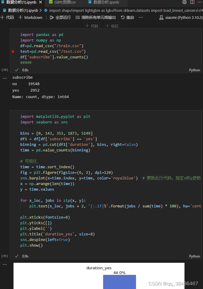
yes: 2952
可以看出目标变量的类别分布存在失衡情况,yes类别的样本数量较少。
2. 分箱展示时长变量
对时长(duration)变量进行分箱并展示其分布: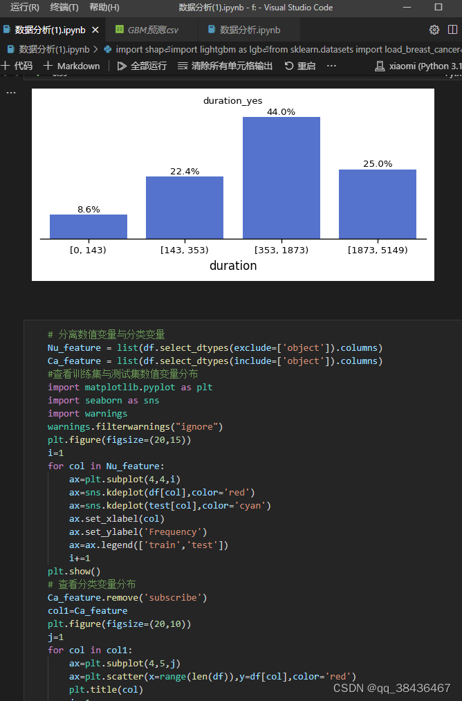
可以看出时长对目标变量有一定的区分能力,时长较短的样本更有可能购买银行产品。
3. 数据分布和相关性分析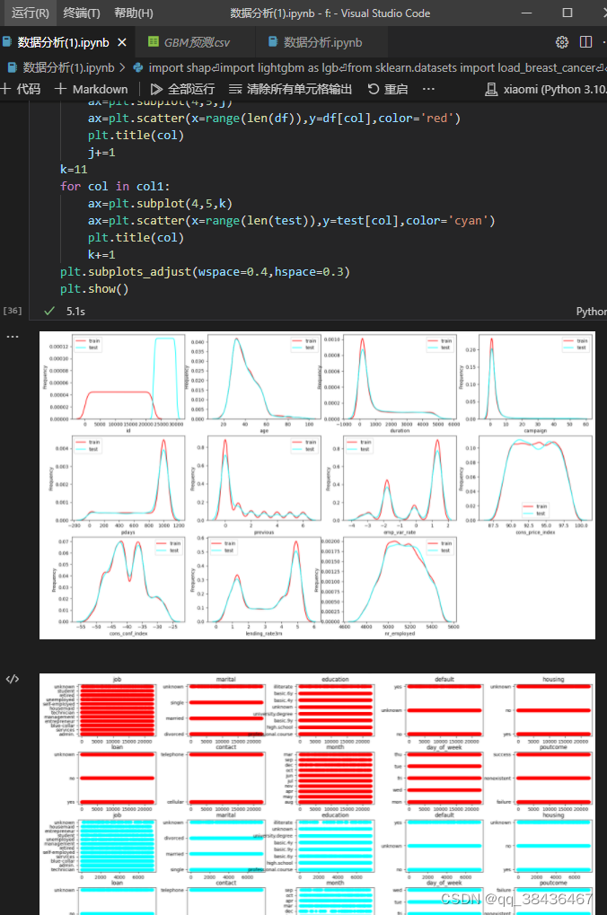
分离数值变量和分类变量,并分别查看其在训练集和测试集上的分布情况。还对分类变量进行了Label Encoding处理。
通过相关性矩阵热力图可以观察到一些与目标变量相关性较高的特征,在模型的特征输出中也占据了重要的位置。
4. 其他变量的可视化展示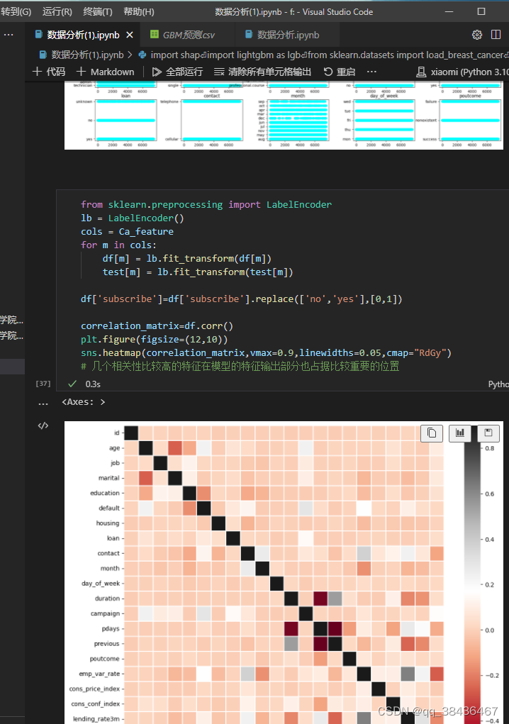
展示了其他一些变量在样本为yes的情况下的分布情况。
三、数据建模
没有进行特征工程,直接使用原始数据进行建模。
1. 划分训练集和测试集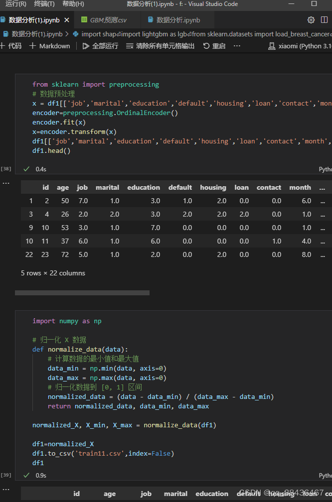
将数据集划分为训练集和测试集,比例为70%:30%。
2. 建立模型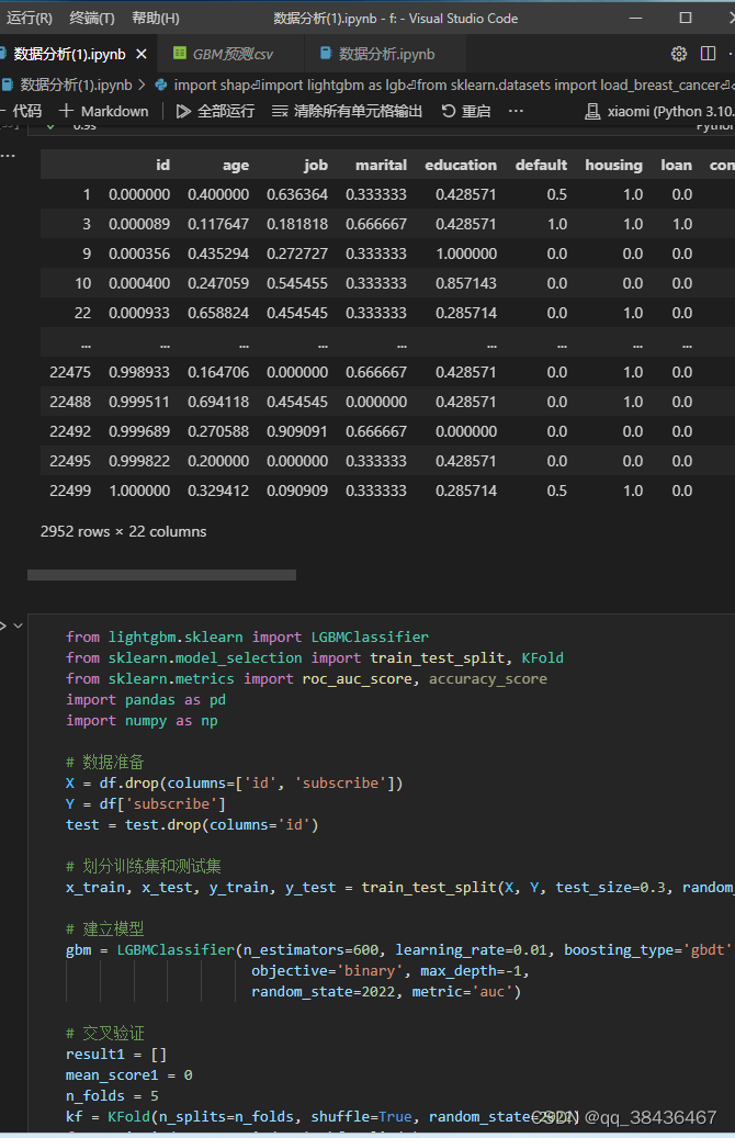
使用LightGBM模型进行建模,设置了一些参数,如n_estimators(树的数量)和learning_rate(学习率)。
3. 交叉验证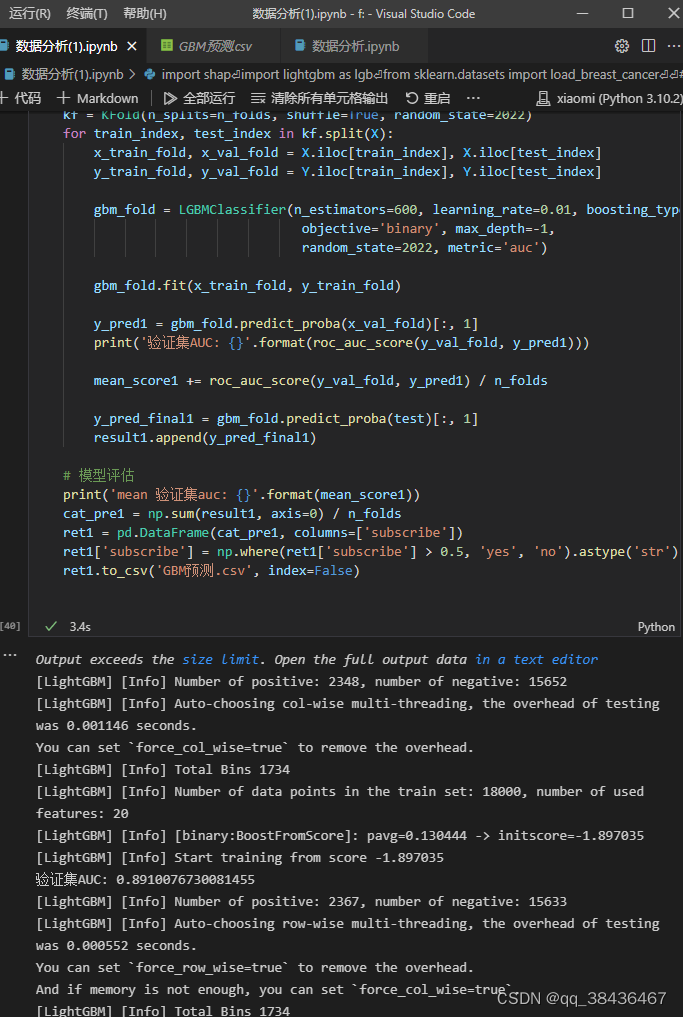
使用5折交叉验证进行模型评估,计算验证集AUC。
4. 模型评估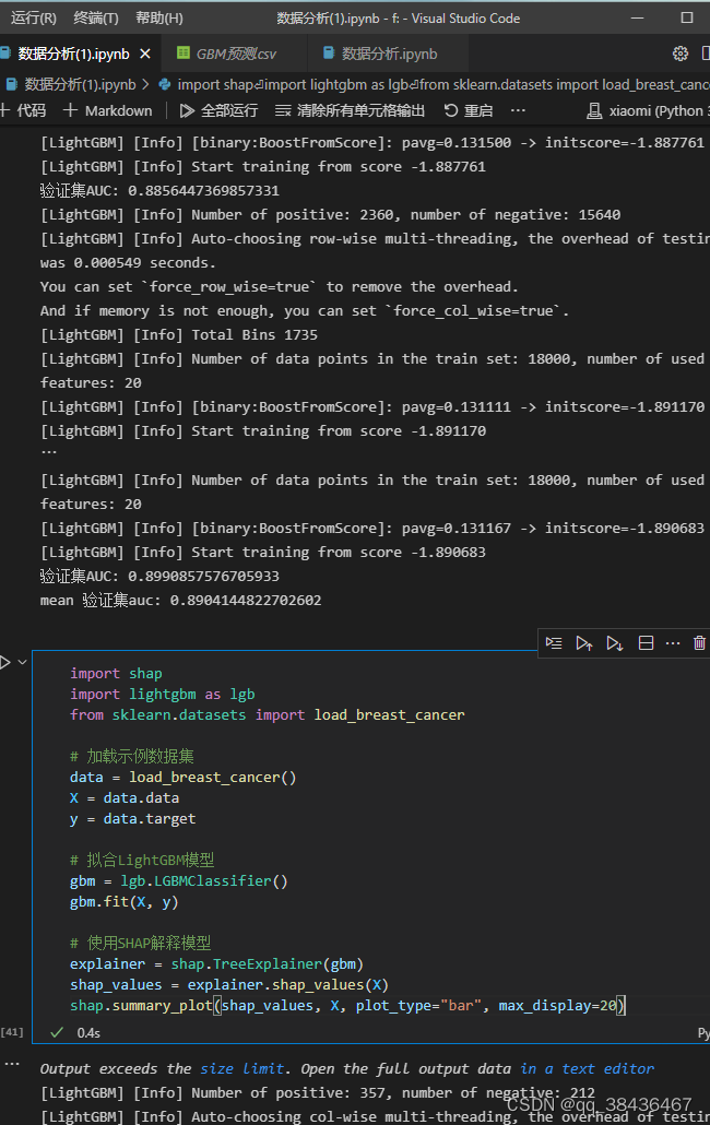
计算平均验证集AUC,并将模型应用于测试集,生成最终预测结果。
四、特征输出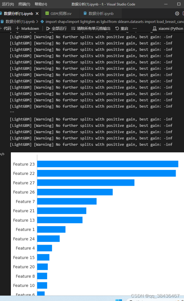
通过SHAP(SHapley Additive exPlanations)可视化工具,展示了模型的特征重要性。
代码:
1.读取数据
import pandas as pd
import numpy as np
df=pd.read_csv("/train.csv")
test=pd.read_csv("/test.csv")
df['subscribe'].value_counts()
#####
no 19548
yes 2952
Name: subscribe, dtype: int64
目标变量比例失衡
2.查看数据统计量
df.describe().T
duration分箱展示
import matplotlib.pyplot as plt
import seaborn as sns
bins=[0,143,353,1873,5149]
df1=df[df['subscribe']=='yes']
binning=pd.cut(df1['duration'],bins,right=False)
time=pd.value_counts(binning)
# 可视化
time=time.sort_index()
fig=plt.figure(figsize=(6,2),dpi=120)
sns.barplot(time.index,time,color='royalblue')
x=np.arange(len(time))
y=time.values
for x_loc,jobs in zip(x,y):
plt.text(x_loc, jobs+2, '{:.1f}%'.format(jobs/sum(time)*100), ha='center', va= 'bottom',fontsize=8)
plt.xticks(fontsize=8)
plt.yticks([])
plt.ylabel('')
plt.title('duration_yes',size=8)
sns.despine(left=True)
plt.show()
可以看出时长对目标变量有一定的区分
3.查看数据分布
# 分离数值变量与分类变量
Nu_feature = list(df.select_dtypes(exclude=['object']).columns)
Ca_feature = list(df.select_dtypes(include=['object']).columns)
#查看训练集与测试集数值变量分布
import matplotlib.pyplot as plt
import seaborn as sns
import warnings
warnings.filterwarnings("ignore")
plt.figure(figsize=(20,15))
i=1
for col in Nu_feature:
ax=plt.subplot(4,4,i)
ax=sns.kdeplot(df[col],color='red')
ax=sns.kdeplot(test[col],color='cyan')
ax.set_xlabel(col)
ax.set_ylabel('Frequency')
ax=ax.legend(['train','test'])
i+=1
plt.show()
# 查看分类变量分布
Ca_feature.remove('subscribe')
col1=Ca_feature
plt.figure(figsize=(20,10))
j=1
for col in col1:
ax=plt.subplot(4,5,j)
ax=plt.scatter(x=range(len(df)),y=df[col],color='red')
plt.title(col)
j+=1
k=11
for col in col1:
ax=plt.subplot(4,5,k)
ax=plt.scatter(x=range(len(test)),y=test[col],color='cyan')
plt.title(col)
k+=1
plt.subplots_adjust(wspace=0.4,hspace=0.3)
plt.show()
4.数据相关图
from sklearn.preprocessing import LabelEncoder
lb = LabelEncoder()
cols = Ca_feature
for m in cols:
df[m] = lb.fit_transform(df[m])
test[m] = lb.fit_transform(test[m])
df['subscribe']=df['subscribe'].replace(['no','yes'],[0,1])
correlation_matrix=df.corr()
plt.figure(figsize=(12,10))
sns.heatmap(correlation_matrix,vmax=0.9,linewidths=0.05,cmap="RdGy")
# 几个相关性比较高的特征在模型的特征输出部分也占据比较重要的位置
5.其它变量可视化展示
这里可视化的都是样本为yes的数据
三、数据建模
本次数据没有做任何特征工程,虽然也尝试过平均数编码,但效果不太好,所以就直接上原始数据建模
from lightgbm.sklearn import LGBMClassifier
from sklearn.model_selection import train_test_split
from sklearn.model_selection import KFold
from sklearn.metrics import accuracy_score, auc, roc_auc_score
X=df.drop(columns=['id','subscribe'])
Y=df['subscribe']
test=test.drop(columns='id')
# 划分训练及测试集
x_train,x_test,y_train,y_test = train_test_split( X, Y,test_size=0.3,random_state=1)
# 建立模型
gbm = LGBMClassifier(n_estimators=600,learning_rate=0.01,boosting_type= 'gbdt',
objective = 'binary',
max_depth = -1,
random_state=2022,
metric='auc')
# 交叉验证
result1 = []
mean_score1 = 0
n_folds=5
kf = KFold(n_splits=n_folds ,shuffle=True,random_state=2022)
for train_index, test_index in kf.split(X):
x_train = X.iloc[train_index]
y_train = Y.iloc[train_index]
x_test = X.iloc[test_index]
y_test = Y.iloc[test_index]
gbm.fit(x_train,y_train)
y_pred1=gbm.predict_proba((x_test),num_iteration=gbm.best_iteration_)[:,1]
print('验证集AUC:{}'.format(roc_auc_score(y_test,y_pred1)))
mean_score1 += roc_auc_score(y_test,y_pred1)/ n_folds
y_pred_final1 = gbm.predict_proba((test),num_iteration=gbm.best_iteration_)[:,1]
y_pred_test1=y_pred_final1
result1.append(y_pred_test1)
# 模型评估
print('mean 验证集auc:{}'.format(mean_score1))
cat_pre1=sum(result1)/n_folds
ret1=pd.DataFrame(cat_pre1,columns=['subscribe'])
ret1['subscribe']=np.where(ret1['subscribe']>0.5,'yes','no').astype('str')
ret1.to_csv('/GBM预测.csv',index=False)
四、特征输出
import shap
explainer = shap.TreeExplainer(gbm)
shap_values = explainer.shap_values(X)
shap.summary_plot(shap_values, X, plot_type="bar",max_display =20)
————————————————
原文链接:https://blog.csdn.net/weixin_46685991/article/details/127736013
五、最终成绩
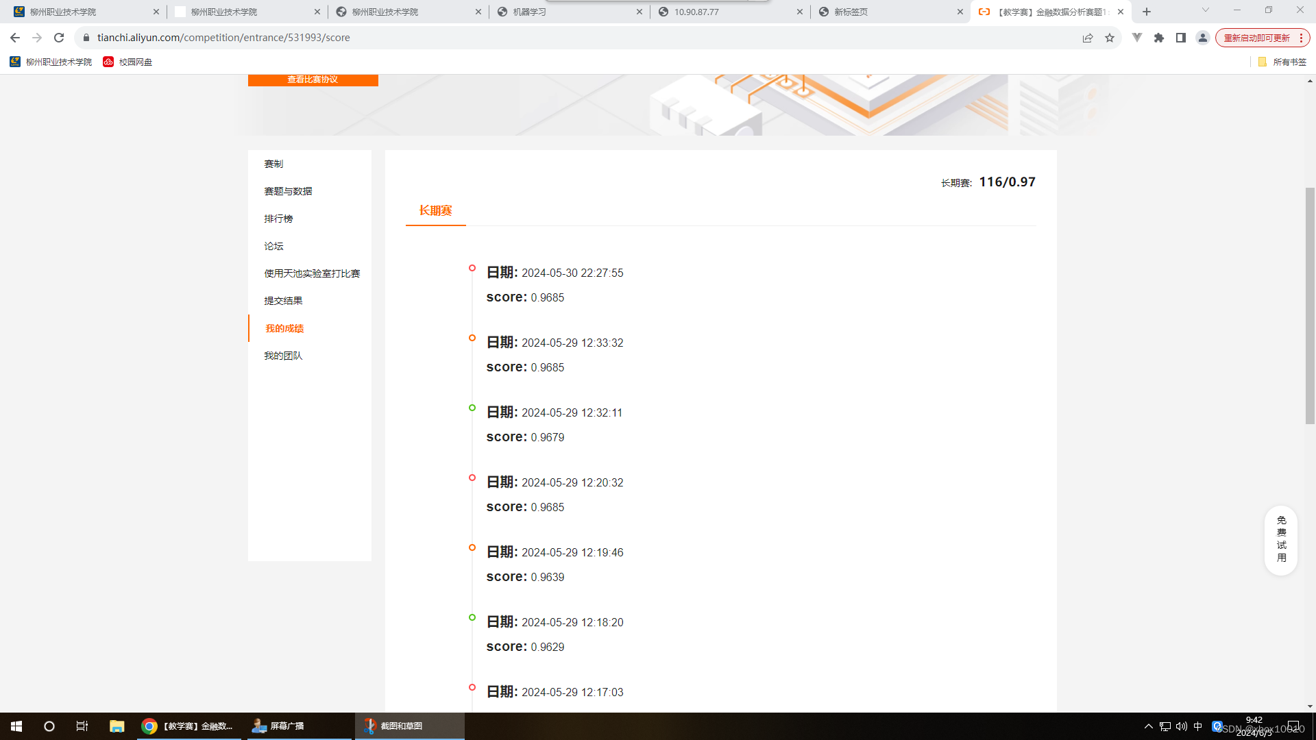


 3974
3974

 被折叠的 条评论
为什么被折叠?
被折叠的 条评论
为什么被折叠?
 到【灌水乐园】发言


