


font 部分:
font-style: italic; /*一般调节字体倾斜或者不倾斜*/
/*font-weight: bold; !*定义由粗到细的字符。400 等同于 normal,而 700 等同于 bold。*!*/
font-weight: 700;
font-family: "Microsoft YaHei UI";
font-size: 16px;
-----
文本:
color: red; /*文字颜色*/
text-align: center;/*文字对齐方式*/
text-decoration: underline;/*underline是下划线,line-through是删除线 a标签一般有下划线,用text-decoration:none;用来取消a标签下划线*/
text-indent: 2em; /*2个字的缩进 单位也可以用px*/
line-height: 30px; /*行高sa*/
.imgDiv{
text-align: center;
}
<div class="imgDiv">
<img src="img/img1.jpg" alt="">
</div>
----
emmet语法(html,css的快速生成代码)
div>span
生成
<div><span></span></div>
ul>li*3
生成
<ul>
<li></li>
<li></li>
<li></li>
</ul>
p.red
生成
<p class="red"></p>
div#div1
生成
<div id="div1"></div>
ul>li.class$*3
生成
<ul>
<li class="class1"></li>
<li class="class2"></li>
<li class="class3"></li>
</ul>
a{test$}*6
生成
<a href="">test1</a><a href="">test2</a><a href="">test3</a><a href="">test4</a><a href="">test5</a>
<a href="">test6</a>
ul>li.test${测试$}*3
生成
<ul>
<li class="test1">测试1</li>
<li class="test2">测试2</li>
<li class="test3">测试3</li>
</ul>
css:
lh100px
生成
line-height: 100px;
ta
生成
text-align:
w100
生成
width: 100px;
所有css属性,两个单词可以两个单词的首字母缩写
例如ta表示,text-align
块元素和行内元素
块元素可以设置width和height,像div这种
行内元素不能设置width和height,像span这种设置宽度就没有作用
行内块元素,可以并行,而且可以调节宽度和高度
display:inline;
display:inline-block;
display:block;
-----------
background相关属性
div{
background-image: url(img/img1.jpg);
background-repeat: no-repeat;
background-position: center top; /*背景图片相对于div中上对齐*/
}
效果:

background-attachment: fixed;   /*背景图片固定,不随鼠标滚动*/
background-size: cover;  /*规定背景图像的尺寸 cover表示让背景图片能够尽量覆盖*/
border
border-collapse:collapse; /* 当两个边框和在一起,只显示一个边框,解决边框靠在一起变粗的问题 */
box-shadow属性
box-shadow: 20px 5px 5px 10px #888888;
h-shadow控制阴影水平方向的位置,越大,阴影越往右偏
v-shadow控制阴影垂直方向位置,越大,越向下偏
blur控制阴影的模糊程度,越大越模糊,设置为0时阴影会非常清楚,一般设置5px-10px
spread控制阴影的尺寸,也可以理解成阴影扩散的面积,越大,阴影覆盖的面积就越大
color表示阴影的颜色
inset制定是内部阴影还是外部阴影,一般不填,默认是内部阴影
css三角形:
相关推荐文章:
经典CSS实现三角形图标原理解析 - 江湖小角色 - 博客园
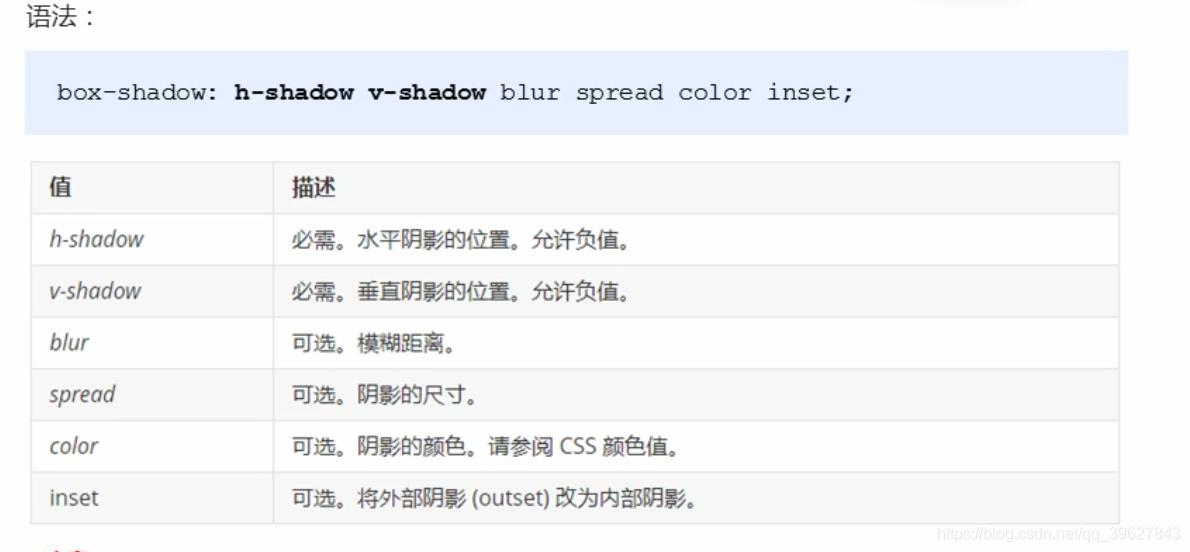
一个正常的border会这样显示

<!DOCTYPE html>
<html lang="en">
<head>
  <meta charset="UTF-8">
  <title>Title</title>
  <style>
    #main{
        /*width: 40px;*/
        border-top: 40px solid red;
        border-bottom: 40px solid green;
        border-left: 40px solid lavender;
        border-right: 40px solid royalblue;
        text-align: center;
    }
  </style>
</head>
<body>

<div id="main">content</div>

</body>
</html>
当我们逐渐调小宽度,并去掉div里面的内容,最后会变成一个正方形
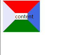

然后通过设置border为transparent将正方形变成三角形

<!DOCTYPE html>
<html lang="en">
<head>
  <meta charset="UTF-8">
  <title>Title</title>
  <style>
    #main{
        width: 0px;
        border-top: 40px solid transparent;
        border-bottom: 40px solid green;
        border-left: 40px solid transparent;
        border-right: 40px solid royalblue;
        text-align: center;
    }
  </style>
</head>
<body>

<div id="main"></div>

</body>
</html>
通过修改每一个border的大小,以及去掉某些boder,来控制三角形的形状和大小(有一点需要注意,一般父元素的宽高都会设置为0)
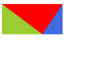
<!DOCTYPE html>
<html lang="en">
<head>
  <meta charset="UTF-8">
  <title>Title</title>
  <style>
    #main{
        width: 0px;

        border-top: 60px solid red;
        /*border-bottom: 0px solid green;*/
        border-left: 80px solid yellowgreen;
        border-right: 40px solid royalblue;
        text-align: center;
    }
  </style>
</head>
<body>

<div id="main"></div>

</body>
</html>
字体图标的使用
推荐文章:
使用ali icon,下载代码后有对应的使用说明
html5,css3新属性:
1.新增语义化标签
<header>
<nav>
<article>
<section>
<aside>
<footer>


 1622
1622


 被折叠的 条评论
为什么被折叠?
被折叠的 条评论
为什么被折叠?
 到【灌水乐园】发言


