


跳动的心
心形绘制
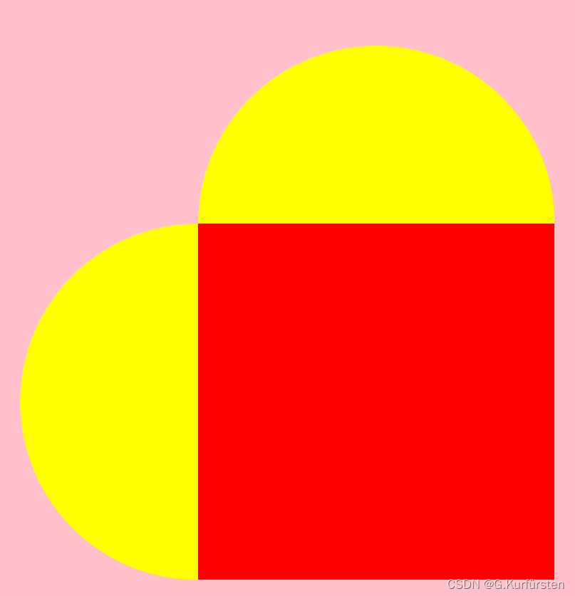
绘制思路:
将心形分为三部分:正方形,两个半圆
减少dom元素的个数,使用单个div(正方形),操作其::before和::after伪元素画半圆。最后通过旋转得到最终结果
<style>
        *{
            margin: 0;
            padding: 0;
        }
        /* 让容器的宽高都充满全屏 */
        html, body{
            width: 100%;
            height: 100%;
        }
        /* 设置弹性盒子让.heart元素居中 */
        body{
            background-color: pink;
            display: flex;
            align-items: center;
            justify-content: center;
        }

        .heart{
            width: 200px;
            height: 200px;
            background-color: red;
            position: relative;
            transform: rotate(45deg);  /*旋转*/
        }

        .heart::before{
            content: "";
            width: 200px;
            height: 100px;
            background-color: red;
            position: absolute;
            left: 0;
            top: -100px;
            border-radius: 100px 100px 0px 0px;

        }
        .heart::after{
            content: "";
            width: 100px;
            height: 200px;
            background-color: red;
            position: absolute;
            left: -100px;
            top: 0;
            border-radius: 100px 0px 0px 100px ;
        }
</style>

<body>
    <div class="heart"></div>
</body>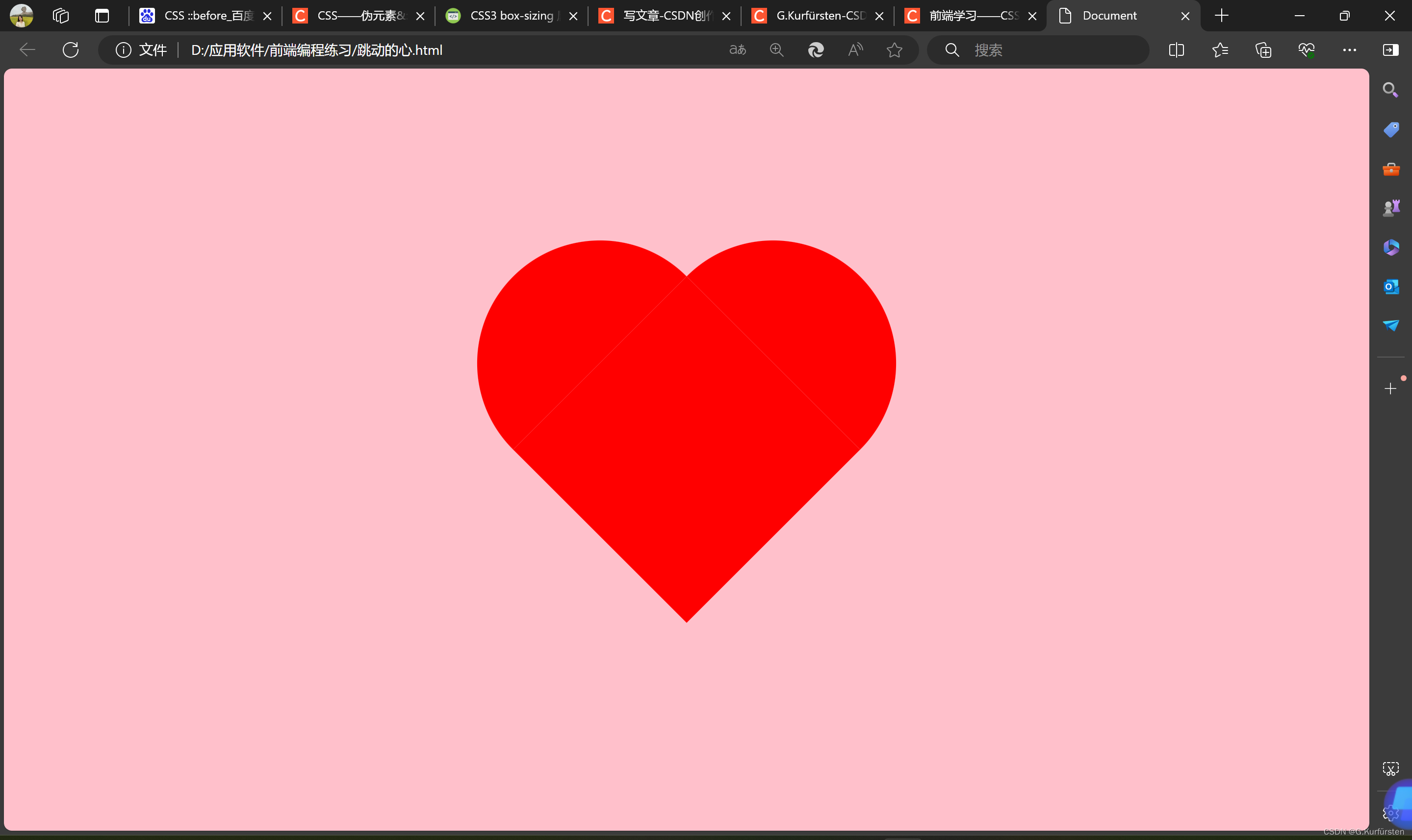
跳动动画
利用缩放实现跳动。
<style>
        *{
            margin: 0;
            padding: 0;
        }
        /* 让容器的宽高都充满全屏 */
        html, body{
            width: 100%;
            height: 100%;
        }
        /* 设置弹性盒子让.heart元素居中 */
        body{
            background-color: pink;
            display: flex;
            align-items: center;
            justify-content: center;
        }

        .heart{
            width: 200px;
            height: 200px;
            background-color: red;
            position: relative;
            transform: rotate(45deg);  /*旋转*/
            animation: heartbit 1s alternate infinite;
            animation-direction: alternate;
            box-shadow: 0 0 30px red;

        }

        .heart::before{
            content: "";
            width: 200px;
            height: 100px;
            background-color: red;
            position: absolute;
            left: 0;
            top: -100px;
            border-radius: 100px 100px 0px 0px;
            box-shadow: 0 0 30px red;

        }
        .heart::after{
            content: "";
            width: 100px;
            height: 200px;
            background-color: red;
            position: absolute;
            left: -100px;
            top: 0;
            border-radius: 100px 0px 0px 100px ;
            box-shadow: 0 0 30px red;
        }

        @keyframes heartbit {
            0%{
                transform: rotate(45deg) scale(0.6);
            }
            100%{
                transform: rotate(45deg) scale(1.4);
            }
        }

</style>

<body>
    <div class="heart"></div>
</body>
火柴人
火柴人结构
胳膊,躯干,腿使用边框完成
<style>
        * {
            margin: 0;
            padding: 0;
        }

        body {
            background-color: black;
        }

        .container {
            margin: 50px;
            height: 300px;
            width: 300px;
        }

        .person {
            position: absolute;
            top: 160px;
            left: 150px;
        }

        .head {
            height: 50px;
            width: 50px;
            border-radius: 50%;
            position: absolute;
            border: 5px solid #fff;
            top: -30px;
            left: -6px;
        }

        .torso {
            height: 60px;
            width: 0px;
            position: absolute;
            border: 5px solid #fff;
            top: 25px;
            left: 10px;
        }

        .arm {
            height: 45px;
            width: 40px;
            border-left: 5px solid #fff;
            border-bottom: 5px solid #fff;
            position: absolute;
            top: 25px;
            left: 10px;
            transform-origin: 0% 0% 1px;
        }

        /* 让一个元素同时拥有两个类名,表示一个并集选择器,
            选择器会匹配同时拥有 class1 和 class2 这两个类的元素。
            即元素既需要拥有 .class1 也需要拥有 .class2 */

        .arm.one {
            transform: rotate3d(0, 0, 1, 50deg);
        }

        .arm.two {
            transform: rotate3d(0, 0, 1, -50deg);
        }

        .leg {
            height: 60px;
            width: 40px;
            position: absolute;
            border-top: 5px solid #fff;
            border-right: 5px solid #fff;
            top: 90px;
            left: 15px;
            transform-origin: 0% 0% 1px;
        }

        .leg.one {
            transform: rotate3d(0, 0, 1, 80deg);
        }

        .leg.two {
            transform: rotate3d(0, 0, 1, -20deg);
        }
</style>

<body>
    <!-- 火柴人结构 -->
    <div class="container">
        <div class="person">
            <div class="head"></div>
            <div class="torso"></div>
            <div class="arm one"></div>
            <div class="arm two"></div>
            <div class="leg one"></div>
            <div class="leg two"></div>
        </div>
    </div>
</body>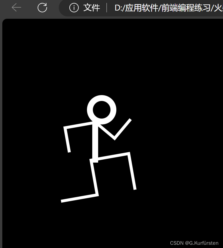
动画:跑起来
<style>
        * {
            margin: 0;
            padding: 0;
        }

        body {
            background-color: black;
        }

        .container {
            margin: 50px;
            height: 300px;
            width: 300px;
        }

        .person {
            position: absolute;
            top: 160px;
            left: 150px;
            animation: move 5s ease-in infinite;
        }

        .head {
            height: 50px;
            width: 50px;
            border-radius: 50%;
            position: absolute;
            border: 5px solid #fff;
            top: -30px;
            left: -6px;
            animation: bob;
            animation-duration: 2s;
            animation-iteration-count: infinite;
            animation-direction: alternate;

        }

        .torso {
            height: 60px;
            width: 0px;
            position: absolute;
            border: 5px solid #fff;
            top: 25px;
            left: 10px;
        }

        .arm {
            height: 45px;
            width: 40px;
            border-left: 5px solid #fff;
            border-bottom: 5px solid #fff;
            position: absolute;
            top: 25px;
            left: 10px;
            transform-origin: 0% 0% 1px;
            animation: pump 1s ease-in-out infinite;
        }

        /* 让一个元素同时拥有两个类名,表示一个并集选择器,
            选择器会匹配同时拥有 class1 和 class2 这两个类的元素。
            即元素既需要拥有 .class1 也需要拥有 .class2 */

        .arm.one {
            transform: rotate3d(0, 0, 1, 50deg);
        }

        .arm.two {
            transform: rotate3d(0, 0, 1, -50deg);
            animation-delay: 0.5s;
        }

        .leg {
            height: 60px;
            width: 40px;
            position: absolute;
            border-top: 5px solid #fff;
            border-right: 5px solid #fff;
            top: 90px;
            left: 15px;
            transform-origin: 0% 0% 1px;
            animation: pump 1s ease-in-out infinite;
        }

        .leg.one {
            transform: rotate3d(0, 0, 1, 80deg);
        }

        .leg.two {
            transform: rotate3d(0, 0, 1, -20deg);
            animation-delay: 0.5s;
        }

        /* 头部动画 */
        @keyframes bob {
            0% {
                transform: rotate3d(0, 0, 1, 5deg);
            }

            25% {
                transform: rotate3d(0, 0, 1, -30deg) skew(15deg, 0deg);
            }

            50% {
                transform: rotate3d(0, 0, 1, 5deg);
            }

            75% {
                transform: rotate3d(0, 0, 1, 20deg) skew(-15deg, 0deg);
            }
        }

        /* 胳膊摆动 */
        @keyframes pump {
            0% {
                transform: rotate3d(0, 0, 1, 50deg);
            }

            50% {
                transform: rotate3d(0, 0, 1, -60deg);
            }

            100% {
                transform: rotate3d(0, 0, 1, 50deg);
            }
        }

        /* 腿摆动 */
        @keyframes pump {
            0% {
                transform: rotate3d(0, 0, 1, 80deg);
            }

            50% {
                transform: rotate3d(0, 0, 1, -20deg);
            }

            100% {
                transform: rotate3d(0, 0, 1, 80deg);
            }
        }

        /* 运动动画 */
        @keyframes move {
            0% {
                /* 平移 */
                transform: translate(-200px, 0px);
            }

            100% {
                transform: translate(1800px, 0px);
            }
        }
</style>

<body>
    <!-- 火柴人结构 -->
    <div class="container">
        <div class="person">
            <div class="head"></div>
            <div class="torso"></div>
            <div class="arm one"></div>
            <div class="arm two"></div>
            <div class="leg one"></div>
            <div class="leg two"></div>
        </div>
    </div>

</body>


 8475
8475


 被折叠的 条评论
为什么被折叠?
被折叠的 条评论
为什么被折叠?
 到【灌水乐园】发言


