


文章目录
1. 基本使用
1.1 figure 图像
api
plt.figure 方法通常用来创建一个新的figure,或激活一个现有的figure。
Parameters:
num: int 或者 str 类型, 可选参数。是指定图像的唯一标识符,若该标识符指定的图像已经存在则会激活该图像。
figsize:(float, float), 默认值为 rcParams["figure.figsize"] (即 [6.4, 4.8]),
分别表示图像的 Width 与 height,单位是英寸。
dpi:float, 默认值为 rcParams["figure.dpi"] (即 100.0)。指定了图像的分辨率,单位是点/英寸。
示例
matplotlib 的 figure 就是一个 单独的 figure 小窗口, 小窗口里面还可以有更多的小图片。
x = np.linspace(-3, 3, 50)
y1 = 2 * x + 1
y2 = x ** 2
plt.figure(num=1, figsize=[8, 5])
plt.plot(x, y2)
plt.plot(x, y1, color='orange', linewidth=1.0, linestyle='--')
plt.figure(num=2, figsize=[8, 5])  # 最终应为空
plt.figure(num=1)  # 最终应有三条线
plt.plot(x, y1 + 2)
plt.show()
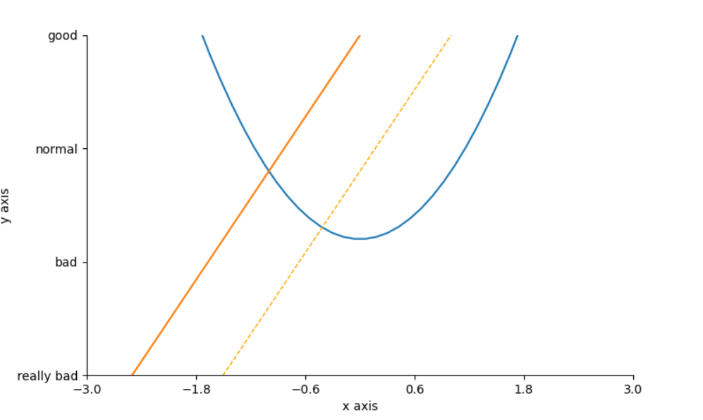
1.2 设置坐标轴
可以使用 plt.xlim 设置x坐标轴范围; 使用 plt.ylim 设置y坐标轴范围; 使用 plt.xlabel 设置x坐标轴名称; 使用 plt.ylabel 设置y坐标轴名称。如下所示:
plt.xlim((-3, 3))
plt.ylim((-2, 3))
plt.xlabel('x axis')
plt.ylabel('y axis')
此外可以使用 plt.xticks 设置x轴刻度, 使用 plt.yticks 设置y轴刻度, 如下所示:
x_ticks = np.linspace(-3, 3, 6)
y_ticks = np.linspace(-2, 3, 4)
plt.xticks(x_ticks)
plt.yticks(y_ticks, ['really bad', 'bad', 'normal', 'good']) # 可以使用list替换数字刻度
可以使用 plt.gca 获取当前坐标轴信息, 对该信息可以使用 .spines 方法设置边框, 进而使用 .set_color 设置边框颜色。
ax = plt.gca()
ax.spines['right'].set_color('none')
ax.spines['top'].set_color('none')
此时效果如下所示:
继续修改,使用 .xaxis.set_ticks_position 可以设置 x 轴刻度的位置,使用 .spines['bottom'].set_position 可以设置 x 轴的位置;y 轴同理:
ax.xaxis.set_ticks_position('bottom')
ax.spines['bottom'].set_position(('data', 0))
ax.yaxis.set_ticks_position('left')
ax.spines['left'].set_position(('data', 0))
最终图像如下:
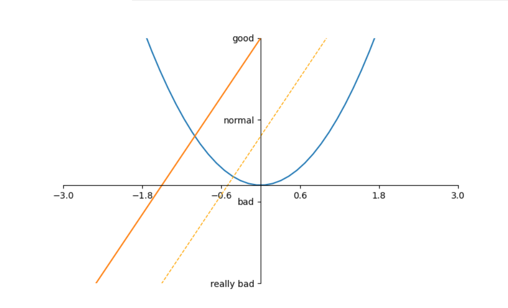
代码:
x = np.linspace(-3, 3, 50)
y1 = 2 * x + 1
y2 = x ** 2
plt.figure(num=1, figsize=[8, 5])
plt.plot(x, y2)
plt.plot(x, y1, color='orange', linewidth=1.0, linestyle='--')
plt.plot(x, y1 + 2)
plt.xlim((-3, 3))
plt.ylim((-2, 3))
x_ticks = np.linspace(-3, 3, 6)
y_ticks = np.linspace(-2, 3, 4)
plt.xticks(x_ticks)
plt.yticks(y_ticks, ['really bad', 'bad', 'normal', 'good'])
ax = plt.gca()
ax.spines['right'].set_color('none')
ax.spines['top'].set_color('none')
ax.xaxis.set_ticks_position('bottom')
ax.spines['bottom'].set_position(('data', 0))
ax.yaxis.set_ticks_position('left')
ax.spines['left'].set_position(('data', 0))
plt.show()
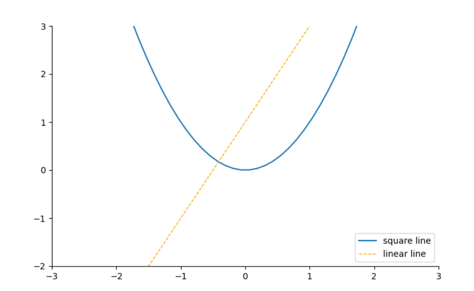
1.3 Legend 图例
- 方法一:
直接使用plt.plot()函数的label属性指定图例名称, 然后使用plt.legend()函数指定图例位置。
x = np.linspace(-3, 3, 50)
y1 = 2 * x + 1
y2 = x ** 2
plt.figure(num=1, figsize=[8, 5])
plt.plot(x, y2, label='square line')  # notice 1
plt.plot(x, y1, color='orange', linewidth=1.0, linestyle='--', label='linear line')  # notice 2
plt.xlim((-3, 3)), plt.ylim((-2, 3))
ax = plt.gca()
ax.spines['right'].set_color('none')
ax.spines['top'].set_color('none')
plt.legend(loc='lower right')  # notice 3
plt.show()
- 方法二:
可以在plt.legend输入更多参数来设置, 只是需要确保在代码notice 1和notice 2处需要用变量l1和l2分别将两个plot存储起来。 而且需要注意的是l1,l2,要以逗号结尾, 因为plt.plot()返回的是一个列表。
x = np.linspace(-3, 3, 50)
y1 = 2 * x + 1
y2 = x ** 2
plt.figure(num=1, figsize=[8, 5])
l1, = plt.plot(x, y2)  # notice 1
l2, = plt.plot(x, y1, color='orange', linewidth=1.0, linestyle='--')  # notice 2
plt.xlim((-3, 3)), plt.ylim((-2, 3))
ax = plt.gca()
ax.spines['right'].set_color('none')
ax.spines['top'].set_color('none')
plt.legend(handles=[l1, l2], labels=['square line', 'linear line'], loc='lower right')  # notice 3
plt.show()
以上无论是哪种方法都应该可以得到下面所示的图像:
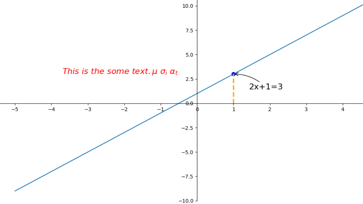
1.4 Annotation 标注
基本图代码
x = np.linspace(-5, 5)
y = 2 * x + 1
plt.figure(num=1, figsize=(8, 5))
plt.plot(x, y)
# set axes
axes = plt.gca()
axes.spines['right'].set_color('none')
axes.spines['top'].set_color('none')
axes.xaxis.set_ticks_position('bottom')
axes.spines['bottom'].set_position(('data', 0))
axes.yaxis.set_ticks_position('left')
axes.spines['left'].set_position(('data', 0))
# line and scatter dot
x0, y0 = 1, 3
plt.plot([x0, x0], [0, y0], 'k--', linewidth=2.5, color='orange')
plt.scatter([x0], [y0], s=50, c='b')
plt.xticks(np.arange(-6, 7))
添加注释 annotate
# 标注 (x0, y0) -- (1, 3) 点
plt.annotate('2x+1=%s' % y0, xy=(x0, y0), xycoords='data', xytext=(+30, -30), textcoords='offset points', fontsize=16,
             arrowprops=dict(arrowstyle='->', connectionstyle="arc3,rad=.2"))
# 添加注释 text
plt.text(-5, 3, r'$This\ is\ the\ some\ text. \mu\ \sigma_i\ \alpha_t$',
         fontdict={'size': 16, 'color': 'r'})
plt.show()
以上可以得到下面所示的图像:
1.5 tick 透明度
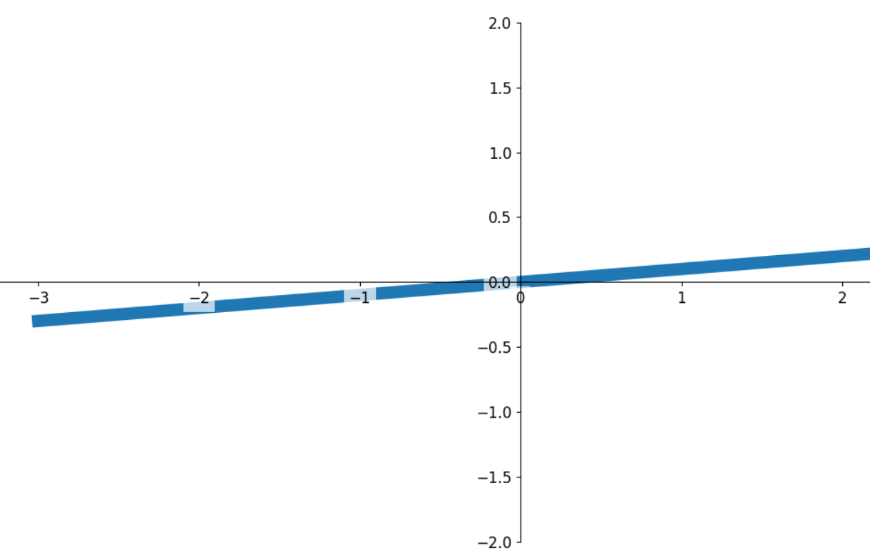
x = np.linspace(-3, 3)
y = 0.1 * x
# 绘制基本图, zorder必需,不知道为啥哦...
plt.plot(x, y, linewidth=10, zorder=1)
axes = plt.gca()
axes.spines['right'].set_color('none')
axes.spines['top'].set_color('none')
axes.spines['left'].set_position(('data', 0))
axes.spines['bottom'].set_position(('data', 0))
plt.ylim(-2, 2)
# 设置透视度
for label in axes.get_xticklabels() + axes.get_yticklabels():
    label.set_fontsize(12)
    # 在 plt 2.0.2 或更高的版本中, 设置 zorder 给 plot 在 z 轴方向排序
    label.set_bbox(dict(facecolor='white', edgecolor='None', alpha=0.7, zorder=2))
plt.show()
主要关注其中 label.set_fontsize(12) 表示调节字体大小,label.set_bbox 设置目的内容的透明度相关参数,facecolor 调节前景色,edgecolor 设置边框, 本处设置边框为无,alpha 设置透明度. 最终结果如下:
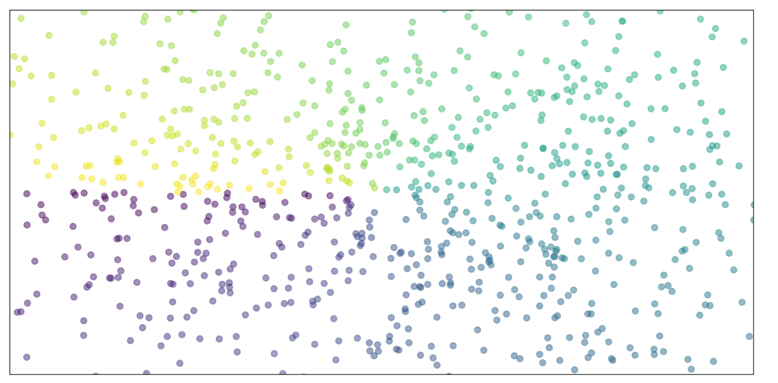
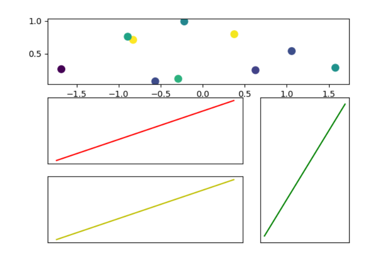
2. 散点图绘制
n = 1024  # data size
X = np.random.normal(0, 1, n)  # 每一个点的X值
Y = np.random.normal(0, 1, n)  # 每一个点的Y值
T = np.arctan2(Y, X)  # for color value
plt.scatter(X, Y, s=50, c=T, alpha=.5)
plt.xlim(-1.5, 1.5)
plt.xticks(())  # ignore xticks
plt.ylim(-1.5, 1.5)
plt.yticks(())  # ignore yticks
plt.show()
图片如下:
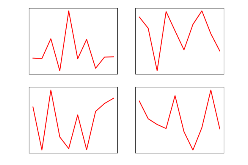
3. 多图合并显示
3.1 Subplot 多合一显示
均匀图中图
使用 plt.subplot 来指定创建小图, 如 plt.subplot(2,2,1) 表示将整个图像窗口分为2行2列, 当前位置为1, 接着使用 plt.plot() 在当前指定位置创建一个小图。
def uniform_multi_graph(rows, cols, idx):
    plt.subplot(rows, cols, idx)
    plt.plot(np.linspace(0, idx, 10), np.random.rand(10), c='red')
    plt.xticks(()), plt.yticks(())

plt.figure()
for i in range(1, 5):
    uniform_multi_graph(2, 2, i)
plt.show()
图片如下:
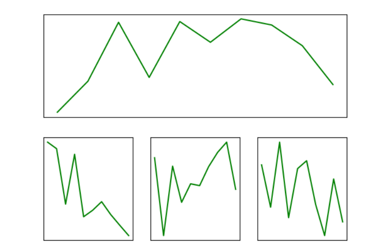
不均匀图中图
仍然使用 plt.subplot 来指定创建小图。 首先使用 plt.subplot(2,1,1) 表示将整个图像窗口分为2行1列, 当前位置为1, 接着使用 plt.plot() 在当前指定位置创建一个小图。接下来使用 plt.subplot(2,3,4) 表示将整个图像窗口分为2行3列, 当前位置为4, 接着使用 plt.plot() 在当前指定的第4个位置创建一个小图,同样对于5, 6 位置也是同样的操作,这样最终就会呈现如下图所示的效果。
def uneven_multi_graph(rows, cols, idx):
    plt.subplot(rows, cols, idx)
    plt.plot(np.linspace(0, idx, 10), np.random.rand(10), c='g')
    plt.xticks(()), plt.yticks(())
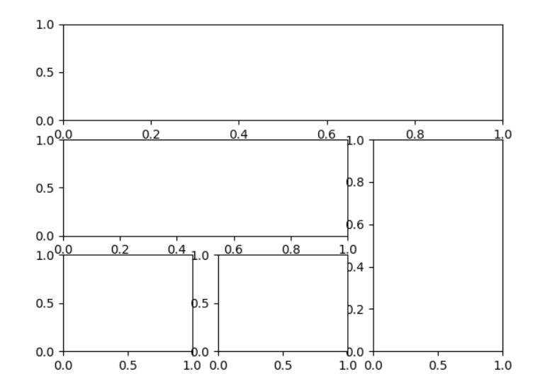
3.2 Subplot 分格显示
matplotlib 的 subplot 还可以是分格的。
subplot2grid
使用 plt.subplot2grid 来创建第1个小图, (3,3) 表示将整个图像窗口分成3行3列, (0,0) 表示从第0行第0列开始作图,colspan=3 表示列的跨度为 3 , rowspan=1 表示行的跨度为 1 。 colspan和rowspan 缺省, 默认跨度为 1 。详见以下程序:
def graph2grid(shape, idx, rowspan=1, colspan=1, color='r'):
    ax = plt.subplot2grid(shape, idx, rowspan, colspan)
    ax.plot(np.arange(10), np.linspace(5, 15, 10), c=color)
    plt.xticks(()), plt.yticks(())


plt.figure()
ax1 = plt.subplot2grid((3, 3), (0, 0), colspan=3)
ax1.scatter(np.random.randn(10), np.random.rand(10), s=70, c=np.random.rand(10))
graph2grid((3, 3), (1, 0), colspan=2)
graph2grid((3, 3), (2, 0), colspan=2, color='y')
graph2grid((3, 3), (1, 2), rowspan=2, color='g')
plt.show()
gridspec
import matplotlib.gridspec as gridspec

plt.figure()
gs = gridspec.GridSpec(3, 3)
plt.subplot(gs[0, :])
plt.subplot(gs[1, :2])
plt.subplot(gs[1:, 2])
plt.subplot(gs[-1, 0])
plt.subplot(gs[-1, -2])
plt.show()
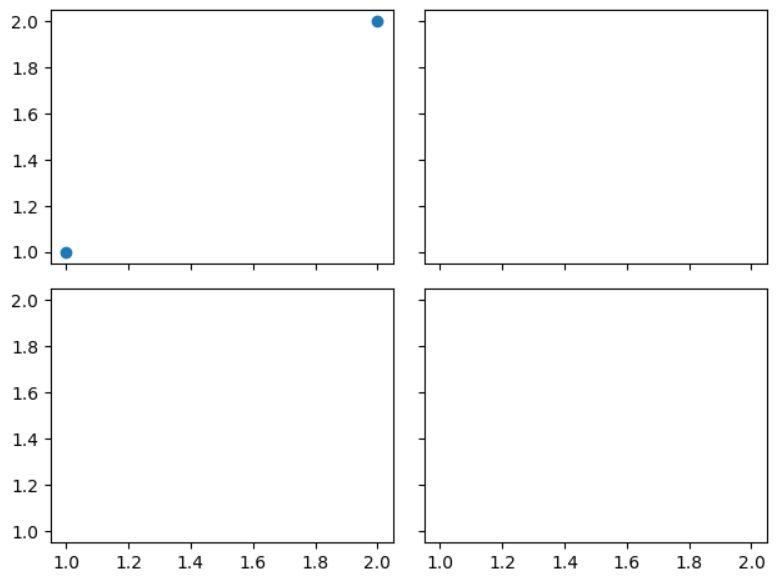
subplots
# sharex=True 表示共享x轴坐标, sharey=True 表示共享y轴坐标
f, ((ax11, ax12), (ax13, ax14)) = plt.subplots(2, 2, sharex=True, sharey=True)
ax11.scatter([1, 2], [1, 2])
plt.tight_layout()  # 表示紧凑显示图像
plt.show()
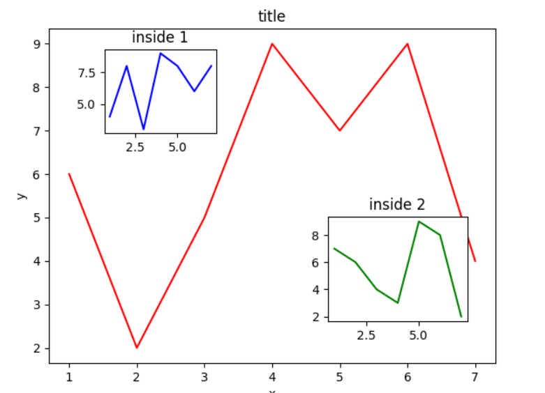
3.3 图中图
f = plt.figure()
left, bottom, width, height = 0.1, 0.1, 0.8, 0.8
ax = f.add_axes([left, bottom, width, height])
ax.plot(np.arange(1, 8), np.random.randint(1, 10, 7), c='r')
ax.set_title('title')
ax.set_xlabel('x')
ax.set_ylabel('y')

ax1 = f.add_axes([0.2, 0.65, 0.2, 0.2])
ax1.plot(np.arange(1, 8), np.random.randint(1, 10, 7), c='b')
ax1.set_title('inside 1')

plt.axes([0.6, 0.2, 0.25, 0.25])
plt.plot(np.arange(1, 8), np.random.randint(1, 10, 7), c='g')
plt.title('inside 2')
plt.show()
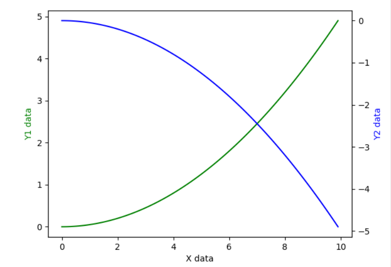
3.4 次坐标轴
有时候我们会用到次坐标轴,即在同个图上有第2个y轴存在,同样可以用matplotlib做到。
x = np.arange(0, 10, 0.1)
y1 = 0.05 * x ** 2
y2 = -y1

fig, ax1 = plt.subplots()
ax2 = ax1.twinx()
ax1.plot(x, y1, 'g-')
ax1.set_xlabel('X data')
ax1.set_ylabel('Y1 data', color='g')
ax2.plot(x, y2, 'b-')
ax2.set_ylabel('Y2 data', color='b')
plt.show()
4. Animation 动画
matplotlib 提供的生成动画的方式有 Animation,FuncAnimation,ArtistAnimation。其中 FuncAnimation 是指通过重复的调用一个函数来生成动画。matplotlib.animation.FuncAnimation 定义如下:
参数:
fig:Figure 对象
func:callable,可被调用对象,每一个帧均会调用一次,其第一个参数将是帧中的下一个值
frames: 动画长度,一次循环包含的帧数
init_func: 自定义开始帧,即下面要传入的函数 init
interval: 更新频率,以ms计
blit: 选择更新所有点,还是仅更新产生变化的点,默认为 False
from matplotlib import pyplot as plt
from matplotlib import animation as animation
import numpy as np
import PIL

fig, ax = plt.subplots()
x = np.arange(-np.pi, np.pi, 0.01)
line, = plt.plot(x, np.sin(x))
ax.spines['right'].set_color('none')
ax.spines['top'].set_color('none')
ax.spines['left'].set_position(('data', 0))
ax.spines['bottom'].set_position(('data', 0))


def animate(i):
    line.set_ydata(np.sin(x + i / 10.0))
    return line,


def init():
    line.set_ydata(np.sin(x))
    return line,


animator = animation.FuncAnimation(fig=fig, func=animate, frames=100, init_func=init,
                        interval=20, blit=True)
# animator.save(r'image\sina.gif', writer='pillow')
plt.show()
最终就会呈现如下图所示的效果:


 646
646

 被折叠的 条评论
为什么被折叠?
被折叠的 条评论
为什么被折叠?
 到【灌水乐园】发言


