


制作 h t m l 网页流程 制作html网页流程 制作html网页流程
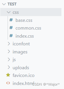
项目结构:
a, abbr, acronym, address, applet, article, aside, audio, b, big, blockquote, body, canvas, caption, center, cite, code, dd, del, details, dfn, div, dl, dt, em, embed, fieldset, figcaption, figure, footer, form, h1, h2, h3, h4, h5, h6, header, hgroup, html, i, iframe, img, ins, kbd, label, legend, li, mark, menu, nav, object, ol, output, p, pre, q, ruby, s, samp, section, small, span, strike, strong, sub, summary, sup, table, tbody, td, tfoot, th, thead, time, tr, tt, u, ul, var, video {
    margin: 0;
    padding: 0;
    border: 0;
    vertical-align: baseline;
    list-style: none;
    text-decoration: none;
}

body{
    font: 16px,1.5 "Microsoft Yahei";
    color: #333;
}

a{
    text-decoration: none;
    color: #333;
}
/* 头尾各个页面相同的样式 */

/* 版心 */
.wrapper{
    margin: 0 auto;
    width: 1240px;
}

/* 快捷导航 */
.shortcut{
    height: 52px;
    background-color: #333;
}

.shortcut .wrapper{
    display: flex;
    justify-content: flex-end;
    height: 52px;
    /* background-color: pink; */
}

.shortcut ul{
    display: flex;
    line-height: 52px;
}

.shortcut li a{
    padding: 0 15px;
    border-right: 1px solid #999;
    font-size: 14px;
    color: #fff;
}

.shortcut li:last-child a {
    border-right: 0;
}

.shortcut li .login{
 color: green;

}

/* 头部 header */
.header{
    display: flex;
    margin-top: 22px;
    margin-bottom: 22px;
    height: 88px;
    /* background-color: pink; */
}

.logo{
    margin-right: 40px;
    width: 200px;
    height: 88px;
    /* background-color: skyblue; */
}

.logo a{
    display: block;
    width: 200px;
    height: 88px;
    background-image: url('../images/logo.png');
    background-position: center;
    background-size: cover;
    background-repeat: no-repeat;

    font-size: 0;
}

/* 导航 */
.nav{
    margin-top: 33px;
    margin-right: 28px;
}

.nav ul{
    display: flex;
}

.nav li{
    margin-right: 47px;
}

.nav li a{
    padding-bottom: 10px;
    /* background-color: skyblue; */
}

.nav li a:hover{
    border-bottom: 2px solid #5EB69C;
    color: #5EB69C;
}

/* 搜索 */
.search{
    display: flex;
    margin-top: 33px;
    margin-right: 45px;
    width: 170px;
    height: 34px;
    border-bottom: 2px solid #F4F4F4;
}

.search .iconfont{
    margin-right: 8px;
    font-size: 18px;
    color: #ccc;
}


.search input{
/* 浏览器优先生效input标签的默认宽度,所以 flex: 1不生效 */
/* 解决办法:重置input 默认宽度→ width:0 */
    flex: 1;
    width: 0;
}

.search input::placeholder{
    font-size: 16px;
    color: #ccc;
}

/* 购物车 */
.cart{
    position: relative;
    margin-top: 32px;
}

.cart .iconfont{
    font-size: 24px;
}

.cart i{
    position: absolute;
    top: 1px;
    /* right: 1px; */
    left:15px;
    padding:  0 6px;
    height: 15px;
    background-color: #E26237;
    border-radius: 8px;
    font-size: 14px;
    color: #fff;
    line-height: 15px;
}


/* 底部 */
.footer{
    height: 580px;
    background-color: #F5F5F5;
}

/* 服务 */
.service{
    padding: 60px 0;
    height: 178px;
    border-bottom: 1px solid #E8E8E8;
}

.service li{
    display: flex;
    width: 190px;
    height: 58px;
    background-color: green;

}

.service ul{
    display: flex;
    justify-content: space-evenly;
}


.service li h5{
    margin-right: 20px;
    width: 58px;
    height: 58px;
    background-color: #E26237;
    /* background-image: url(); */
}

.service li p{
  font-size: 28px;
  line-height: 58px;
}

.service li:nth-child(2) h5{
    background-color: antiquewhite;
}

.service li:nth-child(3) h5{
    background-color: orangered;
}

.service li:nth-child(4) h5{
    background-color: orchid;
}

/* 帮助中心 */
.help{
    display: flex;
    justify-content: space-between;
    padding-top: 60px;
    height: 300px;
    /* background-color: pink; */
}

/* left */
.help .left {
    display: flex;
}

.help .left dl{
    margin-right: 84px;
}

.help .left dl:last-child{
    margin-right: 0;
}

.help .left dt{
    margin-bottom: 30px;
    font-size: 18px;
}

.help .left dd{
    margin-bottom: 10px;
}

.help .left a{
    color: #969696;
}

/* right */
.help .right ul{
    display: flex;
}

.help .right li:first-child{
    margin-right: 55px;
}

.help .right .pic{
    margin-bottom: 10px;
    width: 120px;
    height: 120px;
}

.help .right p{
    color: #969696;
    text-align: center;
}

/* 版权 */
.copyright{
  text-align: center;
}

.copyright p{
    margin-bottom: 10px;
    color: #A1A1A1;
}

.copyright p a{
    margin: 0 10px;
    color: #A1A1A1;
}
/* 首页内容的样式 */

.banner{
    height: 500px;
    /* background-color: aquamarine; */
}

.banner .wrapper{
    position: relative;
    height: 500px;
    /* background-color: pink; */
    /* 溢出隐藏 */
    overflow: hidden;
}

.banner .pic{
    display: flex;
    /* flex布局,父级宽度不够,子级被挤小,不想挤小,增大父级尺引 */
    width: 3720px;
}

.subnav{
    position: absolute;
    left: 0;
    top: 0;
    width: 250px;
    height: 500px;
    background-color: rgba(0, 0, 0, 0.4);
}

.subnav li{
    display: flex;
    justify-content: space-between;
    padding-left: 30px;
    padding-right: 12px;
    height: 50px;
    /* background-color: pink; */
    line-height: 50px;
    color: #fff;
    cursor: pointer;

}


.subnav li a{
    margin-right: 5px;
    font-size: 14px;
    color: #fff;
}

.subnav li .classify{
    margin-right: 14px;
    font-size: 16px;
}

.subnav li .iconfont{
    font-size: 14px;
}

.subnav li:hover{
    background-color: aquamarine;
}

/* 圆点指示器 */
.banner ol{
    position: absolute;
    bottom: 17px;
    right: 16px;
    display: flex;
}

.banner ol li{
    margin-left: 8px;
    width: 22px;
    height: 22px;
    /* background-color: #969696; */
    border-radius: 50%;
}

.banner ol i{
    /* 行内元素高宽不生效,需要设置为块模式 */
    display: block;
    margin: 4px;
    width: 14px;
    height: 14px;
    background-color:rgba(255, 255, 255, 0.5);
    border-radius: 50%;
    cursor: pointer;
}
/* 选中状态 */

.banner ol .current{
    background-color: rgba(255, 255, 255, 0.5);
}


.banner ol .current i{
    background-color:#fff;
}

/* 内容栏1 */
.title{
    display: flex;
    justify-content: space-between;
    margin-top: 40px;
    margin-bottom: 30px;
    height: 42px;
    /* background-color: pink; */
}
.title .left{
    display: flex;
}

.title .left h3{
    margin-right: 35px;
    font-size: 30px;
}

.title .left p{
    align-self: flex-end;
    color: #a1a1a1;
}

.title .right .more{
    line-height: 42px;
    color: #a1a1a1;
}


.title .right .more .iconfont{
    margin-left: 10px;
}

/* 内容公共样式  */
.bd ul{
    display: flex;
    justify-content: space-between;
}

.bd li{
    width: 304px;
    height: 404px;
    background-color: #EEF9F4;
}

.bd li .pic{
    width: 304px;
    height: 304px;
}

.bd li .txt{
    text-align: center;
}

.bd li h4 {
    margin-top: 18px;
    margin-bottom: 8px;
    font-size: 20px;
}

.content1 .bd p{
    font-size: 18px;
    color: #AA2113;
}

.content1 .bd p span{
    margin-left: 3px;
    font-size: 22px;
}
<!DOCTYPE html>
<html lang="en">
<head>
<meta charset="UTF-8">
<meta name="viewport" content="width=device-width, initial-scale=1.0">
<meta name="description" content="">
<meta name="keywords" content="">
<title>Document</title>
<link rel="shortcut icon" href="favicon.ico" type="image/x-icon">
<link rel="stylesheet" href="./css/base.css">
<link rel="stylesheet" href="./css/common.css">
<link rel="stylesheet" href="./css/index.css">
</head>
<body>
<!-- 快捷导航(shortcut)
结构:通栏>版心>导航ul
布局: flex-end
-->
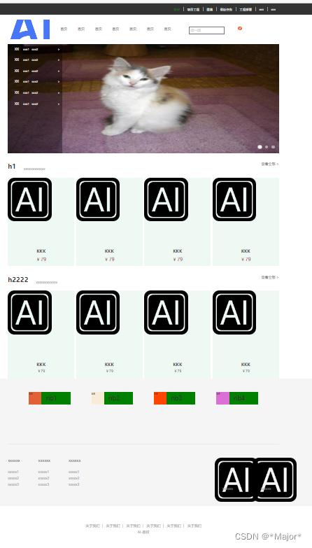
<div class="shortcut">
<div class="wrapper">
<ul>
<li><a href="#" class="login">登录</a></li>
<li><a href="#">项目工程</a></li>
<li><a href="#">图集</a></li>
<li><a href="#">最近任务</a></li>
<li><a href="#">工程部署</a></li>
<li><a href="#">xxx</a></li>
<li><a href="#">xxx</a></li>
</ul>
</div>
</div>
<!-- 头部(header)
结构: .header > logo+导航(nav)+搜索( search)+购物车(cart)
-->
<div class="header wrapper">
<!-- logo -->
<div class="logo">
<h1><a href="#">AI</a></h1>
</div>
<!--导航 -->
<div class="nav">
<ul>
<li><a href="#">首页</a></li>
<li><a href="#">首页</a></li>
<li><a href="#">首页</a></li>
<li><a href="#">首页</a></li>
<li><a href="#">首页</a></li>
<li><a href="#">首页</a></li>
<li><a href="#">首页</a></li>
</ul>
</div>
<!--搜索 -->
<div class="search">
<span class="iconfont icon-search"></span>
<input type="text" placeholder="搜一搜">
</div>
<!-- 购物车 -->
<div class="cart">
<span class="iconfont icon-cart-full"></span>
<i>2</i>
</div>
</div>
<!-- banner -->
<!-- 结构∶通栏>版心轮播图(ul.pic)+侧导航(subnav > ul)+圆点指示器(ol) -->
<div class="banner">
<div class="wrapper">
<!-- 图片 -->
<ul class="pic">
<li><a href="#"><img src="./uploads/1.jpg" width="1240" height="500"></a></li>
<li><a href="#"><img src="./uploads/2.jpg" width="1240" height="500"></a></li>
<li><a href="#"><img src="./uploads/3.jpg" width="1240" height="500"></a></li>
</ul>
<!-- 侧导航 -->
<div class="subnav">
<ul>
<li>
<div><a href="#" class="classify">XX</a> <a href="#">xxx1</a> <a href="#">xxx2</a></div>
<span class="iconfont icon-arrow-right-bold"> > </span>
</li>
<li>
<div><a href="#" class="classify">XX</a> <a href="#">xxx1</a> <a href="#">xxx2</a></div>
<span class="iconfont icon-arrow-right-bold"> > </span>
</li>
<li>
<div><a href="#" class="classify">XX</a> <a href="#">xxx1</a> <a href="#">xxx2</a></div>
<span class="iconfont icon-arrow-right-bold"> > </span>
</li>
<li>
<div><a href="#" class="classify">XX</a> <a href="#">xxx1</a> <a href="#">xxx2</a></div>
<span class="iconfont icon-arrow-right-bold"> > </span>
</li>
<li>
<div><a href="#" class="classify">XX</a> <a href="#">xxx1</a> <a href="#">xxx2</a></div>
<span class="iconfont icon-arrow-right-bold"> > </span>
</li>
<li>
<div><a href="#" class="classify">XX</a> <a href="#">xxx1</a> <a href="#">xxx2</a></div>
<span class="iconfont icon-arrow-right-bold"> > </span>
</li>
</ul>
</div>
<!-- 圆点指示器 -->
<ol>
<li class="current"><i></i></li>
<li><i></i></li>
<li><i></i></li>
</ol>
</div>
</div>
<!-- 内容栏1 -->
<div class="content1 wrapper">
<!-- 标题 -->
<div class="title">
<div class="left">
<h3>h1</h3>
<p>xxxxxxxxxxxx</p>
</div>
<div class="right">
<a href="#" class="moew">查看全部
<span class="iconfont icon-arrow-right-bold">></span></a>
</div>
</div>
<!-- 内容 -->
<div class="bd">
<ul>
<li>
<a href="#">
<div class="pic"><img src="./images/AI.png" alt=""></div>
<div class="txt">
<h4>KKK</h4>
<p>¥<span>79</span></p>
</div>
</a>
</li>
<li>
<a href="#">
<div class="pic"><img src="./images/AI.png" alt=""></div>
<div class="txt">
<h4>KKK</h4>
<p>¥<span>79</span></p>
</div>
</a>
</li>
<li>
<a href="#">
<div class="pic"><img src="./images/AI.png" alt=""></div>
<div class="txt">
<h4>KKK</h4>
<p>¥<span>79</span></p>
</div>
</a>
</li>
<li>
<a href="#">
<div class="pic"><img src="./images/AI.png" alt=""></div>
<div class="txt">
<h4>KKK</h4>
<p>¥<span>79</span></p>
</div>
</a>
</li>
</ul>
</div>
</div>
<!-- 内容栏2 -->
<div class="content2 wrapper">
<!-- 标题 -->
<div class="title">
<div class="left">
<h3>h2222</h3>
<p>xxxxxxxxxxxx</p>
</div>
<div class="right">
<a href="#" class="moew">查看全部
<span class="iconfont icon-arrow-right-bold">></span></a>
</div>
</div>
<!-- 内容 -->
<div class="bd">
<ul>
<li>
<a href="#">
<div class="pic"><img src="./images/AI.png" alt=""></div>
<div class="txt">
<h4>KKK</h4>
<p>¥<span>79</span></p>
</div>
</a>
</li>
<li>
<a href="#">
<div class="pic"><img src="./images/AI.png" alt=""></div>
<div class="txt">
<h4>KKK</h4>
<p>¥<span>79</span></p>
</div>
</a>
</li>
<li>
<a href="#">
<div class="pic"><img src="./images/AI.png" alt=""></div>
<div class="txt">
<h4>KKK</h4>
<p>¥<span>79</span></p>
</div>
</a>
</li>
<li>
<a href="#">
<div class="pic"><img src="./images/AI.png" alt=""></div>
<div class="txt">
<h4>KKK</h4>
<p>¥<span>79</span></p>
</div>
</a>
</li>
</ul>
</div>
</div>
<!-- 底部 -->
<div class="footer">
<div class="wrapper">
<!-- 服务 -->
<div class="service">
<ul>
<li>
<h5>h5</h5>
<p>nb1</p>
</li>
<li>
<h5>h5</h5>
<p>nb2</p>
</li>
<li>
<h5>h5</h5>
<p>nb3</p>
</li>
<li>
<h5>h5</h5>
<p>nb4</p>
</li>
</ul>
</div>
<!-- 帮助中心 -->
<div class="help">
<!-- left -->
<div class="left">
<dl>
<dt>xxxxxx</dt>
<dd><a href="#">xxxxx1</a></dd>
<dd><a href="#">xxxxx2</a></dd>
<dd><a href="#">xxxxx3</a></dd>
</dl>
<dl>
<dt>xxxxxx</dt>
<dd><a href="#">xxxxx1</a></dd>
<dd><a href="#">xxxxx2</a></dd>
<dd><a href="#">xxxxx3</a></dd>
</dl>
<dl>
<dt>xxxxxx</dt>
<dd><a href="#">xxxxx1</a></dd>
<dd><a href="#">xxxxx2</a></dd>
<dd><a href="#">xxxxx3</a></dd>
</dl>
</div>
<!-- right -->
<div class="right">
<ul>
<li>
<div class="pic"><img src="./images/AI.png" alt=""></div>
<p>xxxxxx</p>
</li>
<li>
<div class="pic"><img src="./images/AI.png" alt=""></div>
<p>xxxxxx</p>
</li>
</ul>
</div>
</div>
<!-- 版权 -->
<div class="copyright">
<p>
<a href="#">关于我们</a>|
<a href="#">关于我们</a>|
<a href="#">关于我们</a>|
<a href="#">关于我们</a>|
<a href="#">关于我们</a>|
<a href="#">关于我们</a>
</p>
<p>AI-版权</p>
</div>
</div>
</div>
</body>
</html>
网页背景设置
<!DOCTYPE html>
<html lang="en">
<head>
<meta charset="UTF-8">
<meta name="viewport" content="width=device-width, initial-scale=1.0">
<title>Document</title>
<link rel="stylesheet" href="./css/base.css">
<style>
.wrapper{
margin: 0 auto;
width: 1240px;
height: 800px;
}
div{
/* 背景图默认是平铺的效果 */
background-image: url(./images/back1.webp);
/* 不平铺 */
background-repeat: no-repeat;
/* 铺满 */
background-size: cover;
/* 固定不滚动 */
background-attachment: fixed;
}
</style>
</head>
<body>
<!-- 上传图像数据 -->
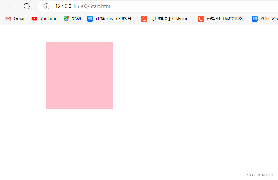
<div class="wrapper">
<div class="start">
<a href="./index.html">go start</a>
</div>
</div>
</body>
</html>
html实现平面转换
<!DOCTYPE html>
<html lang="en">
<head>
    <meta charset="UTF-8">
    <meta name="viewport" content="width=\, initial-scale=1.0">
    <title>Document</title>

    <style>
        div{
            margin: 100px 0;
            width: 100px;
            height: 100px;
            background-color: pink;
            /* 过度 */
            transition: all 1s;
        }

        /* 鼠标滑过,添加动态效果 */
        div:hover{
            transform: translate(180px) rotate(360deg) scale(2);
        }

    </style>
</head>
<body>

<div></div>
</body>
</html>
<!DOCTYPE html>
<html lang="en">
<head>
    <meta charset="UTF-8">
    <meta name="viewport" content="width=device-width, initial-scale=1.0">
    <title>Document</title>
    <style>
        .father{
            width: 500px;
            height: 300px;
            margin: 100px auto;
            border: 1px solid #000;
        }

        .son{
            width: 200px;
            height: 100px;
            background-color: pink;
            transition: all 1s;
        }

        /* 鼠标移入到父盒子,son改变位置 */
        .father:hover .son{
            transform: translate(200px,100px);
            /* 百分比 参照盒子自身尺寸 */
            transform: translate(-50%,100%);
            transform: translate(100px);
            transform: translateY(100px);
        }
    </style>
</head>
<body>

    <div class="father">
        <div class="son"></div>
    </div>

</body>
</html>
网页双开门效果
<!DOCTYPE html>
<html lang="en">
<head>
    <meta charset="UTF-8">
    <meta name="viewport" content="width=device-width, initial-scale=1.0">
    <title>Document</title>

    <style>
        *{
            margin: 0;
            padding: 0;
        }

    /*1。布局:父子结构,父级是大图,子级是左右小图 */
    .father{
        display: flex;
        margin: 0 auto;
        width: 1532px;
        height: 880px;
        background-image: url(./images/pexels-felix-mittermeier-4644812.jpg);
        overflow: hidden;
    }

    .father .left
    {
        width: 50%;
        height: 880px;
        background-image: url(./images/pexels-philippe-donn-1169754.jpg);

        transition: all 0.5s;
    }
    .father .right{
        width: 50%;
        height: 880px;
        background-image: url(./images/pexels-philippe-donn-1169754.jpg);
        transition: all 0.5s;
    }

    /*2.鼠标悬停的效果:左右移动 */
    .father:hover .left{
        transform: translate(-100%);
    }
    .father:hover .right{
        transform: translate(100%);
    }


    </style>
</head>
<body>

    <div class="father">
          <div class="left"></div>
          <div class="right"></div>
    </div>

</body>
</html>
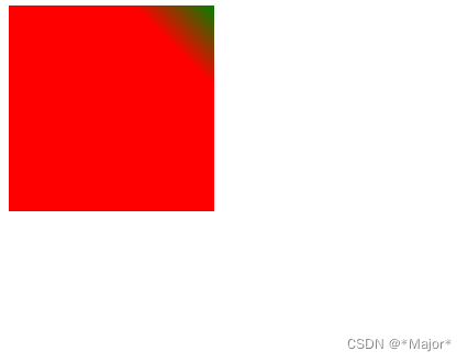
线性渐变
<!DOCTYPE html>
<html lang="en">
<head>
    <meta charset="UTF-8">
    <meta name="viewport" content="width=device-width, initial-scale=1.0">
    <title>Document</title>
    <style>
        div{
            width: 200px;
            height: 200px;
            background-color: green;
            background-image: linear-gradient(
                red,
                green
            );

            background-image: linear-gradient(
                to right,
                red,
                green
            );

            background-image: linear-gradient(
                45deg,
                red 80%,
                green
            );


        }
    </style>

</head>
<body>
<div></div>
</body>
</html>
黑色渐变凸显文字
<!DOCTYPE html>
<html lang="en">
<head>
    <meta charset="UTF-8">
    <meta name="viewport" content="width=device-width, initial-scale=1.0">
    <title>Document</title>

    <style>
      .box{
        position: relative;
        width: 300px;
        height: 212px;
      }

      .box img{
        height: 212px;
        width: 300px;
      }

      .box .title{
        position: absolute;
        left: 15px;
        bottom: 20px;
        z-index: 2;
        width: 260px;
        color: #fff;
        font-size: 20px;
        font-weight: 700;

      }

      .box .mask{
        position: absolute;
        left: 0;
        top: 0;
        width: 100%;
        height: 100%;
        background-image:linear-gradient(
            transparent,
            rgba(0,0,0,0.6)
        );
        opacity: 0;
        transition: all 0.5s;

     }

     .box:hover .mask{
        opacity: 1;
     }


    </style>
</head>
<body>


    <div class="box">
        <img src="./images/pexels-felix-mittermeier-4644812.jpg" alt="">
        <div class="title">xxxxxxxxXXXxxxx</div>
        <div class="mask"></div>
    </div>
</body>
</html>


 2万+
2万+


 被折叠的 条评论
为什么被折叠?
被折叠的 条评论
为什么被折叠?
 到【灌水乐园】发言


