


#_*_ coding:utf-8 _*_
import pandas as pd
import numpy as np
import matplotlib.pyplot as plt
from matplotlib.font_manager import FontProperties
from datetime import datetime
from datetime import timedelta
plt.style.use('ggplot')
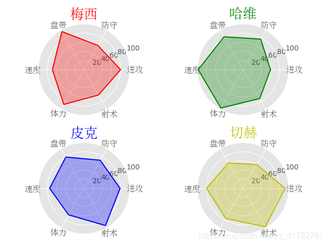
ability_size = 6
ability_label = ([u'进攻', u'防守', u'盘带', u'速度', u'体力', u'射术'])
font = FontProperties(fname=r'c:\windows\fonts\simsun.ttc', size=12) #生成字体
player = {
'M': np.random.randint(size=ability_size, low=60, high=99),
'H': np.random.randint(size=ability_size, low=60, high=99),
'P': np.random.randint(size=ability_size, low=60, high=99),
'Q': np.random.randint(size=ability_size, low=60, high=99),
}
theta = np.linspace(0, 2*np.pi, 6, endpoint=False)
theta = np.append(theta, theta[0])
player['M'] = np.append(player['M'], player['M'][0])
ax1 = plt.subplot(221, projection='polar')
ax2 = plt.subplot(222, projection='polar')
ax3 = plt.subplot(223, projection='polar')
ax4 = plt.subplot(224, projection='polar')
#球员属性
ax1.plot(theta, player['M'], 'r')
ax1.fill(theta, player['M'], 'r', alpha=0.3)
ax1.set_xticks(theta)
ax1.set_xticklabels(ability_label, y=0.1, fontproperties=font)
ax1.set_title(u'梅西', position=(0.5, 1.01), fontproperties=font, color='r', size=20)
ax1.set_yticks([20, 40, 60, 80, 100])
player['H'] = np.append(player['H'], player['H'][0])
ax2.plot(theta, player['H'], 'g')
ax2.fill(theta, player['H'], 'g', alpha=0.3)
ax2.set_xticks(theta)
ax2.set_xticklabels(ability_label, y=0.1, fontproperties=font)
ax2.set_title(u'哈维', position=(0.5, 1.01), fontproperties=font, color='g', size=20)
ax2.set_yticks([20, 40, 60, 80, 100])
player['P'] = np.append(player['P'], player['P'][0])
ax3.plot(theta, player['P'], 'b')
ax3.fill(theta, player['P'], 'b', alpha=0.3)
ax3.set_xticks(theta)
ax3.set_xticklabels(ability_label, y=0.1, fontproperties=font)
ax3.set_title(u'皮克', position=(0.5, 1.01), fontproperties=font, color='b', size=20)
ax3.set_yticks([20, 40, 60, 80, 100])
player['Q'] = np.append(player['Q'], player['Q'][0])
ax4.plot(theta, player['Q'], 'y')
ax4.fill(theta, player['Q'], 'y', alpha=0.3)
ax4.set_xticks(theta)
ax4.set_xticklabels(ability_label, y=0.1, fontproperties=font)
ax4.set_title(u'切赫', position=(0.5, 1.01), fontproperties=font, color='y', size=20)
ax4.set_yticks([20, 40, 60, 80, 100])
plt.show()
K线图
在matplotlib 2.2.0版本以前,使用from matplotlib.finance import quotes_historical_yahoo_ohlc包导入的函数可以获取雅虎财经网站股票数据,使用from matplotlib.finance import candlestick_ochl导入的candlestick_ochl函数可以画出股票K线图。
但自matplotlib 2.2.0版本后,matplotlib.finance从matplotlib中剥离了,所以需要单独安装两个包来替代:pandas_datareader 和 mpl_finance。
注:mpl_finance是matplotlib.finance改的新名字,但新包没有了quotes_historical_yahoo_ohlc这个API方法,所以需要再安装pandas_datereader包用来获取数据
具体参考:https://blog.csdn.net/Acegem/article/details/102973851
#_*_ coding:utf-8 _*_
import pandas as pd
import numpy as np
import matplotlib.pyplot as plt
from matplotlib.font_manager import FontProperties
from datetime import datetime
from datetime import timedelta
import pandas_datareader as pdr
plt.style.use('ggplot')

# quotes = pdr.get_data_yahoo('INTC', date1, date2)
quotes = pdr.get_data_yahoo('INTC', '2019/10/1', '2019/11/1')

volumns = np.array([])
dates = np.array([])

for record in quotes:
    dates = np.append(dates, record[0])
    volumns = np.append(volumns, record[2])
#界面布局
left, width = 0.1, 0.8
rect_vol = [left, 0.1, width, 0.3]
rect_main = [left, 0.4, width, 0.5]
fig = plt.figure()
ax_vol = fig.add_axes(rect_vol)
ax_vol.fill_between(dates, volumns, color='y')


ax_main = fig.add_axes(rect_main)
plt.setp(ax_vol.get_xticklabels(), rotation=30, horizontalalignment='right') # horizontal alignment 水平放置

plt.show()


 4140
4140


 被折叠的 条评论
为什么被折叠?
被折叠的 条评论
为什么被折叠?
 到【灌水乐园】发言


