


数据可视化在分析和解释数据的过程中起着举足轻重的作用。Python中的Matplotlib库提供了一个强大的工具包,用于制作各种图表和图表。一个突出的功能是它能够在单个图中生成子图,为以组织良好和结构化的方式呈现数据提供了有价值的工具。使用子图可以同时显示多个图,有助于改进基础数据的全面视觉表示。
使用Python的Matplotlib生成子图
有几种方法可以使用Python的Matplotlib生成子图。在这里,我们将探索一些常用的方法来使用Python的Matplotlib创建子图。
- 使用Line Plot的多个子图
- 使用Bar Plot的多个子图
- 使用Pie Plot的多个子图
- 自定义子图组合
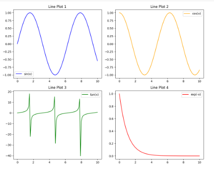
使用Line Plot的多个子图
在本例中,代码利用Matplotlib生成一个2×2网格的线图,每个线图都基于示例数据描绘一个数学函数(正弦、余弦、正切和指数)。子图是使用plt.subplots函数创建和自定义的,每个子图都标有标题、线条颜色和图例。在调整布局以获得子图之间的最佳间距后,使用plt.show显示生成的可视化。
import matplotlib.pyplot as plt
import numpy as np

# Example data
x = np.linspace(0, 10, 100)
y1 = np.sin(x)
y2 = np.cos(x)
y3 = np.tan(x)
y4 = np.exp(-x)

# Creating Multiple Subplots for Line Plots
fig, axes = plt.subplots(nrows=2, ncols=2, figsize=(10, 8))

# Line Plot 1
axes[0, 0].plot(x, y1, label='sin(x)', color='blue')
axes[0, 0].set_title('Line Plot 1')
axes[0, 0].legend()

# Line Plot 2
axes[0, 1].plot(x, y2, label='cos(x)', color='orange')
axes[0, 1].set_title('Line Plot 2')
axes[0, 1].legend()

# Line Plot 3
axes[1, 0].plot(x, y3, label='tan(x)', color='green')
axes[1, 0].set_title('Line Plot 3')
axes[1, 0].legend()

# Line Plot 4
axes[1, 1].plot(x, y4, label='exp(-x)', color='red')
axes[1, 1].set_title('Line Plot 4')
axes[1, 1].legend()

# Adjusting layout
plt.tight_layout()

# Show the plots
plt.show()
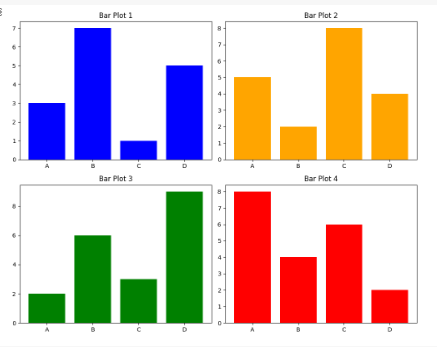
使用Bar Plot的多个子图
在这个例子中,Python代码利用Matplotlib生成一个2×2的子图网格,每个子图都包含一个条形图。示例数据由四个类别(A、B、C、D)和四个集合的对应值组成。子图函数用于创建子图网格,然后为每组值生成单独的条形图。生成的可视化显示了条形图1到条形图4中各类别值的分布,每个子图都有自定义的颜色和标题。为了清晰起见,布局进行了调整,合并的子图集使用plt.show()显示。
import matplotlib.pyplot as plt
import numpy as np

# Example data for bar plots
categories = ['A', 'B', 'C', 'D']
values1 = [3, 7, 1, 5]
values2 = [5, 2, 8, 4]
values3 = [2, 6, 3, 9]
values4 = [8, 4, 6, 2]

# Creating Multiple Subplots for Bar Plots
fig, axes = plt.subplots(nrows=2, ncols=2, figsize=(10, 8))

# Bar Plot 1
axes[0, 0].bar(categories, values1, color='blue')
axes[0, 0].set_title('Bar Plot 1')

# Bar Plot 2
axes[0, 1].bar(categories, values2, color='orange')
axes[0, 1].set_title('Bar Plot 2')

# Bar Plot 3
axes[1, 0].bar(categories, values3, color='green')
axes[1, 0].set_title('Bar Plot 3')

# Bar Plot 4
axes[1, 1].bar(categories, values4, color='red')
axes[1, 1].set_title('Bar Plot 4')

# Adjusting layout
plt.tight_layout()

# Show the plots
plt.show()
使用Pie Plot的多个子图
在这个例子中,Python代码使用Matplotlib创建了一个2×2的饼图网格。每个图表都表示不同的分类数据,并具有指定的标签、大小和颜色。plt.subplots函数生成子图网格,然后使用pie函数用饼图填充每个子图。该代码调整布局的间距,并显示饼图的可视化表示。
import matplotlib.pyplot as plt

# Example data for pie charts
labels1 = ['Category 1', 'Category 2', 'Category 3']
sizes1 = [30, 40, 30]

labels2 = ['Section A', 'Section B', 'Section C']
sizes2 = [20, 50, 30]

labels3 = ['Apple', 'Banana', 'Orange', 'Grapes']
sizes3 = [25, 30, 20, 25]

labels4 = ['Red', 'Green', 'Blue']
sizes4 = [40, 30, 30]

# Creating Multiple Subplots for Pie Charts
fig, axes = plt.subplots(nrows=2, ncols=2, figsize=(10, 8))

# Pie Chart 1
axes[0, 0].pie(sizes1, labels=labels1, autopct='%1.1f%%', colors=['red', 'yellow', 'green'])
axes[0, 0].set_title('Pie Chart 1')

# Pie Chart 2
axes[0, 1].pie(sizes2, labels=labels2, autopct='%1.1f%%', colors=['blue', 'orange', 'purple'])
axes[0, 1].set_title('Pie Chart 2')

# Pie Chart 3
axes[1, 0].pie(sizes3, labels=labels3, autopct='%1.1f%%', colors=['orange', 'yellow', 'green', 'purple'])
axes[1, 0].set_title('Pie Chart 3')

# Pie Chart 4
axes[1, 1].pie(sizes4, labels=labels4, autopct='%1.1f%%', colors=['red', 'green', 'blue'])
axes[1, 1].set_title('Pie Chart 4')

# Adjusting layout
plt.tight_layout()

# Show the plots
plt.show()

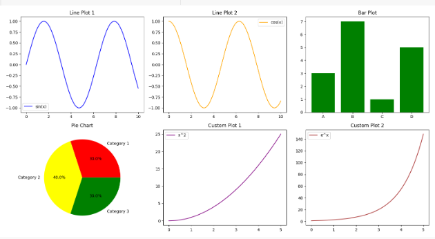
自定义子图组合
在这个例子中,Python代码使用Matplotlib生成一个具有2×3子图网格的图。示例数据包括正弦和余弦线图、条形图、饼图以及二次和指数函数的自定义图。每个子图都使用标题、标签和图例进行自定义。该代码展示了如何在单个图中创建子图的视觉多样性布局,展示了Matplotlib对各种图类型的多功能性。
import matplotlib.pyplot as plt
import numpy as np

# Example data
x = np.linspace(0, 10, 100)
y1 = np.sin(x)
y2 = np.cos(x)

# Example data for bar plots
categories = ['A', 'B', 'C', 'D']
values = [3, 7, 1, 5]

# Example data for pie chart
labels = ['Category 1', 'Category 2', 'Category 3']
sizes = [30, 40, 30]

# Example data for custom layout
x_custom = np.linspace(0, 5, 50)
y3 = x_custom**2
y4 = np.exp(x_custom)

# Creating Multiple Subplots
fig, axes = plt.subplots(nrows=2, ncols=3, figsize=(15, 8))

# Creating Multiple Subplots of Line Plots
axes[0, 0].plot(x, y1, label='sin(x)', color='blue')
axes[0, 0].set_title('Line Plot 1')
axes[0, 0].legend()

axes[0, 1].plot(x, y2, label='cos(x)', color='orange')
axes[0, 1].set_title('Line Plot 2')
axes[0, 1].legend()

# Creating Multiple Subplots of Bar Plots
axes[0, 2].bar(categories, values, color='green')
axes[0, 2].set_title('Bar Plot')

# Creating Multiple Subplots of Pie Charts
axes[1, 0].pie(sizes, labels=labels, autopct='%1.1f%%', colors=['red', 'yellow', 'green'])
axes[1, 0].set_title('Pie Chart')

# Creating a custom Multiple Subplots
axes[1, 1].plot(x_custom, y3, label='x^2', color='purple')
axes[1, 1].set_title('Custom Plot 1')
axes[1, 1].legend()

axes[1, 2].plot(x_custom, y4, label='e^x', color='brown')
axes[1, 2].set_title('Custom Plot 2')
axes[1, 2].legend()

# Adjusting layout
plt.tight_layout()

# Show the plots
plt.show()
总结
Matplotlib的子图提供的灵活性允许在单个图中同时呈现多个图,增强了显示信息的清晰度和一致性。无论是组织折线图、条形图、饼图还是自定义图,理解子图网格、轴对象和“子图”功能的概念都是必不可少的。


 2929
2929


 被折叠的 条评论
为什么被折叠?
被折叠的 条评论
为什么被折叠?
 到【灌水乐园】发言


