


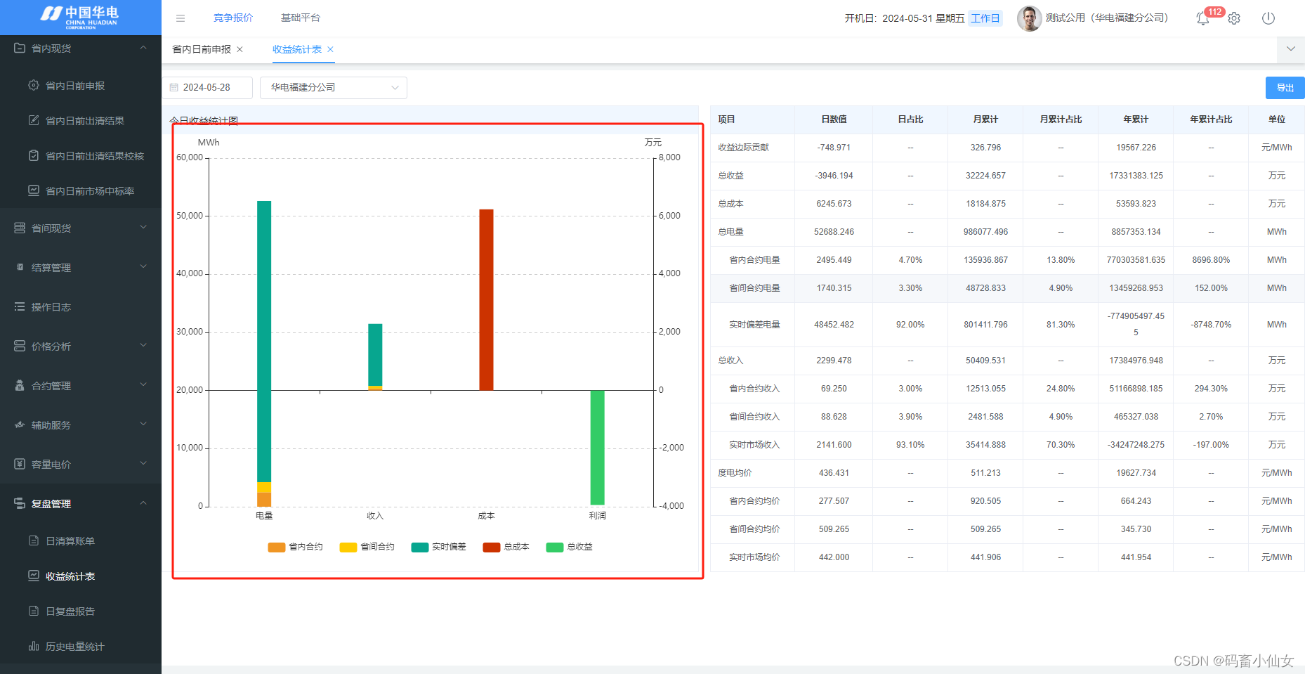
这个需求说实话很奇葩 ,我们通厂都是把y轴数据跟 legend 相关联的,显示要跟xAxis数据相关联,其实实现思想是没有变的我们只需要创造出双x轴,然后再隐藏其中一个x轴即可,效果图是这样的,电量用的MWh左轴,而收入,成本,利润用的是万元右轴
代码如下:
<div class="charts" ref="chartDom"></div>

setChartData() {
            if (this.myChart == null) {
               this.myChart = this.$echarts.init(this.$refs.chartDom);
            }
            this.myChart.clear();
            const rawData = [
               [200, null, null, null],
               [400, null, null, null],
               [500, null, null, null],

               [null, 300, null, null],
               [null, 200, null, null],
               [null, 600, null, null],

               [null, null, 400, null],
               [null, null, null, -380]
            ];
            const hasVal = rawData.some((e) => {
                return e != '--';
            });

            const option = {
                title: {
                   show: !hasVal,
                   subtext: '暂无数据',
                   subtextStyle: {
                      fontWeight: 350,
                      fontSize: 25,
                   },
                   left: 'center',
                   top: 'center',
                },
               tooltip: {
                  trigger: "axis",
                  axisPointer: {
                     type: "shadow"
                  },
                  textStyle: {
                     fontSize: 12
                  },
                  formatter: function(params) {
                     let tip = params[0].name;
                     params.map(param => {
                        if( param.value != undefined ) {
                           tip += "<br />" + param.marker + param.seriesName + ": " + param.value;
                        }
                     });
                     return tip;
                  }
               },
                grid: {
                    top: 34,
                    left: 20,
                    right: 20,
                    bottom: 30,
                    containLabel: true,
                },
                legend: {
                    show: true,
                    itemGap: 24,
                    bottom: 0,
                },
                xAxis: [
                    {
                        type: 'category',
                        data: ['电量', '收入', '成本', '利润'],
                        show: false,
                        position: 'bottom',
                    },
                    {
                        type: 'category',
                        data: ['电量', '收入', '成本', '利润'],
                        position: 'bottom',
                    },
                ],
                yAxis: [
                    {
                        type: 'value',
                        name: 'MWh',
                        min:!hasVal ? 0 :null,
                        max:!hasVal ? 0 :null,
                        splitLine: {
                            show: true,
                            lineStyle: {
                                type: 'dashed',
                            },
                        },
                    },
                    {
                        type: 'value',
                        name: '万元',
                        min:!hasVal ? 0 :null,
                        max:!hasVal ? 0 :null,
                        splitLine: {
                            show: true,
                            lineStyle: {
                                type: 'dashed',
                            },
                        },
                    },
                ],
                series: [
                    {
                        name: '省内合约',
                        type: 'bar',
                        stack: 'one',
                        color: '#f09624',
                        barWidth: 20,
                        data: rawData[0] || [],
                    },
                    {
                        name: '省间合约',
                        type: 'bar',
                        stack: 'one',
                        color: '#ffcc00',
                        barWidth: 20,
                        data: rawData[1] || [],
                    },
                    {
                        name: '实时偏差',
                        type: 'bar',
                        stack: 'one',
                        color: '#07a68f',
                        barWidth: 20,
                        data: rawData[2] || [],
                    },
                    {
                        name: '省内合约',
                        type: 'bar',
                        stack: 'two',
                        color: '#f09624',
                        yAxisIndex: 1,
                        xAxisIndex: 1,
                        barWidth: 20,
                        data: rawData[3] || [],
                    },
                    {
                        name: '省间合约',
                        type: 'bar',
                        stack: 'two',
                        color: '#ffcc00',
                        yAxisIndex: 1,
                        xAxisIndex: 1,
                        barWidth: 20,
                        data: rawData[4] || [],
                    },
                    {
                        name: '实时偏差',
                        type: 'bar',
                        stack: 'two',
                        color: '#07a68f',
                        yAxisIndex: 1,
                        xAxisIndex: 1,
                        barWidth: 20,
                        data: rawData[5] || [],
                    },
                    {
                        name: '总成本',
                        type: 'bar',
                        stack: 'two',
                        color: '#cc3300',
                        yAxisIndex: 1,
                        xAxisIndex: 1,
                        barWidth: 20,
                        data: rawData[6] || [],
                    },
                    {
                        name: '总收益',
                        type: 'bar',
                        stack: 'two',
                        color: '#33cc66',
                        yAxisIndex: 1,
                        xAxisIndex: 1,
                        barWidth: 20,
                        data: rawData[7] || [],
                    },
                ],
            };
            this.myChart.setOption(option, true);
            window.addEventListener('resize', () => {
                  this.myChart.resize()
            })
         },


 4341
4341


 被折叠的 条评论
为什么被折叠?
被折叠的 条评论
为什么被折叠?
 到【灌水乐园】发言


