


WPF 实现切换按钮
示例一:
Xaml代码:
<Window x:Class="WPF0315a.MainWindow"
        xmlns="http://schemas.microsoft.com/winfx/2006/xaml/presentation"
        xmlns:x="http://schemas.microsoft.com/winfx/2006/xaml"
        xmlns:local="clr-namespace:WPF0315a"
        Title="MainWindow" Height="350" Width="525">
    <Window.Resources>
        <local:SizeConverter x:Key="MyConverter"></local:SizeConverter>
        <Style TargetType="ToggleButton" x:Key="DefaultButton">
            <Setter Property="Template">
                <Setter.Value>
                    <ControlTemplate TargetType="ToggleButton">
                        <Grid>
                            <Rectangle Name="ButtonRectangle" Width="{TemplateBinding Width}"
                                       Height="{TemplateBinding Height,Converter={StaticResource MyConverter}}"
                                       Fill="{TemplateBinding Background}"
                                       RadiusX="{Binding Path=Height,Converter={StaticResource MyConverter}, RelativeSource={RelativeSource Self}}"
                                       RadiusY="{Binding Path=RadiusX,RelativeSource={RelativeSource Self}}">
                            </Rectangle>
                            <Ellipse Name="ButtonEllipse" Height="{TemplateBinding Height}"
                                     Width="{Binding RelativeSource={RelativeSource Self}, Path=Height}"
                                     Fill="White" Stroke="Gray"></Ellipse>
                        </Grid>
                        <ControlTemplate.Triggers>
                            <Trigger Property="IsChecked" Value="true">
                                <Setter TargetName="ButtonEllipse" Property="HorizontalAlignment" Value="Right"></Setter>
                            </Trigger>
                            <Trigger Property="IsChecked" Value="false">
                                <Setter Property="Fill" TargetName="ButtonRectangle" Value="Gray"></Setter>
                                <Setter TargetName="ButtonEllipse" Property="HorizontalAlignment" Value="Left"></Setter>
                            </Trigger>
                        </ControlTemplate.Triggers>
                    </ControlTemplate>
                </Setter.Value>
            </Setter>
            <Setter Property="Background" Value="DarkSeaGreen"></Setter>
        </Style>
    </Window.Resources>
    <Grid>
        <ToggleButton Width="120" Height="70" Content="GOOD" Style="{StaticResource DefaultButton}"></ToggleButton>
    </Grid>
</Window>
添加一个转换器类的代码:
using System;
using System.Collections.Generic;
using System.Linq;
using System.Text;
using System.Threading.Tasks;

namespace WPF0315a
{
    class SizeConverter:System.Windows.Data.IValueConverter
    {
        public object Convert(object value, Type targetType, object parameter, System.Globalization.CultureInfo culture)
        {
            return (double)value / 2;
        }

        public object ConvertBack(object value, Type targetType, object parameter, System.Globalization.CultureInfo culture)
        {
            return null;
        }
    }
}
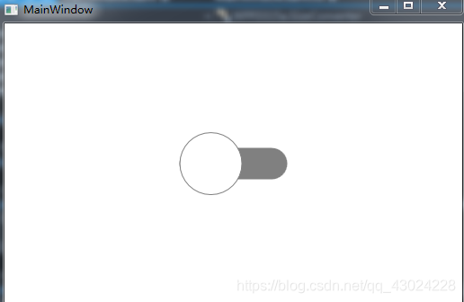
运行效果:
示例二:
添加一个自定义控件FlatToggleButton,Generic.xaml代码:
<ResourceDictionary
    xmlns="http://schemas.microsoft.com/winfx/2006/xaml/presentation"
    xmlns:x="http://schemas.microsoft.com/winfx/2006/xaml"
    xmlns:local="clr-namespace:WPF0316b">

    <SolidColorBrush x:Key="Button.Static.Background" Color="#FFDBB377" />
    <SolidColorBrush x:Key="Button.Static.Border" Color="#FF707070" />
    <SolidColorBrush x:Key="Button.MouseOver.Background" Color="#FFBEE6FD" />
    <SolidColorBrush x:Key="Button.MouseOver.Border" Color="#FF3C7FB1" />
    <SolidColorBrush x:Key="Button.Pressed.Background" Color="#FFC4E5F6" />
    <SolidColorBrush x:Key="Button.Pressed.Border" Color="#FF2C628B" />
    <SolidColorBrush x:Key="Button.Disabled.Background" Color="#FFF4F4F4" />
    <SolidColorBrush x:Key="Button.Disabled.Border" Color="#FFADB2B5" />
    <SolidColorBrush x:Key="Button.Disabled.Foreground" Color="#FF838383" />

    <SolidColorBrush x:Key="Button.Checked.Foreground" Color="#FF76E8A6" />

    <Style TargetType="{x:Type local:FlatToggleButton}">
        <Setter Property="FocusVisualStyle" Value="{x:Null}" />
        <Setter Property="Background" Value="{StaticResource Button.Pressed.Background}" />
        <Setter Property="BorderBrush" Value="{StaticResource Button.Static.Border}" />
        <Setter Property="Foreground" Value="{DynamicResource {x:Static SystemColors.ControlTextBrushKey}}" />
        <Setter Property="BorderThickness" Value="0" />
        <Setter Property="HorizontalContentAlignment" Value="Center" />
        <Setter Property="VerticalContentAlignment" Value="Center" />
        <Setter Property="Padding" Value="0" />
        <Setter Property="Width" Value="43" />
        <Setter Property="Height" Value="20" />
        <Setter Property="Template">
            <Setter.Value>
                <ControlTemplate TargetType="{x:Type local:FlatToggleButton}">
                    <Grid>
                        <Border x:Name="border"
                                Background="{StaticResource Button.Pressed.Background}"
                                BorderBrush="{TemplateBinding BorderBrush}"
                                BorderThickness="{TemplateBinding BorderThickness}"
                                CornerRadius="10" SnapsToDevicePixels="true" UseLayoutRounding="True" />
                        <Border x:Name="InnerBd" Width="15" Height="15" Margin="3,0"
                                HorizontalAlignment="Left" VerticalAlignment="Center" Background="White" CornerRadius="100"
                                RenderTransformOrigin="0.5,0.5">
                            <Border.RenderTransform>
                                <TransformGroup>
                                    <ScaleTransform />
                                    <SkewTransform />
                                    <RotateTransform />
                                    <TranslateTransform />
                                </TransformGroup>
                            </Border.RenderTransform>
                        </Border>
                        <VisualStateManager.VisualStateGroups>
                            <VisualStateGroup x:Name="CheckStates">
                                <VisualState x:Name="Checked">
                                    <Storyboard>
                                        <DoubleAnimationUsingKeyFrames Storyboard.TargetName="InnerBd" Storyboard.TargetProperty="(UIElement.RenderTransform).(TransformGroup.Children)[3].(TranslateTransform.X)">
                                            <EasingDoubleKeyFrame KeyTime="0" Value="0">
                                                <EasingDoubleKeyFrame.EasingFunction>
                                                    <CubicEase EasingMode="EaseOut" />
                                                </EasingDoubleKeyFrame.EasingFunction>
                                            </EasingDoubleKeyFrame>
                                            <EasingDoubleKeyFrame KeyTime="0:0:0.2" Value="22">
                                                <EasingDoubleKeyFrame.EasingFunction>
                                                    <CubicEase EasingMode="EaseOut" />
                                                </EasingDoubleKeyFrame.EasingFunction>
                                            </EasingDoubleKeyFrame>
                                        </DoubleAnimationUsingKeyFrames>

                                        <ColorAnimationUsingKeyFrames BeginTime="00:00:00" Storyboard.TargetName="border" Storyboard.TargetProperty="(Border.Background).(SolidColorBrush.Color)">
                                            <EasingColorKeyFrame KeyTime="0:0:0" Value="#FFC4E5F6">
                                                <EasingColorKeyFrame.EasingFunction>
                                                    <CircleEase EasingMode="EaseOut" />
                                                </EasingColorKeyFrame.EasingFunction>
                                            </EasingColorKeyFrame>
                                            <EasingColorKeyFrame KeyTime="0:0:0.2" Value="#FF3399FF">
                                                <EasingColorKeyFrame.EasingFunction>
                                                    <CircleEase EasingMode="EaseOut" />
                                                </EasingColorKeyFrame.EasingFunction>
                                            </EasingColorKeyFrame>
                                        </ColorAnimationUsingKeyFrames>
                                    </Storyboard>
                                </VisualState>
                                <VisualState x:Name="Unchecked">
                                    <Storyboard>
                                        <DoubleAnimationUsingKeyFrames Storyboard.TargetName="InnerBd" Storyboard.TargetProperty="(UIElement.RenderTransform).(TransformGroup.Children)[3].(TranslateTransform.X)">
                                            <EasingDoubleKeyFrame KeyTime="0" Value="22">
                                                <EasingDoubleKeyFrame.EasingFunction>
                                                    <CubicEase EasingMode="EaseIn" />
                                                </EasingDoubleKeyFrame.EasingFunction>
                                            </EasingDoubleKeyFrame>
                                            <EasingDoubleKeyFrame KeyTime="0:0:0.2" Value="0">
                                                <EasingDoubleKeyFrame.EasingFunction>
                                                    <CubicEase EasingMode="EaseIn" />
                                                </EasingDoubleKeyFrame.EasingFunction>
                                            </EasingDoubleKeyFrame>
                                        </DoubleAnimationUsingKeyFrames>
                                        <ColorAnimation BeginTime="00:00:00" Duration="0:0:0.2" From="#FF3399FF"
                                                        Storyboard.TargetName="border"
                                                        Storyboard.TargetProperty="(Border.Background).(SolidColorBrush.Color)"
                                                        To="#FFC4E5F6" />
                                    </Storyboard>
                                </VisualState>
                            </VisualStateGroup>
                        </VisualStateManager.VisualStateGroups>
                    </Grid>
                </ControlTemplate>
            </Setter.Value>
        </Setter>
    </Style>
</ResourceDictionary>
FlatToggleButton.cs代码:
using System;
using System.Collections.Generic;
using System.Linq;
using System.Text;
using System.Threading.Tasks;
using System.Windows;
using System.Windows.Controls;
using System.Windows.Controls.Primitives;
using System.Windows.Data;
using System.Windows.Documents;
using System.Windows.Input;
using System.Windows.Media;
using System.Windows.Media.Imaging;
using System.Windows.Navigation;
using System.Windows.Shapes;

namespace WPF0316b
{
    public class FlatToggleButton : ToggleButton
    {
        static FlatToggleButton()
        {
            DefaultStyleKeyProperty.OverrideMetadata(typeof(FlatToggleButton), new FrameworkPropertyMetadata(typeof(FlatToggleButton)));
        }
    }
}
主窗体代码:
<Window x:Class="WPF0316b.MainWindow"
        xmlns="http://schemas.microsoft.com/winfx/2006/xaml/presentation"
        xmlns:x="http://schemas.microsoft.com/winfx/2006/xaml"
        xmlns:d="http://schemas.microsoft.com/expression/blend/2008"
        xmlns:mc="http://schemas.openxmlformats.org/markup-compatibility/2006"
        xmlns:local="clr-namespace:WPF0316b"
        mc:Ignorable="d"
        Title="MainWindow" Height="450" Width="800">
    <Grid>
        <local:FlatToggleButton Width="43" Height="20" HorizontalAlignment="Center" VerticalAlignment="Center" IsChecked="True"/>
    </Grid>
</Window>
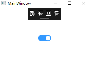
运行效果图:


 696
696


 被折叠的 条评论
为什么被折叠?
被折叠的 条评论
为什么被折叠?
 到【灌水乐园】发言


