


 文章介绍了如何在微信小程序中使用SwipeAction组件创建左滑删除或其他操作的列表项,强调了确保在v-for循环中使用唯一键以及配置滑动单元格按钮的样式和事件处理。同时,提供了组件的使用示例和CSS样式代码。
icons8是高质量的免费图标资源网站,支持在线改色、添加文字或背景装饰等.
该组件一般用于左滑唤出操作菜单的场景,用的最多的是左滑删除操作。
注意
如果把该组件通过v-for用于左滑删除的列表,请保证循环的:key是一个唯一值,可以用数据的id或者title替代。 不能是数组循环的index,否则删除的时候,可能会出现数据错乱。
如果您的需求中只使用到了 基本滑动单元格,您可以将有关backgroundImage的代码注释
父组件部分
给组件绑定一个clickFu方法
<view class="container">
  <!-- 滑动单元格组件  -->
  <SwipeAction options="{{options1}}" bind:clickFu="clickFu"></SwipeAction>
  <view class="block"></view>
  <SwipeAction options="{{options2}}" bind:clickFu="clickFu"></SwipeAction>
  <view class="block"></view>
  <SwipeAction options="{{options3}}" bind:clickFu="clickFu"></SwipeAction>
</view>
{
"usingComponents": {
"SwipeAction":"../../compents/SwipeAction/index"
}
}-
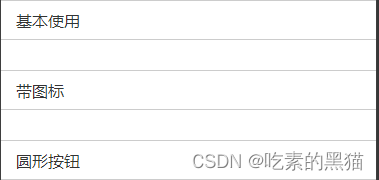
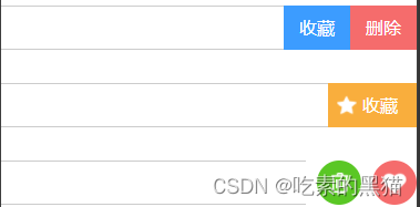
滑动单元格右边按钮有三种不同的类型 type:square(方形) ,square-icon(带图标),circle(圆形)。注意:同一个滑动单元格使用同一种类型的按钮 ,以免样式混乱
-
内部的按钮通过
options参数配置,此参数为一个数组,元素为对象,可以配置按钮的文字,背景颜色 ,背景图片(建议只配置此是三个参数即可)。
Page({
  data: {
    // 内部的按钮通过options参数配置,此参数为一个数组,元素为对象,可以配置按钮的文字,背景颜色,背景图片(建议只配置此三个参数即可)
    options1: {
      text: '基本使用',
      type: 'square',
      optionsBtn: [{
        text: '收藏',
        style: {
          backgroundColor: '#3c9cff',
          backgroundImage: ''
        },

      }, {
        text: '删除',
        style: {
          backgroundColor: '#f56c6c',
          backgroundImage: ''
        }
      }]
    },
    options2: {
      text: '带图标',
      type: 'square-icon',
      optionsBtn: [{
        text: '收藏',
        style: {
          backgroundColor: '#f9ae3d',
          backgroundImage: 'https://img.icons8.com/ios-glyphs/30/ffffff/hand-drawn-star.png'
        },
      }]
    },
    options3: {
      text: '圆形按钮',
      type: 'circle',
      optionsBtn: [{
        text: '',
        style: {
          backgroundColor: '#5ac725',
          backgroundImage: 'https://img.icons8.com/windows/32/ffffff/trash.png'
        },

      }, {
        text: '',
        style: {
          backgroundColor: '#f56c6c',
          backgroundImage: 'https://img.icons8.com/windows/32/ffffff/filled-heart.png'
        }
      }]
    },
  },
  clickFu(e) {
    // 点击的是第几个按钮 调用对应的方法
    let index=e.detail
    // 调用不同的方法
    if(index===1){
      wx.showModal({
        title:'温馨提示',
        content:'您确定要删除吗?'
      })
    }
    // 以下方法根据自己的需求来
  }
})
子组件部分
<!-- 滑动块单元格 -->
<view class="swipe-action">
    <view class="swipe-action-item">
        <!-- 文本 -->
        <view class="swipe-action__content" style="left:{{movelength}}rpx;" bindtouchstart="touchstartFn" bindtouchmove="touchmoveFn" bindtouchend="touchendFn">
            <view class="swipe-action__content__text">{{options.text}}</view>
        </view>
        <!-- 按钮 -->
        <view class="swipe-action__btn,{{options.type}}">
            <view class="swipe-action__btn__item" wx:for="{{options.optionsBtn}}" wx:key="index" style="background-image:url({{item.style.backgroundImage}});background-color: {{item.style.backgroundColor}};"  bindtap="clickFu" data-index="{{index}}">
                <view class="swipe-action__btn__item__text">{{item.text}}</view>
            </view>
        </view>
    </view>
</view>
根据不同的类型设置不同的按钮样式
.swipe-action {
  width: 100vw;
  height: 80rpx;
  box-sizing: border-box;
  overflow-x: auto;
  overflow-y: hidden;
}

.swipe-action-item {
  width: 100vw;
  height: 100%;
  display: flex;
  justify-content: flex-end;
  align-content: center;
  box-sizing: border-box;
  position: relative;
}

/* 文本的样式 */
.swipe-action__content {
  /* 本文的宽度固定为屏幕宽度 */
  width: 750rpx;
  height: 100%;
  border-top: 1px solid #cccccc;
  border-bottom: 1px solid #cccccc;
  background-color: #ffffff;
  box-sizing: border-box;
  position: absolute;
  top: 0;
  left: 0;
  z-index: 1;
  transition: 0.5s;
}

.swipe-action__content .swipe-action__content__text {
  width: 100%;
  height: 100%;
  font-size: 32rpx;
  color: #333333;
  padding-left: 30rpx;
  line-height: 80rpx;
  box-sizing: border-box;
}

/* 按钮的样式 */
.swipe-action__btn {
  width: auto;
  height: 80rpx;
  color: #ffffff;
  text-align: center;
  line-height: 80rpx;
  box-sizing: border-box;
  display: flex;
}

/*方形按钮的样式 */
.swipe-action__btn.square .swipe-action__btn__item {
  width: 120rpx;
  height: 80rpx;
}
/* 带图标和文字的按钮 */
.swipe-action__btn.square-icon .swipe-action__btn__item {
  padding-right: 34rpx;
  width: 160rpx;
  height: 80rpx;
  text-align: right;
  background-repeat: no-repeat;
  background-position: 48rpx center;
  background-size: 40rpx 40rpx;
}

/* 圆形按钮的样式 */
.swipe-action__btn.circle {
  gap: 10px;
}

.swipe-action__btn.circle .swipe-action__btn__item {
  width: 80rpx;
  height: 80rpx;
  font-size: 24rpx;
  border-radius: 50%;
  background-repeat: no-repeat;
  background-position: center center;
  background-size: 48rpx 48rpx;
}

/* 隐藏滚动条 */
::-webkit-scrollbar {
  display: none;
  width: 0;
  height: 0;
  color: transparent;
}
通过触摸事件
1.向左触摸滑动的距离 设置为文本容器 left的值 。
2.向右触摸滑动的时 文本框 left的值不变(0)
3.向左触摸滑动结束之后的距离大于30 设置为文本容器 left的值为optionsBtnWidth(按钮容器的宽度),否则为0
4. 给每一个按钮绑定一个点击事件,用于获取当前按钮的索引来判断调用对应的方法
Component({
    properties: {
        options: { //定义的属性
            type: Object, //属性的类型
            value: {} //属性的默认值
        }
    },

    /**
     * 组件的初始数据
     */
    data: {
        startX: 0, //开始触摸时的x坐标点
        endX: 0, //结束触摸时的x坐标点
        movelength: 0, //移动的距离
        optionsBtnWidth: 0, // 内部的按钮容器的的宽度
    },
    /**
     * 组件的方法列表
     */
    attached() {
        let {
            options,
            optionsBtnWidth
        } = this.data
        let count = options.optionsBtn.length //按钮的个数
        if (options.type === 'square') {
            optionsBtnWidth = count * 120
        } else if (options.type === 'square-icon') {
            optionsBtnWidth = count * 160
        } else if (options.type === 'circle') {
            optionsBtnWidth = count * 100
        }
        this.setData({
            optionsBtnWidth
        })
    },
    methods: {
        // 1.向左触摸滑动的距离 设置为文本容器 left的值
        // 2.向右触摸滑动的时 文本框 left的值不变(0)
        // 3.向左触摸滑动结束之后的距离大于30 设置为文本容器 left的值为optionsBtnWidth(按钮容器的宽度),否则为0

        // 手指触摸动作开始
        touchstartFn(event) {
            let startX = event.changedTouches[0].pageX
            this.setData({
                startX
            })
        },
        // 手指触摸后移动
        touchmoveFn(event) {
            let {
                startX,
                optionsBtnWidth
            } = this.data
            let endX = event.changedTouches[0].pageX
            let movelength = Math.floor(endX - startX < 0 ? (endX - startX < -optionsBtnWidth ? -optionsBtnWidth : endX - startX) : 0)
            this.setData({
                endX,
                movelength
            })
        },
        // 手指触摸动作结束
        touchendFn(event) {
            let {
                startX,
                optionsBtnWidth
            } = this.data
            let endX = event.changedTouches[0].pageX
            let movelength = Math.floor(endX - startX < -30 ? -optionsBtnWidth : 0)
            this.setData({
                endX,
                movelength
            })
        },
        // 点击事件
        clickFu(event) {
            let index = event.currentTarget.dataset.index
            this.triggerEvent('clickFu', index)
        }
    }
})


 扫一扫
扫一扫


 853
853

 被折叠的 条评论
为什么被折叠?
被折叠的 条评论
为什么被折叠?
 到【灌水乐园】发言


