


语雀知识库地址:语雀HarmonyOS知识库
飞书知识库地址:飞书HarmonyOS知识库
本文示例代码地址:Gitee 仓库地址
嗨,各位好呀,我是小白
上一篇文章我为大家介绍了如何使用 ArkTS 开发鸿蒙应用,对 HarmonyOS 项目代码结构做了初步的介绍
还没看过的小伙伴可以先复习一下,对接下来的内容会有很大的帮助
从上面的案例中,很容易就能看出,开发一个鸿蒙应用实际上就是使用 ArkTS 提供的各个组件来组合成一个页面
那么,要熟练的使用 ArkTS 提供的组件就显得尤为重要
这篇文章就向大家介绍一些 ArkTS 常用的基础组件
Image——图片组件
Image 为图片组件,常用于在应用中显示图片
Image 支持加载 PixelMap、ResourceStr 和 DrawableDescriptor 类型的数据源,支持 png、jpg、bmp、svg 和 gif 类型的图片格式
定义方式
Image(src: string | Resource | media.PixelMap)
其入参需要传入一个图片源,参数名为 src ,参数类型是 union 联合类型,支持字符串地址、像素图以及本地图片
参数使用
- string:该方式通常用来加载网络图片,也可以加载本地资源,比如下面这种写法
// 加载网络资源
Image('https://developer.huawei.com/images/logo-developer-header.svg')
// 加载本地资源 创建文件夹,将本地图片放入ets文件夹下的任意位置,Image组件引入本地图片路径,即可显示图片(根目录为ets文件夹)
Image('images/view.jpg')
效果如下

在这里需要注意的是,当使用该方式获取网络上的图片资源时,在本地预览是可以进行展示的,但是当使用模拟器进行调试时,使用该方式获取的网络资源是无法展示的,这是因为该方式需要使用网络权限,所以我们可以在当前模块的 module.json5 配置文件的 module 标签下加入以下代码即可
"requestPermissions": [
  {
    "name": "ohos.permission.INTERNET"
  }
]
- PixelMap:这种方式可以用来加载像素图,常用于图片编辑的场景
- Resource:加载本地图片,使用资源格式可以跨包/跨模块引入图片,resources文件夹下的图片都可以通过 $r 资源接口读取到并转换到 Resource 格式,推荐使用
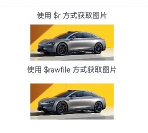
Image($r('app.media.icon'))
Image($rawfile('icon.png'))
可以看到,使用 Resource 类型加载图片时,有两种写法,这两种写法所读取的文件目录是不同的
- 使用
$r()方式所读取的目录是src/main/resources/base/media该目录下的文件,这种方式不需要写文件的后缀名 - 使用
$rawfile()方式读取的目录是src/main/resources/rawfile该目录下的文件,这种方式必须将文件的后缀名写上,否则就会报错 (如果没有这个文件夹,手动创建即可)
- 媒体库文件:即手机内部文件,支持file://路径前缀的字符串,用于访问通过媒体库提供的图片路径
- base64:路径格式为
data:image/[png | jpeg | bmp | webp]; base64,[base64 data],其中[base64 data]为 Base64 字符串数据。Base64 格式字符串可用于存储图片的像素数据,在网页上使用较为广泛
效果如下
设置属性
Image 作为基本组件,除了有通用属性 width()、height()、padding() 等,还有其自身所拥有的属性
Image($r('app.media.car'))
  .alt($r('app.media.icon'))
  .width('50%')
  .height(70)
  .borderRadius(10)
  .interpolation(ImageInterpolation.High)
其中
- alt 为图片加载时显示的占位图,支持本地图片(png、jpg、bmp、svg 和 gif 类型),不支持网络图片
- borderRadius 为图片设置圆角,数值越大,图片的圆角就越大
- interpolation 设置图片的插值效果,即减轻低清晰度图片在放大显示时出现的锯齿问题,可以为数值,也可以使用枚举值

设置事件
onComplete:图片数据加载成功和解码成功时均触发该回调,返回成功加载的图片尺寸
onComplete(callback: (event?: { width: number, height: number, componentWidth: number, componentHeight: number, loadingStatus: number }) => void)
- loadingStatus 参数用于返回图片加载成功的状态值。返回的状态值为0时,表示图片数据加载成功。返回的状态值为1时,表示图片解码成功
onError:图片加载异常时触发该回调
onError(callback: (event?: { componentWidth: number, componentHeight: number , message: string }) => void)
onFinish:当加载的源文件为带动效的 svg 格式图片时,svg 动效播放完成时会触发这个回调。如果动效为无限循环动效,则不会触发这个回调。仅支持svg格式的图片
onFinish(event: () => void)
Text/Span——文本组件
定义方式
Text(content?: string | Resource)
Span(value: string | Resource)
在 Text 中套用 Span 组件时,Span 的内容会覆盖掉 Text 的内容
参数使用
- string:传入的内容即为所显示的内容
Text('Hello World')

- Resource:该方式传入的内容为当前系统语言所对应文件中的数据值
Text($r('app.string.module_desc'))

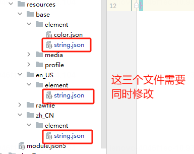
这里需要注意的是,$r 方式默认是根据系统的语言来匹配读取对应语言文件夹下 /element/string.json 文件中对应的值,如果都匹配不到的话,则读取的是 /resources/base/element/string.json,因此,在使用此方式读取值的时候,需要在每种系统语言对应的目录文件中都添加相同 key 的数据,否则会报错
设置属性
Text 除了通用的属性外,其自身也有许多属性可以设置
示例 1
// 单行文本
Text('textAlign')
  .fontSize(15)
  .fontColor('#36D')
  .fontWeight(FontWeight.Bold)
  .padding({top:5, bottom:5})
Text('TextAlign set to Center.')
  .textAlign(TextAlign.Center)
  .fontSize(12)
  .border({ width: 1 })
  .padding(10)
  .width('100%')
Text('TextAlign set to Start.')
  .textAlign(TextAlign.Start)
  .fontSize(12)
  .border({ width: 1 })
  .padding(10)
  .width('100%')
Text('TextAlign set to End.')
  .textAlign(TextAlign.End)
  .fontSize(12)
  .border({ width: 1 })
  .padding(10)
  .width('100%')

// 多行文本
Text('This is the text content with textAlign set to Center.')
  .textAlign(TextAlign.Center)
  .fontSize(12)
  .border({ width: 1 })
  .padding(10)
  .width('100%')
Text('This is the text content with textAlign set to Start.')
  .textAlign(TextAlign.Start)
  .fontSize(12)
  .border({ width: 1 })
  .padding(10)
  .width('100%')
Text('This is the text content with textAlign set to End.')
  .textAlign(TextAlign.End)
  .fontSize(12)
  .border({ width: 1 })
  .padding(10)
  .width('100%')


// 文本超长时显示方式
Text('TextOverflow+maxLines')
  .fontSize(15)
  .fontColor('#36D')
  .fontWeight(FontWeight.Bold)
  .padding({top:5, bottom:5})
// 超出maxLines截断内容展示
Text('This is the setting of textOverflow to Clip text content This is the setting of textOverflow to None text content. This is the setting of textOverflow to Clip text content This is the setting of textOverflow to None text content.')
  .textOverflow({ overflow: TextOverflow.Clip })
  .maxLines(1)
  .fontSize(12)
  .border({ width: 1 })
  .padding(10)

// 超出maxLines展示省略号
Text('This is set textOverflow to Ellipsis text content This is set textOverflow to Ellipsis text content.'.split('')
  .join('\u200B'))
  .textOverflow({ overflow: TextOverflow.Ellipsis })
  .maxLines(1)
  .fontSize(12)
  .border({ width: 1 })
  .padding(10)

Text('lineHeight')
  .fontSize(15)
  .fontColor('#36D')
  .fontWeight(FontWeight.Bold)
  .padding({top:5, bottom:5})
Text('This is the text with the line height set. This is the text with the line height set.')
  .fontSize(12).border({ width: 1 }).padding(10)
Text('This is the text with the line height set. This is the text with the line height set.')
  .fontSize(12).border({ width: 1 }).padding(10)
  .lineHeight(20)
效果如下:
其中:
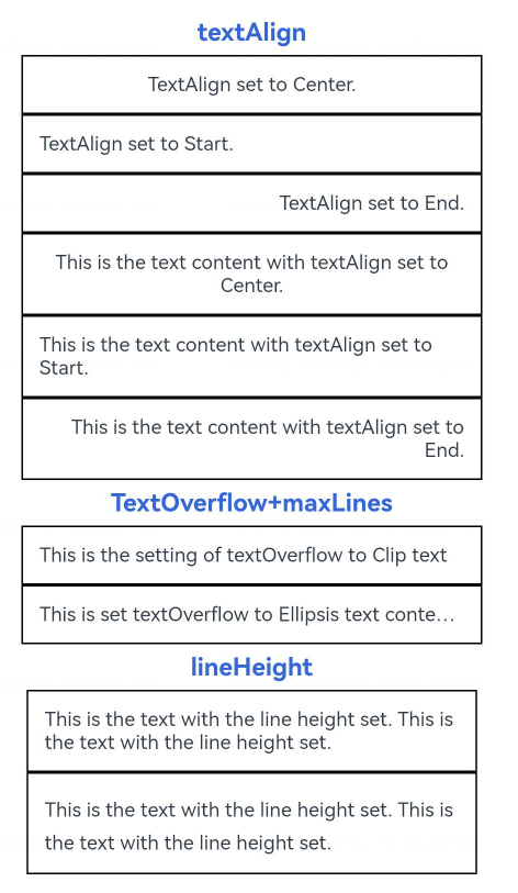
- textAlign:设置文本段落在水平方向的对齐方式,默认值:TextAlign.Start,可选值:TextAlign.Start、TextAlign.Center、TextAlign.End
- textOverflow:设置文本超长时的显示方式。默认值:
{overflow: TextOverflow.Clip} - lineHeight:设置文本的文本行高,设置值不大于 0 时,不限制文本行高,自适应字体大小,Length 为 number 类型时单位为fp
示例 2
  Text('decoration')
    .fontSize(15)
    .fontColor('#36D')
    .fontWeight(FontWeight.Bold)
    .padding({top:5, bottom:5})
  Text('This is the text content with the decoration set to LineThrough and the color set to Red.')
    .decoration({
      type: TextDecorationType.LineThrough,
      color: Color.Red
    })
    .fontSize(12)
    .border({ width: 1 })
    .padding(10)
    .width('100%')


  Text('This is the text content with the decoration set to Overline and the color set to Red.')
    .decoration({
      type: TextDecorationType.Overline,
      color: Color.Red
    })
    .fontSize(12)
    .border({ width: 1 })
    .padding(10)
    .width('100%')


  Text('This is the text content with the decoration set to Underline and the color set to Red.')
    .decoration({
      type: TextDecorationType.Underline,
      color: Color.Red
    })
    .fontSize(12)
    .border({ width: 1 })
    .padding(10)
    .width('100%')

  // 文本基线偏移
  Text('baselineOffset')
    .fontSize(15)
    .fontColor('#36D')
    .fontWeight(FontWeight.Bold)
    .padding({top:5, bottom:5})
  Text('This is the text content with baselineOffset 0.')
    .baselineOffset(0)
    .fontSize(12)
    .border({ width: 1 })
    .padding(10)
    .width('100%')
  Text('This is the text content with baselineOffset 30.')
    .baselineOffset(30)
    .fontSize(12)
    .border({ width: 1 })
    .padding(10)
    .width('100%')
  Text('This is the text content with baselineOffset -20.')
    .baselineOffset(-20)
    .fontSize(12)
    .border({ width: 1 })
    .padding(10)
    .width('100%')

  // 文本字符间距
  Text('letterSpacing')
    .fontSize(15)
    .fontColor('#36D')
    .fontWeight(FontWeight.Bold)
    .padding({top:5, bottom:5})
  Text('This is the text content with letterSpacing 0.')
    .letterSpacing(0)
    .fontSize(12)
    .border({ width: 1 })
    .padding(10)
    .width('100%')
  Text('This is the text content with letterSpacing 3.')
    .letterSpacing(3)
    .fontSize(12)
    .border({ width: 1 })
    .padding(10)
    .width('100%')
  Text('This is the text content with letterSpacing -1.')
    .letterSpacing(-1)
    .fontSize(12)
    .border({ width: 1 })
    .padding(10)
    .width('100%')

  Text('textCase')
    .fontSize(15)
    .fontColor('#36D')
    .fontWeight(FontWeight.Bold)
    .padding({top:5, bottom:5})
  Text('This is the text content with textCase set to Normal.')
    .textCase(TextCase.Normal)
    .fontSize(12)
    .border({ width: 1 })
    .padding(10)
    .width('100%')
  // 文本全小写展示
  Text('This is the text content with textCase set to LowerCase.')
    .textCase(TextCase.LowerCase)
    .fontSize(12)
    .border({ width: 1 })
    .padding(10)
    .width('100%')
  // 文本全大写展示
  Text('This is the text content with textCase set to UpperCase.')
    .textCase(TextCase.UpperCase)
    .fontSize(12).border({ width: 1 }).padding(10)
效果如下
其中:
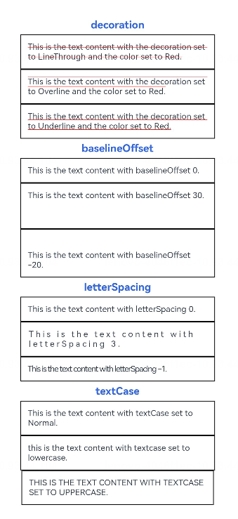
- decoration:设置文本装饰线样式及其颜色。默认值:
{type: TextDecorationType.None,color:Color.Black} - baselineOffset:设置文本基线的偏移量,默认值0。设置该值为百分比时,按默认值显示
- letterSpacing:设置文本字符间距。默认值0。设置该值为百分比时,按默认值显示
- textCase:设置文本大小写。默认值:TextCase.Normal
TextInput/TextArea——文本输入
定义方式
TextArea(value?:{placeholder?: ResourceStr, text?: ResourceStr, controller?: TextAreaController})
TextInput(value?:{placeholder?: ResourceStr, text?: ResourceStr, controller?: TextInputController})
参数使用
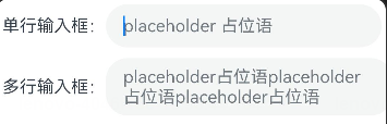
- placeholder:
TextInput({placeholder:'placeholder 占位语'})
TextArea({placeholder:'placeholder占位语placeholder占位语placeholder占位语'})
- text:
TextInput({text:'为TextInput设置默认值'})
TextArea({text:'我是TextArea我是TextArea我是TextArea我是TextArea'})

当 placeholder 与 text 同时存在时,placeholder 的值将会被 text 的内容所覆盖
设置属性
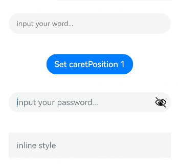
TextInput({ text: this.text, placeholder: 'input your word...', controller: this.controller })
  .placeholderColor(Color.Grey)
  .placeholderFont({ size: 14, weight: 400 })
  .caretColor(Color.Blue)
  .width(400)
  .height(40)
  .margin(20)
  .fontSize(14)
  .fontColor(Color.Black)
  .inputFilter('[a-z]', (e) => {
    console.log(JSON.stringify(e))
  })
  .onChange((value: string) => {
    this.text = value
  })
Text(this.text)
Button('Set caretPosition 1')
  .margin(15)
  .onClick(() => {
    // 将光标移动至第一个字符后
    this.controller.caretPosition(1)
  })
// 密码输入框
TextInput({ placeholder: 'input your password...' })
  .width(400)
  .height(40)
  .margin(20)
  .type(InputType.Password)
  .maxLength(9)
  .showPasswordIcon(true)
// 内联风格输入框
TextInput({ placeholder: 'inline style' })
  .width(400)
  .height(50)
  .margin(20)
  .borderRadius(0)
  .style(TextInputStyle.Inline)
	.copyOption(CopyOptions.LocalDevice)
  .textAlign(TextAlign.Start)
其中:
- placeholderColor:设置placeholder文本颜色
- placeholderFont:设置placeholder文本样式
- caretColor:设置输入框光标颜色
- inputFilter:正则表达式,匹配表达式的输入允许显示,不匹配的输入将被过滤。目前仅支持单个字符匹配,不支持字符串匹配。其中 value 设置正则表达式,error 设置正则匹配失败时,返回被过滤的内容
- type:输入框的类型,默认是
InputType.Normal - maxLength:设置文本的最大输入字符数
- showPasswordIcon:当 type 属性为
InputType.Password时,输入框末尾的图标是否显示 - style:设置输入框为默认风格或内联输入风格
- copyOption:设置输入的文本是否可复制
- textAlign:设置输入文本在输入框中的对齐方式
设置事件
- onChange(callback: (value: string) => void):输入内容发生变化时的回调函数
- onSubmit(callback: (enterKey: EnterKeyType) => void):按下输入法回车键触发该回调,返回值为当前输入法回车键的类型
- onCopy(callback:(value: string) => void):长按输入框内部区域弹出剪贴板后,点击剪切板复制按钮,触发该回调
Button——按钮
定义方式
Button(options?: {type?: ButtonType, stateEffect?: boolean})
Button(label?: string, options?: { type?: ButtonType, stateEffect?: boolean })
参数使用
- label:按钮文本内容
Button('按钮文本内容 label')

Button('这是一个按钮-正常', { type: ButtonType.Normal, stateEffect: true })
Button('这是一个按钮-胶囊', { type: ButtonType.Capsule, stateEffect: true })
Button('Ok-圆', { type: ButtonType.Circle, stateEffect: true })
- options-type:描述按钮显示样式
- options-stateEffect:按钮按下时是否开启按压态显示效果,当设置为 false 时,按压效果关闭。当开启按压态显示效果,设置状态样式时,会基于状态样式设置完成后的背景色再进行颜色叠加

设置属性
Button 组件的属性在通用属性中均已支持
设置事件
Button 组件的事件在通用事件中均已支持
结语
除了以上所列举的 Image、Text/Span、TextInput/TextArea、Button 组件外,ArkTS 还支持了 Menu(菜单)、Slider(滑块)、Radio(单选)、CheckBox(复选框)、Progress(进度条) 等我们在手机上所能看到的组件,这些组件的使用方式大同小异,无需特殊记忆,在需要使用时查阅官方文档即可


 1670
1670


 被折叠的 条评论
为什么被折叠?
被折叠的 条评论
为什么被折叠?
 到【灌水乐园】发言


