


Python数据分析活用Pandas库学习笔记
引言
笔者Python数据分析活用Pandas库学习笔记专栏链接🔗导航:
第3章 绘图
3.1 matplotlib库
"""
2021.02.18
author:alian
三类绘图的库:matplotlib,seaborn,Pandas绘图
"""
import pandas as pd
import matplotlib.pyplot as plt
import seaborn as sns


# 载入anscombe数据集
anscombe = sns.load_dataset("anscombe")
# print(anscombe)

# 库1: matplotlib
dataset1 = anscombe[anscombe['dataset'] == 'I']
plt.plot(dataset1['x'],dataset1['y'],'*')
# plt.show()  # 如图1
dataset2 = anscombe[anscombe['dataset'] == 'II']
dataset3 = anscombe[anscombe['dataset']== 'III']
dataset4 = anscombe[anscombe['dataset']=='IV']
# 创建画布
fig = plt.figure()
# 指定子图的排布方式
# 子图有2行2列位置是1
axes1 = fig.add_subplot(2,2,1)
axes2 = fig.add_subplot(2,2,2)
axes3 = fig.add_subplot(2,2,3)
axes4 = fig.add_subplot(2,2,4)
# 各轴绘图,如图2
axes1.plot(dataset1['x'],dataset1['y'],'o')
axes2.plot(dataset2['x'],dataset2['y'],'o')
axes3.plot(dataset3['x'],dataset3['y'],'o')
axes4.plot(dataset4['x'],dataset4['y'],'o')
# 向各子图添加小标题
axes1.set_title('dataset1')
axes1.set_xlabel('x')
axes1.set_xlabel('y')
axes2.set_title('dataset2')
axes3.set_title('dataset3')
axes4.set_title('dataset4')
# 为整幅图添加一个大标题
fig.suptitle('Anscombe Data')
# 使用紧凑布局
fig.tight_layout()
plt.show()


3.2 使用matplotlib绘制统计图
3.2.1单变量
tips = sns.load_dataset("tips")
print(tips.head())
# 单变量
fig = plt.figure()
axes1 = fig.add_subplot(1,1,1)
axes1.hist(tips['total_bill'],bins = 10)
axes1.set_title('Histogram of Total Bill')
axes1.set_xlabel('total bill')
axes1.set_ylabel('frequency')
fig.show()  # 图3

3.2.2 双变量
# 双变量
scatter_plot = plt.figure()
axes1 = scatter_plot.add_subplot(1,1,1)
axes1.scatter(tips['total_bill'],tips['tip'])
axes1.set_title('Scatterplot of Total Bill vs Tip')
axes1.set_xlabel('total bill')
axes1.set_ylabel('tip')
scatter_plot.show()  # 图4

3.2.3 箱线图
# 箱线图
boxplot = plt.figure()
axes1 = boxplot.add_subplot(1,1,1)
axes1.boxplot(
    # 箱线图的第一个参数是数据
    # 由于要绘制多块数据,因此必须把每块数据放入列表中
    [tips[tips['sex'] == 'Female']['tip'],
    tips[tips['sex'] == 'Male']['tip']],
    # 然后可以传入一个可选的标签参数,用来标记传递的数据
    labels = ['Female','Male']
)
axes1.set_xlabel('Sex')
axes1.set_ylabel('Tip')
axes1.set_title('Boxplot of Tips by Sex')
boxplot.show()  # 图5

3.2.4 多变量数据
# 多变量数据
def recode_sex(sex):
    if sex == 'Female':
        return 0
    else:
        return 1
tips['sex_color'] = tips['sex'].apply(recode_sex)

scatter_plot = plt.figure()
axes1 = scatter_plot.add_subplot(1,1,1)
axes1.scatter(
    x = tips['total_bill'],
    y = tips['tip'],
    # 根据聚餐人数设置点的大小,乘上10以放大不同
    s = tips['size']*10,
    # 为sex设置颜色
    c = tips['sex_color'],
    # 设置alpha值,增加点的透明度,以表现重叠的点
    alpha = 0.5
)
axes1.set_title('total bill vs tip colored by sex and sized by size')
axes1.set_xlabel('total bill')
axes1.set_ylabel('tip')
scatter_plot.show()  # 图6

3.3 seaborn库
3.3.1 单变量
(1)直方图
# 直方图
hist,ax = plt.subplots()  # 使用subplots创建画布,前面是用figure来创建画布
ax = sns.distplot(tips['total_bill'])
ax.set_title('Total Bill Histogram with Density Plot')
plt.show()  # 仍然需要使用matplotlib.pyplot来显示图,图7

若只想显示直方图而不显示密度图,则将参数kde参数设置为False
ax = sns.distplot(tips['total_bill'],kde = False) # 图8

(2)密度图
# 密度图:通过绘制以每个数据点为中心的正态分布,然后消除重叠的图
den,ax = plt.subplots()
ax = sns.distplot(tips['total_bill'],hist=False)
ax.set_title('Total Bill Density')
ax.set_xlabel('Total Bill')
ax.set_ylabel('Unit Probability')
plt.show()  # 图9

(3)频数图
```python
# 频数图
hist_den_rug, ax = plt.subplots()
ax = sns.distplot(tips['total_bill'],rug=True)
ax.set_title('Total Bill Histogram with Density and Rug Plot')
ax.set_xlabel('Total Bill')
plt.show()  # 图10

#### (4)计数图

```python
# 计数图:对离散变量来计数
count,ax = plt.subplots()
ax = sns.countplot('day',data = tips)
ax.set_title('Count of days')
ax.set_xlabel('Day of the Week')
ax.set_ylabel('Frequency')
plt.show()  # 图11

3.3.2 双变量数据
(1)散点图
# 双变量数据
# 散点图regplot函数,该函数不仅可以绘制散点图还可以拟合回归线
scatter, ax = plt.subplots()
ax = sns.regplot(x = 'total_bill',y = 'tip',data = tips)
ax.set_title('Scatterplot of Total Bill and Tip')
ax.set_xlabel('Total Bill')
ax.set_ylabel('Tipy')
plt.show()  # 图12

# 散点图lmplot,其与regplot的区别在于:lmplot创建图而regplot创建轴阈
fig = sns.lmplot(x='total_bill',y = 'tip',data = tips)
plt.show()  # 图13

# joinplot在每个轴上创建包含单个变量的散点图,但是它不返回轴阈,所以无须创建带有轴域的画布来放置图
join = sns.jointplot(x='total_bill',y = 'tip',data = tips)
join.set_axis_labels(xlabel='Total Bill',ylabel='Tip')
# 添加标题设置字号,移动轴域上方的文字
join.fig.suptitle('Join Plot of Total Bill and Tip',fontsize = 10,y=1.03)
plt.show()  # 图14

(2)蜂巢图
散点图适用于比较两个变量,但是有时图中的点太多反而会失去意义。解决该问题的一种方法是把途中的点装箱,就像直方图可将变量装箱来创建条形图,蜂巢图(hexbin)可以对两个变量装箱,显示它们的频次分布情况,而六边形是覆盖任意二维平面最有效的形状。
hexbin = sns.jointplot(x='total_bill',y = 'tip',data = tips,kind="hex")
hexbin.set_axis_labels(xlabel='Total Bill',ylabel='Tip')
# 添加标题设置字号,移动轴域上方的文字
join.fig.suptitle('Hexbin Join Plot of Total Bill and Tip',fontsize = 10,y=1.03)
plt.show()  # 图15

(3)2D密度图
kde, aax = plt.subplots()
ax = sns.kdeplot(data = tips['total_bill'],data2 = tips['tip'],shade=True)
ax.set_title('Kernel Density Plot of Total Bill and Tip')
ax.set_xlabel('Total Bill')
ax.set_ylabel('Tip')
plt.show()  # 图16

# joinplot 绘制KDE图
kde_join = sns.jointplot(x='total_bill',y='tip',data = tips,kind='kde')
plt.show()  # 图17

(4)条形图
# 条形图
bar,ax = plt.subplots()
ax = sns.barplot(x='time',y='total_bill',data = tips)
ax.set_title('bar plot of average total bill for time of day')
ax.set_xlabel('Time of day')
ax.set_ylabel('Average total bill')
plt.show()  # 图18

(5)箱线图
用于显示多种显示信息,最小值、第一个四分位数、中位数、第三个四分位数、最大值,以及(若有)基于四分位差的离群值等。
# 箱线图
box,ax = plt.subplots()
ax = sns.boxplot(x='time',y='total_bill',data = tips)
ax.set_title('Boxplot of total bill for time of day')
ax.set_xlabel('Time of day')
ax.set_ylabel('Average total bill')
# plt.show()  # 图19

# 小提琴图
violin,ax = plt.subplots()
ax = sns.violinplot(x='time',y='total_bill',data = tips)
ax.set_title('violin plot of total bill for time of day')
ax.set_xlabel('Time of day')
ax.set_ylabel('Average total bill')
# plt.show()  # 图20

# 成对关系
fig = sns.pairplot(tips)
plt.show()  # 图21

pairplot的一个缺点是存在冗余信息,即图的上部分和下部分相同。可以使用pairgrid手动指定上半部分和下半部分。
pair_grid = sns.PairGrid(tips)
# 可以使用plt.scatter替代sns.regplot
pair_grid = pair_grid.map_upper(sns.regplot)
pair_grid = pair_grid.map_lower(sns.kdeplot)
pair_grid = pair_grid.map_diag(sns.distplot,rug=True)
plt.show()  # 图22

图22
3.3.3 多变量数据
(1)颜色
使用violinplot函数时,可以通过hue参数按性别(sex)给图着色。split分别设置ture和false
# 颜色
violin,ax = plt.subplots()
ax = sns.violinplot(x='time',y='total_bill',hue='sex',data=tips,split=True)
plt.show() # 图23


# 使用lmplot函数代替regplot函数
scatter = sns.lmplot(x='total_bill',y='tip',hue='sex',data=tips,fit_reg=False)
plt.show()  # 图24

fig = sns.pairplot(tips,hue='sex')
plt.show()  # 图25

(2)大小和形状
Seaborn 处理matplotlib函数调用的例子。
# 大小和形状
scatter = sns.lmplot(x='total_bill',y='tip',data=tips,fit_reg=False,hue='sex',scatter_kws={'s':80})
plt.show() # 图26

(3)分面
如果想要显示更多变量,或者确定要实现的可视化图,但是想基于一个分类变量画出多幅图,可以使用分面(facet)。
# 分面
anscombe_plot = sns.lmplot(x='x',y='y',data=anscombe,fit_reg=False,col='dataset',col_wrap=2)
plt.show()  # 图27

lmplot是图级别的,而seaborn中许多图都是轴域级别(axes-level)函数创建的额。这意味着并不是每个绘图函数都有分面参数col和col_warp。为此必须先创建FacetGrid,它要知道在哪个变量上进行分面,然后为每个分面提供单独的绘图代码。
# 创建FacetGrid
facet = sns.FacetGrid(tips,col='time')
# 绘制直方图
facet.map(sns.distplot,'total_bill',rug=True)
plt.show()  # 图28

facet = sns.FacetGrid(tips,col='day',hue='sex')
facet = facet.map(plt.scatter,'total_bill','tip')
facet = facet.add_legend()
plt.show()  # 图28
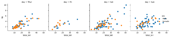
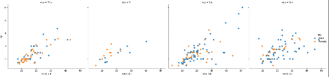
fig = sns.lmplot(x='total_bill',y='tip',data=tips,fit_reg=False,hue='sex',col='day')
plt.show()  # 图29
facet = sns.FacetGrid(tips,col='time',row='smoker',hue='sex')
facet = facet.map(plt.scatter,'total_bill','tip')
plt.show()  # 图3

如果不想所有的hue元素重叠。可以使用sns.factorplot函数
facet = sns.factorplot(x='day',y='total_bill',data=tips,hue='sex',row='smoker',col='time',kind = 'violin')
plt.show()  # 图31

ax=tips['total_bill'].plot.hist()
plt.show() # 图32

# 为DataFrame绘制直方图
fig,ax = plt.subplots()
ax=tips[['total_bill','tip']].plot.hist(alpha = 0.5,bins=20,ax=ax)
plt.show()  # 图33

3.4.2 密度图
使用SeriesFrame.plot.kde创建核密度函数
# 密度图
fig,ax = plt.subplots()
ax=tips['tip'].plot.kde()
plt.show()  # 图34

ax=tips.plot.scatter(x='total_bill',y='tip',ax=ax)
plt.show() # 图35

3.4.4 蜂巢图
使用SeriesFrame.plot.hexbin创建蜂巢图
# 蜂巢图
fig,ax = plt.subplots()
ax=tips.plot.hexbin(x='total_bill',y='tip',ax=ax)
plt.show()  # 图36

fig,ax = plt.subplots()
ax=tips.plot.hexbin(x='total_bill',y='tip',gridsize=10,ax=ax)
plt.show()  # 图37

3.4.5 箱线图
使用SeriesFrame.plot.box创建箱线图
# 箱线图
fig,ax = plt.subplots()
ax=tips.plot.box(ax=ax)
plt.show()  # 图38

3.5 seaborn主题和样式
5种样式:darkgrid, whitegrid, dark, white, ticks
# 未设置样式的图
fig, ax = plt.subplots()
ax = sns.violinplot(x='time',y='total_bill',hue = 'sex',data=tips,split=True)
plt.show()  # 图39

sns.set_style('whitegrid')
fig, ax = plt.subplots()
ax = sns.violinplot(x='time',y='total_bill',hue = 'sex',data=tips,split=True)
plt.show()  # 图40

# 一下代码展示所有的样式
fig = plt.figure()
seaborn_styles = ['darkgrid', 'whitegrid', 'dark', 'white', 'ticks']
for idx,style in enumerate(seaborn_styles):
    plot_position = idx+1
    with sns.axes_style(style):
        ax = fig.add_subplot(2,3,plot_position)
        violin = sns.violinplot(x='time',y='total_bill',data=tips,ax=ax)
        violin.set_title(style)
fig.tight_layout()
plt.show()  # 图41

小结
笔者是根据《Python数据分析活用Pandas库学》的内容学习相关的绘图函数
"""
# ------------------------------------------------------------------------
# 整理汇总
绘图步骤
1.创建画布
2.添加子图
3.使用函数绘图
4.设置标题和x,y轴标签
5.显示绘图
# 1.matplotlib绘图--------------------------------------------------------------------------------------------------------
fig = plt.figure()  # 创建画布
axes = fig.add_subplot(2,2,1)  # 添加子图
------------------绘图函数---------------------------------------
axes.hist(数据集,bin=10)  # 直方图(单变量)
axes.scatter(数据集1,数据集2)  # 散点图(双变量)
axes.boxplot([数据集1,数据集2,...],
            labels['标签1','标签2',...])  # 箱线图(双变量)
axes.scatter(数据集1,数据集2,s= (设置点的大小),c = (设置点的颜色),alpha = 0.5(设置点的透明度))  # 多变量
-----------------------------------------------------------------
axes.set_title()
axes.set_xlabel()
axes.set_ylabel()
fig.show()

# 2.seaborn绘图--------------------------------------------------------------------------------------------------------
_, ax = plt.subplots()  # 创建画布的同时添加子图
------------------绘图函数---------------------------------------
ax = sns.distplot(数据集,hist = False(直方图,默认为Ture)
                        /kde =False(密度图,默认为Ture)
                        /rug = Ture(频数图,默认为False) )  # 单变量
ax = sns.countplot('标签',data=数据集)  # 单变量
ax = sns.regplot(x = 'x标签', y='y标签',data = 数据集)  # 散点图(双变量)
ax = sns.lmplot(x = 'x标签', y='y标签',data = 数据集)  # 散点图(双变量)
ax = sns.lmplot(x = 'x标签', y='y标签',hue = 'sex',data = 数据集)  # 散点图(多变量),hue:着色变量
ax = sns.lmplot(x = 'x标签', y='y标签',hue = 'sex',fig_reg = False,data = 数据集,scatter_kws={'s':80})  # 散点图(多变量),scatter_kws={'s':80}:改变点的大小
ax = sns.lmplot(x = 'x标签', y='y标签',data = 数据集,fig_reg = False,col = 数据集,col_warp = 2)  # 散点图(多变量),col:分面变量,col_warp:设置分面每行几列
ax = sns.joinplot(x = 'x标签', y='y标签',data = 数据集) # 散点图(双变量)
ax = sns.joinplot(x = 'x标签', y='y标签',data = 数据集,kind = "hex") # 蜂巢图(双变量)
ax = sns.kdeplot(data = 数据集,data2 = 数据集, shade=True)  # 2D图(双变量)
ax = sns.joinplot(x = 'x标签', y='y标签',data = 数据集,kind = "kde") # 2D图(双变量)
ax = sns.barplot(x = 'x标签', y='y标签',data = 数据集) # 条形图(双变量)
ax = sns.boxplot(x = 'x标签', y='y标签',data = 数据集) # 箱线图(双变量)
ax = sns.violinplot(x = 'x标签', y='y标签',data = 数据集) # 小提琴图(双变量)
ax = sns.violinplot(x = 'x标签', y='y标签',hue = 'sex',data = 数据集) # 小提琴图(多变量)
ax = sns.pairplot(多个数据集)  # 成对关系(双变量)
ax = sns.pairplot(多个数据集,hue = 'sex')  # 成对关系(多变量)
ax = sns.PairGrid(多个数据集)  # 成对关系(双变量)
ax = sns.PairGrid(多个数据集,col = 数据集)  # col:分面变量

-----------------------------------------------------------------
ax.set_title()
# 或者
ax.fig.suptitle('标签',fontsize=10,y = 1.03)
ax.set_xlabel()
ax.set_ylabel()
# 或者
ax.set_axis_labels(xlabel = 'x标签',ylabel = 'y标签')
fig.show()

# 3.pandas绘图--------------------------------------------------------------------------------------------------------
_, ax = plt.subplots()  # 创建画布的同时添加子图
------------------绘图函数---------------------------------------
ax = 数据集.plot.hist()  # 直方图
ax = 数据集.plot.kde()  # 密度图
ax = 数据集.plot.scatter(数据集1,数据集2,ax=ax)  # 散点图
ax = 数据集.plot.hexbin(数据集1,数据集2,gridsize = 10, ax=ax)  # 蜂巢图,gridsize调整网格大小
ax = 数据集.plot.box(ax=ax)  # 箱线图

-----------------------------------------------------------------
ax.set_title()
# 或者
ax.fig.suptitle('标签',fontsize=10,y = 1.03)
ax.set_xlabel()
ax.set_ylabel()
# 或者
ax.set_axis_labels(xlabel = 'x标签',ylabel = 'y标签')
fig.show()
--------------------------------------------------------------------
# 设置样式:5种样式:darkgrid, whitegrid, dark, white, ticks
sns.set_style()
sns.axes_style()  # 设置子图样式
"""


 1611
1611


 被折叠的 条评论
为什么被折叠?
被折叠的 条评论
为什么被折叠?
 到【灌水乐园】发言


