


 本文对比了使用SVG和Canvas在移动端绘制棋盘的效果与性能。针对移动端特性,详细探讨了SVG画图过程中的适配问题及解决方案,并通过实际案例展示了两种技术的优劣。
最近做了一个画图的功能,后端提供棋盘数据,前端需要把数据转换成一个棋盘画出来,当时有两种实现方法,一种是使用canvas画图,一个是使用svg画图.
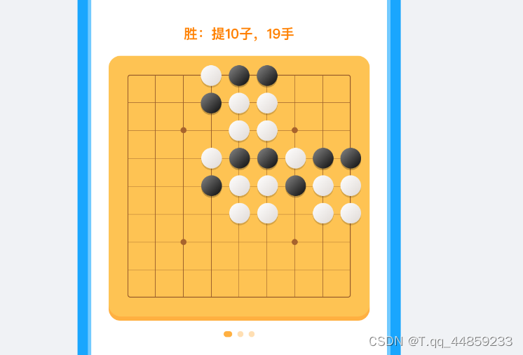
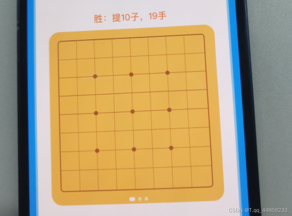
ui提供的设计稿如下:
由于这是一个轮播图,当后端返回多少张棋盘数据时,就需要渲染多少张棋盘,最多有十张,基于canvas和svg画图,为了保证页面的首次渲染时长最优,就是不使用库来画,正好可以熟悉一下canvas和svg的基础.
svg画棋盘
适配
由于是在移动端的页面,所以首选就是使用rem单位,但是画着画着就出现了问题
svg画简单形状的代码是
<p>使用rem单位画线</p>
  <svg>
    <line
      x1="0"
      y1="0"
      x2="5rem"
      y2="5rem"
      stroke-width="2"
      stroke="#975B2A"
    />
  </svg>
  <p>使用rem单位画圆</p>
  <svg>
    <circle
      cx="6rem"
      cy="6rem"
      fill="#A7632D"
      r="0.3rem"
    ></circle>
  </svg>
效果如下:
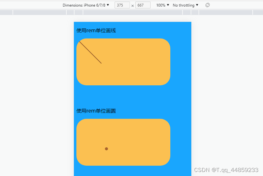
在电脑上能够正常显示,但是到iphone13上,就显示不出来了.
我发现是小于1的rem单位的显示不出来,不过我没有使用各种各样的机型测试,但是iphone13就不行,那就只能放弃了.
所以就只能依赖js计算
40px的线条距离:40 * document.documentElement.clientWidth / 375;
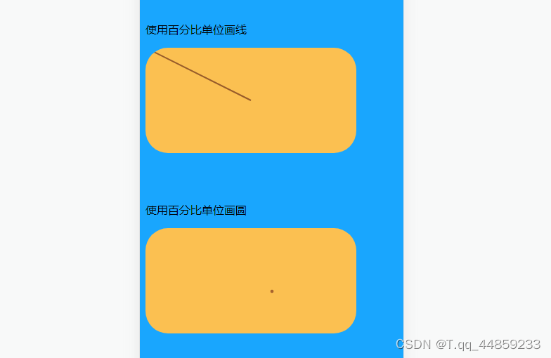
虽然不能使用rem单位,但是可以使用百分比,使用svg的DOM元素使用rem单位还是没有问题的,使用百分比就能够正常显示
<p>使用百分比单位画线</p>
  <svg>
    <line
      x1="0"
      y1="0"
      x2="50%"
      y2="50%"
      stroke-width="2"
      stroke="#975B2A"
    />
  </svg>
  <p>使用百分比单位画圆</p>
  <svg>
    <circle
      cx="60%"
      cy="60%"
      fill="#A7632D"
      r="1%"
    ></circle>
  </svg>
不过使用js计算一次就可以了,百分比对着ui稿我还得计算一遍,所以我就直接使用document.documentElement.clientWidth计算了.
很快棋盘的样式就画好了
所以很快就被ui设计师打了回来,没有光泽,她说棋子需要画渐变,也需要有阴影,不然不好看.
加渐变
<p>加渐变(first:没渐变,second:有渐变)</p>
  <svg>
    <defs>
      <linearGradient id="b" x1="0" x2="1" y1="0" y2="1">
          <stop offset="0" stop-color="#fff" stop-opacity="1"></stop>
          <stop offset="1" stop-color="#D0CBC7" stop-opacity="1"></stop>
      </linearGradient>
  </defs>
  <circle
      cx="20%"
      cy="60%"
      fill="#fff"
      r="3rem"
    ></circle>
    <circle
      cx="60%"
      cy="60%"
      fill="url(#b)"
      r="3rem"
    ></circle>
  </svg>
  <svg>
    <defs>
      <linearGradient id="a" x1="0" x2="1" y1="0" y2="1">
          <stop offset="0" stop-color="#7B7B7B" stop-opacity="1"></stop>
          <stop offset="1" stop-color="#0B0B0B" stop-opacity="1"></stop>
      </linearGradient>
  </defs>
  <circle
      cx="20%"
      cy="60%"
      fill="#000"
      r="3rem"
    ></circle>
    <circle
      cx="60%"
      cy="60%"
      fill="url(#a)"
      r="3rem"
    ></circle>
  </svg>
效果对比如下:
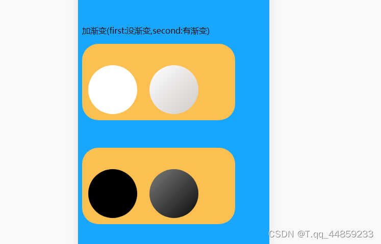
渐变兼容性在PC,iphone,ipad,安卓都支持~
加阴影
<p>加阴影(first:没阴影,second:有阴影)</p>
  <svg>
    <defs>
      <linearGradient id="b" x1="0" x2="1" y1="0" y2="1">
          <stop offset="0" stop-color="#fff" stop-opacity="1"></stop>
          <stop offset="1" stop-color="#D0CBC7" stop-opacity="1"></stop>
      </linearGradient>

      <filter id="bb" width="200%" height="200%">
        <!-- 投影偏移 -->
        <feOffset dx="0" dy="2" />
        <!-- 投影模糊 -->
        <feGaussianBlur stdDeviation="2" result="offset-blur" />
        <!-- 反转投影使其变成内投影 -->
        <feComposite
          operator="out"
          in="SoredurceGraphic"
          in2="offset-blur"
          result="inverse"
        />
        <!-- 内投影附加黑色 -->
        <feFlood flood-color="#BE8C2E" flood-opacity=".95" result="color" />
        <feComposite operator="in" in="color" in2="inverse" result="shadow" />
        <!-- 把内投影显示在图像上 -->
        <feComposite operator="over" in="shadow" in2="SourceGraphic" />
      </filter>
  </defs>
  <circle
      cx="20%"
      cy="60%"
      fill="url(#b)"
      r="3rem"
    ></circle>
    <circle
      cx="60%"
      cy="60%"
      fill="url(#b)"
      filter="url(#bb)"
      r="3rem"
    ></circle>
  </svg>
  <svg>
    <defs>
      <linearGradient id="a" x1="0" x2="1" y1="0" y2="1">
          <stop offset="0" stop-color="#7B7B7B" stop-opacity="1"></stop>
          <stop offset="1" stop-color="#0B0B0B" stop-opacity="1"></stop>
      </linearGradient>
      <filter id="aa" x="-0.05" y="0" width="120%" height="120%">
        <!-- 投影偏移 -->
        <feOffset dx="0" dy="1" />
        <!-- 投影模糊 -->
        <feGaussianBlur stdDeviation="1" result="offset-blur" />
        <!-- 反转投影使其变成内投影 -->
        <feComposite
          operator="out"
          in="SoredurceGraphic"
          in2="offset-blur"
          result="inverse"
        />
        <!-- 内投影附加黑色 -->
        <feFlood flood-color="#1D1D1D" flood-opacity=".95" result="color" />
        <feComposite operator="in" in="color" in2="inverse" result="shadow" />
        <!-- 把内投影显示在图像上 -->
        <feComposite operator="over" in="shadow" in2="SourceGraphic" />
      </filter>
  </defs>
  <circle
      cx="20%"
      cy="60%"
      fill="url(#a)"
      r="3rem"
    ></circle>
    <circle
      cx="60%"
      cy="60%"
      fill="url(#a)"
      filter="url(#aa)"
      r="3rem"
    ></circle>
  </svg>
效果如下:
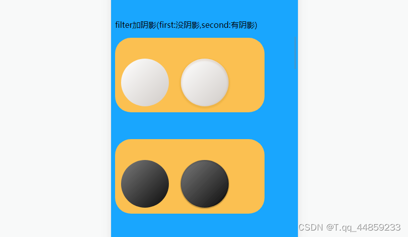
阴影没有加渐变这么顺利,出现了新的问题
iphone中棋子不见了
排查原因:发现去掉去掉filter标签就能够看到棋子.
于是我查看svg中filter标签的兼容性。如下:
https://caniuse.com/?search=filter svg
上面写着IOS6就开始支持了,但是在iphone13中就是没有显示出来,所以就只能不能这样画阴影了,得另寻他路.
重叠元素加阴影
  <p>重叠元素加阴影(first:没阴影,second:有阴影)</p>
  <svg>
    <defs>
      <linearGradient id="b" x1="0" x2="1" y1="0" y2="1">
          <stop offset="0" stop-color="#fff" stop-opacity="1"></stop>
          <stop offset="1" stop-color="#D0CBC7" stop-opacity="1"></stop>
      </linearGradient>
  </defs>
  <circle
      cx="20%"
      cy="60%"
      fill="url(#b)"
      r="3rem"
    ></circle>
    <circle
      cx="60%"
      cy="64%"
      fill="rgba(0,0,0,.16)"
      r="3rem"
    ></circle>
    <circle
      cx="60%"
      cy="60%"
      fill="url(#b)"
      r="3rem"
    ></circle>

  </svg>
  <svg>
    <defs>
      <linearGradient id="a" x1="0" x2="1" y1="0" y2="1">
          <stop offset="0" stop-color="#7B7B7B" stop-opacity="1"></stop>
          <stop offset="1" stop-color="#0B0B0B" stop-opacity="1"></stop>
      </linearGradient>
  </defs>
  <circle
    cx="60%"
    cy="64%"
    fill="rgba(0,0,0,.24)"
    r="3rem"
  ></circle>
  <circle
      cx="20%"
      cy="60%"
      fill="url(#a)"
      r="3rem"
    ></circle>
    <circle
      cx="60%"
      cy="60%"
      fill="url(#a)"
      r="3rem"
    ></circle>

  </svg>
效果如下:
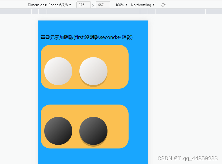
不过这个需要特别注意顺序,阴影需要在下面显示,所以要先绘制阴影,不然就会把棋子盖住,效果像下面这样:
突然发现使用重叠元素加出来的阴影更加好看.
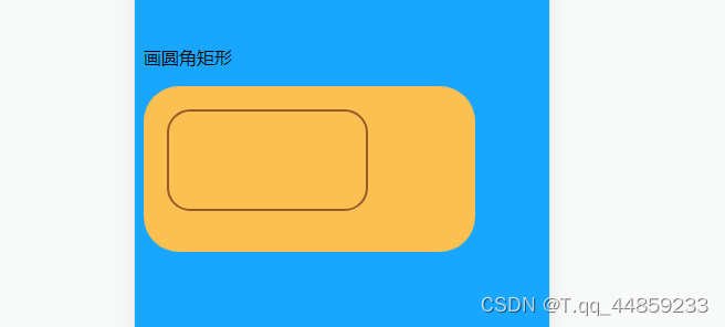
边缘棋子不显示问题
svg中的cricle标签没有z-index层级之说
解决办法:svg面积增大,svg中的元素x,y轴偏移,根据rect画圆角矩形
<p>画圆角矩形</p>
<svg>
    <rect
    width="60%"
    height="60%"
    x="22"
    y="22"
    rx="20"
    ry="20"
    style="
      fill: transparent;
      stroke: rgb(151, 91, 42);
      fill-opacity: 0.5;
      stroke-opacity: 1;
      opacity: 1;
      stroke-width: 2;
    "
    ></rect>
  </svg>
  // x,y是矩形的起点;w,h是矩形的宽高;r是圆角矩形的半径
效果如下:
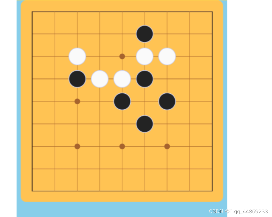
canvas和svg比较
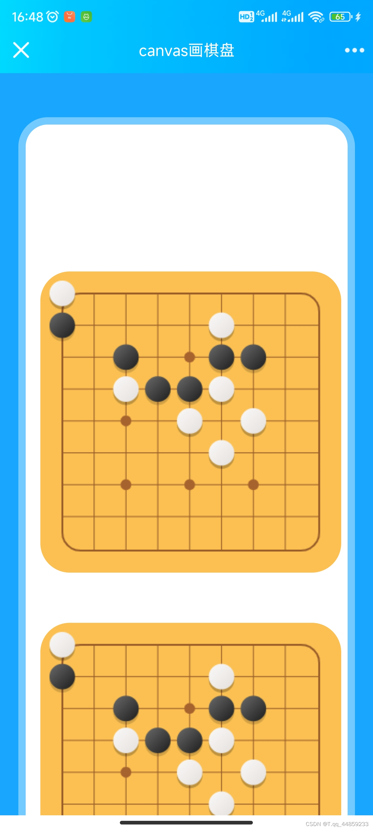
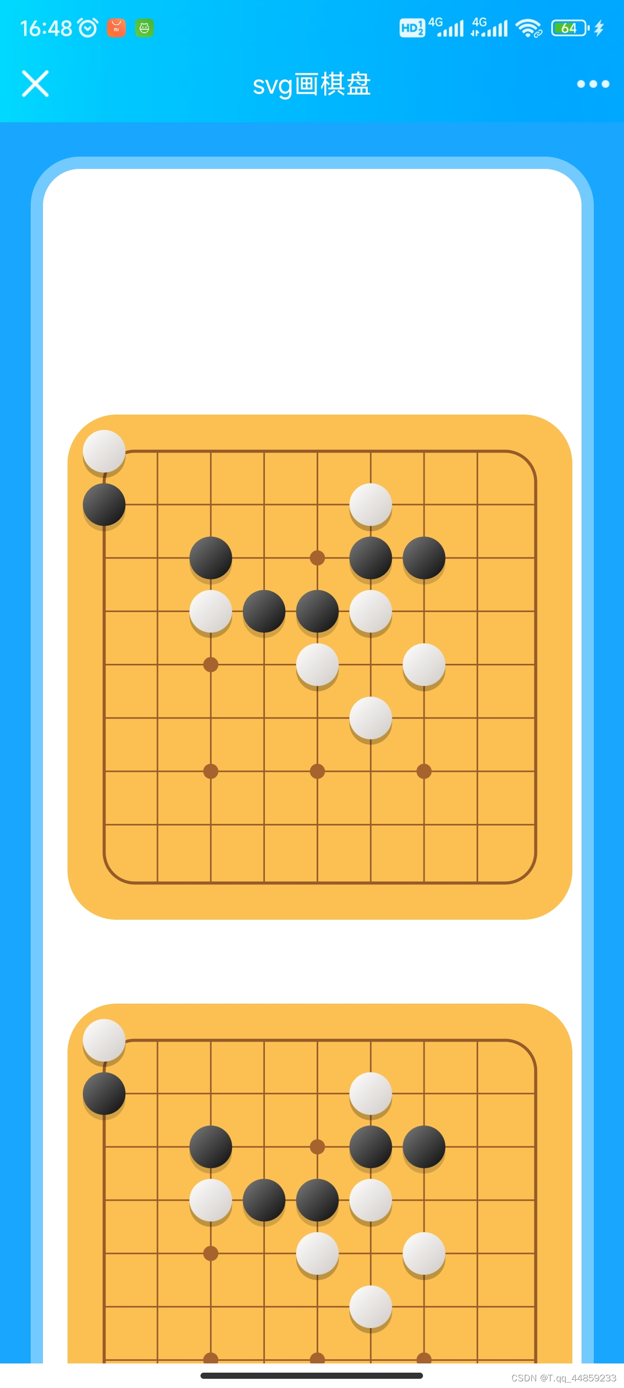
android效果
canvas截图如下:
svg截图如下:
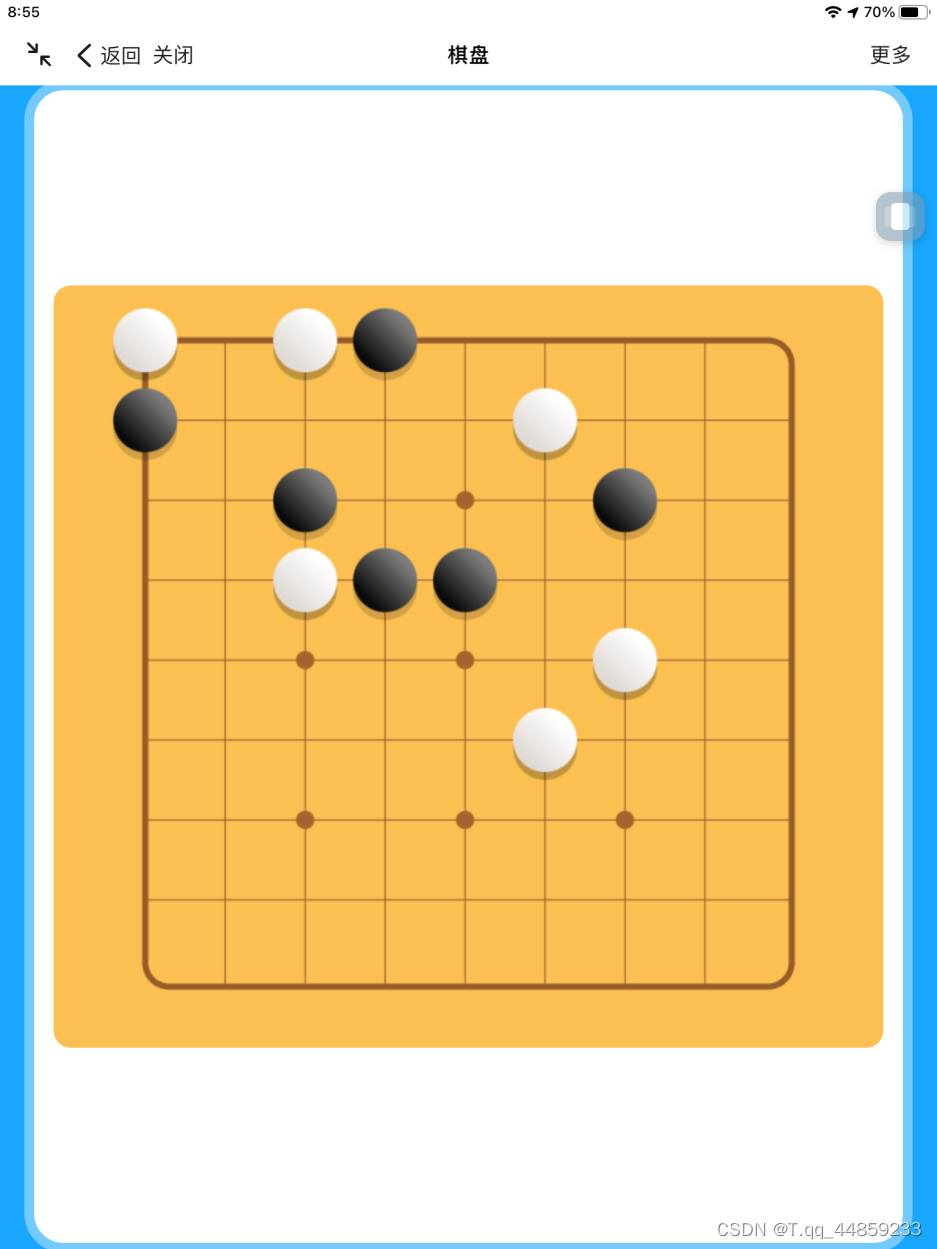
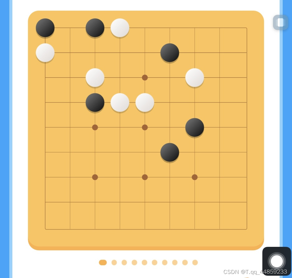
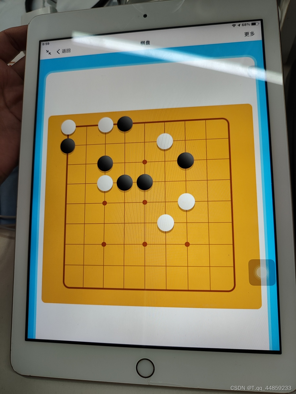
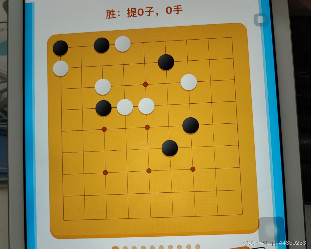
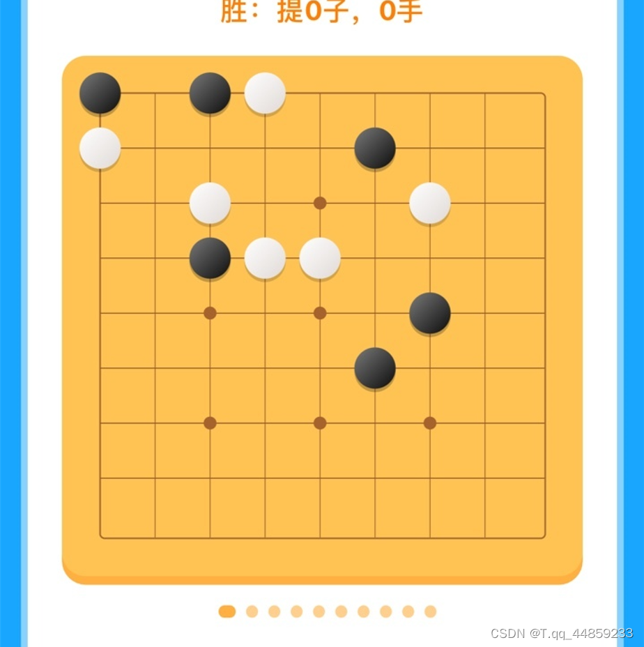
ipad效果
canvas截图如下:
svg截图如下:
canvas拍照效果:
svg拍照效果:
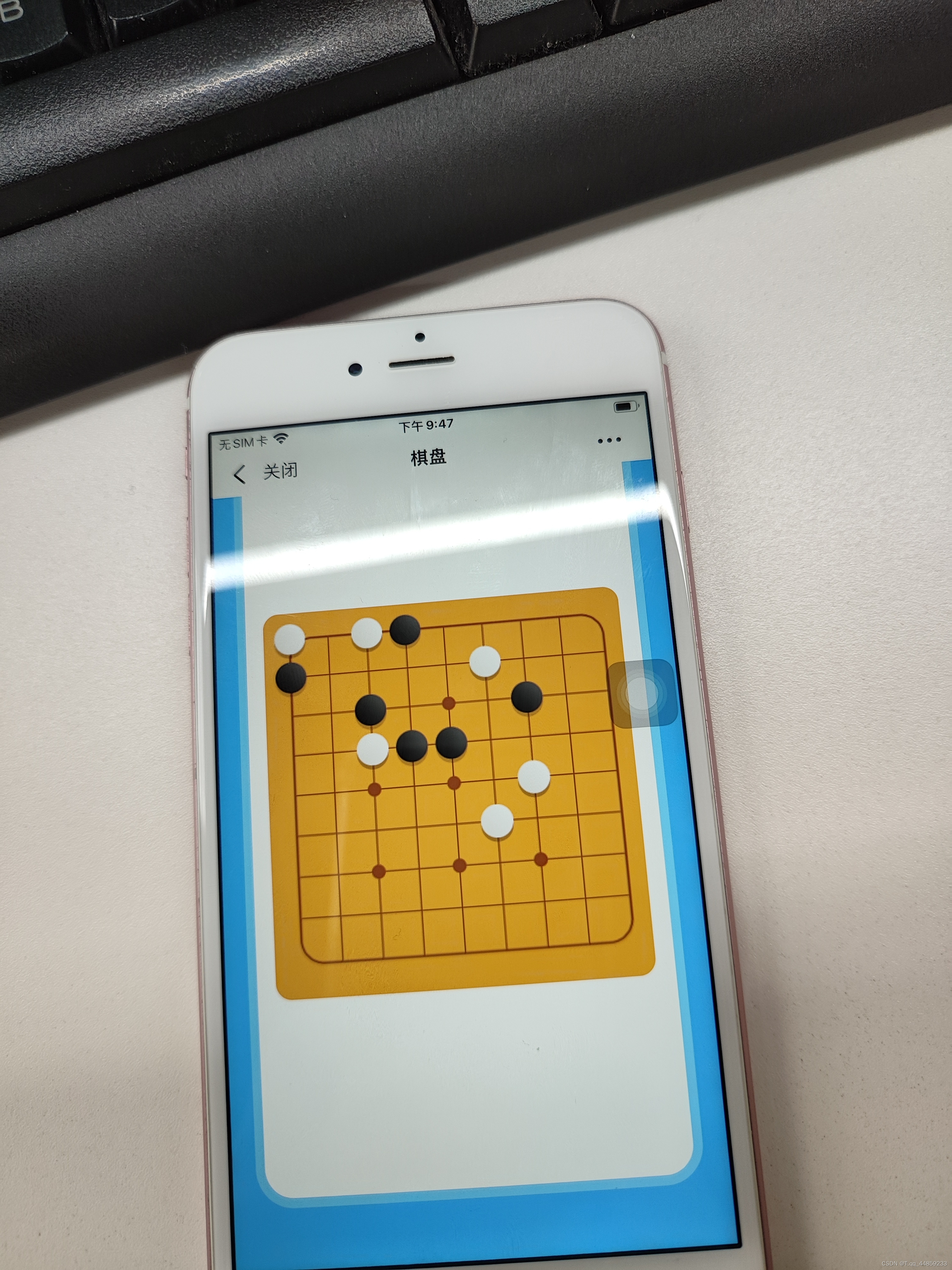
iphone效果
canvas截图如下:

svg截图如下:
canvas拍照效果:
svg拍照效果:
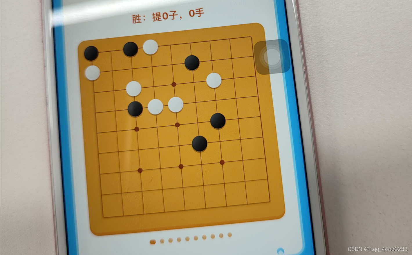
从上面效果来说,我觉得svg画的棋盘在移动端更高清,而canvas更像是一张图片,对效果有更加浓厚的兴趣的可以去下载一下源码,然后自己手动在手机上看看效果.
性能比较
我只是通过谷歌浏览器的lighthouse测量了一下,下面是绘制十张棋盘的测试结果,当然觉得这样测量不准确的,也欢迎下载源码自己去测试一下~
canvas
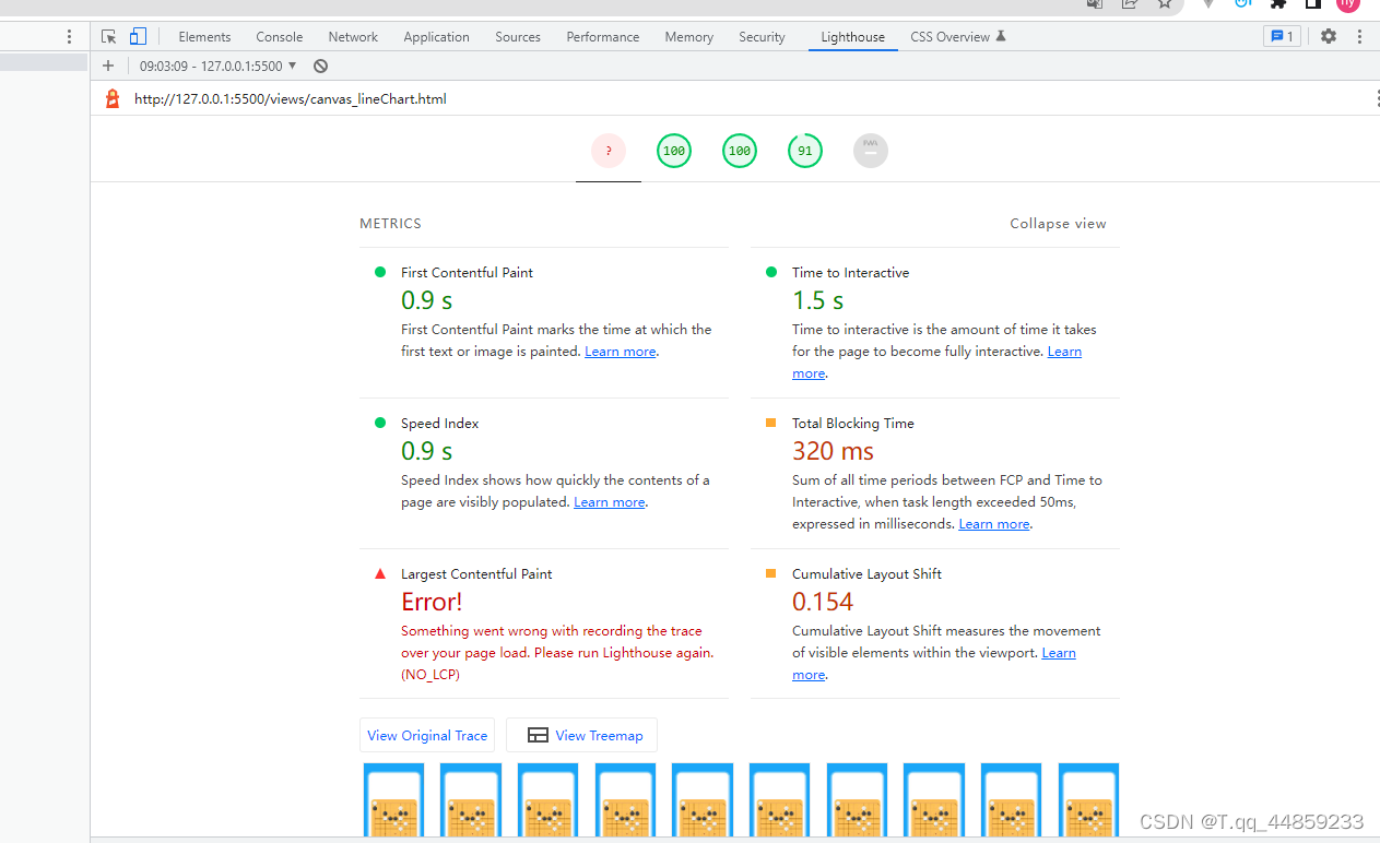
svg

从上面结果上看,svg和canvas画十张棋盘的性能,svg优胜一点点,总阻塞时间svg快了100ms的样子.
源码:
为了保证公平性,源码中没有使用任何库,只是js操作,十张棋盘的数据也是一样的.
gitee地址:svg_vs_canvas_chess: svg和canvas在移动端适配比较 (gitee.com)
github地址:https://github.com/tiantianhy/svg_vs_canvas_chess
上述分享中,如有疑问和想法,欢迎一起探讨~


 扫一扫
扫一扫


 2061
2061

 被折叠的 条评论
为什么被折叠?
被折叠的 条评论
为什么被折叠?
 到【灌水乐园】发言


