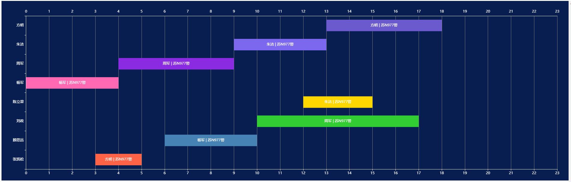
vue2 项目中 echarts 实现排班 效果

效果

在这里插入图片描述

代码

<template>
  <div class="index">
    <div ref="scheduleChart" style="width: 100%; height: 600px"></div>
  </div>
</template>

<script>
import * as echarts from "echarts";

export default {
  name: "ScheduleChart",
  data() {
    return {
      scheduleData: [
        {
          name: "张凯松",
          shifts: [{ start: 3, end: 5, label: "方明 | 苏N977警" }],
        },
        {
          name: "顾思远",
          shifts: [{ start: 6, end: 10, label: "杨军 | 苏N977警" }],
        },
        {
          name: "刘政",
          shifts: [{ start: 10, end: 17, label: "周军 | 苏N977警" }],
        },
        {
          name: "陈立梁",
          shifts: [{ start: 12, end: 15, label: "朱洁 | 苏N977警" }],
        },
        {
          name: "杨军",
          shifts: [{ start: 0, end: 4, label: "杨军 | 苏N977警" }],
        },
        {
          name: "周军",
          shifts: [{ start: 4, end: 9, label: "周军 | 苏N977警" }],
        },
        {
          name: "朱洁",
          shifts: [{ start: 9, end: 13, label: "朱洁 | 苏N977警" }],
        },
        {
          name: "方明",
          shifts: [{ start: 13, end: 18, label: "方明 | 苏N977警" }],
        },
      ],
      XData: [
        0, 1, 2, 3, 4, 5, 6, 7, 8, 9, 10, 11, 12, 13, 14, 15, 16, 17, 18, 19,
        20, 21, 22, 23,
      ],
    };
  },
  mounted() {
    this.initChart();
  },
  methods: {
    initChart() {
      this.chart = echarts.init(this.$refs.scheduleChart);
      const yAxisData = this.scheduleData.map((item) => item.name);

      const seriesData = this.scheduleData.map((item, index) => ({
        name: item.name,
        type: "custom",
        renderItem: (params, api) => {
          const categoryIndex = api.value(0);
          const start = api.coord([api.value(1), categoryIndex]);
          const end = api.coord([api.value(2), categoryIndex]);
          const height = api.size([0, 1])[1] * 0.6;

          return {
            type: "group",
            children: [
              {
                type: "rect",
                shape: {
                  x: start[0],
                  y: start[1] - height / 2,
                  width: end[0] - start[0],
                  height: height,
                },
                style: api.style(),
              },
              {
                type: "text",
                style: {
                  text: api.value(3),
                  x: (start[0] + end[0]) / 2,
                  y: start[1],
                  fill: "white",
                  textAlign: "center",
                  textVerticalAlign: "middle",
                  fontSize: 12,
                },
              },
            ],
          };
        },
        data: item.shifts.map((shift) => [
          index,
          shift.start,
          shift.end,
          shift.label,
        ]),
        itemStyle: {
          color: this.getColor(item.name),
        },
      }));

      const option = {
        tooltip: {
          trigger: "item",
          formatter: (params) => {
            return `${params.value[3]}<br/>${params.value[1]}:00 - ${params.value[2]}:00`;
          },
        },
        grid: {
          left: "2%",
          right: "2%",
          bottom: "3%",
          top: "5%",
          containLabel: true,
        },
        xAxis: [
          {
            type: "category",
            data: this.XData,
            axisLabel: {
              formatter: "{value}",
              color: "white",
              interval: 0,
            },
            axisLine: {
              show: true,
              lineStyle: {
                color: "white",
              },
            },
            axisTick: {
              // show: true,
              alignWithLabel: true,
            },
            splitLine: {
              show: true,
              lineStyle: {
                color: "gray",
              },
            },
            boundaryGap: false,
          },
          {
            type: "category",
            data: this.XData,
            axisLabel: {
              formatter: "{value}",
              color: "white",
              interval: 0,
            },
            axisLine: {
              show: true,
              lineStyle: {
                color: "white",
              },
            },
            axisTick: {
              show: false,
              alignWithLabel: true,
            },
            position: "top",
            // splitLine: {
            //   show: true,
            //   lineStyle: {
            //     color: "white",
            //   },
            // },
            boundaryGap: false,
          },
        ],
        yAxis: {
          type: "category",
          data: yAxisData,
          axisLabel: {
            color: "white",
          },
          axisLine: {
            show: true,
            lineStyle: {
              color: "white",
            },
          },
          axisTick: {
            show: true,
          },
        },
        series: seriesData,
      };

      this.chart.setOption(option);
    },
    getColor(name) {
      const colors = [
        "#FF6347",
        "#4682B4",
        "#32CD32",
        "#FFD700",
        "#FF69B4",
        "#8A2BE2",
        "#7B68EE",
        "#6A5ACD",
      ];
      const index = this.scheduleData.findIndex((item) => item.name === name);
      return colors[index % colors.length];
    },
  },
};
</script>

<style scoped>
.index {
  background: #091e50;
}
</style>

  • 2
    点赞
  • 0
    收藏
    觉得还不错? 一键收藏
  • 打赏
    打赏
  • 0
    评论
要在Vue项目使用echarts图表,你需要先安装echarts库。可以通过npm或yarn来安装echarts: ```bash npm install echarts --save # 或者 yarn add echarts ``` 然后在Vue组件引入echarts并使用它来绘制图表。以下是一个简单的例子: ```vue <template> <div class="chart-container"> <div ref="echarts" class="echarts"></div> </div> </template> <script> import echarts from 'echarts' export default { name: 'EchartsDemo', data() { return { chartData: [ { name: '一月', value: 100 }, { name: '二月', value: 200 }, { name: '三月', value: 300 }, { name: '四月', value: 400 }, { name: '五月', value: 500 }, { name: '六月', value: 600 } ] } }, mounted() { this.drawChart() }, methods: { drawChart() { const chartDom = this.$refs.echarts const chart = echarts.init(chartDom) const option = { xAxis: { type: 'category', data: this.chartData.map(item => item.name) }, yAxis: { type: 'value' }, series: [{ data: this.chartData.map(item => item.value), type: 'bar' }] } chart.setOption(option) } } } </script> <style scoped> .echarts { width: 100%; height: 400px; } </style> ``` 在这个例子,我们在组件的`mounted`生命周期钩子调用了`drawChart`方法来绘制图表。方法首先通过`this.$refs.echarts`获取到一个DOM元素,然后使用`echarts.init`方法初始化echarts实例。接着,我们通过设置`option`对象来定义图表的配置,最后调用`chart.setOption`方法来渲染图表。 上面的例子演示了如何使用echarts来绘制一个简单的柱状图。你可以根据需要调整`option`对象的配置来实现其他类型的图表,例如折线图、饼图等等。

“相关推荐”对你有帮助么?

  • 非常没帮助
  • 没帮助
  • 一般
  • 有帮助
  • 非常有帮助
提交
评论
添加红包

请填写红包祝福语或标题

红包个数最小为10个

红包金额最低5元

当前余额3.43前往充值 >
需支付:10.00
成就一亿技术人!
领取后你会自动成为博主和红包主的粉丝 规则
hope_wisdom
发出的红包

打赏作者

fruge365

你的鼓励将是我创作的最大动力

¥1 ¥2 ¥4 ¥6 ¥10 ¥20
扫码支付:¥1
获取中
扫码支付

您的余额不足,请更换扫码支付或充值

打赏作者

实付
使用余额支付
点击重新获取
扫码支付
钱包余额 0

抵扣说明:

1.余额是钱包充值的虚拟货币,按照1:1的比例进行支付金额的抵扣。
2.余额无法直接购买下载,可以购买VIP、付费专栏及课程。

余额充值