


X 轴刻度线标签处理
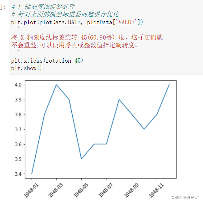
plt.xticks(rotation=45)
添加文字说明
plt.text()可以在图中的任意位置添加文字,并支持LaTex语法
text(x, y, s=‘this is text’, fontsize=15)
x:x 轴的位置
y:y 轴的位置
s:设置书写的文本内容 fontsize:设置字的大小
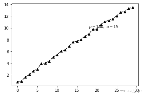
import numpy as np
plt.plot(np.random.random(30).cumsum(), color='k', linestyle='dashed', marker='^')
plt.text(18, 10, r'$\mu=100,\ \sigma=15$')
plt.show()
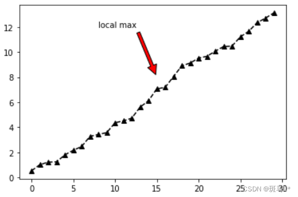
文本注释
在数据可视化的过程中,图片中的文字经常被用来注释图中的一些特征。使用annotate()方法可以很方便地添加此类注释。在使用annotate时,要考虑两个点的坐标:被注释的地方xy(x, y)和插入文本的地方xytext(x, y)
annotate( s=‘lxz’, xy=(1980, 65.1), xytext=(1970, 77.1),xycoords=‘data’, textcoords=‘data’, color=‘r’, fontsize=20, arrowprops=dict(arrowstyle=“->”,connectionstyle=‘arc3’,color=‘r’,) )
s:代表要注释的内容(必选参数)
xy:(实际点)代表 x、y 轴的位置(必选参数)
xytext:("注释内容"的实际位置)调整"注释内容"的位置,不设置就默认使用 xy 的位置
xycoords:(实际点)默认为data,代表注释(可选)
textcoords:("注释内容"的实际样式)不设置就默认使用 xycoords 的设置(可选)
color:注释内容的颜色 fontsize:注释内容的字体大小
设置箭头
arrowprops=dict(arrowstyle=“-”,connectionstyle=‘arc3’,color=‘r’,)
arrowstyle:设置箭头样式 connectionstyle:连接风格 color:箭头颜色
import numpy as np
plt.plot(np.random.random(30).cumsum(), color='k', linestyle='dashed', marker='^')
plt.annotate('local max', xy=(15, 8), xytext=(8, 12),
            arrowprops=dict(facecolor='r', shrink=0.05))
plt.show()
import matplotlib.pyplot as plt
from matplotlib import style
style.use('ggplot')
fig = plt.figure()
ax1 = plt.subplot2grid((1,1), (0,0))
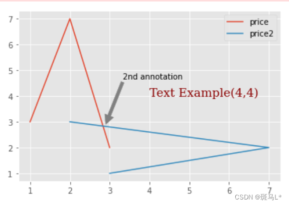
ax1.plot([1,2,3],[3,7,2],label = 'price')
ax1.plot([3,7,2],[1,2,3],label = 'price2')
font_dict = {'family':'serif',
'color':'darkred',
'size':15}
#我们使用ax1.text添加文本,坐标为(4,4)
#我们使用fontdict参数添加一个数据字典,来使用所用的字体。
#在我们的字体字典中,我们将字体更改为serif,颜色为『深红色』,然后将字体大小更改为 15。
ax1.text(4, 4,'Text Example(4,4)', fontdict=font_dict)
#用另一种方式进行注解,xytext为比例
ax1.annotate('2nd annotation',(2.9,2.9),
xytext=(0.4, 0.6), textcoords='axes fraction',
arrowprops = dict(facecolor='grey',color='grey'))
plt.legend()
plt.show()
中文和字体
方法一
污染全局字体设置
plt.rcParams[‘font.sans-serif’] = [‘SimHei’] #
步骤一(替换sans-serif字体) plt.rcParams[‘axes.unicode_minus’] = False #
步骤二(解决坐标轴负数的负号显示问题)
方法二
不污染全局字体设置
plt.ylabel(“y轴”, fontproperties=“SimSun”) # (宋体)
plt.title(“标题”, fontproperties=“SimHei”) # (黑体)
字体大小
plt.rcParams[‘xtick.labelsize’] = 24 plt.rcParams[‘ytick.labelsize’] =
20 plt.rcParams[‘font.size’] = 15
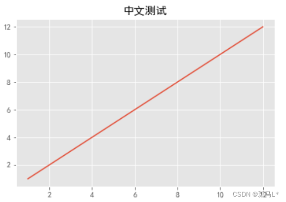
x = range(1,13,1)
y = range(1,13,1)
plt.rcParams['font.sans-serif'] = ['SimHei']
plt.rcParams['axes.unicode_minus']=False
plt.plot(x,y)
plt.title('中文测试')
plt.show()
边框和水平线条
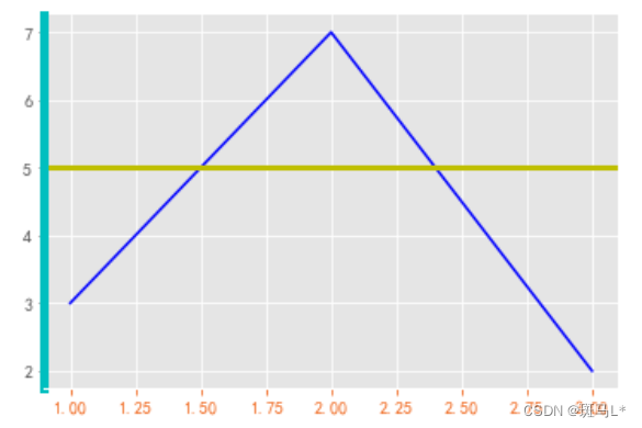
fig = plt.figure()
ax1 = plt.subplot2grid((1,1), (0,0))
ax1.plot([1,2,3],[3,7,2],label = 'price', color= 'b')

#左边框设为青色
ax1.spines['left'].set_color('c')

#删除右、上边框
ax1.spines['right'].set_visible(False)
ax1.spines['top'].set_visible(False)

#让左边框变粗
ax1.spines['left'].set_linewidth(5)

#橙色的x轴数值
ax1.tick_params(axis='x', colors='#f06215')

#直接画一条水平线
ax1.axhline(5, color='y', linewidth=3)

plt.show()
堆叠图
堆叠图用于显示『部分对整体』随时间的关系。 堆叠图基本上类似于饼图,只是随时间而变化。
让我们考虑一个情况,我们一天有 24 小时,我们想看看我们如何花费时间。 我们将我们的活动分为:睡觉,吃饭,工作和玩耍。
我们假设我们要在 5 天的时间内跟踪它,因此我们的初始数据将如下所示:
days = [1,2,3,4,5]

sleeping = [7,8,6,11,7]
eating =   [2,3,4,3,2]
working =  [7,8,7,2,2]
playing =  [8,5,7,8,13]

#因此,我们的x轴将包括day变量,即 1, 2, 3, 4 和 5。然后,日期的各个成分保存在它们各自的活动中。

plt.stackplot(days, sleeping,eating,working,playing, colors=['m','c','r','yellow'])

plt.xlabel('x')
plt.ylabel('y')
plt.title('Interesting Graph\nCheck it out')
plt.show()
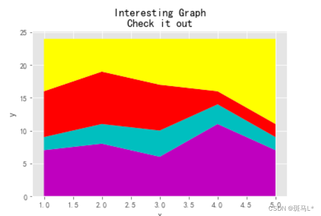
在这里,我们可以至少在颜色上看到,我们如何花费我们的时间。 问题是,如果不回头看代码,我们不知道什么颜色是什么。 下一个问题是,对于多边形来说,我们实际上不能为数据添加『标签』。 因此,在任何不止是线条,带有像这样的填充或堆叠图的地方,我们不能以固有方式标记出特定的部分。 这不应该阻止程序员。 我们可以解决这个问题:
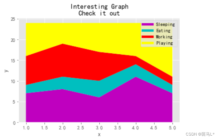
days = [1,2,3,4,5]

sleeping = [7,8,6,11,7]
eating =   [2,3,4,3,2]
working =  [7,8,7,2,2]
playing =  [8,5,7,8,13]

#我们在这里做的是画一些空行,给予它们符合我们的堆叠图的相同颜色,和正确标签。
#我们还使它们线宽为 5,使线条在图例中显得较宽。
plt.plot([],[],color='m', label='Sleeping', linewidth=5)
plt.plot([],[],color='c', label='Eating', linewidth=5)
plt.plot([],[],color='r', label='Working', linewidth=5)
plt.plot([],[],color='yellow', label='Playing', linewidth=5)

plt.stackplot(days, sleeping,eating,working,playing, colors=['m','c','r','yellow'])

plt.xlabel('x')
plt.ylabel('y')
plt.title('Interesting Graph\nCheck it out')
plt.legend()
plt.show()
饼图拉出一个
slices = [7,2,2,13]
activities = ['sleeping','eating','working','playing']
cols = ['c','m','r','b']

#slices是切片内容
plt.pie(slices,
        labels=activities,
        colors=cols,
        startangle=90,   #第一条线开始的角度,90度即为竖线
        shadow= True,
        explode=(0,0.1,0,0),    #一个切片拉出
        autopct='%1.1f%%')   #选择将百分比放置到图表上面

plt.title('Interesting Graph\nCheck it out')
plt.show()
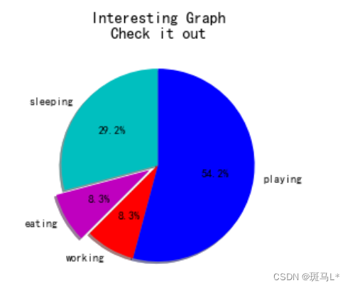
在plt.pie中,我们需要指定『切片』,这是每个部分的相对大小。 然后,我们指定相应切片的颜色列表。 接下来,我们可以选择指定图形的『起始角度』。 这使你可以在任何地方开始绘图。 在我们的例子中,我们为饼图选择了 90 度角,这意味着第一个部分是一个竖直线条。 接下来,我们可以选择给绘图添加一个字符大小的阴影,然后我们甚至可以使用explode拉出一个切片。
我们总共有四个切片,所以对于explode,如果我们不想拉出任何切片,我们传入0,0,0,0。 如果我们想要拉出第一个切片,我们传入0.1,0,0,0。
最后,我们使用autopct,选择将百分比放置到图表上面。
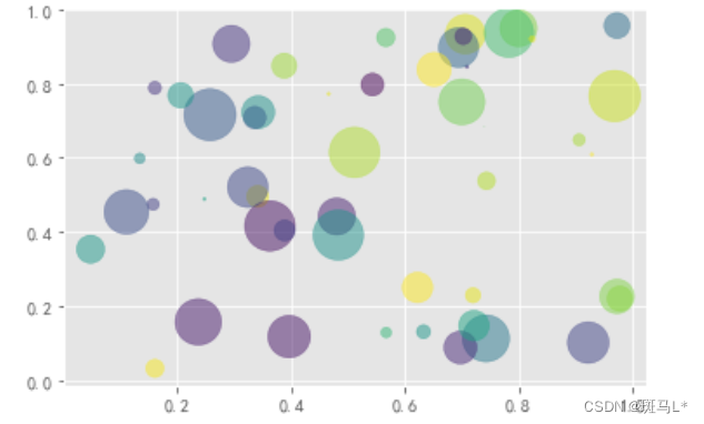
泡泡图
散点图的一种,加入了第三个值 s 可以理解成普通散点,画的是二维,泡泡图体现了Z的大小
# 泡泡图
np.random.seed(19680801)

N = 50
x = np.random.rand(N)
y = np.random.rand(N)
colors = np.random.rand(N)
area = (30 * np.random.rand(N))**2  # 0 to 15 point radii

plt.scatter(x, y, s=area, c=colors, alpha=0.5)
plt.show()
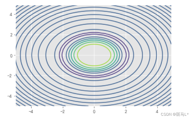
等高线
contour和contourf都是画三维等高线图的,不同点在于contourf会对等高线间的区域进行填充
x = np.arange(-5, 5, 0.1)
y = np.arange(-5, 5, 0.1)
xx, yy = np.meshgrid(x, y, sparse=True)
z = np.sin(xx**2 + yy**2) / (xx**2 + yy**2)
plt.contour(x, y, z) # contourf
plt.show()
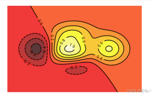
import matplotlib.pyplot as plt
import numpy as np

# 定义等高线高度函数
def f(x, y):
    return (1 - x / 2 + x ** 5 + y ** 3) * np.exp(- x ** 2 - y ** 2)

# 数据数目
n = 256
# 定义x, y
x = np.linspace(-3, 3, n)
y = np.linspace(-3, 3, n)

# 生成网格数据
X, Y = np.meshgrid(x, y)


# 填充等高线的颜色, 8是等高线分为几部分
plt.contourf(X, Y, f(X, Y), 8, alpha = 0.75, cmap = plt.cm.hot)
# 绘制等高线
C = plt.contour(X, Y, f(X, Y), 8, colors = 'black', linewidth = 0.5)
# 绘制等高线数据
plt.clabel(C, inline = True, fontsize = 10)

# 去除坐标轴
plt.xticks(())
plt.yticks(())
plt.show()
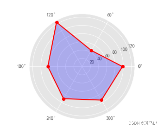
雷达图
# 导入第三方模块
import numpy as np
import matplotlib.pyplot as plt

# 中文和负号的正常显示
plt.rcParams['font.family'] = 'SimHei'
plt.rcParams['axes.unicode_minus'] = False

# ------------------------------------------------
# 数据处理和准备
values = [98, 45, 124, 83, 90, 94] # 数值
labels = ['语文', '英语', '数学', '物理', '化学', '生物']  # 标签
# 设置雷达图的角度,用于平分切开一个圆面
angles = np.linspace(0, 2 * np.pi, len(values), endpoint=False)  # 角度
'''
—— 拼接数组:
# 注意:数组之间形状要一致才可以拼接
np.concatenate((a, b), axis=0) 一维数组
np.concatenate((c, d), axis=1) 二维数组
'''
# 为了使雷达图一圈封闭起来,需要下面的步骤, 首尾相连
values = np.concatenate((values,[values[0]]))
angles = np.concatenate((angles,[angles[0]]))
print('\n>>>', values, '\n>>>', angles)


# --------------------------------------------------
# 绘图
fig = plt.figure()

''' 雷达图的核心 '''
# polar=True 这里一定要设置为极坐标格式
ax = fig.add_subplot(111, polar=True)
ax.plot(angles, values, marker='o', color='r', linewidth=2)  # 绘制折线图
ax.fill(angles, values, color='b', alpha=0.25)  # 填充蓝色颜色
ax.set_thetagrids(angles * 180/np.pi, labels)  # 添加每个特征的标签
'''
注意:
ax.plot(x=angles, y=values, marker='o', linewidth=2)
加上 x, y 显示不出线的标记
'''

# -------------------------------------------------
# 其他设置
ax.set_ylim(0,150)  # 设置雷达图的范围
plt.title('单个学生成绩展示')  # 添加标题
ax.grid(True)  # 添加网格线
plt.show()
共享坐标轴
共享一个x轴坐标,y轴左右分别使用两个刻度来标识
Axes.twinx(),Axes.twiny() 用来生成坐标轴实例以共享x或者y坐标轴
matplotlib.pyplot.subplots(nrows=1, ncols=1, sharex=False, sharey=False)
nrows,ncols: 用来确定绘制子图的行数和列数
sharex,sharey:用来确定是否共享坐标轴刻度,当设置为True或者all时,会共享参数刻度,设置为False或者None时,每一个子绘图会有自己独立的刻度,设置为row或者col时即共享行,列的x,y坐标轴刻度,当sharex=‘col’时,只会该列最底层axes的x刻度标签会创建
# 共享x坐标轴
# Create some mock data
t = np.arange(0.01, 10.0, 0.01)
data1 = np.exp(t)
data2 = np.sin(2 * np.pi * t)

fig, ax1 = plt.subplots()

color = 'tab:red'
ax1.set_xlabel('time (s)')
ax1.set_ylabel('exp', color=color)
ax1.plot(t, data1, color=color)
ax1.tick_params(axis='y', labelcolor=color)

ax2 = ax1.twinx()  # instantiate a second axes that shares the same x-axis

color = 'tab:blue'
ax2.set_ylabel('sin', color=color)  # we already handled the x-label with ax1
ax2.plot(t, data2, color=color)
ax2.tick_params(axis='y', labelcolor=color)

fig.tight_layout()  # otherwise the right y-label is slightly clipped
plt.show()

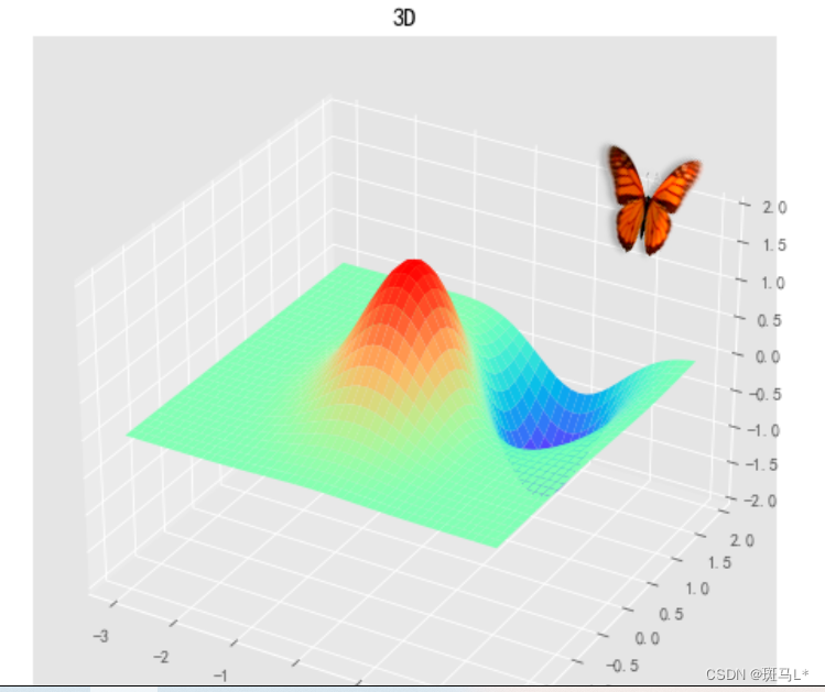
三维图
mpl_toolkits.mplot3d模块在matplotlib基础上提供了三维绘图的功能。由于它使用matplotlib的二维绘图功能来实现三维图形的绘制工作,因此绘图速度有限,不适合用于大规模数据的三维绘图。如果需要更复杂的三维数据可视化功能,可使用Mayavi。
1 创建3D图形对象
fig = plt.figure() # 创建图像对象
ax = Axes3D(fig) # 创建3D的多轴对象
2 绘制曲面
Axes3D.plot_surface(X, Y, Z, *args, **kwargs)

3.设置轴范围
设置 x,y,z 轴的范围[a, b]
ax.set_xlim(a, b)
ax.set_ylim(a, b)
ax.set_zlim(a,b)
import matplotlib.pyplot as plt
import numpy as np
from mpl_toolkits.mplot3d import Axes3D
fig = plt.figure(figsize=(8, 6))
ax = Axes3D(fig)
delta = 0.125
# 生成代表X轴数据的列表
x = np.arange(-3.0, 3.0, delta)
# 生成代表Y轴数据的列表
y = np.arange(-2.0, 2.0, delta)
# 对x、y数据执行网格化
X, Y = np.meshgrid(x, y)
Z1 = np.exp(-X**2 - Y**2)
Z2 = np.exp(-(X - 1)**2 - (Y - 1)**2)
# 计算Z轴数据(高度数据)
Z = (Z1 - Z2) * 2
# 绘制3D图形
ax.plot_surface(X, Y, Z,
    rstride=1,  # rstride(row)指定行的跨度
    cstride=1,  # cstride(column)指定列的跨度
    cmap=plt.get_cmap('rainbow'))  # 设置颜色映射
# 设置Z轴范围
ax.set_zlim(-2, 2)
# 设置标题
plt.title("3D")
plt.show()
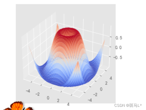
投影模式
投影模式决定了点从数据坐标转换为屏幕坐标的方式.可以通过下面的语句获得当前有效的投影模式的名称:
from matplotlib import projections
projections.get_projection_names()
只有在载入mplot3d模块之后,此列表中才会出現’3d’投影模式。’aitoff’、’hammer’ 、’lamberf’ 、 ’mollweide’等均为地图投影,’polar’ 为极坐标投影,‘rectilinear’则是默认的直线投影模式。
import numpy as np
import mpl_toolkits.mplot3d
import matplotlib.pyplot as plt

x, y = np.mgrid[-2:2:20j, -2:2:20j]
z = x * np.exp( - x**2 - y**2)
ax = plt.subplot(111, projection='3d')
ax.plot_surface(x, y, z, rstride=2, cstride=1, cmap = plt.cm.Blues_r)
ax.set_xlabel("X")
ax.set_ylabel("Y")
ax.set_zlabel("Z")
plt.show()

from matplotlib import cm
import matplotlib.pyplot as plt
import numpy as np
fig = plt.figure()
ax = fig.gca(projection='3d')
X = np.arange(-5, 5, 0.25)
Y = np.arange(-5, 5, 0.25)
X, Y = np.meshgrid(X, Y)
R = np.sqrt(X**2 + Y**2)
Z = np.sin(R)
surf = ax.plot_surface(X, Y, Z, rstride=1, cstride=1, cmap=cm.coolwarm)
plt.show()


 9万+
9万+


 被折叠的 条评论
为什么被折叠?
被折叠的 条评论
为什么被折叠?
 到【灌水乐园】发言


