


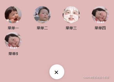
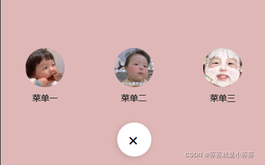
1.实现效果

2.实现原理
- 定义一个菜单列表,图标,名称,跳转路由
menuList: [
  {
      name: '菜单一',
      src: 'https://i.postimg.cc/Bn1XpkSn/susu.jpg',
      url: ''
    },
    {
      name: '菜单二',
      src: 'https://i.postimg.cc/Gm7KjGmN/111.jpg',
      url: ''
    },
    {
      name: '菜单三',
      src: 'https://i.postimg.cc/Bv28vfkg/222.webp',
      url: ''
    },
    {
      name: '菜单四',
      src: 'https://i.postimg.cc/65STLQNc/333.webp',
      url: ''
    },
  ]
- wx:for数组,为每一项设置内联样式,当菜单大于等同于4个时候,每个菜单宽度25%,超过100%,换行展示,反之宽度为100/数组的长度,居中显示,动画逐次延迟0.1s。如下图所示。
style="width:{{menuList.length>=4?'25':100/menuList.length}}%;animation-delay: {{(index+1)*0.1}}s"
- 设置弹出动画
@keyframes menuAwave {
  0% {
    opacity: 0;
    transform: translateY(100%)
  }

  60% {
    transform: translateY(-10%);
  }

  80% {
    transform: translateY(10%);
  }

  100% {
    opacity: 1;
    transform: translateY(0%)
  }
}
- 为mask背景层设置动画,transform: scale设置缩放大小。
3.实现代码
<view class="maskBg {{mask_animation}}" catchtouchmove="preventdefault"></view>
<view class='menu-container' catchtouchmove="preventdefault" hidden='{{isShow}}'>
  <view class='menu'>
    <view class='menu-list'>
      <view data-url="{{item.url}}" catchtap="toDetail" class='menu-item' wx:for='{{menuList}}' wx:key="menuList" style="width:{{menuList.length>=4?'25':100/menuList.length}}%;animation-delay: {{(index+1)*0.1}}s">
        <image mode='aspectFill' src='{{item.src}}' class="menu-icon"></image>
        <text class='menu-name'>{{item.name}}</text>
      </view>
    </view>
  </view>
</view>
<view class="btn">
  <view catchtap="click" class="btn-main {{btn_animation}}">+</view>
</view>
/* pages/effects/popMenu2/index.wxss */
.maskBg {
  height: 48px;
  width: 48px;
  background-color: #ddacac;
  opacity: 0.85;
  z-index: 1000;
  border-radius: 750rpx;
  transform: scale(0);
  position: fixed;
  bottom: 0;
  left: 50%;
  margin-left: -24px;
}
.maskOpen {
  animation: maskOpenAin 0.3s both;
}

.maskClose {
  animation: maskCloseAin 0.4s both;
}

@keyframes maskOpenAin {
  0% {
    transform: scale(0);
  }

  75% {
    transform: scale(24);
  }

  100% {
    transform: scale(48);
  }
}

@keyframes maskCloseAin {
  0% {
    transform: scale(48);
  }

  25% {
    transform: scale(24);
  }

  100% {
    transform: scale(0);
  }
}

.btn {
  width: 100%;
  height: 48px;
  display: flex;
  justify-content: center;
  align-items: center;
  position: fixed;
  z-index: 1005;
  bottom: calc(10rpx + env(safe-area-inset-bottom));
}

.btn-main {
  border-radius: 50%;
  z-index: 1005;
  height: 48px;
  font-size: 28px;
  width: 48px;
  line-height: 48px;
  text-align: center;
  box-shadow: 0 2px 8px rgba(0, 0, 0, 0.15);
  color: #fff;
  background: pink;
}

.menuOpen {
  animation: menuOpenAni 0.3s both;
}

.menuClose {
  animation: menuCloseAni 0.3s both;
}

@keyframes menuOpenAni {
  0% {
    transform: rotate(0deg);
    color: #fff;
    background: pink;
  }

  100% {
    transform: rotate(45deg);
    color: #000;
    background: #fff;
  }
}

@keyframes menuCloseAni {
  0% {
    transform: rotate(45deg);
    color: #000;
    background: #fff;
  }

  100% {
    transform: rotate(-0deg);
    color: #fff;
    background: pink;
  }
}

.menu-container {
  position: fixed;
  width: 100%;
  z-index: 1002;
  bottom: 0rpx;
}

.menu {
  padding-bottom: calc(48px + 40rpx + env(safe-area-inset-bottom));
}

.menu-list {
  display: flex;
  align-items: center;
  flex-wrap: wrap;
  width: 100%;
  padding-bottom: 15rpx;
}

.menu-item {
  display: flex;
  flex-direction: column;
  align-items: center;
  animation: menuAwave 0.45s linear both;
}

.menu-icon {
  width: 110rpx;
  height: 110rpx;
  margin-bottom: 15rpx;
  border-radius: 100%;
}

.menu-name {
  color: #333;
  font-size: 25rpx;
  font-weight: bold;
  margin-bottom: 10rpx;
}

@keyframes menuAwave {
  0% {
    opacity: 0;
    transform: translateY(100%)
  }

  60% {
    transform: translateY(-10%);
  }

  80% {
    transform: translateY(10%);
  }

  100% {
    opacity: 1;
    transform: translateY(0%)
  }
}
Page({

  data: {
    isShow: true,
    menuList: [
      {
        name: '菜单一',
        src: 'https://i.postimg.cc/Bn1XpkSn/susu.jpg',
        url: ''
      },
      {
        name: '菜单二',
        src: 'https://i.postimg.cc/Gm7KjGmN/111.jpg',
        url: ''
      },
      {
        name: '菜单三',
        src: 'https://i.postimg.cc/Bv28vfkg/222.webp',
        url: ''
      },
      {
        name: '菜单四',
        src: 'https://i.postimg.cc/65STLQNc/333.webp',
        url: ''
      },
      {
        name: '菜单5',
        src: 'https://i.postimg.cc/65STLQNc/333.webp',
        url: ''
      },
    ],
    mask_animation: "",
    btn_animation: ""
  },
  ...

})


 2429
2429


 被折叠的 条评论
为什么被折叠?
被折叠的 条评论
为什么被折叠?
 到【灌水乐园】发言


