


实验内容:
自选数据绘制箱型图描述数据统计分布;
实验目的:
掌握箱型图的绘制方法,能够利用箱型图识别数据中的异常值,判断
数据的偏态和尾重;
实验要求:
选取至少三组不同分布的实际数据集,绘制带误差线的箱形图和箱形
与抖动散点组合图,观察分析数据分布情况。得出观察结果:关键数
值、异常值、数据分布情况、数据分布是否偏斜。
import pandas as pd
import numpy as np
import seaborn as sns
import matplotlib.pyplot as plt
from plotnine import *
#带误差线的柱形图
Barjitter_plot=(ggplot(df,aes(x='class',y="value",fill="class"))
+stat_summary(fun_data="mean_sdl",fun_args = {'mult':1},geom="bar", color = "black",size =0.75,width=0.7,show_legend=False)
+stat_summary(fun_data="mean_sdl", fun_args = {'mult':1},geom="errorbar", color = "black",size =0.75,width=.2,show_legend=False)
+scale_fill_hue(s = 0.90, l = 0.65, h=0.0417,color_space='husl')
+ylim(0,7)
+theme_matplotlib()
+theme(#legend_position='none',
aspect_ratio =1.05,
dpi=100,
figure_size=(4,4)))
print(Barjitter_plot)
#箱形与抖动散点组合图
freq =np.logspace(1,4,num=4-1+1,base=10,dtype='int')
df=pd.DataFrame({'class': np.repeat(['a','b','c','d'], freq),
                 'value':np.random.normal(3, 1, sum(freq))})
box_plot=(ggplot(df,aes(x='class',y="value",fill="class"))
          +geom_boxplot(show_legend=False)
          +scale_fill_hue(s = 0.90, l = 0.65, h=0.0417,color_space='husl')
          +theme_matplotlib()
          +theme(#legend_position='none',
              aspect_ratio =1.1,
              dpi=100,
              figure_size=(4,4)))
print(box_plot)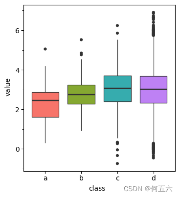
#带误差线柱形与抖动图
Barjitter_plot=(ggplot(df,aes(x='class',y="value",fill="class"))
                +stat_summary(fun_data="mean_sdl", fun_args = {'mult':1},geom="bar", fill="w",color = "black",size=0.75,width=0.7,show_legend=False)
                +stat_summary(fun_data="mean_sdl",fun_args = {'mult':1},geom="errorbar", color = "black",size =0.75,width=.2,show_legend=False)
                +geom_jitter(width=0.3,size=2,stroke=0.1,shape='o',show_legend=False)
                +scale_fill_hue(s = 0.90, l = 0.65, h=0.0417,color_space='husl')
                +ylim(0,7)
                +theme_matplotlib()
                +theme(
                    aspect_ratio =1.05,
                    dpi=100,
                    figure_size=(4,4)))
print(Barjitter_plot)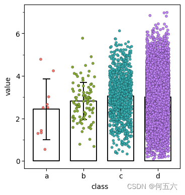


 9035
9035


 被折叠的 条评论
为什么被折叠?
被折叠的 条评论
为什么被折叠?
 到【灌水乐园】发言


