


Matplotlib 比较影片评分的柱状图
加载数据
# Import statements
import numpy as np
import pandas as pd

import matplotlib.pyplot as plt

%matplotlib inline
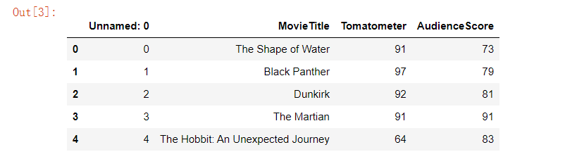
# Load dataset
movie_scores = pd.read_csv('data/movie_scores.csv')
movie_scores
画图
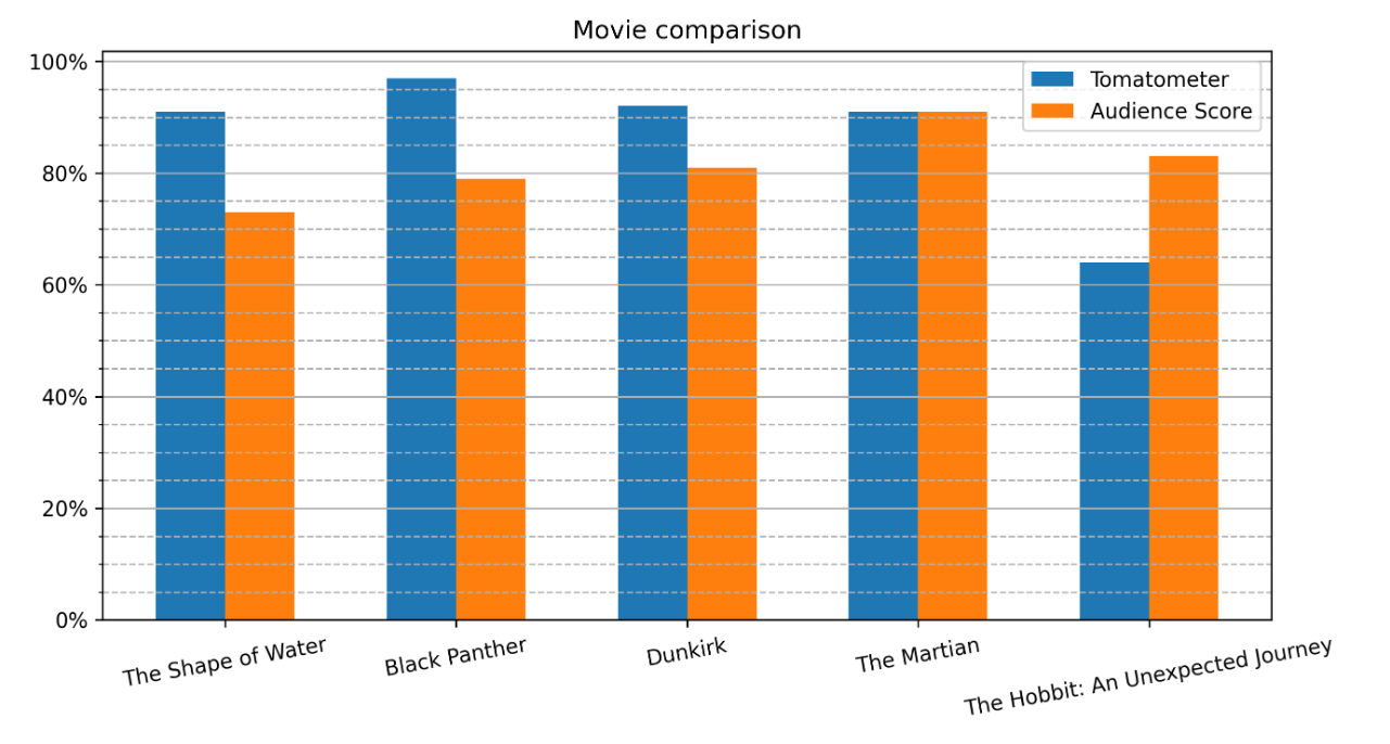
# Create figure
plt.figure(figsize=(10,5), dpi=300)
# Create bar plot
pos = np.arange(len(movie_scores['MovieTitle']))
width = 0.3
plt.bar(pos - width/2, movie_scores['Tomatometer'], width, label='Tomatometer')
plt.bar(pos + width/2, movie_scores['AudienceScore'], width, label='Audience Score')
# Specify ticks
plt.xticks(pos, rotation=10)
plt.yticks(np.arange(0,101,20))
# Get current Axes for setting tick labels and horizontal grid
ax = plt.gca()
# Set tick labels
ax.set_xticklabels(movie_scores['MovieTitle'])
ax.set_yticklabels(['0%', '20%', '40%', '60%', '80%', '100%'])
# Add minor ticks for y-axis in the interval of 5
ax.set_yticks(np.arange(0,100,5), minor=True)
# Add major horizontal grid with solid lines
ax.yaxis.grid(which='major')
# Add minor horizontal grid with dashed lines
ax.yaxis.grid(which='minor', linestyle='--')
# Add title
plt.title("Movie comparison")
# Add legend
plt.legend()
# Show plot
plt.show()


 986
986


 被折叠的 条评论
为什么被折叠?
被折叠的 条评论
为什么被折叠?
 到【灌水乐园】发言


