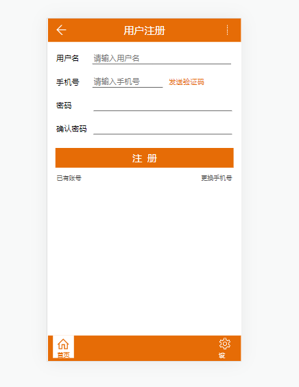
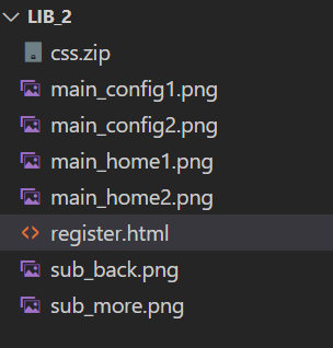
前端实验2

效果:
在这里插入图片描述
目录结构:
在这里插入图片描述
代码:

<!DOCTYPE html>
<html lang="en">

<head>
    <meta charset="UTF-8">
    <meta http-equiv="X-UA-Compatible" content="IE=edge">
    <meta name="viewport" content="width=device-width, initial-scale=1.0">
    <title>Document</title>
</head>

<script type="text/javascript">
    function setRootFontSize() {
        var rootHtml = document.documentElement;
        var rem = rootHtml.clientWidth / (1080 / 100);   //1080为设计图px宽度
        rootHtml.style.fontSize = rem + "px";
    }
    setRootFontSize();   //网页首次载入时执行一次
    window.addEventListener("resize", setRootFontSize, false);   //网页大小改变时执行
    window.addEventListener("orientationchange", setRootFontSize, false);   //横屏切换时执行
</script>

<style>
    body {
        margin: 0%
    }

    .header {
        background-color: #e66c06;
    }

    .left {
        width: 1.04rem;
        height: 1.32rem;
        float: left;
        /* background-color: red; */
        background-image: url(sub_back.png);
        background-size: .55rem .55rem;
        background-repeat: no-repeat;
        background-position: .46rem .36rem;
    }

    .center {
        height: 1.32rem;
        margin: 0rem 1.05rem 0rem 1.05rem;
        /* background-color: green; */
        text-align: center;
        font-size: .58rem;
        color: #fff;
        line-height: 1.32rem;
    }

    .right {
        width: 1.04rem;
        height: 1.32rem;
        float: right;
        /* background-color: blue; */
        background-image: url(sub_more.png);
        background-size: .55rem .55rem;
        background-repeat: no-repeat;
        background-position: 0rem .36rem;
    }

    .content_left {
        float: left;
        font-size: .43rem;
        padding: .62rem 0 0 .46rem;
    }

    input {
        width: 7.63rem;
        border-bottom: 1px solid #000;
        border-top: 0;
        border-left: 0;
        border-right: 0;
        outline: none;
        background: transparent;
        margin-left: .75rem;
    }

    input:placeholder-shown {
        font-size: .43rem;
        color: #a1a1a1;
    }

    .input2 {
        width: 3.82rem;
    }

    .input3 {
        margin-left: 1.23rem;
    }

    .input4 {
        margin-left: .38rem;
    }

    #register {
        height: 1.12rem;
        background-color: #e66c06;
        margin: 0.675rem .41rem 0 .41rem;
        text-align: center;
        font-size: .52rem;
        line-height: 1.12rem;
        color: #fff;
    }

    .content2 {
        position: relative;
    }

    .yanzhengma {
        float: right;
        /* position: absolute; */
        left: 6.23rem;
        font-size: .4rem;
        padding: .65rem 2.04rem .14rem .23rem;
        color: #e66c06;
    }

    .middle_left {
        float: left;
        font-size: .27rem;
        padding: .31rem 0 0 .48rem;
        color: #5f5f5f;
    }

    .middle_right {
        float: right;
        font-size: .27rem;
        padding: .31rem .51rem 0 0;
        color: #5f5f5f;
    }

    .bottom {
        position: fixed;
        bottom: 0px;
        background-color: #e66c06;
        height: 1.45rem;
        width: 100%;
    }

    .bottom_left {
        float: left;
        position: relative;
        height: 1.26rem;
        width: 1.19rem;
        background-color: #fff;
        margin-left: .27rem;
        background-image: url(main_home2.png);
        background-repeat: no-repeat;
        background-size: .64rem .64rem;
        background-position: .26rem .17rem;
    }

    .bottom_left_1 {
        font-size: .32rem;
        color: #e66c06;
        position: absolute;
        top: .82rem;
        left: .25rem;
    }

    .bottom_right {
        position: relative;
        float: right;
        height: 1.05rem;
        width: .67rem;
        margin-right: .59rem;
        margin-top: .14rem;
        background-image: url(main_config1.png);
        background-repeat: no-repeat;
        background-size: .64rem .64rem;
        background-position-x: .05rem;
    }

    .bottom_right_1 {
        font-size: .32rem;
        color: #fff;
        position: absolute;
        top: .73rem;
        left: 0.02rem;
    }
</style>

<body>
    <div class="header">
        <div class="left"></div>
        <div class="right"></div>
        <div class="center">用户注册</div>
    </div>

    <div class="contentArea">
        <div class="content_left">用户名</div>
        <div class="content1"><input type="text" placeholder="请输入用户名"></div>
        <div class="content_left">手机号</div>
        <div class="content2">
            <div class="yanzhengma">发送验证码</div>
            <input class="input2" type="text" placeholder="请输入手机号">
        </div>
        <!-- <div class="yanzhengma">发送验证码</div> -->
        <div class="content_left">密码</div>
        <div class="content3"><input class="input3" type="text"></div>
        <div class="content_left">确认密码</div>
        <div class="content4"><input class="input4" type="text"></div>
    </div>

    <div id="register">&nbsp;&nbsp;</div>

    <div class="middle_left">已有账号</div>
    <div class="middle_right">更换手机号</div>

    <div class="bottom">
        <div class="bottom_left">
            <div class="bottom_left_1">首页</div>
        </div>
        <div class="bottom_right">
            <div class="bottom_right_1">设置</div>
        </div>
    </div>

</body>

</html>
  • 0
    点赞
  • 0
    收藏
    觉得还不错? 一键收藏
  • 0
    评论
实验名称:使用Bootstrap开发响应式网站 实验目的:掌握Bootstrap框架的基本使用方法,能够使用Bootstrap开发响应式网站。 实验步骤: 1. 下载Bootstrap框架文件,包括CSS文件和JS文件。 2. 创建HTML文件,引入Bootstrap的CSS和JS文件。 ```html <!DOCTYPE html> <html> <head> <meta charset="UTF-8"> <title>Bootstrap实验</title> <link rel="stylesheet" href="css/bootstrap.min.css"> <script src="js/jquery-3.2.1.slim.min.js"></script> <script src="js/popper.min.js"></script> <script src="js/bootstrap.min.js"></script> </head> <body> </body> </html> ``` 3. 使用Bootstrap的网格系统布局页面,将页面分成12列,根据需要占用不同的列数。 ```html <div class="container"> <div class="row"> <div class="col-md-4">左侧内容</div> <div class="col-md-8">右侧内容</div> </div> </div> ``` 4. 使用Bootstrap的组件,如导航栏、按钮、表格、表单等。 ```html <nav class="navbar navbar-expand-lg navbar-dark bg-dark"> <a class="navbar-brand" href="#">Navbar</a> <button class="navbar-toggler" type="button" data-toggle="collapse" data-target="#navbarNav" aria-controls="navbarNav" aria-expanded="false" aria-label="Toggle navigation"> <span class="navbar-toggler-icon"></span> </button> <div class="collapse navbar-collapse" id="navbarNav"> <ul class="navbar-nav"> <li class="nav-item active"> <a class="nav-link" href="#">Home <span class="sr-only">(current)</span></a> </li> <li class="nav-item"> <a class="nav-link" href="#">Features</a> </li> <li class="nav-item"> <a class="nav-link" href="#">Pricing</a> </li> <li class="nav-item"> <a class="nav-link disabled" href="#">Disabled</a> </li> </ul> </div> </nav> <button type="button" class="btn btn-primary">Primary</button> <table class="table"> <thead> <tr> <th>#</th> <th>First Name</th> <th>Last Name</th> <th>Username</th> </tr> </thead> <tbody> <tr> <td>1</td> <td>Mark</td> <td>Otto</td> <td>@mdo</td> </tr> <tr> <td>2</td> <td>Jacob</td> <td>Thornton</td> <td>@fat</td> </tr> <tr> <td>3</td> <td>Larry</td> <td>the Bird</td> <td>@twitter</td> </tr> </tbody> </table> <form> <div class="form-group"> <label for="exampleInputEmail1">Email address</label> <input type="email" class="form-control" id="exampleInputEmail1" aria-describedby="emailHelp" placeholder="Enter email"> <small id="emailHelp" class="form-text text-muted">We'll never share your email with anyone else.</small> </div> <div class="form-group"> <label for="exampleInputPassword1">Password</label> <input type="password" class="form-control" id="exampleInputPassword1" placeholder="Password"> </div> <div class="form-check"> <input type="checkbox" class="form-check-input" id="exampleCheck1"> <label class="form-check-label" for="exampleCheck1">Check me out</label> </div> <button type="submit" class="btn btn-primary">Submit</button> </form> ``` 5. 使用Bootstrap的样式,如颜色、字体、边框等。 ```html <h1 class="text-center text-primary">Bootstrap实验</h1> <div class="card"> <div class="card-header"> Featured </div> <div class="card-body"> <h5 class="card-title">Special title treatment</h5> <p class="card-text">With supporting text below as a natural lead-in to additional content.</p> <a href="#" class="btn btn-primary">Go somewhere</a> </div> </div> <div class="alert alert-warning" role="alert"> A simple warning alert—check it out! </div> <div class="jumbotron"> <h1 class="display-4">Hello, world!</h1> <p class="lead">This is a simple hero unit, a simple jumbotron-style component for calling extra attention to featured content or information.</p> <hr class="my-4"> <p>It uses utility classes for typography and spacing to space content out within the larger container.</p> <a class="btn btn-primary btn-lg" href="#" role="button">Learn more</a> </div> ``` 实验结果:完成了一个响应式网站,具有良好的视觉效果和交互体验。 实验结论:Bootstrap是一个非常实用的前端开发框架,能够快速开发响应式网站,提高开发效率,减少开发难度。通过本次实验,我掌握了Bootstrap的基本使用方法,能够使用Bootstrap开发响应式网站,对于我以后的前端开发工作将会有很大的帮助。

“相关推荐”对你有帮助么?

  • 非常没帮助
  • 没帮助
  • 一般
  • 有帮助
  • 非常有帮助
提交
评论
添加红包

请填写红包祝福语或标题

红包个数最小为10个

红包金额最低5元

当前余额3.43前往充值 >
需支付:10.00
成就一亿技术人!
领取后你会自动成为博主和红包主的粉丝 规则
hope_wisdom
发出的红包
实付
使用余额支付
点击重新获取
扫码支付
钱包余额 0

抵扣说明:

1.余额是钱包充值的虚拟货币,按照1:1的比例进行支付金额的抵扣。
2.余额无法直接购买下载,可以购买VIP、付费专栏及课程。

余额充值