


一、页面布局
三栏布局
题目:假设高度已知,请写出三栏布局,其中左栏、右栏宽度各为 300px,中间自适应。
解答:可以有很多种布局方式,这里列出五种:float布局,absolute布局,flex布局,table布局,grid布局,代码如下:
面试时至少写出三种哦。
接下来问题可能会有三个延伸方向:
-
每种方案的优缺点?
-
如果高度不固定,实践中一般用哪种?
-
以上几种方案的兼容性如何?
每种布局的优缺点
1. float 布局
优点: 比较简单,兼容性也比较好。只要清除浮动做的好,是没有什么问题的
缺点:浮动元素是脱离文档流,要做清除浮动,这个处理不好的话,会带来很多问题,比如高度塌陷等。
<section class="layout float">
    <style type="text/css" media="screen">
        .layout.float .wrapper>div{
            min-height: 100px;
        }
        .layout.float .left{
            float: left;
            width: 300px;
            background: red;
        }
        .layout.float .center{
            background: yellow;
        }
        .layout.float .right{
            float: right;
            width: 300px;
            background: blue;
        }

    </style>
    <article class="wrapper">
        <div class="left"></div>
        <div class="right"></div>
        <div class="center">
            <h1>float布局</h1>
            1.我是float布局的中间部分
            2.我是float布局的中间部分
        </div>
    </article>
</section>
2. 绝对布局
优点:很快捷,设置很方便,而且也不容易出问题
缺点:绝对定位是脱离文档流的,意味着下面的所有子元素也会脱离文档流,这就导致了这种方法的有效性和可使用性是比较差的。
<section class="layout absolute">
    <style type="text/css" media="screen">
        .layout.absolute .wrapper{
            width: 100%;
            margin-top: 20px;
        }
        .layout.absolute .wrapper>div{
            min-height: 100px;
        }
        .layout.absolute .left{
            position: absolute;
            left: 0;
            width: 300px;
            background: red;
        }
        .layout.absolute .center{
            position: absolute;
            left: 300px;
            right: 300px;
            background: yellow;
        }
        .layout.absolute .right{
            position: absolute;
            right: 0;
            width: 300px;
            background: blue;
        }
    </style>
    <article class="wrapper">
        <div class="left"></div>
        <div class="center">
            <h1>absolute布局</h1>
            1.我是absolute布局的中间部分
            2.我是absolute布局的中间部分
        </div>
        <div class="right"></div>
    </article>
</section>
3. flex 布局
优点:简单快捷
缺点:不支持 IE8 及以下
<section class="layout flex">
    <style type="text/css" media="screen">
        .layout.flex .wrapper{
            width: 100%;
            min-height: 100px;
            display: flex;
            margin-top: 140px;
        }
        .layout.flex .left{
            width: 300px;
            background: red;
        }
        .layout.flex .center{
            flex: 1;
            background: yellow;
        }
        .layout.flex .right{
            width: 300px;
            background: blue;
        }
    </style>
    <article class="wrapper">
        <div class="left"></div>
        <div class="center">
            <h1>flex布局</h1>
            1.我是flex布局的中间部分
            2.我是flex布局的中间部分
        </div>
        <div class="right"></div>
    </article>
</section>
4. table布局
优点:实现简单,代码少
缺点:当其中一个单元格高度超出的时候,两侧的单元格也是会跟着一起变高的,而有时候这种效果不是我们想要的。
<section class="layout table">
    <style type="text/css" media="screen">
        .layout.table .wrapper{
            display: table;
            width: 100%;
            min-height: 100px;
            margin-top: 20px;
        }
        .layout.table .left{
            display: table-cell;
            width: 300px;
            background: red;
        }
        .layout.table .center{
            display: table-cell;
            background: yellow;
        }
        .layout.table .right{
            display: table-cell;
            width: 300px;
            background: blue;
        }

    </style>
    <article class="wrapper">
        <div class="left"></div>
        <div class="center">
            <h1>table布局</h1>
            1.我是table布局的中间部分
            2.我是table布局的中间部分
        </div>
        <div class="right"></div>
    </article>
</section>
5. grid布局
跟 flex 相似。
<section class="layout grid">
    <style type="text/css" media="screen">
        .layout.grid .wrapper{
            display: grid;
            grid-template-columns: 300px auto 300px;
            grid-template-rows: 100px;
            width: 100%;
            margin-top: 20px;
        }
        .layout.grid .left{
            background: red;
        }
        .layout.grid .center{
            background: yellow;
        }
        .layout.grid .right{
            background: blue;
        }

    </style>
    <article class="wrapper">
        <div class="left"></div>
        <div class="center">
            <h1>grid布局</h1>
            1.我是grid布局的中间部分
            2.我是grid布局的中间部分
        </div>
        <div class="right"></div>
    </article>
</section>
水平垂直居中
absolute + 负margin
这种方式比较好理解,兼容性也很好,缺点是需要知道子元素的宽高
<div class="out">
<div class="inner">12345</div>
</div>
<style type="text/css">
.out{
position: relative;
width: 300px;
height: 300px;
background: red;
}
.inner{
position: absolute;
width: 100px;
height: 100px;
background: yellow;
left: 50%;
top: 50%;
margin-left: -50px;
margin-top: -50px;
}
</style>
复制代码
absolute + auto margin
这种方法兼容性也很好,缺点是需要知道子元素的宽高
<style type="text/css">
.out{
position: relative;
width: 300px;
height: 300px;
background: red;
}
.inner{
position: absolute;
width: 100px;
height: 100px;
background: yellow;
left: 0;
top: 0;
right: 0;
bottom: 0;
margin: auto;
}
</style>
复制代码
absolute + calc
这种方法的兼容性依赖于 calc,且也需要知道宽高
<style type="text/css">
.out{
position: relative;
width: 300px;
height: 300px;
background: red;
}
.inner{
position: absolute;
width: 100px;
height: 100px;
background: yellow;
left: calc(50% - 50px);
top: calc(50% - 50px);
}
</style>
复制代码
absolute + transform
兼容性依赖 translate,不需要知道子元素宽高
<style type="text/css">
  .out{
    position: relative;
    width: 300px;
    height: 300px;
    background: red;
  }

  .inner{
    position: absolute;
    background: yellow;
    left: 50%;
    top: 50%;
    transform: translate(-50%, -50%);
  }
</style>
复制代码
table
css新增的table属性,可以让我们把普通元素,变为table元素的显示效果,通过这个特性也可以实现水平垂直居中。
这种方法兼容性也不错。
<style type="text/css">
  .out{
    display: table-cell;
    width: 300px;
    height: 300px;
    text-align: center;
    vertical-align: middle;
    background: red;
  }

  .inner{
    display: inline-block;
    background: yellow;
    width: 100px;
    height: 100px;
  }
</style>
复制代码
flex
flex 实现起来比较简单,三行代码即可搞定。可通过父元素指定子元素的对齐方式,也可通过 子元素自己指定自己的对齐方式来实现。第二种方式见 grid 布局。
<style type="text/css">
  .out{
    display: flex;
    justify-content: center;
    align-items: center;
    width: 300px;
    height: 300px;
    background: red;
  }

  .inner{
    background: yellow;
    width: 100px;
    height: 100px;
  }
</style>
复制代码
grid
grid 布局也很强大,大体上属性跟 flex 差不多。
//方法一:父元素指定子元素的对齐方式
<style type="text/css">
  .out{
    display: grid;
    align-content: center;
    justify-content: center;
    width: 300px;
    height: 300px;
    background: red;
  }

  .inner{
    background: yellow;
    width: 100px;
    height: 100px;
  }
</style>

//方法二:子元素自己指定自己的对齐方式
<style type="text/css">
  .out{
    display: grid;
    width: 300px;
    height: 300px;
    background: red;
  }

  .inner{
    background: yellow;
    width: 100px;
    height: 100px;
    align-self: center;
    justify-self: center;
  }
</style>
复制代码
页面布局小结:
-
语义化掌握到位
-
页面布局理解深刻
-
CSS基础知识扎实
-
思维灵活且积极上进
-
代码书写规范
二、CSS盒模型
CSS盒模型是前端的基石,这个问题由浅入深,由易到难,可以依次问出下面几个问题
-
基本概念:标准模型 + IE模型
-
标准模型 和 IE模型的区别
-
CSS如何设置这两种模型
-
JS如何设置和获取盒模型对应的宽和高
-
实例题(根据盒模型解释边距重叠)
-
BFC(边距重叠解决方案)
1、基本概念
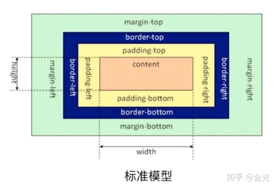
所有HTML元素可以看作盒子,在CSS中,"box model"这一术语是用来设计和布局时使用。
CSS盒模型本质上是一个盒子,封装周围的HTML元素,它包括:边距,边框,填充,和实际内容。
盒模型允许我们在其它元素和周围元素边框之间的空间放置元素。
下面的图片说明了盒子模型(Box Model):

2、标准模型与IE模型的区别
标准模型与 IE 模型的区别在于宽高的计算方式不同。
标准模型计算元素的宽高只算 content 的宽高,IE模型是 content + padding + border 的总尺寸。
假如 content 宽高是 100100px,padding 为 10px,border为 10px,margin为10px,那么在标准模型下,这个元素的宽为 100px,高为 100px。 IE模型下,宽为 100px + 2 10px(左右padding) + 210px(左右border) = 140px; 高为 100px + 2 10px(上下padding) + 2*10px(上下border) = 140px;

3、如何设置这两种模型
//设置标准模型
box-sizing: content-box;
//设置IE模型
box-sizing: border-box;
复制代码
box-sizing 的默认值是 content-box,即默认标准模型。
4、JS如何设置盒模型的宽和高
假设已经获取的节点为 dom
//只能获取内联样式设置的宽高
dom.style.width/height

//获取渲染后即时运行的宽高,值是准确的。但只支持 IE
dom.currentStyle.width/height

//获取渲染后即时运行的宽高,值是准确的。兼容性更好
window.getComputedStyle(dom).width/height;

//获取渲染后即时运行的宽高,值是准确的。兼容性也很好,一般用来获取元素的绝对位置,getBoundingClientRect()会得到4个值:left, top, width, height
dom.getBoundingClientRect().width/height;
复制代码
5、BFC
什么是 BFC?Block Formatting Context(块级格式化上下文)。
在解释什么是BFC之前,我们需要先知道Box、Formatting Context的概念。
Box:css布局的基本单位
Box 是 CSS 布局的对象和基本单位, 直观点来说,就是一个页面是由很多个 Box 组成的。元素的类型和 display 属性,决定了这个 Box 的类型。 不同类型的 Box, 会参与不同的 Formatting Context(一个决定如何渲染文档的容器),因此Box内的元素会以不同的方式渲染。让我们看看有哪些盒子:
-
block-level box: display 属性为 block, list-item, table 的元素,会生成 block-level box。并且参与 block fomatting context;
-
inline-level box: display 属性为 inline, inline-block, inline-table 的元素,会生成 inline-level box。并且参与 inline formatting context;
-
run-in box: css3 中才有, 这儿先不讲了。
Formatting Context
Formatting context 是 W3C CSS2.1 规范中的一个概念。它是页面中的一块渲染区域,并且有一套渲染规则,它决定了其子元素将如何定位,以及和其他元素的关系和相互作用。最常见的 Formatting context 有 Block fomatting context (简称BFC)和 Inline formatting context (简称IFC)。
BFC的布局规则
-
内部的Box会在垂直方向,一个接一个地放置。
 最低0.47元/天 解锁文章


 784
784


 被折叠的 条评论
为什么被折叠?
被折叠的 条评论
为什么被折叠?
 到【灌水乐园】发言


