


💥💥💞💞欢迎来到本博客❤️❤️💥💥
🏆博主优势:🌞🌞🌞博客内容尽量做到思维缜密,逻辑清晰,为了方便读者。
⛳️座右铭:行百里者,半于九十。
📋📋📋本文目录如下:🎁🎁🎁
目录
💥1 概述
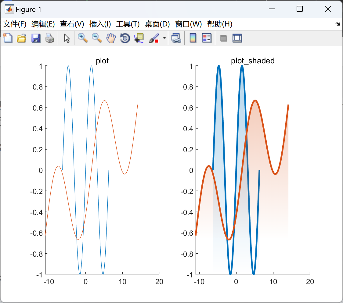
绘制函数以反映现代视觉设计美学。线条图的阴影是这种可视化的核心。这些函数的主要特点包括(i)带阴影的线条绘图和(ii)带阴影的统计分布线条绘图。
带阴影绘图:
这一功能在线条图下添加轻微阴影效果(plot_shaded)。该函数也可用于创建视觉上吸引人的直方图图表(plot_histogram_shaded)。
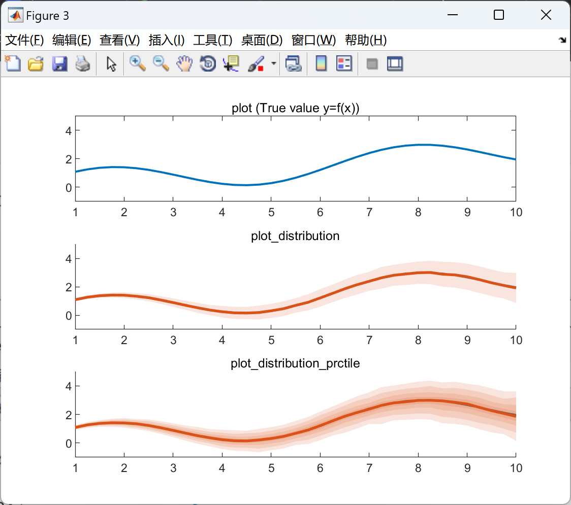
带阴影分布绘图:
对于可能具有多个样本并受到噪声/测量误差影响的线条图,通常有必要可视化误差的分布,例如,传统上可以使用带误差棒的线条图。这里提供的两个函数提供了将数据中的误差以带阴影效果显示在图表上的功能。plot_distribution 可用于可视化线条图的均值和标准差,而 plot_distribution 则可用于显示线条图的非高斯统计量,例如中位数和四分位距(IQR)。
📚2 运行结果

主函数:
%% Shaded line plot
% Example showing the difference between the standard plot routine and the
% shaded routine
x = -2*pi:pi/100:2*pi;
fx = sin(x);
figure('Color','w');
subplot(1,2,1);
hold on
plot(x,fx);
plot(2*x+pi/2,0.5*fx+0.1*x);
hold off
title('plot');
subplot(1,2,2);
hold on
plot_shaded(x,fx);
plot_shaded(2*x+pi/2,0.5*fx+0.1*x);
hold off
title('plot\_shaded');
%% Histogram plot
% Plots two histograms for two different distributions
X1 = 3 + 2.0*randn([100000,1]);
X2 = 12 + 4.0*randn([100000,1]);
figure('Color','w');
hold on
plot_histogram_shaded(X1,'Alpha',0.3);
plot_histogram_shaded(X2);
hold off
title('plot\_histogram\_shaded');
%% Distribution plots
% Show different plot routines to visualize measurement errors/noise
X = 1:0.25:10;
Y = sin(X)+0.25*X;
Y_error = randn(1000,numel(Y));
Y_noisy = Y+Y_error.*repmat(0.1*X,[size(Y_error,1) 1]);
figure('Color','w');
subplot(3,1,1);
plot(X,Y,'LineWidth',1.5);
title('plot (True value y=f(x))');
ylim([-1 5]);
subplot(3,1,2);
hold on
plot(X,Y,'LineWidth',1.5);
plot_distribution(X,Y_noisy);
hold off
title('plot\_distribution');
ylim([-1 5]);
subplot(3,1,3);
hold on
plot(X,Y,'LineWidth',1.5);
plot_distribution_prctile(X,Y_noisy,'Prctile',[25 50 75 90]);
hold off
title('plot\_distribution\_prctile');
ylim([-1 5]);
🎉3 参考文献
文章中一些内容引自网络,会注明出处或引用为参考文献,难免有未尽之处,如有不妥,请随时联系删除。
John Onofrey (2024)


 7307
7307


 被折叠的 条评论
为什么被折叠?
被折叠的 条评论
为什么被折叠?
 到【灌水乐园】发言


