


from sklearn import datasets
# 导入数据集
import numpy as np
from sklearn.model_selection import train_test_split
# 划分数据集
from sklearn.preprocessing import StandardScaler
# 对特征进行标准化处理
from sklearn.linear_model import Perceptron
# 对结果进行预测
from sklearn.metrics import accuracy_score
# 计算准确率
from matplotlib.colors import ListedColormap
import matplotlib.pyplot as plt
'''导入数据并切分训练集和测试集'''
iris = datasets.load_iris()
# print(iris)
x = iris.data[:, [2, 3]]
y = iris.target
# print(np.unique(y))
x_train, x_test, y_train, y_test = train_test_split(x, y, test_size=0.3, random_state=0)
# 将数据集分为测试集和训练集3:7
'''用标准差对数据进行标准化处理'''
sc = StandardScaler() # 使用先创建类
sc.fit(x_train)
# 调用fit方法,可以计算训练集中每个特征的样本均值和标准差
x_train_std = sc.transform(x_train)
x_test_std = sc.transform(x_test)
# 调用transform可以使用前面得到的均值和标准差来对训练数据作标准化处理
# print(x_test_std)
# print(x_test_std)
'''训练预测数据集并判断预测结果'''
ppn = Perceptron(n_iter_no_change=40, eta0=0.1, random_state=0)
# n_iter_no_change定义了迭代的次数(遍历次数) 老版本叫做n_iter
# eta0是学习速率,太大可能会跳过最优 太小会训练很慢
# random_state 设置每次迭代后初始化重排训练数据集
ppn.fit(x_train_std, y_train)
# 实例一个新的perceptron对象
y_pred = ppn.predict(x_test_std)
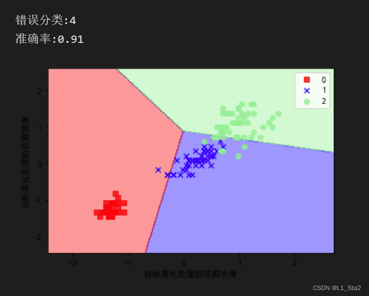
print(f'错误分类:{(y_test != y_pred).sum()}')
print(f'准确率:{accuracy_score(y_test, y_pred):.2f}')
'''绘制决策区域'''
def plot_decision_regions(x, y, classifier, test_idx=None, resolution=0.02):
# 设置标记和颜色
markers = ('s', 'x', 'o', '^', 'v')
colors = ('red', 'blue', 'lightgreen', 'gray', 'cyan')
cmap = ListedColormap(colors[:len(np.unique(y))])
# 绘制决策平面
x1_min, x1_max = x[:, 0].min() - 1, x[:, 0].max() + 1
x2_min, x2_max = x[:, 1].min() - 1, x[:, 1].max() + 1
xx1, xx2 = np.meshgrid(np.arange(x1_min, x1_max, resolution),
np.arange(x2_min, x2_max, resolution))
z = classifier.predict(np.array([xx1.ravel(), xx2.ravel()]).T).reshape(xx1.shape)
plt.contourf(xx1, xx2, z, alpha=0.4, cmap=cmap)
# 用于绘制等高线 填充轮廓
plt.xlim(xx2.min(), xx1.max())
plt.ylim(xx2.min(), xx2.max())
# 绘制所有例子
x_test, y_test, = x[test_idx, :], y[test_idx]
for idx, cl in enumerate(np.unique(y)):
plt.scatter(x=x[y == cl, 0], y=x[y == cl, 1], alpha=0.8, c=cmap(idx), marker=markers[idx], label=cl)
x_combined_std = np.vstack((x_train_std, x_test_std))
y_combined = np.hstack((y_train, y_test))
plot_decision_regions(x=x_combined_std, y=y_combined, classifier=ppn, test_idx=range(105, 150))
plt.rcParams['font.sans-serif'] = ['SimHei'] # 用来正常显示中文标签
plt.rcParams['axes.unicode_minus'] = False # 用来正常显示负号
plt.xlabel('经标准化处理的花瓣长度')
plt.ylabel('经标准化处理的花瓣宽度')
plt.legend()
plt.show()只有代码段捏,因为注释写的比较全
跑跑试试


 1万+
1万+


 被折叠的 条评论
为什么被折叠?
被折叠的 条评论
为什么被折叠?
 到【灌水乐园】发言


