


目录
前言
通过一天的学习,接触到小兔鲜儿的项目,并进行实战,完成其头部和底部的代码书写
提示:以下是本篇文章正文内容,下面案例可供参考
一、头部
1.头部书写的准备工作
1.引入css样式和seo优化标签
<!-- 网页描述标签 -->
    <meta name="description" content="小兔鲜儿官网,致力于打造全球最大的食品、生鲜电商购物平台。">
    <!-- 网页关键词标签 -->
    <meta name="keywords" content="小兔鲜儿,食品,生鲜,服装,家电,电商,购物">
    <!-- 搜索引擎优化 -->
    <title>小兔鲜儿-新鲜、惠民、快捷!</title>
    <!-- 网页的标题图标 -->
    <link rel="shortcut icon" href="./favicon.ico" type="image/x-icon">
    <!-- 字体图标 -->
    <link rel="stylesheet" href="./iconfont/iconfont.css">
    <!-- 初始化样式 -->
    <link rel="stylesheet" href="./css/base.css">
    <!-- 公共样式 -->
    <link rel="stylesheet" href="./css/common.css">
    <!-- 首页样式 -->
    <link rel="stylesheet" href="./css/index.css">
css版心样式
/* 头部和尾部,版心以及各个页面相同的样式 */
.container {
    width: 1240px;
    margin: 0 auto;
}
2.对头部进行划分,并将其分为两个大的部分,一个为快捷导航(shortcut),一个为头部导航(head),然后又把头部导航细分为多个小部分。
头部导航:
1.logo区域(logo)
2.导航区域(nav)
3.搜索区域(search)
4.购物车区域(cart)
2.按照指定的划分开始进行摆放
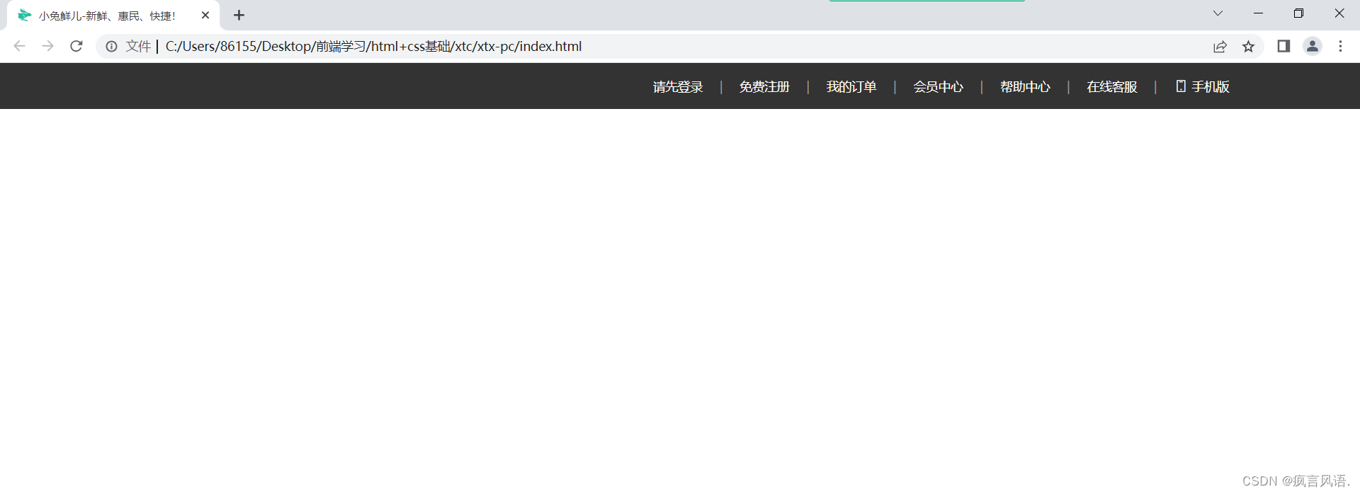
1.快捷导航:
<!-- 快捷导航开始 -->
    <div class="shortcut">
        <div class="container">
            <div class="shortcut-nav">
                <a href="#">请先登录</a>
                <span>|</span>
                <a href="#">免费注册</a>
                <span>|</span>
                <a href="#">我的订单</a>
                <span>|</span>
                <a href="#">会员中心</a>
                <span>|</span>
                <a href="#">帮助中心</a>
                <span>|</span>
                <a href="#">在线客服</a>
                <span>|</span>
                <a href="#">
                    <i class="iconfont icon-mobile-phone"></i>
                    手机版</a>
            </div>
        </div>
    </div>
    <!-- 快捷导航结束 -->
2.头部导航:
<!-- 主体头部开始 -->
    <div class="head container">
        <!-- logo盒子 -->
        <div class="logo">
            <h1>
                <a href="#">
                    小兔鲜儿
                </a>
            </h1>
        </div>
        <!-- 导航盒子 -->
        <div class="nav">
            <ul>
                <li><a href="#">首页</a></li>
                <li><a href="#">生鲜</a></li>
                <li><a href="#">美食</a></li>
                <li><a href="#">餐厨</a></li>
                <li><a href="#">电器</a></li>
                <li><a href="#">居家</a></li>
                <li><a href="#">洗护</a></li>
                <li><a href="#">孕婴</a></li>
                <li><a href="#">服装</a></li>
            </ul>
        </div>
        <!-- 搜索盒子 -->
        <div class="search">
            <i class="iconfont icon-search"></i>
            <input type="text" placeholder="搜一搜">
        </div>
        <!-- 购物车盒子 -->
        <div class="cart">
            <i class="iconfont icon-cart-full"></i>
            <span>2</span>
        </div>
    </div>
    <!-- 主体头部结束 -->
3.书写css样式
1.快捷导航:
/* 快捷导航开始 */
.shortcut {
    width: 100%;
    height: 52px;
    background-color: #333;
}

.shortcut .container {
    display: flex;
    justify-content: flex-end;
}

.shortcut-nav {
    line-height: 52px;
    font-size: 14px;
}

.shortcut-nav a {
    color: #fff;
}

.shortcut-nav a:hover {
    color: #5EB69C;
}

.shortcut-nav span {
    color: #999;
    margin: 0px 15px;
}
/* 快捷导航结束 */
运行后的效果;
2.头部导航:
/* 主体头部开始 */
.head {
    display: flex;
    align-items: center;
    height: 132px;
}

.head .logo {
    margin-right: 40px;
}

.head .logo a {
    display: block;
    width: 200px;
    height: 88px;
    background: url(../images/logo.png) no-repeat;
    font-size: 0;
}

.head .nav {
    margin-right: 30px;
}

.head .nav ul {
    display: flex;
}

.nav ul li {
    margin-right: 45px;
}

.nav ul li a {
    padding-bottom: 10px;
    border-bottom: 2px solid transparent;
}

.nav ul li a:hover {
    color: #5EB69C;
    border-bottom: 2px solid #5EB69C;
}

.search {
    padding: 10px 0px;
    margin-right: 45px;
    border-bottom: 2px solid #f4f4f4;
}

.search i {
    font-size: 20px;
    margin-right: 8px;
}

.cart {
    position: relative;
}

.cart i {
    font-size: 24px;
}

.cart span {
    position: absolute;
    left: 16px;
    top: -4px;
    padding: 1px 5px;
    border-radius: 7.5px;
    background-color: #E26237;
    font-size: 14px;
    color: #fff;
}

/* 主体头部结束 */
运行后的效果:
4.总结
1.先对其进行盒子的划分和取类名,能够帮助自己书写结构不会出错,能更快更好的书写代码
2.头部这个部分运用到了定位、flex布局、input表单等知识点,帮助自己回顾之前记忆的知识点,加深影响
3.知道了网页logo的固定写法h1标签里面包裹a标签,在a标签里面插入背景图,来完成网页logo
二、底部
1.底部书写的准备工作
1.对底部进行划分,共分为三个部分,服务区域(container)、帮助区域(help)、版权中心(copyright)
2.按照指定的划分开始进行摆放
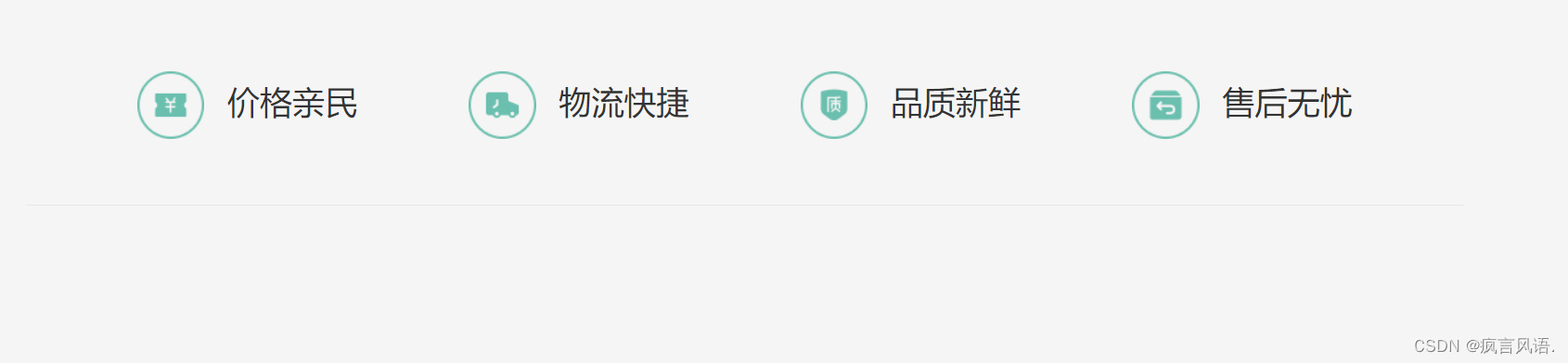
1.服务区域:
<div class="service">
                <a href="#">价格亲民</a>
                <a href="#">物流快捷</a>
                <a href="#">品质新鲜</a>
                <a href="#">售后无忧</a>
            </div>
2.帮助区域:
<div class="help">
                <div class="left">
                    <dl>
                        <dt>购物指南</dt>
                        <dd>购物流程</dd>
                        <dd>支付方式</dd>
                        <dd>售后规则</dd>
                    </dl>
                    <dl>
                        <dt>配送方式</dt>
                        <dd>配送运费</dd>
                        <dd>配送范围</dd>
                        <dd>配送时间</dd>
                    </dl>
                    <dl>
                        <dt>关于我们</dt>
                        <dd>平台规则</dd>
                        <dd>联系我们</dd>
                        <dd>问题反馈</dd>
                    </dl>
                    <dl>
                        <dt>售后服务</dt>
                        <dd>售后政策</dd>
                        <dd>退款说明</dd>
                        <dd>取消订单</dd>
                    </dl>
                    <dl>
                        <dt>服务热线</dt>
                        <dd>在线客服<i class="iconfont icon-customer-service"></i></dd>
                        <dd>客服电话 400-0000-000</dd>
                        <dd>工作时间 周一至周日 8:00-18:00</dd>
                    </dl>
                </div>
                <div class="right">
                    <div class="wx">
                        <img src="./images/wechat.png" alt="">
                        <p>微信公众号</p>
                    </div>
                    <div class="code">
                        <img src="./images/app.png" alt="">
                        <p>APP下载二维码</p>
                    </div>
                </div>
            </div>
3.版权区域:
<div class="copyright">
                 <p>
                    <a href="#">关于我们</a>
                    |
                    <a href="#">帮助中心</a>
                    |
                    <a href="#">售后服务</a>
                    |
                    <a href="#">配送与验收</a>
                    |
                    <a href="#">商务合作</a>
                    |
                    <a href="#">搜索推荐</a>
                    |
                    <a href="#">友情链接</a>
                 </p>
                 <p>
                    CopyRight © 小兔鲜
                 </p>
            </div>
3.添加css样式
1.服务区域:
.footer {
    width: 100%;
    height: 582px;
    background-color: #f5f5f5;
}

.footer .service {
    display: flex;
    justify-content: space-evenly;
    height: 180px;
    line-height: 180px;
    font-size: 28px;
    border-bottom: 1px solid #e8e8e8;
}

.footer .service a::before {
    content: '';
    display: inline-block;
    width: 58px;
    height: 58px;
    vertical-align: middle;
    background: url(../images/sprite.png) no-repeat 0 0;
    margin-right: 20px;
}

.footer .service a:nth-child(2)::before {
    background: url(../images/sprite.png) no-repeat 0 -58px;
}

.footer .service a:nth-child(3)::before {
    background: url(../images/sprite.png) no-repeat 0 -116px;
}

.footer .service a:nth-child(4)::before {
    background: url(../images/sprite.png) no-repeat 0 -174px;
}
运行后的效果:
2.帮助区域:
.footer .help {
    height: 202px;
    padding-top: 60px;
    display: flex;
    justify-content: space-between;
}

.help .left {
    display: flex;
}

.help .left i {
    color: #60b6a4;
    margin-left: 5px;
}

.help .left dl {
    margin-right: 84px;
}

.help .left dt {
    font-size: 18px;
    margin-bottom: 25px;
}

.help .left dd {
    margin-bottom: 8px;
    color: #969696;
}

.help .right {
    display: flex;
}

.help .right .wx {
    margin-right: 55px;
}

.help .right img {
    width: 110px;
    height: 110px;
    margin-bottom: 8px;
}

.help .right p {
    text-align: center;
    color: #969696;
}
运行后的效果:

3.版权区域:
.footer .copyright {
    padding-top: 100px;
    height: 202px;
    line-height: 30px;
}

.footer .copyright p {
    text-align: center;
    color: #A1A1A1;
}

.footer .copyright p a {
    color: #A1A1A1;
}
运行后的效果:

4.总结
1.运用了精灵图、自定义列表、flex布局的知识点,帮助自己巩固了之前快遗忘的知识
2.了解到底部因为其不是很重要,所以很多代码和布局都是越简单越好,不需要实现太多效果
最后,经过一天的学习,并独自进行书写,巩固了之前学习的知识,进一步了解到很多知识点的实际运用场景,有了很多新的理解和感受,果然,进行实战才是理解和加深知识的最好方法,多敲多练,总能成功


 1654
1654


 被折叠的 条评论
为什么被折叠?
被折叠的 条评论
为什么被折叠?
 到【灌水乐园】发言


