


目录
前言
本文参考黑马移动开发技术(HarmonyOS)的实战案例:健康生活案例,记录自己在做这个案例时遇到的问题,和想要分享的要点。
一、分析食物列表页的布局设计
如下图所示:左图是我们想要实现的食物列表页模块,根据该UI样式我们可以抽象出如右图所示的结构,我们接下来做的就是添加这些组件,填充并丰富组件的样式及内容。
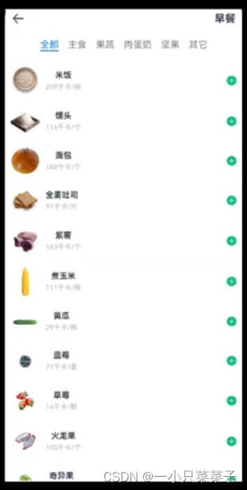
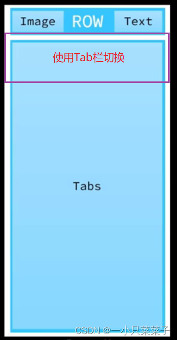
食物列表页总共可以分为上方的导航栏和下方的Tab栏,通过点击TabBar的文字可以实现对应TabContent内容的切换显示。和饮食记录页一样,我们将组件放到各自的est文件中,只负责在食物列表页页调用。下面我将详细说明这两个组件的设计。
这里补充一点:因为我们根据点击的不同组件,可以显示食物列表,也可以显示运动列表页等,但是它们之间的实现形式都是一样的。因此这里拿食物列表举例。
二、顶部导航栏
1. 组件构成
由上面的分析的布局图片可知:顶部导航栏左边是Image图片,右边是text文本,它们呈行式布局,因为运动等记录列表也会用到,所以抽出来作为一个函数。
2. 代码实现
import router from '@ohos.router'
import { CommonConstants } from '../common/constants/CommonConstants'
import { ItemList } from '../view/Item/ItemList'
@Entry
@Component
struct ItemIndex {

  build() {
    Column(){
      //1.头部导航栏
      this.Header()
      //2.列表
      ItemList()
    }
    .width('100%')
    .height('100%')
  }

  @Builder Header(){
    Row(){
      Image($r('app.media.ic_public_back'))
        .width(24)
        .onClick(()=>router.back())
      Blank()
      Text('早餐').fontSize(18).fontWeight(CommonConstants.FONT_WEIGHT_600)
    }
    .width(CommonConstants.THOUSANDTH_940)
    .height(32)
  }
}
二、食物列表
1. 组件构成
通过上面的食物列表页的UI分析知道:下面的食物列表是通过Tab容器来实现的,通过选择TabBar的不同文字,切换到对应的TabContent内容上去。每一个TabContent内部是一个List列表(该列表与我们上次饮食记录页的List类似)
2. 代码实现
import { CommonConstants } from '../../common/constants/CommonConstants'
@Component
export struct ItemList {
  build() {
    Tabs(){
      TabContent(){
        this.TabContentBuilder()
      }
      .tabBar('全部')

      TabContent(){
        this.TabContentBuilder()
      }
      .tabBar('主食')

      TabContent(){
        this.TabContentBuilder()
      }
      .tabBar('肉蛋奶')


    }
    .width(CommonConstants.THOUSANDTH_940)
    .height('100%')

  }

  @Builder TabContentBuilder(){
    List({space:CommonConstants.SPACE_10}){
      ForEach([1,2,3,4,5], (item) => {
        ListItem(){
          Row({space: CommonConstants.SPACE_6}){
            Image($r('app.media.toast')).width(50)
            Column({space: CommonConstants.SPACE_4}){
              Text('全麦吐司').fontWeight(CommonConstants.FONT_WEIGHT_500)
              Text('91千卡/片').fontSize(14).fontColor($r('app.color.light_gray'))
            }
            Blank()
            Image($r('app.media.ic_public_add_norm_filled'))
              .width(18)
              .fillColor($r('app.color.primary_color'))
          }
          .width('100%')
          .padding(CommonConstants.SPACE_6)
        }
      })
    }
    .width('100%')
    .height('100%')
  }

}注意:因为我们TabContent的形式一致,所以将List抽取为一个@Builder函数,在后面使用Foreach渲染出不同的TabContent就可以了。这里不抽取整个TabContent是因为编译器不认可这种形式会报错。
三、食物列表---底部Panel
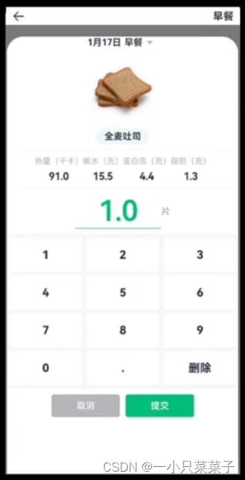
要求点击食物列表项后面的加号后弹出具体食物信息,在这里可以设置使用该食物的数量,也可以点击上方日期后的倒三角图标实现日期的切换(这里和饮食记录的日期做法一样)。
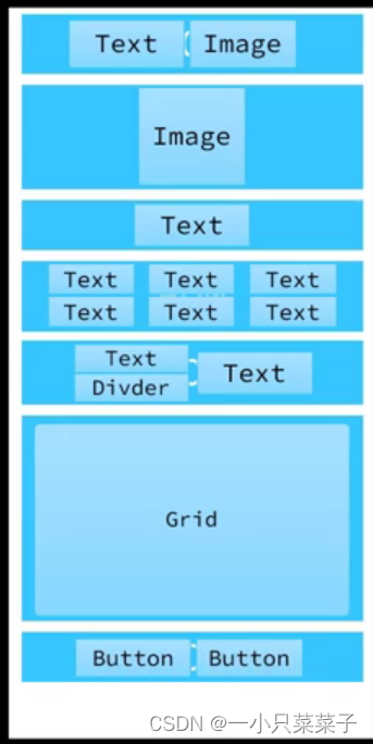
1. 组件构成
通过食物列表Panel的UI设计,我们可以抽象出如右侧所示的所示的结构。其中Grid是一个表格布局,用来布局键盘。剩余的部分不再做过多赘述。
2. 代码实现
注意:Panel不占高度,他是浮在元素上方的(脱离文档流)。但是它要求它所在的容器的高度,和容器内的子元素高度全都固定。因为column中的ItemList组件的高度是动态的,不固定,所以相当于它将Panel挤到了最下方,所以Panel不会显示。要想改正,就在ItemList下加layoutWeight(1),即:除了头部导航栏Header()剩下的都是ItemList,这样固定高度后Panel就可以正常显示了。
2.1.顶部日期
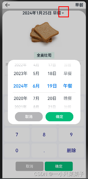
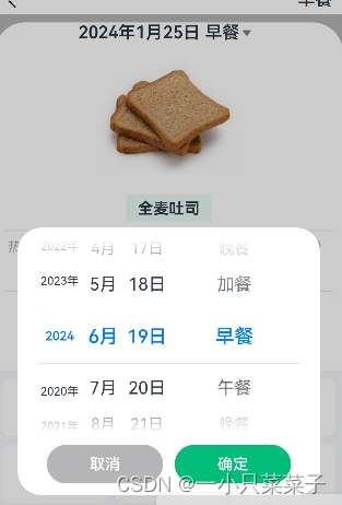
顶部是日期和早中晚饭的选择。
这里一部分的实现和上篇饮食记录日期的实现基本一样,区别就是又加了一个textPicke来选择早餐午餐还是加餐。
import { CommonConstants } from '../../common/constants/CommonConstants'
@CustomDialog
export struct ItemDatePickDialog {
  controller:CustomDialogController
  ItemSelectedDate:Date=new Date()
  selectedFoodIndex:number=0
  @Link selectedFood:string

  build() {
      Column({space:CommonConstants.SPACE_12}){

        Row(){
          DatePicker({
            start: new Date('2020-01-01'),
            end: new Date(),
            selected: this.ItemSelectedDate
          })
            .onChange((value: DatePickerResult) => {
              this.ItemSelectedDate.setFullYear(value.year, value.month, value.day)
            })
            .layoutWeight(3)

          TextPicker({ range: ['早餐','午餐','晚餐','加餐'], selected: this.selectedFoodIndex})
            .onChange((value: string, index: number) => {
              this.selectedFoodIndex=index
              this.selectedFood=value
            })
            .layoutWeight(1)

        }
        .width(CommonConstants.THOUSANDTH_940)

        //2.按钮

        Row({space:CommonConstants.SPACE_12}){
          Button('取消')
            .backgroundColor($r('app.color.light_gray'))
            .width(120)
            .onClick(()=>{
              this.controller.close()
            })
          Button('确定')
            .backgroundColor($r('app.color.primary_color'))
            .width(120)
            .onClick(()=>{
              //1.保存日期到全局存储(使应用内的页面都能用)
              AppStorage.SetOrCreate('ItemSelectedDate',this.ItemSelectedDate.getTime())
              //注意:这个地方不直接把data对象存进去,因为它将来在做状态变量监控的时候会出现问题(prop link state),
              // 所以这里存储它所对应的毫秒值(基础类型可以状态监控)
              this.controller.close()
            })
        }

      }
    .padding(12)
  }
}
注意:这里要注意为日期选择器和文本选择器添加权重(layoutWeight),因为日期有三项(年月日),选餐只有一项,所以它们设置3:1比较合适。否则会出现右图效果:日期被挤到一边。
2.2.记录项卡片
该组件用来显示用户点击记录项的具体信息(比如这里的全麦吐司的热量、碳水、蛋白质、脂肪),并且这里显示的信息数值要随着数量amount的改变而改变。
import { CommonConstants } from '../../common/constants/CommonConstants'
@Component
export struct ItemCard {
  @Prop amount:number
  build() {
    Column({space:CommonConstants.SPACE_8}){
      //1.图片
      Image($r('app.media.toast')).width(150)
      //2.名称
      Row(){
        Text('全麦吐司').fontWeight(CommonConstants.FONT_WEIGHT_700)

      }
      .backgroundColor($r('app.color.lightest_primary_color'))
      .padding({top:5,bottom:5,left:12,right:12})
      Divider().width(CommonConstants.THOUSANDTH_940).opacity(0.6)
      //3,营养素
      Row({space:CommonConstants.SPACE_8}){
          this.NutrientInfo('热量(千卡)',91.0)
          this.NutrientInfo('碳水(克)',15.5)
          this.NutrientInfo('蛋白质(克)',4.4)
          this.NutrientInfo('脂肪(克)',1.3)
      }
      Divider().width(CommonConstants.THOUSANDTH_940).opacity(0.6)
      //4.数量
       Row(){
         Column({space:CommonConstants.SPACE_4}){
           Text(this.amount.toFixed(1))
             .fontSize(50).fontColor($r('app.color.primary_color'))
             .fontWeight(CommonConstants.FONT_WEIGHT_600)
           Divider().color($r('app.color.primary_color'))
         }
         .width(150)
         Text('片')
           .fontColor($r('app.color.light_gray'))
           .fontWeight(CommonConstants.FONT_WEIGHT_600)
       }


    }
  }

  @Builder NutrientInfo(label:string, value:number){
    Column({space:CommonConstants.SPACE_8}){
      Text(label).fontSize(14).fontColor($r('app.color.light_gray'))
      Text((value*this.amount).toFixed(1)).fontSize(18).fontWeight(CommonConstants.FONT_WEIGHT_700)
    }
  }
}
注意:这里amount变量要使用@prop来保证键盘子组件修改amount值后,父亲可以及时得知状态的改变从而重新渲染。
2.3.数字键盘
要求将用户从键盘上点击数字记录下来并判断是否合法,将合法的输入渲染到页面上。键盘的布局通过Grid容器来实现。
Grid是网格容器,由“行”和“列”分割的单元格所组成,通过指定“项目”所在的单元格做出各种各样的布局。Grid的高度要根据里面元素的高度来控制
import { CommonConstants } from '../../common/constants/CommonConstants'
@Component
export struct NumberKeyboard {
  numbers:string[]=['1','2','3','4','5','6','7','8','9','0','.']
  @Link amount:number
  @Link value:string

  @Styles keyBoxStyle(){
    .backgroundColor(Color.White)
    .borderRadius(8)
    .height(60)
  }

  build() {
    //gird高度根据里面元素的高度来控制
    //4*60+5*8=280
    Grid(){
      ForEach(this.numbers,num =>{
        GridItem(){
          Text(num).fontSize(20).fontColor(CommonConstants.FONT_WEIGHT_900)
        }
        .keyBoxStyle()
        .onClick(()=>this.clickNumber(num))
      })

      GridItem(){
        Text('删除').fontSize(20).fontColor(CommonConstants.FONT_WEIGHT_900)
          .onClick(()=>this.clickDelete())
      }
      .keyBoxStyle()
    }
    .width('100%')
    .height(280)
    .backgroundColor($r('app.color.index_page_background'))
    .columnsTemplate('1fr 1fr 1fr') //按每行三个等宽组件往下排
    .columnsGap(8)
    .rowsGap(8)
    .padding(8)
    .margin({top:10})
  }
  clickDelete(){
    if(this.value.length<=1){
      this.value=''
      this.amount=0
      return
    }
    this.value=this.value.substring(0,this.value.length-1)
    this.amount=this.parseFloat(this.value)

  }
  clickNumber(num:string){
    //1.拼接用户输入的内容
     let val =this.value+num
    //2.校验输入格式是否正确
    let firstIndex =val.indexOf('.')
    let lastIndex =val.lastIndexOf('.')
    if(firstIndex!=lastIndex || (lastIndex!=-1 &&lastIndex<val.length-2)){
      //非法输入
      return
    }
    //3.将字符串转为数值
    let amount =this.parseFloat(val)

    //4.保存
    if(amount >=999.9){
      this.amount=999.0
      this.value='999'
    }else{
      this.amount=amount
      this.value=val
    }

  }

  parseFloat(str:string){

    if(str.endsWith('.')){
      //这个函数取值是左闭右开
      str=str.substring(0,str.length-1)
    }
    return parseFloat(str)
  }
}
注意:再从键盘输入的时候要判断用户输入是否合法,合法的输入我们保存,不合法直接返回就好,同时还要设置上限(这里是999.9)。删除的时候要注意判断是否<=1 ,如果value为空还ParseFloat一个空值则会出现NAN错误(not a number)。
2.4.按钮
取消Panel面板或确定数量,保存后退出面板(这里的确定按钮先只实现退出,保存设计到数据库,到后面完善的时候一起实现这部分)
       //3.4按钮
        Row({space:CommonConstants.SPACE_6}){
          Button('取消')
            .width(120)
            .backgroundColor($r('app.color.light_gray'))
            .type(ButtonType.Normal)
            .borderRadius(6)
            .onClick(()=>this.showPanel=false)

          Button('确定')
            .width(120)
            .backgroundColor($r('app.color.primary_color'))
            .type(ButtonType.Normal)
            .borderRadius(6)
            .onClick(()=>this.showPanel=false)

        }
        .margin({top:10})
三、UI效果展示
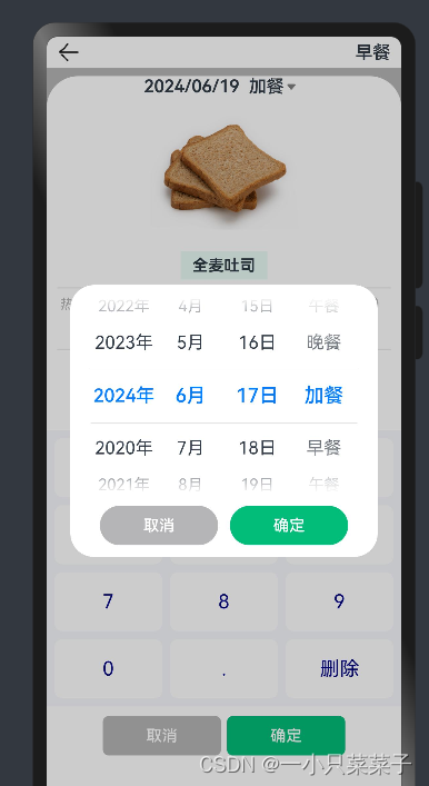
点击相应的记录项后弹出Panel面板,面板上有记录项的详细信息,用户可以通过上方的日期选择某一天的早餐午餐晚餐或加餐,然后通过数字键盘输入相应的数量,改数量会同步的渲染出来。
总结
以上就是今天的内容,本文实现了食物列表页部分,要注意DatePicker和textPicker的权重分配,以及NAN错误如何解决。下篇文章将完成数据模型部分。


 1697
1697

 被折叠的 条评论
为什么被折叠?
被折叠的 条评论
为什么被折叠?
 到【灌水乐园】发言


