


<span style="font-size:18px;color:#000066;"><strong><em>ADD media queries into HTML</em></strong></span><span style="font-size:14px;">
</span><span style="font-size:14px;"><link href="lounge-mobile.css" rel="stylesheet"<strong><em><span style="color:#ff0000;"> </span><span style="color:#000066;">media="screen and (max-device-width: 480px)"></span></em></strong></span><span style="font-size:14px;"><link href="lounge-print.css" rel="stylesheet"<strong><em><span style="color:#ff0000;"> </span><span style="color:#000066;">media="print"></span></em></strong></span>ADD media queries right into CSS
@media screen and (min-device-width:481px) {
#guarantee {
margin-right :250px;
}
}
@media screen and (max-device-width:180px) {
#guarantee {
margin-right : 30px;
}
}
@media print {
body {
font-family: Times, serif;}
}
}
p.specials { /* All other rules apply to all pages because they aren’t contained within a @media rule. */
color: red;
}
if you put all your rules in one file and split them up using @media rules, your CSS could get pretty big. By using different <link> elements for different media types, you can keep your CSS organized in different files depending on the media type.
So, if your CSS files are fairly large, we recommend sing <link> elements to specify different stylesheets
select id using CSS

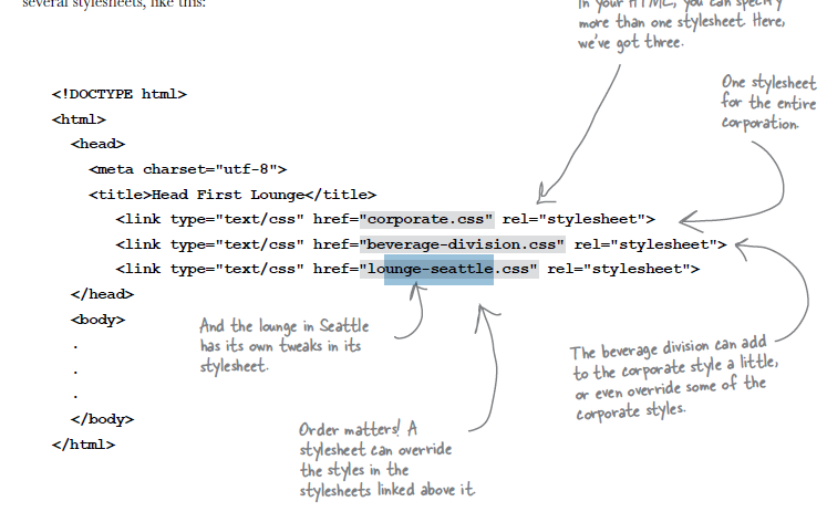
Use multiple stylesheets in HTML
Order Matters!


 717
717


 被折叠的 条评论
为什么被折叠?
被折叠的 条评论
为什么被折叠?
 到【灌水乐园】发言


