


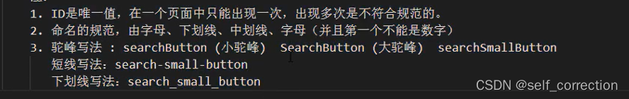
HTML+CSS系列学习:重生之我要精通编程语言修仙 第三篇
二十八、CSS选择器
1.ID选择器
#elem{} id="elem"
PS:
2.CLASS选择器和注意事项
.elem{} class+"elem"
PS:
1.class选择器是可以复用的;
2。可以添加多个class样式;
3.多个样式的时候,样式的优先级根据CSS决定,而不是class属性中的顺序;
4.标签+类的写法。
3.标签选择器(TAG选择器)
div{}
使用的场景:
1.去掉某些标签的默认样式时;
2.复杂的选择器中,如 层次选择器;
4.群组选择器(分组选择器)
可以通过逗号的方式,给多个不同的选择器添加统一的CSS样式,来达到代码的复用。
5.通配选择器
*{} →div,ul,li,p,h1,h2…{}
PS:尽量避免使用通配选择器,因为会给所有的标签添加样式,慎用。
使用的场景:
1.去掉所有标签的默认样式时;
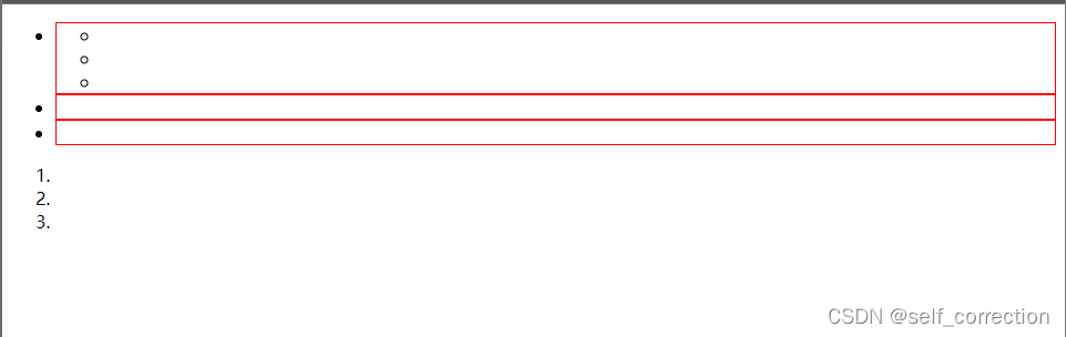
6.层次选择器
1.后代 M N { }
例如:
ul li{border:1px red solid}
<body>
 <ul>
        <li>
            <ul>
                <li></li>
                <li></li>
                <li></li>
            </ul>
        </li>
        <li></li>
        <li></li>
    </ul>
    <ol>
        <li></li>
        <li></li>
        <li></li>
    </ol>
    </body>
效果如下:

2.父子 M > N { }
例如:
#list > li{border:1px red solid}
<body>
<ul id="list">
        <li>
            <ul>
                <li></li>
                <li></li>
                <li></li>
            </ul>
        </li>
        <li></li>
        <li></li>
    </ul>
    <ol>
        <li></li>
        <li></li>
        <li></li>
    </ol>
    </body>
效果如下:
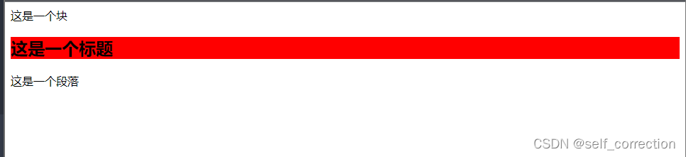
3.兄弟 M~N { }
例如:
div~h2{background: red;}
<body>
    <div>这是一个块</div>
    <p>这是一个段落</p>
    <h2>这是一个标题</h2>
    </body>
效果如下:

PS:当前M下的所有兄弟N标签
4.相邻 M + N { }
例如:
div+h2{background: red;}
<body>
    <div>这是一个块</div>
    <h2>这是一个标题</h2>
    <p>这是一个段落</p>
    </body>
效果如下:
PS:当前M下面相邻的N标签
7.属性选择器
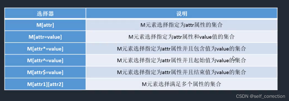
M [] {}
= : 完全匹配
*= :部分匹配
^= :起始匹配
$= :结束匹配
[][][]:组合匹配
例如:
 div[class][id]{background: red;}
 <body>
   <div>aaaaa</div>
    <div class="box" id="elem">bbbbb</div>
    <div class="search">ccccc</div>
    <div class="search-buttom">ddddd<div>
    <div class="buttom-search">eeeeee</div>
</body>
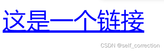
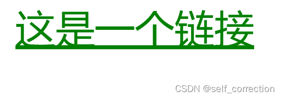
8.伪类选择器
1.M:伪类{}
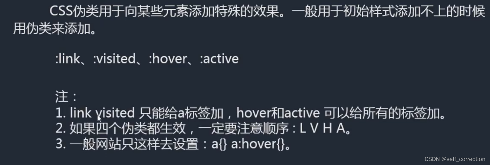
M: 伪类{}
:link     访问前的样式    (只能添加给a标签)
:visited  访问后的样式    (只能添加给a标签)
:hover 	  鼠标移入时的样式(可以添加给所有的标签)
:active   鼠标按下时的样式(可以添加给所有的标签)
例如:
        a:link{color: red;}
        a:visited{color: blue;}
        a:hover{color: green;}
        a:active{color: yellow;}
        <body>
             <a href=" ">这是一个链接</a>
             </body>
效果如下:
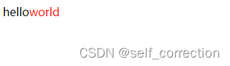
2.:after、:before
:after、:before 通过伪类的方式给元素添加一段文本内容,使用content属性
例如:
 div::after{content:"world";color: red;}
 <body>
  <div>hello</div>
 </body>
效果如下:
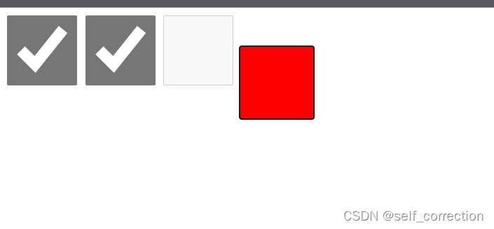
3.:checked、:disabled、:focus
:checked :disabled :focus 都是针对表单元素的
例如:
     input{width: 100px; height: 100px;}
       :focus{background: red;}
       <body>
        <input type="checkbox">
        <input type="checkbox" checked>
        <input type="checkbox" disabled>
        <input type="text" >
        </body>
效果如下:
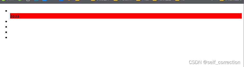
9.结构性伪类选择器
nth-of-type()   nth-child()
角标是从1开始的,1表示第一项,2表示第二项  |  n值 表示从0到无穷大
first-of-type
last-of-type
only-of-type
例如:
<!DOCTYPE html>
<html lang="en">
<head>
    <meta charset="UTF-8">
    <meta http-equiv="X-UA-Compatible" content="IE=edge">
    <meta name="viewport" content="width=device-width, initial-scale=1.0">
    <title>Document</title>
    <style>
        /* li:nth-of-type(2n){background: red;}
        li:nth-of-type(2n-1){background: purple;} */
        /* li:first-of-type{background: red;}
        li:last-of-type{background: blue;}
        li:only-of-type{background: green;} */
        div:only-of-type{background: red;}
    </style>
</head>
<body>
    <ul>
        <li></li>
        <div>aaaa</div> <!-- 此处只举例,结构是不规范的-->
        <li></li>
        <li></li>
        <li></li>
        <li></li>
    </ul>
</body>
</html>
效果如下:
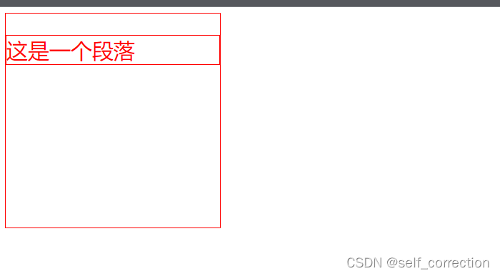
二十九、CSS继承
文字相关的样式是可以继承的
布局相关的样式不可以继承的(默认是不饿能继承,但是可以设置继承属性 inherit 值)
例如:
<!DOCTYPE html>
<html lang="en">
<head>
    <meta charset="UTF-8">
    <meta http-equiv="X-UA-Compatible" content="IE=edge">
    <meta name="viewport" content="width=device-width, initial-scale=1.0">
    <title>Document</title>
    <style>
        div{width: 300px;height: 300px;border:1px red solid;color: red;font-size:30px;}
        p{border: inherit;}
    </style>
</head>
<body>
    <div>
        <p>
            这是一个段落
        </p>
    </div>
</body>
</html>
效果如下:
三十、CSS优先级
1.样式优先级
1.相同样式优先级
当设置相同样式时,后面的优先级较高,但不建议出现重复设置样式的情况

2.内部样式与外部样式
内部样式与外部样式优先级相同,如果都设置了相同样式,那么后写的引入方式优先级高.

3.单一样式优先级
style行间>id>class>tag>*>继承

4.!important
提升样式优先级,非规范方式,不建议使用(0不能针对继承的属性进行优先级的提升

5.标签+类与单类
标签+类>单类 优先级

6.群组优先级
群组选择器与单一选择器的优先级相同,靠后写的优先级高
PS:
style行间 权重 1000
id       权重 100
class    权重10
tag      权重1
例如:
<!DOCTYPE html>
<html lang="en">
<head>
    <meta charset="UTF-8">
    <meta http-equiv="X-UA-Compatible" content="IE=edge">
    <meta name="viewport" content="width=device-width, initial-scale=1.0">
    <title>Document</title>
    <!-- <style>
        div{background: red;}
        div{background-color: bule;}
    </style>
    <link rel="stylesheet" href="./common.CSS"> -->

    <style>
        /* #elem{color: red;} */
        /* .box{color: blue;}
        div{color: green;} */
        /* *{color: red;}
        body{color: blue;} */
        /* #elem{color: red ;}
        *{color: green ;}
        body{color: purple !important;} */
        /* div.box{color: blue;}
        .box{color: red;} */
        div{color: blue;}
        div,p{color: red;}
    </style>
</head>
<body>
    <!-- <div id="elem" style="color: blue;">这是一个块</div> -->
    <!-- <div id="elem" class="box">这是一个块</div> -->
    <!-- <div id="elem" style="color:blue;">这是一个块</div> -->
    <div class="box">这是一个块</div>
    <p>这是一个段落</p>
</body>
</html>
效果如下:

2.层次优先级
1.权重比较
ul li .box p input()        1 + 1 + 10 +1 + 1
.hello span #elem()       10+ 1 + 100
2.约分比较
ul li .box input()        li p input()
.hello span #elem()       #elem
PS:尽量写3层以内
三十一、CSS盒子模型
1.基础了解

组成: content→padding→border→margin
       物品   填充物  包装盒  盒子与盒子之间的间距
      content : 内容区域     width和height组成的
      padding :内边距(内填充)
                只写一个值: 30px (上下左右)
                写两个值  : 30px 40px(上下、左右)
                写四个值  : 30px  40px 50px 60px (上、下、左、右)

				单一样式只能写一个值:
                padding-left
                padding-right
                padding-top
                padding-bottom
       margin: 外边距(外填充)
                只写一个值: 30px (上下左右)
                写两个值  : 30px 40px(上下、左右)
                写四个值  : 30px  40px 50px 60px (上、下、左、右)

				单一样式只能写一个值:
                margin-left
                margin-right
                margin-top
                margin-bottom
PS:
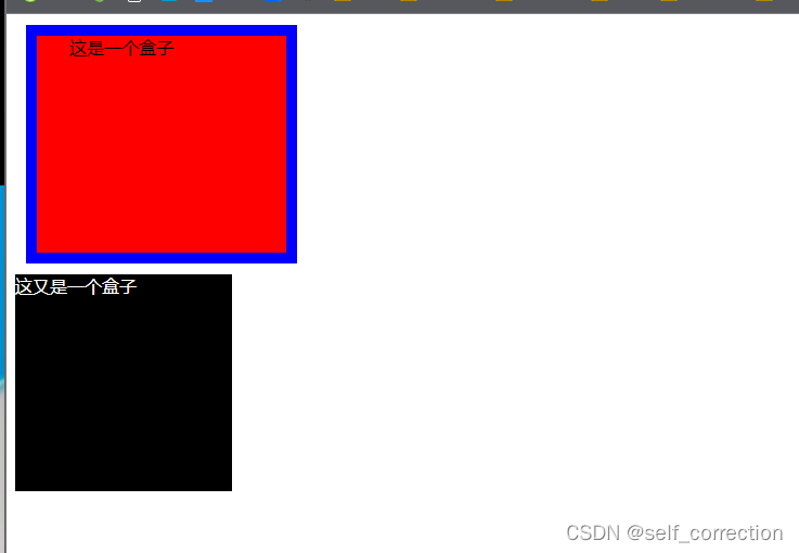
1.背景颜色回填充到margin以内的区域;(不包括margin区域)
2.文字会在content区域;
3.padding不能出现负值,margin时可以出现负值.
例如:
<!DOCTYPE html>
<html lang="en">
<head>
    <meta charset="UTF-8">
    <meta http-equiv="X-UA-Compatible" content="IE=edge">
    <meta name="viewport" content="width=device-width, initial-scale=1.0">
    <title>Document</title>
</head>
<style>
    #box1
    {
        width: 200px;height: 200px;background: red;border: 10px blue solid;
        padding-left: 30px;
        margin: 10px;
    }
    #box2
    {
        width: 200px;height: 200px;background: black;color: white;
    }

</style>
<body>
    <div id="box1">这是一个盒子</div>
    <div id="box2">这又是一个盒子</div>
</body>
</html>
效果如下:
2.box-sizing
盒尺寸:可以改变盒子模型的展示形态
默认值:content-box : width、height→content
      border-box  : width、height→content padding border
      使用的场景:
      1.不用再去计算一些值
      2.解决一些100%的问题
例如:
<!DOCTYPE html>
<html lang="en">
<head>
    <meta charset="UTF-8">
    <meta http-equiv="X-UA-Compatible" content="IE=edge">
    <meta name="viewport" content="width=device-width, initial-scale=1.0">
    <title>Document</title>
</head>
<style>
    /* #box1
    {
        width: 200px;height: 200px;background: red;border: 10px blue solid;
        padding-left: 30px;
        margin: 10px;
    }
    #box2
    {
        width: 200px;height: 200px;background: black;color: white;
    } */

    #box
    {
        width: 200px;height: 200px;background: red;border: 10px blue solid;
        padding-left: 30px 50px;
        box-sizing: border-box;
    }
    input{width: 100%;padding: 30px;box-sizing: border-box;}
</style>
<body>
    <!-- <div id="box1">这是一个盒子</div>
    <div id="box2">这又是一个盒子</div> -->
    <div id="box">这是一个盒子</div>
    <input type="text">
</body>
</html>
效果展示:
3.存在的问题
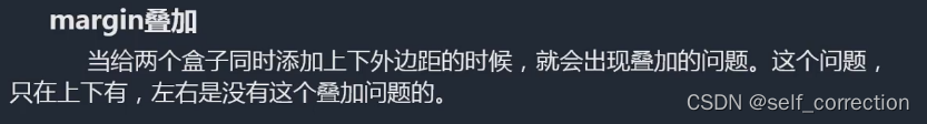
1.margin叠加问题,出现在上下margin同时存在的时候,会去上下中值较大的作为叠加的值.
2.margin传递问题,出现在嵌套的结构中,只是针对margin-top的问题
例如:
<!DOCTYPE html>
<html lang="en">
<head>
    <meta charset="UTF-8">
    <meta http-equiv="X-UA-Compatible" content="IE=edge">
    <meta name="viewport" content="width=device-width, initial-scale=1.0">
    <title>Document</title>
    <style>
        #box1{width: 200px; height: 200px; background: red;margin-bottom:0px;}
        #box2{width: 200px; height: 200px; background: blue;margin-top:70px;}
    </style>
</head>
<body>
    <div id="box1"></div>
    <div id="box2"></div>
</body>
</html>
效果展示:

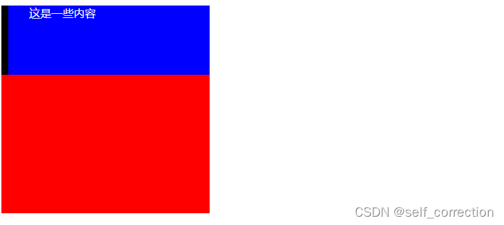
4.扩展
扩展:
1.margin左右自适应时可以的,但是上下自适应是不行的.(如果想实现上下自适应的话,需要在第二大部分来进行学习)
2.width、heightt不设置的时候,对盒子模型的影响,会自动去计算容器的大小、节省代码
例如:
<!DOCTYPE html>
<html lang="en">
<head>
    <meta charset="UTF-8">
    <meta http-equiv="X-UA-Compatible" content="IE=edge">
    <meta name="viewport" content="width=device-width, initial-scale=1.0">
    <title>Document</title>
    <style>
        #box1{width: 300px; height: 300px; background: red;}
        #box2{height: 100px;background: blue;color: white;padding-left: 30px;border-left: 10px black solid}
    </style>
</head>
<body>
    <div id="box1">
        <div id="box2">这是一些内容</div>
    </div>
</body>
</html>
效果展示:
三十二、标签分类
1.按类型
block: div p ul li h1...
1.独立一行
2.支持所有样式
3.不写宽的时候,跟父元素的宽相同
3.所占区域是一个矩形

inline: span a em strong img...
1.挨在一起的
2.有些样式不支持,例如:width height margin padding
3.不写宽的时候,宽度由内容决定
4.所占的区域不一定是矩形
5.内联标签之间会有空袭,原因:换行产生的
inline-block: input select...
1.挨在一起,但是支持宽高
PS:
布局一般用块标签,修饰文本一般用内联标签
例如:
<!DOCTYPE html>
<html lang="en">
<head>
    <meta charset="UTF-8">
    <meta http-equiv="X-UA-Compatible" content="IE=edge">
    <meta name="viewport" content="width=device-width, initial-scale=1.0">
    <title>Document</title>
    <style>
        body{font-size: 0;}
        #content1,#conten2{width: 100px; height: 100px; background: red;font-size: 1em;}
        input{width: 100px; height: 100px;}
    </style>
</head>
<body>
    <span id="content1">内联1内联1内联1内联1内联1内联1</span>
    <span id="content2">内联2</span>
    <input type="text">
    <input type="text">
</body>
</html>
效果展示:

2.按内容
Flow:       流内容
Metadata:   元数据
Sectioning: 分区
Heading:    标题
Phrasing:   措辞
Embedded:   嵌入的
Interactive:互动的
3.按显示
1.替换元素
浏览器根据元素的标签和属性,来决定元素的具体显示内容
img,input...
2.非替换元素
将内容直接告诉浏览器,将其显示出来
div h1 p...
三十三、显示框类型
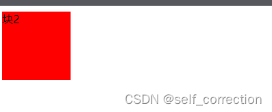
display: block inline inline-block none...
区别:
display:none      不占空间的隐藏
visibility:hidden 占空间的隐藏
例如:
<!DOCTYPE html>
<html lang="en">
<head>
    <meta charset="UTF-8">
    <meta http-equiv="X-UA-Compatible" content="IE=edge">
    <meta name="viewport" content="width=device-width, initial-scale=1.0">
    <title>Document</title>
    <style>
        #box1,#box2{width: 100px; height: 100px; background: red;}
        #box1{display: none;}
    </style>
</head>
<body>
    <div id="box1">块1</div>
    <div id="box2">块2</div>
</body>
</html>
效果展示:
番外篇、标签嵌套规范
ul li
dl dt dd
table tr td

块能够嵌套内联
<div>
<span></span>
<a href=""></a>
<div>
特殊:
错误的写法
<p>
<div></div>
</p>

内联是不能嵌套块
错误的写法:
<span>
<div></div><
/span>

特殊:
正确的写法:
<a href="#">
<div></div>
</a>
三十四、溢出隐藏
overflow:
visible : 默认
hidden
scroll
auto
x轴、y轴
overflow-x、overflow-y分别针对两个轴设置
例如:
<!DOCTYPE html>
<html lang="en">
<head>
    <meta charset="UTF-8">
    <meta http-equiv="X-UA-Compatible" content="IE=edge">
    <meta name="viewport" content="width=device-width, initial-scale=1.0">
    <title>Document</title>
    <style>
        div{width: 300px; height: 200px; border: 1px black solid;overflow: hidden;}
        div{width: 300px; height: 200px; border: 1px black solid;overflow: scroll;}
        div{width: 300px; height: 200px; border: 1px black solid;overflow: auto;}
        div{width: 300px; height: 200px; border: 1px black solid;overflow-y: auto; overflow-x: scroll;}
    </style>
</head>
<body>
        <div>
            溢出隐藏    溢出隐藏    溢出隐藏    溢出隐藏
            溢出隐藏    溢出隐藏    溢出隐藏    溢出隐藏
            溢出隐藏    溢出隐藏    溢出隐藏    溢出隐藏
            溢出隐藏    溢出隐藏    溢出隐藏    溢出隐藏
            溢出隐藏    溢出隐藏    溢出隐藏    溢出隐藏
            溢出隐藏    溢出隐藏    溢出隐藏    溢出隐藏
            溢出隐藏    溢出隐藏    溢出隐藏    溢出隐藏
            溢出隐藏    溢出隐藏    溢出隐藏    溢出隐藏
            溢出隐藏    溢出隐藏    溢出隐藏    溢出隐藏
            溢出隐藏    溢出隐藏    溢出隐藏    溢出隐藏
            溢出隐藏    溢出隐藏    溢出隐藏    溢出隐藏
            溢出隐藏    溢出隐藏    溢出隐藏    溢出隐藏
            溢出隐藏    溢出隐藏    溢出隐藏    溢出隐藏
            溢出隐藏    溢出隐藏    溢出隐藏    溢出隐藏
            溢出隐藏    溢出隐藏    溢出隐藏    溢出隐藏
            溢出隐藏    溢出隐藏    溢出隐藏    溢出隐藏
            溢出隐藏    溢出隐藏    溢出隐藏    溢出隐藏
            溢出隐藏    溢出隐藏    溢出隐藏    溢出隐藏
            溢出隐藏    溢出隐藏    溢出隐藏    溢出隐藏
            溢出隐藏    溢出隐藏    溢出隐藏    溢出隐藏
            溢出隐藏    溢出隐藏    溢出隐藏    溢出隐藏
            溢出隐藏    溢出隐藏    溢出隐藏    溢出隐藏
            溢出隐藏    溢出隐藏    溢出隐藏    溢出隐藏
        </div>
</body>
</html>
效果如下:

三十五、透明度与手势
1.opacity:0(透明)~1(不透明)
0.5(半透明)
注:占空间、所有的子内容也会透明

2.rgba():0~1
注:可以让指定的样式透明,而不影响其他样式

3.cursor:手势
default:默认箭头
要实现自定义手势:
准备图片: .cur .ico
cursor:url(./img/cursor.ico),auto;
例如:
<!DOCTYPE html>
<html lang="en">
<head>
    <meta charset="UTF-8">
    <meta http-equiv="X-UA-Compatible" content="IE=edge">
    <meta name="viewport" content="width=device-width, initial-scale=1.0">
    <title>Document</title>
    <style>
        #div{width: 100px; height: 100px; background: red;opacity: 0.5;}
       #div2{width: 100px; height: 100px; background: rgba(255, 0, 0,0.5);
        cursor: help;
    }
    </style>
</head>
<body>
    <div id="div1">这是一个块</div>
    <p>这是一个段落</p>
    <div id="div2">这又是一个块</div>
</body>
</html>
效果如下:

三十六、最大、最小宽高
min-width min-height
max-width max-height

%单位:换算→已父容器的大小进行换算的

一个容器字母适应屏幕的高:容器加height:100%;  body:100%; html:100%;

html.body(height:100%)
.contrainer(height:100%)
<!DOCTYPE html>
<html lang="en">
<head>
    <meta charset="UTF-8">
    <meta http-equiv="X-UA-Compatible" content="IE=edge">
    <meta name="viewport" content="width=device-width, initial-scale=1.0">
    <title>Document</title>
    <style>
        body{height: 500px;}
        #box1{width: 200px; height: 100px;background:red;}
        #box1{width: 100%; height: 50%; background: blue;}
    </style>
</head>
<body>
    <!-- <div>
        这是一段内容
        这是一段内容
        这是一段内容
        这是一段内容
        这是一段内容
        这是一段内容
        这是一段内容
        这是一段内容
        这是一段内容
        这是一段内容
        这是一段内容
        这是一段内容
        这是一段内容
        这是一段内容
        这是一段内容
        这是一段内容
        这是一段内容
        这是一段内容
        这是一段内容
        这是一段内容
        这是一段内容
        这是一段内容
        这是一段内容
        这是一段内容
        这是一段内容
        这是一段内容
        这是一段内容
        这是一段内容
        这是一段内容
        这是一段内容
        这是一段内容
        这是一段内容
        这是一段内容
        这是一段内容
    </div> -->
    <div id="box1">
        <div id="box2"></div>
    </div>
</body>
</html>
效果如下:
三十七、CSS的默认样式
没有默认样式:
div span...
有默认样式:
body→margin:8px
     font-weight:bold
p→margin: 上下 16px
ul→margin:上下 16px padding : 左 40px
     默认点:list-style : disc
a→ text-decoration:underline
三十八、CSSreset
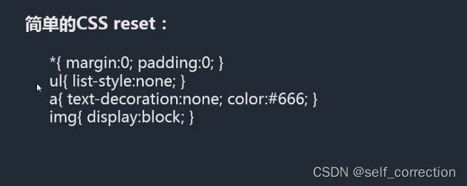
*(margin:0; padding:0;)
优点:不用考虑哪些标签有默认的margin和padding
缺点:稍微的影响性能
body,p,h1,ul(margin:0;padding:0;)
ul{list-style : none;}
a{text-decoration:none;color:#999;}
img{dispaly:block}
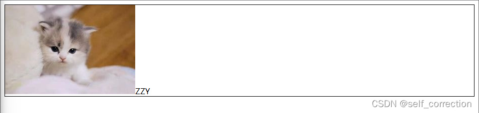
问题的现象:图片跟容器底部有一些空隙.
内联元素的对齐方式是按照文字基线对齐的,而不是文字底线对齐的.
vertical-align:baseline; 基线对齐方式,默认值
img(vertical-align:bottom;)解决方式是推荐的
写具体页面的时候或一个布局效果的时候:
1.写结构;
2.CSS重置样式;
3.写具体样式.
<!DOCTYPE html>
<html lang="en">
<head>
    <meta charset="UTF-8">
    <meta http-equiv="X-UA-Compatible" content="IE=edge">
    <meta name="viewport" content="width=device-width, initial-scale=1.0">
    <title>Document</title>
    <style>
        /* ul{list-style: none;}
        a{text-decoration: none;color: #999;}
        a:hover{text-decoration: underline;color: red;} */
        div{border: 1px black solid}
    </style>
</head>
<body>
    <!-- <div>这是一个块</div>
    <span></span>
    <h1></h1>
    <p></p>
    <ul>
        <li></li>
    </ul>
    <a href="">这是一个链接</a> -->

    <div>
        <img src="./下载.jpg" alt="">ZZY
</body>
</html>
效果展示:
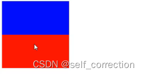
三十九、文档流
1.float浮动
如:
脱离文档流,延迟父容器靠左或靠右进行排列

left right none
<!DOCTYPE html>
<html lang="en">
<head>
    <meta charset="UTF-8">
    <meta http-equiv="X-UA-Compatible" content="IE=edge">
    <meta name="viewport" content="width=device-width, initial-scale=1.0">
    <title>Document</title>
    <style>
        body{border:1px black solid}
        #box1{width: 100px; height: 100px; background: yellow;float: right;}
        #box1{width: 200px; height: 200px; background: red}

    </style>
</head>
<body>
    <div id="box1"></div>
    <div id="box2"></div>
</body>
</html>
效果如下:
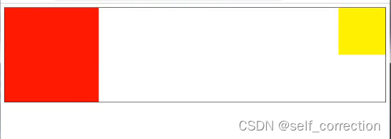
2.注意事项
1.只会影响后面的元素;
2.内容默认提升半层;
3.默认宽根据内容决定;
4.换行排列;
主要给块元素添加,但也可以给内联元素添加.
例如:
<!DOCTYPE html>
<html lang="en">
<head>
    <meta charset="UTF-8">
    <meta http-equiv="X-UA-Compatible" content="IE=edge">
    <meta name="viewport" content="width=device-width, initial-scale=1.0">
    <title>Document</title>
    <style>
        ul{margin: 0; padding: 0; list-style: none; width: 300px; height: 300px; border: 1px black solid}
        li{width: 100px; height: 100px; background: red; border: 1px yellow solid; box-sizing: border-box;
        float:left;
        }
        li:nth-of-type(1){height: 120px;}
        li:nth-of-type(2){height: 80px;}
</style>
</head>
<body>
    <ul>
        <li>1</li>
        <li>2</li>
        <li>3</li>
        <li>4</li>
    </ul>
    <span>aaaa</span>
    <span>bbbb</span>
</body>
</html>
效果如下:

3.清除float浮动
上下排列:
clear属性,表示清除浮动的,left right both

嵌套排列:
固定宽高:   不推荐,不能把高度固定死,不适合做自适应的效果
父元素浮动: 不推荐,因为父容器浮动也会影响到后面的元素
overlow:   hidden(BFC规范),如果有子元素想溢出,那么会受到影响
display:   inline-block(BFC规范),不推荐,父容器会影响到后面的元素
设置空标签: 不推荐,会多添加一个标签
after伪类: 推荐,是空标签的加强班,目前各大公司的做法.
(clear属性只会操作块标签,对内联标签不起作用)
<!DOCTYPE html>
<html lang="en">
<head>
    <meta charset="UTF-8">
    <meta http-equiv="X-UA-Compatible" content="IE=edge">
    <meta name="viewport" content="width=device-width, initial-scale=1.0">
    <title>Document</title>
    <style>
        #box1{width: 200px; border: 1px black solid;}
        #box1{width: 100px; height: 200px; background: red;float:left;}
        .clear:after{content:"";clear:both;display: block;}
    </style>
</head>
<body>
        <div id="box1" class="clear">
            <div id="box2"></div>
        </div>
        aaaaaaaa
</body>
</html>
效果如下:


 1693
1693


 被折叠的 条评论
为什么被折叠?
被折叠的 条评论
为什么被折叠?
 到【灌水乐园】发言


