


目录
序号续上一篇章:QT项目|音乐在线播放器1
四、窗体布局区域划分
4.1区域格式的代码
ColumnLayout{


}
4.2注意颜色代码的基本格式
color:"#........"

//1.透明色为:00000000
//2.青色为:00AAAA
//3.灰色为:f0f0f0
4.3边框的边距设置
spacing:0

padding:0
结束之后的界面为:
五、底部工具栏的设置
5.1间距的调整以及代码结构
//底部区域进行按钮的设置与加载
RowLayout{
anchors.fill:parent
//进行前后占位,防止图标紧靠左侧
Item{
Layout.preferredWidth: parent.width/10 //并修改为步长的10分之一
Layout.fillWidth:true
Layout.fillHeight:true
}
Button{
icon.source: "/images/previous.png"
icon.height: 32
icon.width: 32
}
Button{
icon.source: "/images/stop.png"
icon.height: 32
icon.width: 32
}
Button{
icon.source: "/images/next.png"
icon.height: 32
icon.width: 32
}
Item{
Layout.preferredWidth: parent.width/3 //步长的三分之一
Layout.fillHeight: true
}
Button{
icon.source: "/images/favorite.png"
icon.height: 32
icon.width: 32
}
Button{
icon.source: "/images/repeat.png"
icon.height: 32
icon.width: 32
}
//进行后位置的占位,防止右侧边框紧靠
Item{
Layout.preferredWidth: parent.width/10 //并修改为步长的10分之一
Layout.fillWidth:true
Layout.fillHeight:true
}
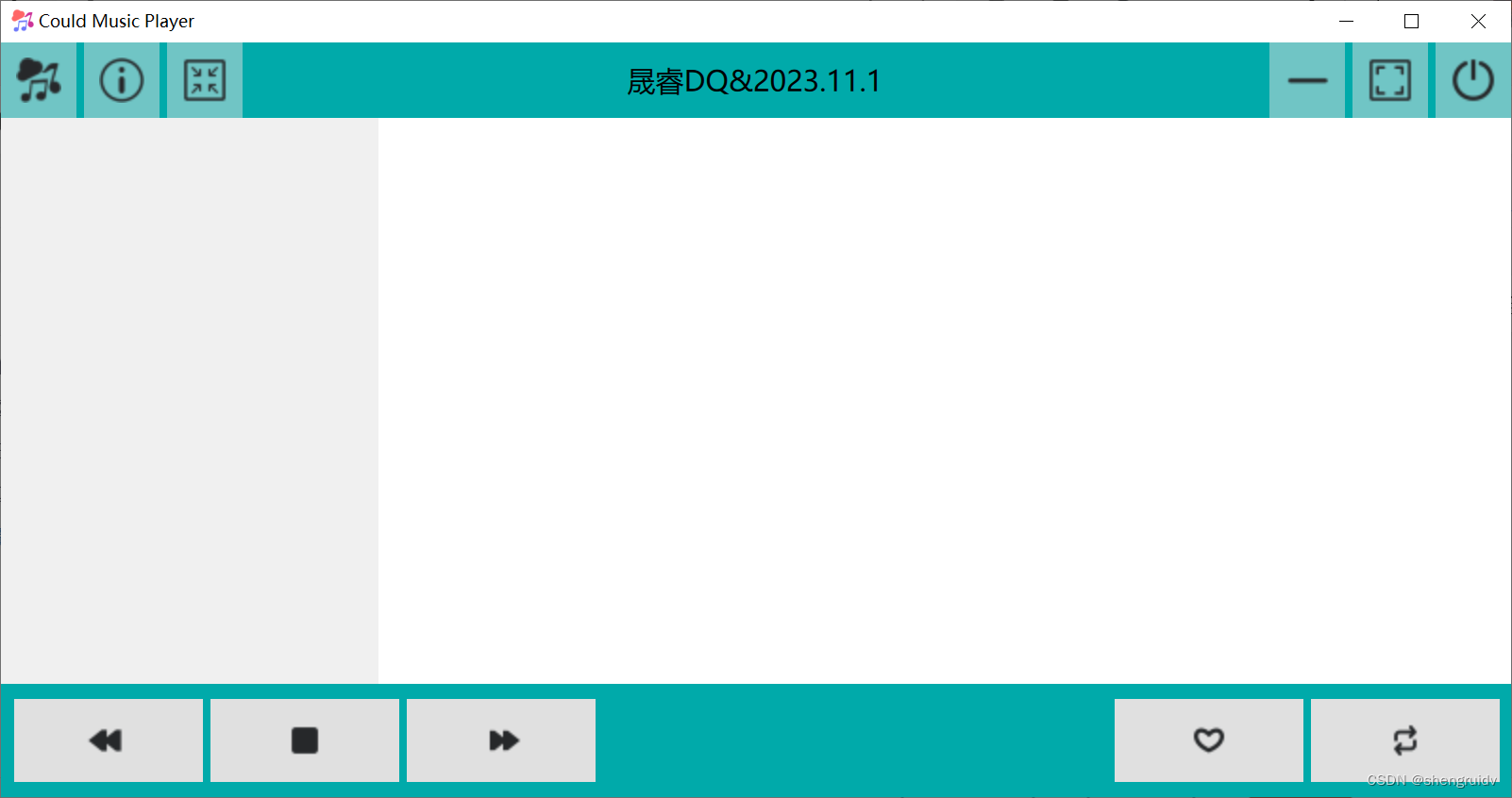
}代码之后的显示结果:
5.2 按钮位置的调控设置
       Button{
           Layout.preferredWidth:50  //进行按钮的位置调控设置
           icon.source: "/images/repeat.png"
           icon.height: 32
           icon.width: 32
       }
5.3 滑动条的设置及上面文字部分
//滑动条上部分的文字说明

       Text {
           id: nameText
           anchors.left:slider.left
           anchors.bottom:slider.top
           text:"晟睿DQ&2023.11.1"
       }

       Text {
           id: timeText
           anchors.right:slider.right
           anchors.bottom:slider.top
           text:"00:00/05:20"
       }


 //设置滑动条,并使其合适
       Slider{
           id:slider    //如未设置该处ID,将会导致滑动条左右不分,出现叠加
           width: parent.width
           Layout.fillWidth: true
           height: 25
       }
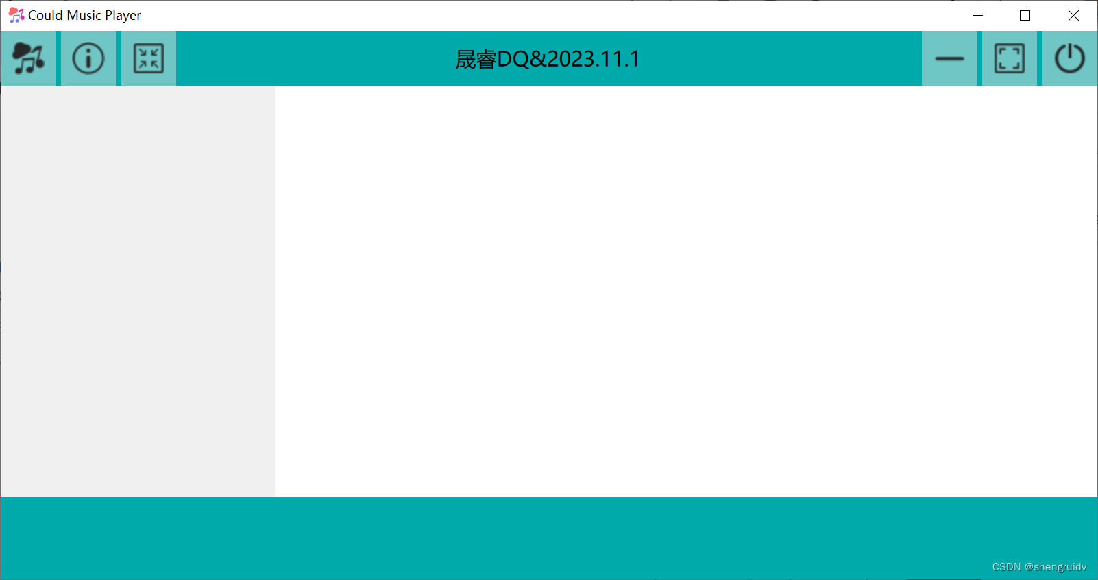
将其进行适度增加修改完善,如下图所示
 结果呈现将如图所示:

最终进行适度修改后,如下代码所示:
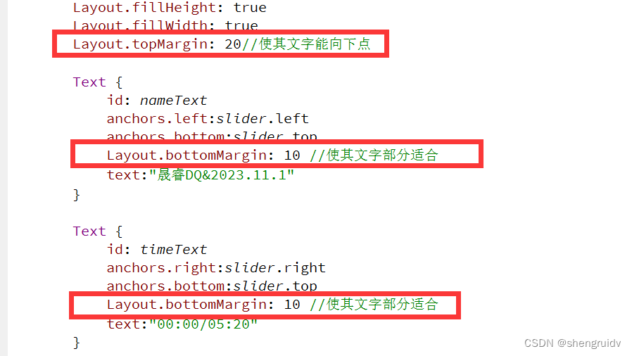
       Item{
       Layout.preferredWidth: parent.width/3  //步长的三分之一
       Layout.fillHeight: true
       Layout.fillWidth: true
       Layout.topMargin: 25//使其文字能向下点

       Text {
           id: nameText
           anchors.left:slider.left
           anchors.bottom:slider.top
           Layout.bottomMargin: 15 //使其文字部分适合
           text:"晟睿DQ&2023.11.1"
       }

       Text {
           id: timeText
           anchors.right:slider.right
           anchors.bottom:slider.top
           Layout.bottomMargin: 15 //使其文字部分适合
           text:"00:00/05:20"
       }
六、进度条的美化
PS:相关注意事项,已经在代码里详细注明
PS:PS:PS:防止打错,例如前缀没有slider;或者原本为“+”,打成“-”
6.1 滑动条的设置
       //设置滑动条,并使其合适
       Slider{
           id:slider    //如未设置该处ID,将会导致滑动条左右不分,出现叠加
           width: parent.width
           Layout.fillWidth: true
           height: 25


           background:Rectangle{
               //设置x,y相应坐标,防止颜色设置出现错误
               x:slider.leftPadding
               y:slider.topPadding+(slider.availableHeight-height)/2 //将其除以2,才回使得设置的颜色在相关的背景上
               width:slider.availableWidth //设置可用宽度
               height: 4
               radius: 2 //设置圆角
               color: "#e9f4ff" //设置为蓝色

               //设置滑块移动,前后颜色改变
               Rectangle{
               width: slider.visualPosition*parent.width
               height: parent.height
               color: "#73a7ab"
               radius:2
               }

           }
6.2滑块的设置
           //点击滑块的操作设置,也即设置滑块
           handle:Rectangle{
               x:slider.leftPadding+(slider.availableWidth-width)*slider.visualPosition//因为滑块是可移动的,所以要设置初始坐标,后续可滑动
               y:slider.topPadding+(slider.availableHeight-height)/2
               width: 15
               height: 15
               radius:5
               color:"#f0f0f0" //颜色为灰色,并且移动至此处可看颜色示例
               border.color: "#73a7ab" //颜色为蓝色
               border.width: 0.5 //设置粗细宽度
           }


 扫一扫
扫一扫


 839
839

 被折叠的 条评论
为什么被折叠?
被折叠的 条评论
为什么被折叠?
 到【灌水乐园】发言


